


C-Squared
-
Posts
1,559 -
Joined
-
Last visited
-
Days Won
13
Posts posted by C-Squared
-
-
I have to admit, after seeing them in action, I like the Browns wordmark on the pants.
*ducks for cover*
I have to admit that those unis looked a lot better to me in live action.
-
 1
1
-
-
Another one about the NFL:
I like the old Chargers jerseys better than the new ones. Something about how that lightning bolt looks on a darker background. I just think it's cool.

Is this the original "make the team look tougher by darkening their primary color" uniform? I can see the argument for loking this uniform, but, to me, the powder blue is so much more emblamatic of the San Diego region... just like how the Fins' colors are perfect for the Miami region
-
-1
If by beautiful you mean hediously ugly and not at all representive of the team's nickname. Because nothing says "distinctive" like using a color scheme already used by three teams (and soon to be a fourth) And the striping just being the Leafs is a straight up lie. So you hate the Canucks home uniforms because the striping is just the Devils minus the shoulder yoke?
I'm not even a huge fan of the original Sabres uniforms (the buffalo is poorly rendered and the striping color inconsistency is horrendous), but the logo still had more appeal than the goathead. Seriously, WTF is that on the bottom right side of the logo? And blue and yellow (not navy) is one of the greatest color schemes ever.
The Sabres have never truly had a good uniform, but the goathead is the worst (I honestly prefer the Buffaslug to it, at least that one had some appeal and a better color scheme).
I've read you praise these uniforms multiply times, and it honestly feels like you just hate the original logo (and obviously the slug), so you just latch onto the goathead because you feel like you have to like at least one Sabres look. That's just my two cents, maybe you really like that hideous crap.
This is the type of unbridled contempt that can only grow in the heart of a Cubs fan

Of course, the logo (and corresponding uniform) in my avatar trumps both Sabres unis posted, but that's another story!
-
I strongly prefer this:

over this:
-
2
-
-
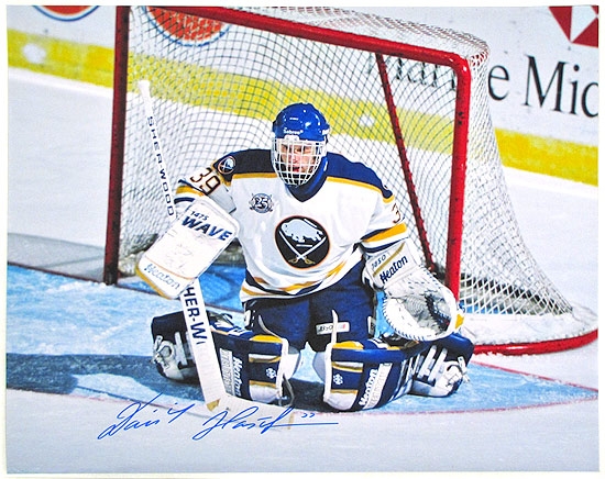
From that last-ditch splurge to get Hasek a cup in 00/01:

-
Here it is... My guess is it was done by a third party, likely Zephyr. They took lots of NHL logos and made them more animated for use on Baseball caps. Might be an unpopular opinion but I think this would make great shoulder patch.

I used to have a Rangers hat with a fantastic glove and torch logo I always loved:

-
1
-
-
This one would have been weird: Jim Kelly in Baltimore.

http://articles.baltimoresun.com/1998-02-03/sports/1998034113_1_dan-kelly-jim-kelly-ravens
Jim attempted a comeback with Buffalo in 1998 after doctors said his son Hunter wouldn't live to be a year old, but Ralph Wilson wasn't interested because he had just landed Rob Johnson... Ralph released Jim's rights and he wanted a 3-year deal from Baltimore as a replacement for Vinny Testaverde, which would have put him on that 2000 Super Bowl roster...
-
Anyone seen this NFL vs CFL page?
http://www.mmbolding.com/BSR/Candian_Football_League_vs_National_Football_League.htm
The NFL vs. CFL series was a regular thing back in the day, but promptly cancelled after the Bills became the only NFL team to lose to a CFL team when Hamilton won by 17
-
The Music CIty Miracle game is so iconic that the Titans home vs. Bills away unis don't seem like a "rare matchup" image, even though it only happened once... the rematch week 1 in 2000 (my first NFL game in person!) feels less familair... the only time the Titans whites met the Flutie/Johnson era home uni's:

-
.jpg)
Another gem from 1998; second year of the Nikefied Broncos set, and the penultimate year of the Phil Simms/LT-era Giants togs.
Also a classic game - Denver's bid for a perfect season died in a major upset.
-

2000-2001 were the only years these unis clashed.
Those Bills unis = top 5 ever IMO
-
I know this isn't the specific spirit of the thread, but I find it interesting that Dan Marino and John Elway only met twice in the regular season in their entire careers - once in 1985 and not again until Week 16 in 1998.
-
I'm sure this was posted already, but I always thought this was his revenge for finding out he was released by a news report:

-
1) I am a Buffalonian and I hate this logo:
These were both infinitely better:


2) I'd like to see the Browns dawn an alternate uniform using their seldum-used "B-Ball" logo on an actual BROWN helmet:

3) Despite the racist overtones (read up on what these three stars have meant over the years in Tennessee/KKK history), this is one of the best-designed NFL logos ever:

-
I don't know what has or hasn't been posted so far, but...

(Vince Young with the Bills)

(Kurt Warner with the Giants)

(Trent Green with the Redskins)

(Rob Johnson with the Giants)
-
Weird, I was just talking about how I had a Harbaugh action figure thing when he was on the Ravens last night. And that's a pretty rare Oilers-Ravens matchup.
Ha same here! Immediately what popped into my head when I saw that picture.
-
Nothing can top Guy LaFleur as a Nordique... its one thing for a player to wear a different uniform, but for arguably the most popular player in Montreal history to play for Quebec... unreal. It would have happened with Roy too if they didn't move to Colorado that same offseason.

Unpopular Opinions
in Sports Logo General Discussion
Posted
Not just piping... not just side-paneling... piped side-paneling. Woof.