


Around the Horn
-
Posts
995 -
Joined
-
Last visited
-
Days Won
1
Posts posted by Around the Horn
-
-
Gorgeous matchup in Philly tonight

-
 7
7
-
 1
1
-
 1
1
-
 3
3
-
 2
2
-
 1
1
-
-
I loved that interlocking DC logo
-
15
-
-
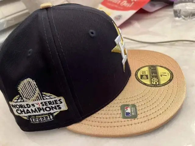
13 hours ago, TrueYankee26 said:
On the side there is a World champions patch with a globe design
I wouldn't mind the actual World Series logos bringing back the globe too. It looks good.
-
2
-
-
The only combos the Titans should be wearing are navy/columbia, navy/white, columbia/white and white/columbia.
And yes I also preferred the original uniforms too.
-
5
-
-
I don't know if it's intentional but the Sixers' city court really has a high school gymnasium vibe to it
-
On 11/4/2022 at 11:44 PM, Conrad. said:

hopefully just the drop shadow tweak... the white uniforms are basically perfect as is and the blue ones are alright
-
2
-
-
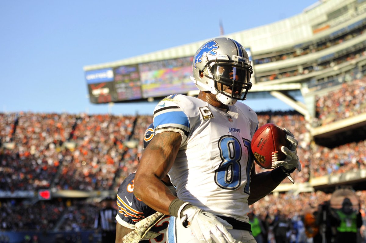
38 minutes ago, Carolingian Steamroller said:
People are going to hate me for this but:
This came very close to greatness.
Here me out.
We have the updated logo and a tri-color design ordering is consistent across every element except the home jersey (black on the outside, followed by the lightest non-background color, with the interior color the middle ground [silver/blue]).
The black really creates a sharp line against the silver on the helmet/pants and the Honolulu blue on the home jersey that helps it stand out.
The helmet stripes are way too narrow but in an interesting way.I think with a slightly better number font that matched and silver numbers on the home uniform, this might be a winner.
The Lions also made the playoffs multiple time wearing this.
That having been said, I do like their current set because I think it successfully cleaned up some of the issues with the old set, namely making the helmet stripes a more reasonable width and opting for a silver facemask. I think a happy medium would be to swap the black for the interior most color (silver on the blue jersey / blue on the helmet, pants, and away jersey).It looked even better before the Nike toilet bowl collars. The neck striping really completed the look.
-
5
-
 1
1
-
-
The Sixers are wearing their updated red jerseys tonight. The drop shadow is larger and now to the right of the letters/numbers rather than to the left.
-
7
-
4
-
-
Forcing teams to make new city jerseys every year was a mistake
-
17
-
-
12 hours ago, MJD7 said:
@SFGiants58 kind of already did something similar:
His blue/gold concept needs to be their City Connect. That is absolutely gorgeous.
-
1
-
-
That new ESPN scorebug could be really promising if they do a good job of matching the colors to whats actually being worn on the court.
The song however did not need to be changed.
-
3
-
-
6 hours ago, the admiral said:
Maybe we gotta start abbreviating long surnames and being okay with it, like "Phila" on Sixers jerseys. This is becoming a problem on NFL jerseys, too; guys who insist on like "Hightower-Cromartie Sr." are really pushin' it.
In the NHL, either the league or the Rangers told Mats Zuccarello Aasen to shorten his NOB to just Zuccarello, so there is some precedent for this
-
This has to be fake, no?
-
On 8/25/2022 at 2:55 PM, MackAttack said:
I don't know how I feel about the MEM pattern as a side panel but I think the Kings should bring back the checkerboard in a similar way...
-
Rangers-Kraken this afternoon was absolutely gorgeous
-
4
-
1
-
-
Gorgeous matchup at the Garden tonight...
Calgary getting rid of black was such a smart move.
-
8
-
-
On 10/23/2021 at 7:48 PM, Igor Coelho said:
This wordmark needs to comeback ASAP. Never should have changed.
Also is it just me or are the modern blue and orange a lighter shade?-
1
-
-
On 9/16/2021 at 8:24 PM, jb1322 said:
The Jazz going black and white just to “simplify the color scheme” is probably one of the worst reasons that could be made for this decision.
Instantly thought of this:
-
11
-
-
11 hours ago, Pyromania1983 said:
"However, when the 2021-2022 season begins, a new brand will have their patches on the Sixers' uniforms.
The team announced Wednesday that their new, official ticketing partner will be Ticketmaster — but the jersey patch sponsor for next season has not yet been determined. It will not be Ticketmaster."
Looks like it's going to be something else then. Do have to say, despite hating ad patches, the Sixers StubHub one was possibly the least intrusive in the league.
I want Wawa for maximum Philly-ness, but that's almost certainly a long shot
-
2
-
-
2 hours ago, Sec19Row53 said:
Does anyone OTHER than Chris Berman still do this?
@BBTV is, as often the case, correctThe team themselves still use that name in MetLife Stadium behind the end zones
-
14
-
-
On 3/20/2021 at 9:43 PM, GoGreenGoWhite said:
IMO something about the white uniform doesn't look right when compared to the others in that set.
I think it needs that gold outline that the navy jersey had.
-
6
-
-
Some free advice for Jacksonville:
These three combinations are all you need (with teal numbers on the road and preferably gold outlines/trim)
-
23
-
-
I'm just not a fan of the Phillies in pinstripes and I love the blue hat with the red brim...
-
6
-
-
@8BW14's AC St. Louis concept is so much better than what they actually came up with.


2022-23 NBA Logo & Jersey Changes
in Sports Logo News
Posted
When they first leaked I didn't like them, but the whole presentation with the court and social media stuff have warmed me up to them.