


Sport
-
Posts
19,460 -
Joined
-
Last visited
-
Days Won
159
Posts posted by Sport
-
-
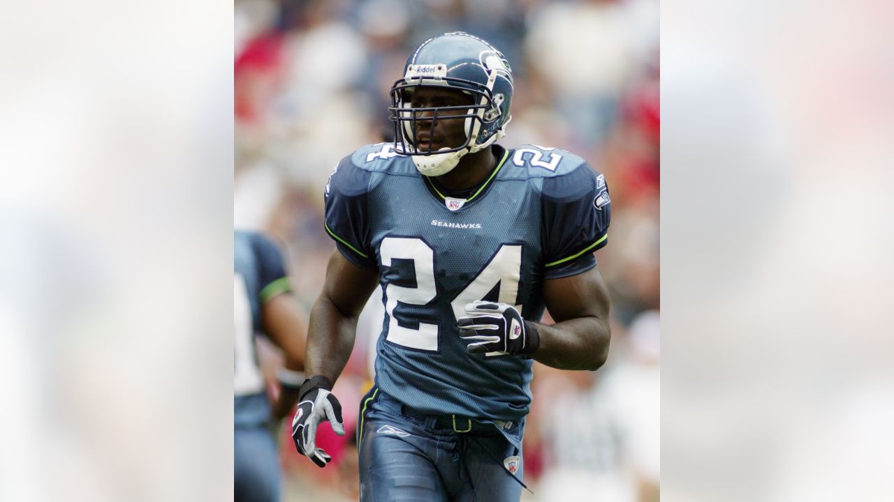
I was 15 when these debuted so I thought they were the coolest thing in a long time. I played the Seahawks all the time in NFL Fever on XBOX.

They have not aged well in retrospect, but I still prefer them to the 2012 update. That slate blue was fun.
At the time I thought the Seahawks uniforms were both stuffy and boring and they were the third silver helmet, blue jersey team. I was in favor of the change.
Edit: of course, at the time they were never photographed with the colors looking this rich and sharp.
Whenever I saw the Seahawks as a kid it was under the dreariest of dome lighting.
-
 4
4
-
-
9 hours ago, Old School Fool said:
He pretty much summed up how I feel. When people say "It should be full time" I often wonder if they literally mean the exact look because that's not going to fly. Do I want the Bucs to wear orange more? Sure but how about we put orange with the current pewter look? How about the Eagles create a new kelly green look? The Browns went back to their classic look but you know what they did? They modified the look. That's what you should do. You wanna go forwards not backwards with aesthetics.
I hate when teams go back to old looks without adapting it for modern conventions. If you're going back to an old look that's an opportunity to fix some of the things that didn't work the first time. It's an opportunity to incorporate some of the new stuff that's been done well in the intervening years. It doesn't have to be/shouldn't be re-adopted identically to the old look just because that's how it was worn the first time. The Chargers are a good example of how to do this right.
Take the Seahawks as a hypothetical. If they were to go back to the 80's/90's unis there's some things that would have to change. The 2002 logo update is such an improvement over the old one that it'd be a crime to throw out. I'd also lose the collar striping, match the pants stripes to the sleeve stripes and go with a brighter green.
-
12
-
-
Titans
Chiefs
Falcons
Saints
Rams
Commanders
Ravens
Bucs
Browns
Colts
Raiders
Eagles
Bengals
Chargers
-
14 hours ago, the admiral said:
I've warned everyone already: "horn devices"
Like the Longhorns basketball short?
-
I wouldn't miss the Texans if they did a HornetsPelicans with the Oilers, but I'd miss the logo. The Texans are the Wild of the NFL - A fantastic logo saves the awful name. The uniforms are nothing to get excited about, but they're not terrible either, which counts for something now. I'd even go as far to say that they wear a handsome look and it's kind of immune to combination :censored:ery. They look good more often than they don't and if they were given to the league office to redesign I can only imagine what Titans-like BS we'd get - I'm picturing a Texas flag that covers both shoulders and stars down the pants leg.
-
4
-
-
Jeezes, Lions. Nobody is forcing you to dress like that. Why do you do this to yourselves?
-
10
-
 2
2
-
-
3 hours ago, the admiral said:
Put me down for the '82/'84 Super Bowl-losing Dolphins uniforms: they're nice and stripey but have aqua facemasks. I like the idea of Art Deco numbers but I think it would be too foofy in practice. Add aqua pants as an option for white jerseys and punch up the logo and I think you can arrive at a canonical Fins uniform and never have to touch them again.
Give me 86 every time.
Never liked the orange-teal-orange stripes on the OG unis pants that they wore through 85. In 1986 they achieved Dolphin perfection. Finally matched the pants to the helmets and matched the jersey sleeves to the socks. It's a perfectly balanced football uniform. But they still have the single outline numbers, which feel sturdier. When they went to double outlines on the numbers and the logos on the sleeves it got a little too cute, too "matchy matchy", a little too "Sacramento Surge".
A Cardinalian update to the logo (NOT what they did in 97) and a pair of aqua pants for occasional road usage and I think the Dolphins would be set for good.
Their current logo and uniforms do look like something that belongs on a jet ski, but they don't inspire any emotions one way or another for me. I guess it's a win that they no longer cloud things with blue, but at this point I don't like them just because they're not what's pictured above.
-
8
-
-
I wouldn’t say it’s “meaningless”. Clearly the meaning was meant to match the helmet and pants stripe. I do prefer the outline with the orange directly touching the aqua though.
-
3
-
-
18 hours ago, oldschoolvikings said:
That's a terrible uniform.
It's the inevitable conclusion of mixing and matching disease. The Panthers did the same thing yesterday wearing their white pants with their dark jerseys. "Let's wear these pants and these jerseys because we can" with nobody there to say don't do that. Items never designed to be worn together now forced into the same look and, unsurprisingly, looks worse than if they'd gone with the uniform as it was designed and meant to be worn.
The funny thing to me is the Cowboys refuse for decades to wear anything with the white jersey other than the dumbest looking green silver pants, but will f*** the brand with the new white pants and white helmets with no thought at all. They can never just look good.
-
5
-
 2
2
-
-
The old logo looks like it's for a company that makes B tier pasta. The new one looks like the mark for an exclusive sports car.
-
5
-
1
-
1
-
-
7 hours ago, Dilbert said:
Had the Reds won their final two games with the Cardinals, they would've taken the Dbacks spot in the postseason.
Two things: 1. The Reds also blew a 9-0 lead to the :censored:ing Pirates in the penultimate series. I can think of about six more games they lost that easily should’ve been wins. That’s our fault, not the Dbacks.
2. the Reds pitching was a mess in the last two months and like two starters were healthy. They wouldn’t have gotten out of the wildcard series.-
3
-
-
7 hours ago, Unocal said:
Those teams didn't have negative run differentials
You said they wouldn’t have made the playoffs in a previous season and then I provided two examples where, yes actually, they could’ve and now run differential matters.
I’m not expecting intellectual consistency from you, but if you want to do the run differential thing then the Rangers should be your team - They were 36 runs better than both the Orioles and Astros. They also have a top ten payroll, which should quiet the “what’s the point of even trying?” alarm bells.
So, again, I’m really not sure what you want other than to endlessly :censored: about every possible outcome. You even pre-bitched about an “inevitable” Astros-Marlins World Series before the playoffs began. I sincerely suggest finding a third hobby since sports and posting here clearly makes you so miserable.
-
4
-
-
13 minutes ago, Unocal said:
The last two NL pennant winners would have missed the playoffs in every full season in the history of Major League Baseball prior to last season.
Good job, Manfred.
You never heard of the 73 Mets or the 06 Cardinals?
-
3
-
-
4 minutes ago, Kramerica Industries said:
Week 7 results:
Week 7 winner(s): @Sport and @Seadragon76 with 8 wins in an otherwise-rough week all around.
YES...HAHAHA...YES!
Bills
Jets
Jags
Eagles
Cowboys
Vikings
Titans
Dolphins
Colts
Texans
Browns
49ers
Chiefs
Ravens
Chargers
Lions
-
Ughhhh. Their Reverse "Retro" was a "throwback" to their current road whites, which are in no way classic or anything that deserves a special homage. That whole brand and its stewards bother me. Yeah, looking more like the Blackhawks and Devils than you already do is a great idea, ya idiots.
On 10/19/2023 at 10:50 AM, spartacat_12 said:The 2007 All Star Game was the debut of the Edge uniforms. You can see what they were hoping to do based on how the side panels matched up with the pants.
Someone really wanted these guys to look like some future "Rollerball" skating Megaman armored superheroes. The league wanted the guys in tight fitting jerseys for some reason. I remember going to the 2007 draft where they introduced the Blue Jackets new EDGE uniforms. They poured Jody Shelley and Dan Fritsche into those jerseys. Then the season came and every guy just wore the jerseys a few sizes bigger and then the jerseys started getting more tailored to a traditional hockey sweater cut. Still looks weird to look at those games and see those tight sleeves.
-
1
-
-
9 hours ago, Unocal said:
If an 84 win team with a negative run differential makes it 2 straight years a 6 seed that never would have made the playoffs makes the WS.......... what are we doing here?
We're watching baseball. I don't know what you're doing here.
-
4
-
-
9 hours ago, JerseyJimmy said:
so assuming the current score holds, which it probably will, this means that the Astros have been involved in the only two 7-game series to have the road team win every game, and that they've also lost both. god, that's weird.
I thought 2019 was so weird and now I'm astounded and amused that it's happened again.
-
5
-
-
12 hours ago, the admiral said:
It's time to give up on arena football. Channel that energy into getting team handball over as a league sport, which I believe our own @Sport once called "something your gym teacher invented on a rainy day."
A bunch of team handball people came after me four or five years ago on Twitter when I said if you gave our best quarterbacks and our best soccer goalie six months they could win Olympic gold at team handball. I still think I’m right.-
2
-
-
Since proclaiming the Bucs as my #1 a few pages back I thought about my most hated NFL uniforms and only one is from before 2000. My 10 Most Hated Full Time Uniforms In the Super Bowl Era. (Confining this to the super bowl era because I'm not going back to when the Eagles wore yellow in 19 dicketty when we were still developing a shared football aesthetic. And I'm not including alternates like the Steelers bumblebees where ugliness in one-offs is purposeful and half of the novelty. It has to have been used in the modern era where the team had to commit to it in both home and road. Looks where the team was trying to look cool and ended up looking like bozos.)
1. 2014-2019 Tampa Bay Buccaneers
2. 2015-2019 Cleveland Browns
3. 2013-2017 Jacksonville Jaguars
These three are Nike's masterpiece titled "Painting with S***, Oops All Bad Decisions"
4. 2002-2010 Buffalo Bills
5. 2004-2020 Cincinnati Bengals
6. 2005-2022 Arizona Cardinals
7. 2006-2012 Minnesota Vikings
These four are Reebok's masterpiece. Daring at the time in the field of Looking Like Ass, they laid the ground work for the Nike atrocities that would come later, but are quaint in their badness in retrospect. We had it so good before these and had no idea what hell these would inspire later.
8. 2018-2023 Tennessee Titans
That number font should be an actual crime. Could we add a 9th outline to the helmet logo? As if the shoulders aren't busy enough, how about a random square of columbia blue under the armpits? Year 6 and they haven't improved. Hoping the Oilers throwbacks convince the team to readopt the Oilers color scheme moving forward.
9. 1996 Baltimore Ravens
Later iterations have come to be some of my favorite uniforms in the NFL, but the first attempt was just a gross usage of their colors. And the logo, the one guy sued them over - DOGS***. Like the Jags and Jaguar automobiles, they came out the other side of the lawsuit with a much better mark.
10. 2009-2012 Jacksonville Jaguars
Reebok's last gasp. It's like they said "Can we be boring and pointlessly modern?" Teal flake helmets walked so the Jags two-color helmet could poop.
-
4
-
1
-
-
4 minutes ago, Cujo said:
Okay. The Chargers have a top-12 kicker..
LA is on this graphic because Staley leaves points on the field with his horrible in-game decision making. How many of those Ls become wins if Staley takes the FG instead of going for it on 4th and 5 on the ten? Another one of those close losses was the SNF game where he called that OT timeout vs the Raiders which literally cost the Chargers a playoff spot. Staley is really truly terrible.
How many of those close losses were only close because they successfully converted a fourth and short? How many wins do they have because of successfully converting a fourth and short? You can't only focus on the times it hasn't worked and just because it doesn't work sometimes doesn't mean it was the wrong call. That's how probability works. His fourth down decisions are just using easily calculated math.
I'm not saying he's a good coach, but the reason he's a bad coach is not his fourth down decisions, it's his inability to take his defensive "genius" and get his defense out of the bottom quarter of defenses.
-
1
-
-
The Chargers go for it on fourth and short because they have Justin Herbert, a bad kicker, and a stinky defense who are very likely to allow the opposing offense to get back to the yard-line they punt from anyway. I don't know why this is hard to grasp.
-
1
-
-
They're spiritually close enough to these uniforms that they feel correct for the Cardinals
they're a pair of red socks away from being an actual good uniform.
The all-white sock trend is the worst thing to happen to NFL aesthetics since the Bucs alarm clock digits.
-
15
-
1
-
-
10 minutes ago, Lights Out said:
I still like everything about that look besides the alarm clock numbers and maybe the mismatched sleeve logos. Even with those poor choices, I still don't think they were worse than this...
...or this...
...or some of the crap that Reebok came up with over the years.
You and I have done this before and I just don't agree. I can't see how anyone could find them anything other than hideous. We're getting into personal preferences territory so I'll just say if you removed the number font, which is the Jaguars black/gold helmet of number fonts, they'd still be disgusting in my eyes. They're every bad modern trend of the late 2000's/early 2010's, used entirely thoughtlessly, and the Bucs took their color palette and turned it into mud. The whole thing reminds me of when you're a kid and you mix mustard and ketchup together.
I'm not a fan of the Rams and Commandos looks or any of the other All Time Bad contenders mentioned here (The Browns 2015 update would be my easy #2), but none of them combined bad design trends with bad design choices with bad color usage with bad logo updates with bad facemasks choices with bad everything quite like that Bucs uniform. It's the biggest mess I've ever seen and that's why it's my #1.
And the number font should be an actual crime. It can't just be handwaved away like it's not a huge part of the problem. Everyone responsible for that shouldn't have to go to prison, but, like, 500 hours community service every year would be a good first step towards justice.
-
3
-
-
18 hours ago, DCarp1231 said:
Wasn’t the intention of including pewter for the helmet to mimic a cannonball? If that’s the case, they missed the mark.
I think they chose that color to evoke a feeling rather than a specific reference to one object or another. Plus it was completely unique to the sport so they could own it in a way that you can't with white or black helmets. Some of the prototypes look great, but they don't have the punch that the pewter helmets have and other teams were already using those colors at the time.
18 hours ago, DCarp1231 said:Ohio State on the other hand, hit the mark a few years ago with their alternate black helmet-
Textured helmets weren't a thing in 1997. Your choices back then were basically gloss metallic, gloss non-metallic, or semigloss like the Steelers.
-
2
-


2023-'24 NHL season
in Sports In General
Posted
Holy. 0-9-1 and they just got pulverized by Vancouver 10-1. Now I’m very curious and I’m gonna have to stay up late for their next game to get a glimpse of this train wreck.