

AnPheitseog
-
Posts
4,301 -
Joined
-
Last visited
-
Days Won
1
Posts posted by AnPheitseog
-
-
If it's not broke, dont fix it.
A lot of the NHL isnt broke, and what's broken just need tweaks. not massive overhauls
-
 7
7
-
-
8 hours ago, pepis21 said:
One though came to my mind before sleep. If somehow CCM grab contract then we would basically have a return to Rbk Edge with maybe different collar because CCM still manufacturing those designs (and was a manufacturer back in a day).
CCM has switched away from the EDGE template to their own CCM quicklite.
I own both the replica and authentic quicklite and, tbh, if CCM gets it and brings quicklite to the NHL i'll be ecstatic.
Also, regardless of who gets the contract SP sports is STILL likely to be the ones making the jerseys. As they did for CCM, reebok, and adidas. just slapping a new logo on it
EDIT: It's also worth mentioning that fanatics already makes the retail NFL jerseys and they're not half bad.
-
1
-
-
4 hours ago, JTernup said:
Within teams Nike seems to have standardized prices but that’s newer as well. Majestic definitely had jerseys with more features costing more than jerseys with fewer features.
But across teams the prices do vary seemingly based on things like layers of twill, piping, patches, etc. The fully loaded (player name and number non-custom) authentics vary quite a bit actually.
Yankees Home Judge - $300Reds Home Moustakas - $320
Rangers Home Seager - $440
Rockies City Blackmon - $475
There are a lot of teams in that $350-400 range but I picked out some extremes. There are also so,e bizarrely cheap authentics that I can’t figure out like a Trevor Story Red Sox Authentic priced at $205.
Rangers is designed by nike. The nike designed ones are all more expensive, then there's the city connect tax too.
Yankees and reds are both pre nike designs so cheaper
-
2 hours ago, Ferdinand Cesarano said:
I'm just hoping that the team with the the best-looking uniform, China, doesn't change its design, as I just bought a China cap. (I haven't received it yet. I really don't like buying fitted cats online, due to wild inconsistencies in sizing. But the seller promised that I could return the cap if it doesn't fit.)
Even if China does change, the cap will still be beautiful. Nevertheless, I would prefer that it be both beautiful and current.
This is why I like erring on the side of being smaller. You can always buy a hat stretcher and stretch it to your needs. Much harder going the other way.
-
1 hour ago, Jer15 said:
I really like the new Montreal helmet and I think it has made the whole set bump up the list.
I'd say mine is:
1. Winnipeg
2. Hamilton
3. Calgary
4. Montreal
5. Edmonton
6. BC
7. Toronto
8. Ottawa
9. Saskatchewan
Argos make me sad. Small fixes and it would be SO HIGH, but then they do things like solid powder blue socks with solid powder blue pants. and no stripes on anything
-
4
-
-
2 hours ago, DTConcepts said:
I found the image on r/HockeyJerseys. It’s not team issued, but it is an MiC.
It's a team issued MiC, but it's not a primegreen(21-22).
Since MiCs are not sold at retail, all of them are team issued, game issued, or game worn.
-
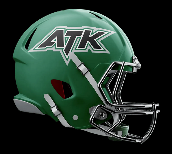
8 minutes ago, LogoFan said:
4 teams are viewable on their site but only 3 cities announced: Canton (Force), Virginia Beach (Armada) and Little Rock (Attack). No idea where the Airborne are located.
?? Airborne

Virginia Beach Armada
Not really sure what that's supposed to be...I see the V and A but that doesn't looks like a boat or really anything to me.
Arkansas Attack
Ohio Force
Trident for VA Beach
-
On 2022-05-13 at 2:10 AM, M4One said:
Maybe they should have made the back numbers red, then the stripes might not be visible through the numbers.
So, they're using SKRC. so that white layer allows it to be seethrough, as it's the only layer for most of the number.
If they used stack, you wouldnt be able to see the stripes because there would be a red layer below a blue layer below the white.
-
1
-
-
On 2022-05-31 at 8:47 AM, Jer15 said:
Speaking of LAX and Colorado:
https://www.nll.com/news/the-mammoth-return-to-the-nll-finals-after-16-years/
We have our NLL Cup final. Colorado v Buffalo.
I'm not a fan of the 3 game series....1 game per week format. It's taking forever to complete series and I'm honestly loosing interest because of it. I realize the NLL doesn't have top billing in most of it's arenas so that plays a factor but they've got to do something.See, that would make it worse IMO. need to plan for 2 days (for the home team), rather than just 1.
aka fully agree, ditch it.
-
27 minutes ago, adsarebad said:
Please tell me why the oilers are wearing those monstrosities for the second game in a row, in the playoffs??!
Because they are their home uniforms for the entire playoffs.
-
1
-
 1
1
-
-
3 hours ago, IceCap said:
I'm going to be an annoying history teacher and go "you can elect kings. It was very common in the medieval period. And happened as late as the late 19th century when the present Belgian and Norwegian monarchies were established via elections and referendums."
I'm truly sorry I ruined the joke but I hope this was at least educational 🫠
And dont forget about the current pope. not a named king, but still an elected monarch
-
5
-
-
9 minutes ago, Digby said:
There are a lot of nice, small-brand kits in the USL Championship, e.g. Hummel and Hartford, Charly and San Diego, whomever makes those wacky Las Vegas kits. But I can't speak to how well they work as suppliers in getting merch sold compared with a big, leaguewide Adidas contract. Of course lots of MLS teams seem to run out of fan replica jerseys halfway through the season and never restock, too, and the overall MLS merch game is pretty weak IMHO outside of the top clubs anyway.
It's not even good for the top teams. I'm a galaxy fan and have been unable to buy adidas polos for the past couple years for them.
-
2
-
-
I like the new NYCFC kits but yeah. From certain angles, they looked like an all orange kit.
-
Can we please make it so that I can actually see where to go to react. I know where to go based off trial and error, but wish i could SEE it.
-
1
-
 1
1
-
-
9 hours ago, Old School Fool said:
The thing about black jerseys is that you can make it work even if it's totally unnecessary if you just stick to what the people know of the brand. Take the Detroit Lions or LA Lakers for example, they shouldn't be good but they manage to work out and it's because the black is applied in a normal manner and not some dumb in your face nightmare like the Commanders. I know it's not everyones cup of tea but to me these were "done right" and inoffensive to me.
Even the Arizona Cardinals usage of black is better than the Commanders.
Starting with black shouldnt be used, these are jerseys that just look GOOD. Besides Arizona, and I should clarify that the jersey is no more or less offensive than the red version.
In short yes, I agree. The teams shouldnt have worn them, but the jerseys on their own look good to non offensive.
-
1
-
-
I like post count, but i'm not as long in the tooth as some others here.
-
 1
1
-
1
-
-
2 minutes ago, habsfan1 said:
It's a fair point. But the script alternates are still better than the side stripe jerseys. If the flag jerseys sold more than this alternate, that's surprising to me. I thought the alt was far superior to the regulars, at the time.
But, there's also the fact that the flag jerseys were their primary set and fans are more likely to buy the regular set.
-
1
-
-
2 hours ago, stumpygremlin said:
I may be in the minority, but I love color vs. color. As long as the colors contrast, of course. So that means that that Chargers/Cowboys example would be a no-go, since they're both blue.
Honestly, they contrast enough for me.
Light uniform v dark uniform is the guideline for me. So, the light blue v dark blue works. That said, green, v red is a no go for sure.
-
3
-
-
32 minutes ago, ralphz said:
Well have fun then.
Sports are entertainment. What's the goal of entertainment? to have fun. At least, it was last i checked.
-
7
-
-
16 minutes ago, habsfan1 said:
It's the short term for Football used mostly in europeen french vocabulary. I don't know any teams either.
Quebec borrowed a word from their jargon.
Missing the point. The standard in France is FC. Football Club. Take a look at ligue 1 and teams across france. Ever more reason it should have been FC Montréal, as it's a name that works in both French and English. Montréal FC also has backing in French as well.
Yes, foot is used a lot in France and in French. just like basket is to shorten from basketball. Has no bearing that the Impact should have been FC Montréal or Montréal FC.
Back to the '32s discussion. Should be the '32s, though I like WFT more than I expected.
-
3
-
-
13 hours ago, upperV03 said:
Mbappe doesn’t wear #10, though… It would take a whole sequence of # changes for that to happen. Also, Neymar offered the 10 to Messi when he arrived but Messi declined and opted to take the #30 that he wore in the early days at Barça. It was Messi’s choice, so I don’t understand the problem with it.
In France, 1,16, 30 are traditionally saved for goalkeepers. To the point that Messi needed an exemption to wear 30.
That's the problem with it.
-
still infuriates me he's wearing 30.
-
Hoping the Galaxy goes back to a blue and gold sash, and goes away from the grey like the now old one.
-
4
-
-
4 minutes ago, SFGiants58 said:
Yeah, two years later and I still don’t know if the wordmark or script was better for the Pirates. The home wordmark is untouchable, but both road options are good. I’m trending towards supporting a less awkward version of the script.
Looking at the old script for long enough makes it look like a retro Twins-level mess.
I'm torn. I like the wordmark because it matches the home, but also think the script looks better. But, i do like the corrected one better.


NFL 2022 Changes
in Sports Logo News
Posted
Didnt the Pats keep the red jersey in the style guide as an alt, even though they havent worn them in forever because of the recently gotten rid of one helmet rule?