

AnPheitseog
-
Posts
4,298 -
Joined
-
Last visited
-
Days Won
1
Posts posted by AnPheitseog
-
-
Rough week
Pittsburgh
Buffalo
NY Jets
Las Vegas
Carolina
Baltimore
Minnesota
Philadelphia
Kansas City
Houston
LA Chargers
LA Rams
Green Bay
Seattle
San Francisco
NY Giants
-
A lot of what I would have said has been said above, but I want to focus on the EDGE question.
There's nothing wrong with the edge jerseys per say. EDGE 1.0 was awful with the new materials, but 2.0 went back to traditional materials and was much better.
The issue was that reebok forced template onto teams, and many teams looked awful as a result. However, the majority of these were fixed by the end of the edge cycle.
-
 3
3
-
-
1 hour ago, infrared41 said:
Thanks for the kind words and for checking out the lists every week. I do appreciate it.
I wish I could help with the piping question, but I can't remember it either. All I remember is that someone else came up with it and it was funny and perfect. Maybe someone with better recall will come along and solve the mystery.
I did some digging, and I think I found it.
PYPs, piping yokes and panels. Also wow, my memory on this board is from 2015! time flies
-
As a self proclaimed massive enjoyer of @infrared41's threads and read them weekly, i must ask. Do you even read his thread? He said, not even last week.
On 2022-09-13 at 10:56 PM, infrared41 said:Finally, I don't care about socks.
IDK about you, but that seems pretty black in white.
If only i could remember the term used for the reebok messes with piping.
-
2
-
-
3 hours ago, harney said:
Poor guy is the only rugby fan here.

nah, i enjoy his posts and am a fan, former player, and former ref
-
1
-
-
1 minute ago, Echo said:
I think it's because there's enough horizontal striping on most hockey uniforms to break up the color so you don't get the leotard-effect that you do with football uniforms.
Plus, there's a clear break between the pants and the socks. And the socks are always properly worn and generally striped so it's broken up as you said.
-
5
-
-
1 hour ago, Jer15 said:
nope, smooth sailing on ad-free
Same. No issues at all.
-
53 minutes ago, ebod39 said:
Meaning? They don't own the factory the jerseys were manufactured in?
They don't, in fact.
Nike baseball jerseys are made by a Fanatics owned plant. It's the old majestic plant.
Adidas NHL jerseys are made by SP, the same plant that made the jerseys for reebok as well.
I dont know on field, but all retail nike NFL jerseys are also made by fanatics and not nike.
-
My strategy of "always pick against the NFC East" backfired, oops.
Kansas City
Pittsburgh
Carolina
Cleveland
Indianapolis
Baltimore
Tampa Bay
Washington
San Francisco
LA Rams
Las Vegas
Denver
Cincinnati
Green Bay
Buffalo
Minnesota
-
9 minutes ago, pepis21 said:
Speaking of Sabres, it always curious me (esepcially that Sabres team with Peca, Hasek and Satan was my faviourite one back in early 00's) why this logo is named a Goathead when it isn't a Goathead but Bisonhead, there is any explanation behind that?
because it looks like a goat's head. Just in the same way that the slug looked like a slug.
(I dont see it, but that's where it came from)
-
2
-
-
Let's see if i remember this for a full season this year....
Buffalo
New Orleans
Cleveland
San Francisco
Pittsburgh
Detroit
Indianapolis
Miami
Baltimore
Jacksonville
Tennessee
Kansas City
LA Chargers
Green Bay
Tampa Bay
Denver
-
19 minutes ago, TrueYankee26 said:
I agree, It just feels WRONG that Heinz Field got renamed
Not to mention Acrisure is based in Michigan while Heinz is a Pittsburgh institution
ohio now, after kraft bought them out.
Honestly? meh, both names are corporate so doesnt matter terribly much.
-
3
-
-
28 minutes ago, SwavyTree said:
I remember people not wanting GreenBay to wear a green color rush uniform, Those same people hated the 49ers all black uniform..but If it were a Falcons uniform, with a touch of white, people would love it. Its so crazy how fickle people can be.
Context and the specific teams matter. What is awful for, say, San Francisco could be good for another team. Now, the SF jersey was bad for everyone but context still matters.
-
2 hours ago, Ben in LA said:
The Dodgers never wore a white jersey with Brooklyn on it…yet I keep seeing it in places labeled as authentic. C’mon, man!
see above for the discussion regarding that shady website. they're a bunch of crooks
-
23 hours ago, mjarvie said:
I never said the place was perfect. I just know that what I purchased was top notch quality. Stuff like manufacturer logos, I could care less about. If it's quality, it's quality. Again, there are things on there that I know are wrong (striping on California Angels '80's jerseys), but there's still some quality stuff there. If there is something I see that is wrong, I won't purchase it. Heck, it's why I won't buy an Angel or Dodger current replica from MLB as they don't have front numbers. Be picky, because that's what will make you happy with your purchases. There are also people out there that aren't as picky as we are, that would enjoy a jersey with a wrong number font or manufacturer logo on it.
In other words, you are advocating people buying fakes.
Also seems incredibly suspicious that you joined JUST to post that, and your only two posts are to defend a store. Seems like you're being a shill for that store.
-
8
-
-
Honestly? if we move to 8 divisions in mlb, then a move to 16 playoff teams would be ideal.
Three game first round series as they're doing it this year. All games at the division winners field. Hell if you want, do it like Japan does and throw in a ghost win.
If you d that, the division winner needs to win 1/2 games at home, and the WC needs to win 2/2 in order to advance.
-
1
-
 1
1
-
-
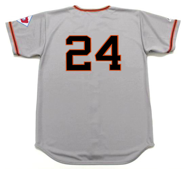
7 hours ago, Ferdinand Cesarano said:
That is a very good observation. That seller also has a Willie Mays Met jersey, a Thurman Munson Yankee jersey, and a Lou Brock Cardinal jersey with the wrong number fonts. The number font on the Ruth Yankee jersey looks off, as well (too thick); and the sleeve patch does indeed, as you note, depict a season after Ruth's playing career was over.
But the Mays Giant jersey doesn't seem to suffer from these problems. The number font is right, and the patch is from 1951, Mays's rookie season.
The main problem that I see with it is that the words in "New York" are too close together.

The jersey on e-bay gets the number font right, which is not true of a presumably authentically-styled jersey for sale at Custom Throwback Jerseys.
Compare both to the number font on what purports to be an actual 1951 Mays jersey on auction at Heritage Auctions.
(The listing says "attributed to Willie Mays", which, in auction-speak, means that the item is believed to be authentic, but that no guarantee is being made. However, the lack of the distinctive 1951 sleeve patch is curious.)
Honestly, the fabric issue doesn't really bother me. If a modern fabric can be made to look like the actual flannel (as has been done here), then that's alright with me. I care about the design elements.
Ultimately, it's the placement of the words "New" and "York" that puts me off this jersey. If that were done better, then I might go for the jersey at the price of $45.Custom Throwback Jerseys is no good. They make fakes and mix them in with legit jerseys and the owner is a jerk and especially a jerk when called out.
Though, I cannot understate the wonders and detailed research of Bill Henderson and his game worn guides. Just the level of detail and research makes it a wonderful resource. https://gamewornguides.com/
-
1
-
-
I can get it this year. have the fans see all three brand new jerseys at home and drum up sales.
Past this year though, nope. And i'm normally good with WAH too
-
1
-
-
10 hours ago, Crabcake said:
And this is my first time hearing that people strongly dislike the blue alt. It’s not flashy but I think it’s a tasteful alternate for such a classic franchise.
In itself, it's not a bad jersey. It's just so much of a lesser jersey than their home and roads.
I also dont see how that particular jersey enhances the set or tries something new. -
2 hours ago, guest23 said:
Nike makes college hockey uniforms to secure overall athletic contracts to sell licensed merch for the entire school and can sell national team merch for the big competitions which are marketed around big events. Do they need to outfit and create licensed product for an entire league that has a much lower ceiling of potential merch sales compared to the other pro leagues they contract with? Is there enough upside in such a deal to make it worthwhile?
To establish a monopoly in what are traditionally considered to be the top 4 US leagues? 100%
Even adding in soccer, this means nike has 4/5 and-for the one sport they DONT have- they have the national teams for both the US AND Canada.
-
1
-
-
21 hours ago, chcarlson23 said:
Milwaukee feels far enough away from the Twin Cities that it’s not really a part of the Wild’s market. I’m fairly certain that Bally Sports Wisconsin does play Wild games, but I’m not exactly sure how far that reach is in Wisconsin.
Of all the Wisconsin people I know, (most of whom live west of Eau Claire,) even though they’re Packers fans because of their “Wisconsin Heritage” their also Wild, Twins, Timberwolves, and Loons fans. There’s only a few peopleI know who are Brewers or Bucks fans, and it’s because they’re from the Milwaukee area.
I can understand the Blackhawks pushback on a Milwaukee team, but not really the Wild.
So, for whatever this is worth.
The only team blacked out for EPSN+ in Milwaukee would be the wild according to the NHL website.
-
Didnt the Pats keep the red jersey in the style guide as an alt, even though they havent worn them in forever because of the recently gotten rid of one helmet rule?
-
1
-
-
If it's not broke, dont fix it.
A lot of the NHL isnt broke, and what's broken just need tweaks. not massive overhauls
-
7
-
-
8 hours ago, pepis21 said:
One though came to my mind before sleep. If somehow CCM grab contract then we would basically have a return to Rbk Edge with maybe different collar because CCM still manufacturing those designs (and was a manufacturer back in a day).
CCM has switched away from the EDGE template to their own CCM quicklite.
I own both the replica and authentic quicklite and, tbh, if CCM gets it and brings quicklite to the NHL i'll be ecstatic.
Also, regardless of who gets the contract SP sports is STILL likely to be the ones making the jerseys. As they did for CCM, reebok, and adidas. just slapping a new logo on it
EDIT: It's also worth mentioning that fanatics already makes the retail NFL jerseys and they're not half bad.
-
1
-


Baseball Jersey Custom Numbers and Stripping
in Sports Logo General Discussion
Posted
Bill Henderson. He's the best bet, even over EPS for baseball.
https://thedream.shop/get-started/