


DCarp1231
-
Posts
9,193 -
Joined
-
Last visited
-
Days Won
129
Posts posted by DCarp1231
-
-
29 minutes ago, Carolingian Steamroller said:
While we're discussing Green Bay... Don't change a stitch.
As much as I hate that team, this is best looking game every single year.

I see your GB-CHI and raise you LV-KC
-
 9
9
-
 1
1
-
 1
1
-
-
15 minutes ago, GhostOfNormMacdonald said:
They like having their stuff made by a local company. Honestly, I love that. The Packers are integral in Wisconsin culture down to who makes their uniforms. I hate them, but I also love them.
This Vikings fan is conflicted
Wasn’t aware of this. Good stuff.
-
1
-
-
25 minutes ago, Sec19Row53 said:
Or not. Timeless. Classic. Not just marketing speak.
Panthers updated their template. Why can’t Green Bay?
-
 1
1
-
-
Packers could just join the trend of updating the template only to add faux mesh/perforations to the numbers
-
 2
2
-
 1
1
-
-
The most entertaining part of the draft is watching the fans in attendance being completely motionless when their favorite team drafts an OL instead of a playmaker.
-
4 minutes ago, ruttep said:
Trying to imagine what vertical sleeve stripes would look like, and I'm not a fan, especially at the expense of TV numbers. But to each their own.
If we’re talking striping in the same vain as Texas A&M (and to a lesser, crueler degree the Titans), I like that as well. But my caveat would be stopping the stripe at the sleeve, not allowing the stripe onto it. It would still allow the use of TV numbers.
-
13 minutes ago, BBTV said:
For the Packers, the only thing I'd change is to lose the TV number and run the stripes vertically from collar to cuff. Same goes for almost any team that has a notable striping pattern but who's stripes are relegated to just a small portion of the sleeve cap.
The Packers font is perfect - especially the 5s, which is what we wore in high school. While I feel that the Steelers look better with the Futura font, I don't think the Packers should change a thing in that regard.
Vertical sleeve stripes and striped socks (though that horse died a long time ago) is all I'd consider changing.
Adding blue as an accent color to the current unis is one of those suggestions that would make me alert the mods that a user is posting under the influence and should be drug tested immediately. How would blue fit in with their identity as an accent?
I originally was going to say the Packers could benefit from UCLA stripes.
As for blue— number outlines, adjust the striping to allow blue and green to coexist on the away jersey, develop a third blue jersey.
-
33 minutes ago, infrared41 said:
Fair enough. What would you change and why?
In short?
For the Packers— maybe a different font (both wordmark and number), adding blue as an accent color, simplifying the sleeve stripe
I’m not a huge fan of the stencil wordmark and never will be. I wouldn’t drastically change the number font, but I’d at least modify it. I think that adding blue would be a nice touch to at least acknowledge the team’s past in a way that isn’t just throwback uniforms. As far as the sleeve stripes go, removing the green from the home sleeve stripe and the white from the away sleeve stripe.
-
 2
2
-
1
-
 2
2
-
-
3 minutes ago, ruttep said:
Because they need it.
-
1
-
1
-
1
-
3
-
1
-
-
3 minutes ago, Chromatic said:
Packers are in a "If it ain't broke don't fix it" situation.
I don't think their uniforms are particularly amazing, but they are timeless and you don't want to throw that away.
Eh, there’s things that could be changed. Same with Pittsburgh.
-
1
-
-
Packers could use both green and blue. It’s doable.
-
2
-
3
-
-
-
Just now, McCall said:
Blacking Out in Vegas
Vegas Flights Blacked Out Nights
-
2
-
-
10 minutes ago, Old School Fool said:
All this does is muddy up the look. They should never mess with their helmet unless it's an alternate or throwback.
If there's going to be an alternate helmet for the Raiders then it should just be all black, in fact I feel like if the Raiders ever hop on the bandwagon of alternates then they should just have a reverse of their helmet and pants, nothing else needs to be done. It's a controversial issue with Raiders fans but I think it could work.
This doesn’t make any sense. If anything, that muddles up the entire look. A simple change to a black facemask would be harmless to the Raiders brand compared to all black from head-to-toe.
-
1
-
-
4 minutes ago, Old School Fool said:
Someone say best uniform in the NFL?
If the Raiders switch to a black facemask, we have a deal.
-
9
-
 1
1
-
1
-
10
-
-
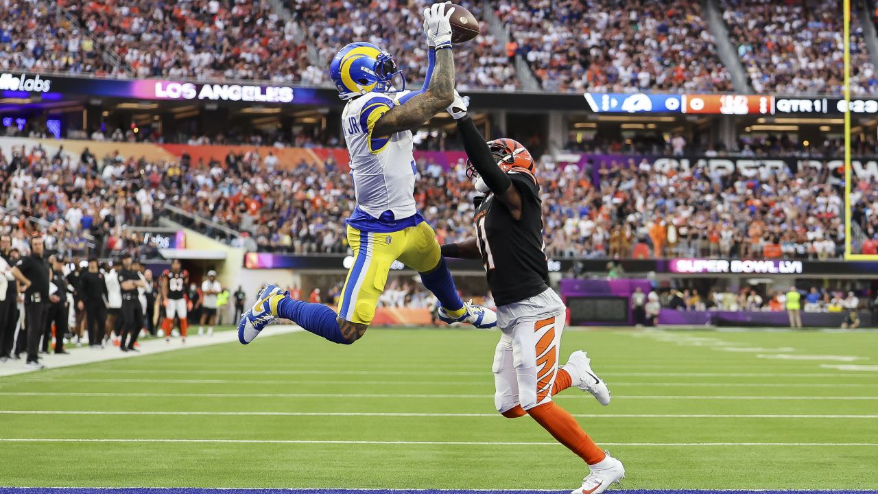
Just now, namefornamesake said:
Say what you will about these uniforms, but you can't discount how beautiful that Super Bowl was aesthetically.
Both uniforms have glaring flaws.
• Rams highlighter yellow pants
• Bengals not using black on the pants correctly
-
4
-
1
-
-
The Commanders are retiring 28
-
 3
3
-
-
30 minutes ago, MJWalker45 said:
I'd say it's a tie. The Color Rash for the Browns is so plain and generic that if you count it in the overall rating it drops the Browns to a C instead of a B+.
I’ll even throw in the Buccaneers as Top 3 candidate. They have a pretty solid set. Even with the all pewter. It’s not even a heinous uniform. The only issue is it lacks orange which will hopefully get fixed for next season.
(I do however want them to use a black(?) textured helmet just like Ohio State in 2016 as their second alt helmet)
-
1
-
-
I used to think the Bears had the best uniforms in the NFL, but now I firmly believe it’s the Browns.
-
6
-
1
-
1
-
-
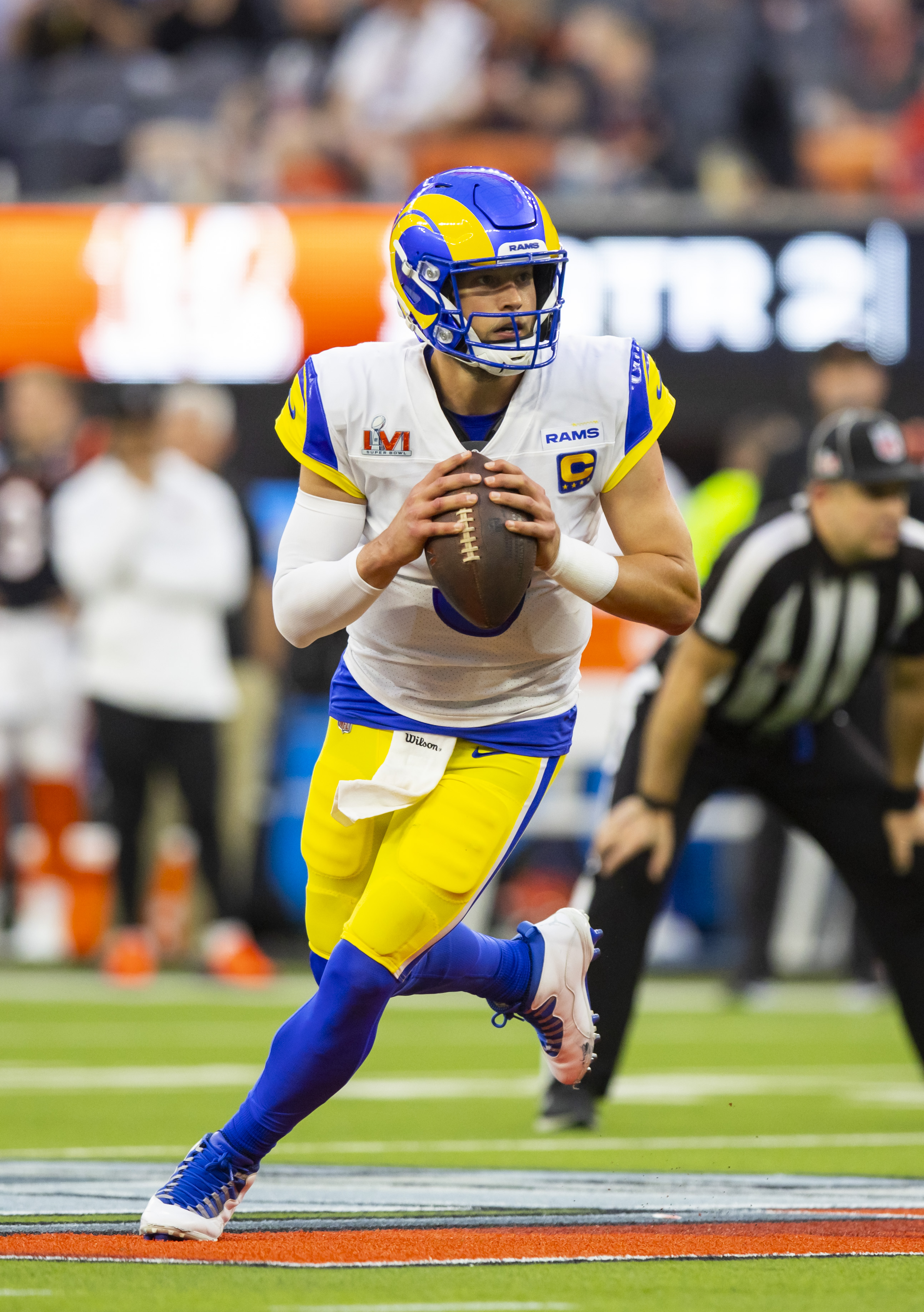
Rams “modern classic” white jersey
-
5
-
1
-
2
-
1
-
1
-
4
-
-
Dover scheme for
Erik JonesCorey Heim
-
3
-
-
27 minutes ago, infrared41 said:
The only issues I had with that set were the dumb pants stripes and the side panels. The helmet stripe was kinda silly, but it wasn't awful. Lose the side panels, fix the pants stripes, and that's a really nice uniform. I always liked the colors.
If they did something with NW stripes, it would’ve at least been somewhat compatible with the helmet stripe.
-
16 minutes ago, PurpleHayes said:
Well it was only a matter of time before PFT chimed in:
Last year, the NFL forced the University of Houston to ditch alternate uniforms that included Houston Oilers-style Columbia Blue. This year, the NFL and the Tennessee Titans gave the Houston Texans permission to use the color in an alternate uniform.
During a Tuesday appearance on SportsRadio 610 in Houston, Texans ownership explains that the two teams and the NFL worked out a compromise that returns Columbia Blue to the Houston NFL team’s color scheme.
“We worked with the NFL, and there was some push and shove and we came to where we . . . could get to with the NFL, giving us a compromise, and sort of a certain percentage in the uniform,” Cal McNair said. “And I think our fans would like more. And we’re probably in that same boat, but we’re working with the powers-that-be with the league and all that stuff to get to where we could get.”
“I think there was some talk,” Hannah McNair added, “I think even publicly we discussed that we were going to be able to use a different color than Columbia Blue, and so when that was released and we got approval to do that, that’s when we started getting pushback. . . . And then it got to a point where they just said, ‘No, you can’t,’ and then we compromised.
The situation traces to the fact that, when the Oilers left Houston, Houston made no effort to retain the names or the logos or the colors (unlike Cleveland). So the Oilers took their logos and colors and ditched them for the Titans and now use the Oilers as a throwback, even though it makes zero geographic sense to think of the Oilers as a Tennessee property.
Frankly, Houston should own the Oilers name and logo. It’s good that a compromise was done. It would be better if the Texans had the Oilers option.
It would be best if Nike would quit cajoling teams into having umpteen uniforms. The ditching of the one-helmet rule has unlocked a new universe of combinations which will have multiple NFL teams looking like Oregon — all while having more jerseys and helmets to sell, sell, sell.
Ah. So they’re dumb, bitter, and selfish and don’t understand how any of this works.
-
5
-
-
Light blue when it comes to being added to as a team color
-
 4
4
-
/cdn.vox-cdn.com/uploads/chorus_image/image/71385239/1358680721.0.jpg)


:format(jpeg)/cdn.vox-cdn.com/uploads/chorus_image/image/52475757/usa_today_9713821.0.jpeg)
2024 NFL Changes
in Sports Logo News
Posted
It was instantly improved with the addition and promotion of the white jersey.