


DCarp1231
-
Posts
9,194 -
Joined
-
Last visited
-
Days Won
129
Posts posted by DCarp1231
-
-
4 hours ago, 655321 said:
It's always so silly when a team puts the same logo on their helmet and their sleeves. It's just so redundant and lazy.
Considering it’s the best of the four jerseys, maybe teams should do it more often.
-
 8
8
-
-
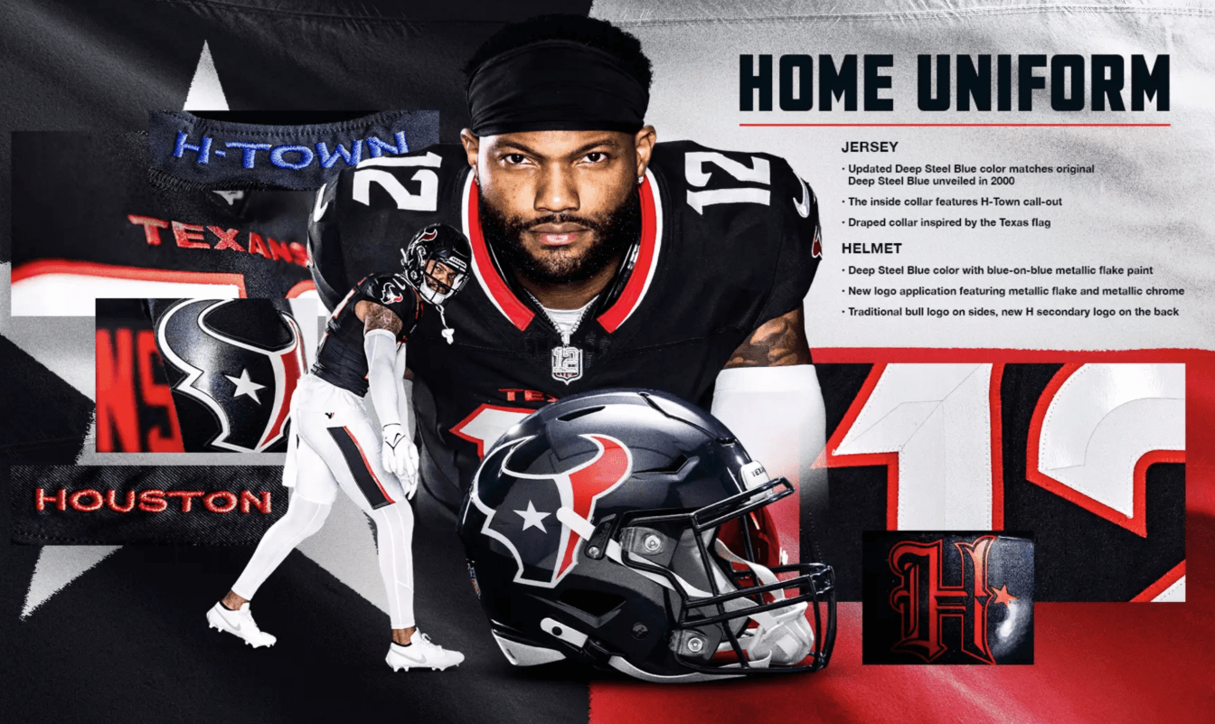
I think I’ve made my stance on the Texans set clear for the past 11 hrs, but here’s the condensed version-
What I like-
• The home set is clearly the best of the bunch
• I guess the away jersey is alright, but it should’ve followed the home jersey design
• The stripes on the white pants and regular blue pants
What I don’t like-
• Everything else is awful and embarrassing
• Managed to make the AFC South bluer
5/10
-
6
-
-
Just now, simtek34 said:
Well technically the words inside the collar use Columbia Blue, so it's now apart of their main color palette, and can be used more due t that.
Yeah I found that out after posting. Doesn’t excuse the buffoonery.
-
1
-
-
1 minute ago, chakdaddy said:
Alts are here to stay, I'm not bothered by it. Good way to have your cake and eat it too IMO
It’s a good way to lose a cohesive identity.
-
3
-
-
1 minute ago, chakdaddy said:
Texans look like 2 normal sets and 2 with bold red. Seems fine to me.
Yeah, exactly what the people want. For one team to look like two.
-
1
-
-
4 minutes ago, SFGiants58 said:
I mean, they won SB III. Then proceeded to spend the next 55 or so years being decent-to-basura, with the highlight being Mark Sanchez running right into Brandon Moore's butt and committing a turnover.
Speaking of which, what play best represents Denver's post-SB 50 futility? I would suggest the Hackett field goal.
Probably Drew Lock rapping on the sidelines. Not a thought behind those eyes. Much like the post-SB50 days
-
6 minutes ago, rfraser85 said:
Agreed. For the record, here is the picture that started my search, courtesy of Uni-Watch.

Houston’s quarter-assed use of the light blue is absolutely magnificent. You really gotta admire this team for being a bunch of crybabies over a color.
They’ve gotten themselves so worked up about being the Oilers that they inadvertently started to look like the Titans. Just really great stuff.
-
9
-
 1
1
-
 1
1
-
-
Just now, rfraser85 said:
The inner collars of all three jerseys have H-Town written in that shade of blue. You can't see it when the players are wearing them, but you can see it on the retail shop pages. Whether or not that satisfies the rules is debatable, but it is there.
There definitely needs to be a rule of visibility, then. Again, hardly an accent color.
-
1
-
-
19 minutes ago, VDizzle12 said:
The rule hasn't changed. No team has an alternate jersey or helmet color that isn't present on a primary uniform or used by the team in the past. Houston's use of lighter blue is just an accent color so it was never against the rules. The Colts and Commanders are close. But they added black to their white jerseys to get around the rule.
C’mon now. It’s nowhere to be found on the other three uniforms. It’s hardly an accent color. Especially when confined to one uniform. We all know why that lighter blue was randomly added.
They definitely wanted a full light blue jersey/uniform, were told no by the league because it wasn’t historical to the franchise, they went all Veruca Salt on ‘em, and to shut them up the league bent the rules.
-
2
-
-
Calling for relocation instigates panic and instability. While two leagues came together in a merger, it’s still a fledgling league that needs proper time to get its footing.
-
2
-
-
The full number set-
-
2
-
-
You really just gotta stand back in awe at how in 3 seasons, the uniform rules went from-
“the color has to be present on one of the primary uniforms to be considered for an alternate uniform”
straight to-
“f*** it, add any color you want.”
-
5
-
 1
1
-
-
Fans: “We want more red!”
Texans: *triples the use the blue*
-
2
-
 1
1
-
-
-
-
23
-
 1
1
-
5
-
-
10 minutes ago, rfraser85 said:
I think we missed a team that's eligible for new uniforms next year: the Colts. They changed their number font and added black in 2020. I wasn't a fan of the Color Rush uniforms from last year, but maybe they can figure out a better way to add a third color. Or at least they could develop a non-blue jersey. Having three royal blue jerseys doesn't make sense to me.
The Colts should definitely be at the bottom of the list of teams that need to change. I personally think their alternate uniform isn’t bad, but it should definitely not be pair with the black helmet.
-
3
-
-
10 minutes ago, MEANS said:
try using black and silver or any shape that looks like a shield.....the Raiders OWN those elements.

Didn’t/Don’t the Raiders hate the Buccaneers for being pirate themed?
-
1
-
-
1 hour ago, infrared41 said:
True, but the Eagles aren't wearing white helmets, brown jerseys with sublimated feather textures, and yellow shoes and socks because it represents the quality craftsmanship and hardworking, high flying example of the American eagle. That's the difference.
Reminds me of Oregon’s duck uniform
-
2
-
1
-
 2
2
-
-
Can Houston just pull a Dallas and only ever wear these
-
12
-
-
Texans could’ve been better. I like the home, but everything else loses my interest. My opinion on them has changed. Absolutely worst of the 4 teams.
-
1
-
-
Just noticed that the stupid H-Town Alt numbers have a crappy shiny plastic finish.

-
2
-
-
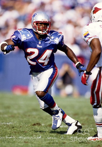
2 minutes ago, 29texan said:
"Nice" is subjective.
This was in 1996, btw:
Yeah and that uniform is cool as f***. What about it?
-
8
-
-
1 minute ago, infrared41 said:
Sums it up nicely.
I’ve liked this guy ever since he showed up on my Twitter feed. Much more knowledgeable about uniform aesthetics than the fashion advice guy.
He’s done some great Commanders concepts.
-
5
-
-
Houston whining about the use of light blue is hilarious. Imagine the Ravens throwing a tantrum about not being able to use the Colts blue.
-
3
-
1
-


2024 NFL Changes
in Sports Logo News
Posted
Light blue when it comes to being added to as a team color