


DCarp1231
-
Posts
9,349 -
Joined
-
Last visited
-
Days Won
138
Posts posted by DCarp1231
-
-
I don't think uniforms should have Home-Away-Alternate designation. The NBA made a good step forward by axing the designations.
-
 2
2
-
-
All NFL teams getting the roundel logo treatment
-
1
-
-
17 hours ago, Brian in Boston said:
When Fayetteville announced the Black, Gray, and Red palette back in May, it struck me that those colors would lend themselves to the name Fayetteville Woodpeckers. Many of the woodpecker species found in North Carolina - including the Downy woodpecker, Hairy woodpecker, Ivory-billed woodpecker, Northern flicker woodpecker, Pileated woodpecker, Red-bellied woodpecker, Red-headed woodpecker, and the Yellow-bellied sapsucker - feature those colors in their plumage.
Well, we'll find out in just over a month.
It would seem a little odd to have the Woodpeckers in the same league as the (Down East) Wood Ducks.
-
Not a big fan of pinstripes. IMHO it tends to clutter the look of a baseball uniform.
-
1
-
-
This could be a good non gimmicky identity
-
-
A kronum league could be a good idea for someone to take under. For those unfamiliar:
About:
http://www.sportpsychologytoday.com/youth-sports-psychology/what-is-kronum/
Uniforms:
Essentially a soccer uniform
Field:
-
1
-
-
28 minutes ago, IndianapolisCubs2009 said:
Georgia's and Grambling State's look oddly similar.
Yeah, weird.
-
3
-
-
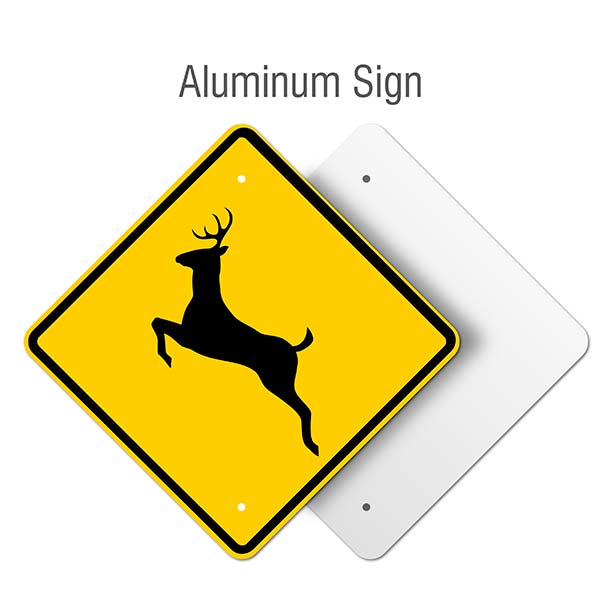
4 hours ago, McCarthy said:
Always thought the deer crossing symbol would look cool on the side of a football helmet

-
3
-
-
A couple years ago I wanted to get into the CFL so I mentioned the league in a tweet asking which team I should root for since I'm a new fan. I actually got a lot of feedback, with the CFL's help, from all nine teams. I ultimately chose BC and even bought a shirt to show support, but now I'm slightly finding myself liking Winnipeg.
-
-
-
15 minutes ago, Gothamite said:
So then why invoke the Pulaski Yankees as the starting point? I'm confused.
I said that I'd like to see the Yankees put that script on their ST/BP jersey instead of the "NY". I'm not sure what's confusing about that.
-
5 hours ago, Gothamite said:

You do know that the Pulaski logo is based on the New York Yankees logo, right?
They've used versions of that script on jackets since at least the 1940s, although I don't think they've ever put it on BP tops.

Of course. That's why I said it. I think it would be a nice change to see instead of the "NY" plastered everywhere
-
I was looking through MiLB team logos and I saw the Pulaski Yankees wordmark.

I then realized that with a few tweaks, dropping the "Pulaski" and possibly thickening the stroke while changing the color to white, the New York Yankees could place it on their blue spring training jerseys and call it a day.
-
Nothing like potentially being known as the genitalia of baseball. My vote is definitely for Rocky Montain Oysters
-
7 hours ago, DustDevil61 said:
It's good, but I would replace either one of the logos with the duck holding a branch logos with something different. Maybe a duck's foot? Then again, a duck's foot in the third logo from the left wouldn't look too bad, either. Either that, or at least give the duck a different expression to use in another logo or two.
I agree. What I see is a logo, a partial of that, then a partial of that. There's gotta be some type of difference.
-
1
-
-
While the Frederick Keys have arguably the worst identity in the Carolina League, one of the newest additions to the League, Down East Wood Ducks have arguably the best:

-
5 hours ago, Dolphins Dynasty said:
Considering the connections to the American flag, I could see them pulling something off... something patriotic? Oh, but that would mean another generic red, white and blue color scheme!

Speaking of patriotic, they used to have logos incorporating an eagle.

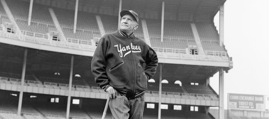
Featuring Jayson Werth pre long hair with some sweet sideburns @DC in Da House w/o a Doubt
I think it would be a good idea to bring back that eagle logo, but try to modernize it.
Another idea I have is maybe they should try to incorporate music imagery into their logo.
-
2
-
-
26 minutes ago, Gothamite said:
Ew. That’s pretty bad. The color scheme has promise, but... yeah, that’s about it.
The whole idea behind the name is to honor Francis Scott Key, author of the Star Spangled Banner, who is from Frederick and is buried in the cemetery right next to the stadium. The mascot that parades around the stadium and in the community is "Keyote" the Coyote and the only time they've ever used Scott Key that at least I can remember is a failed mascot attempt from a few years ago in the form of "Fran-Key". The idea behind the nickname is understandable, but the execution is 100 yards away. Either beef up the identity or scrap it altogether and come up with a new one.
-
Personally, I think the next MiLB team that needs a fresh new look has to be my hometown Frederick Keys. The primary is terrible and dated:

amd the cap cap logo isn't any better:

-
1
-
-
Script logo football helmets are underrated


-
19
-
-
What if th NFL distributed uniform designing rights to state specific corporations?
Examples:
Coca-Cola / Atlanta Falcons
PepsiCo / New York Giants
Chipotle Mexican Grill / Denver Broncos
Gillette / New England Patriots
-
1
-
-
With a few small tweaks, this should be the Capitals primary uniform rotation:
Home (Current Alternate):
-Update wordmark to current
-Use 2018 Stadium Series jersey number font

Away (Throwback Alternate from 2011-14):
-Update wordmark to current
-Use 2018 Stadium Series jersey number font
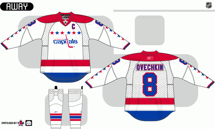
Alternate (2018 Stadium Series uniform):
-I strangely think this is one of the best recent new jerseys
-Keep the "CAPS"
-Place the "Weagle" on the white shoulder yoke
-Outline numbers in red

-
1
-


Players in the "wrong" uniforms
in Sports Logo General Discussion
Posted