


ramsjetsthunder
-
Posts
1,104 -
Joined
-
Last visited
-
Days Won
1
Posts posted by ramsjetsthunder
-
-
I don't understand all the love for the Chargers' yellow pants. Their white pants are far superior with both the powder blue and white jerseys IMO
-
 2
2
-
 6
6
-
-
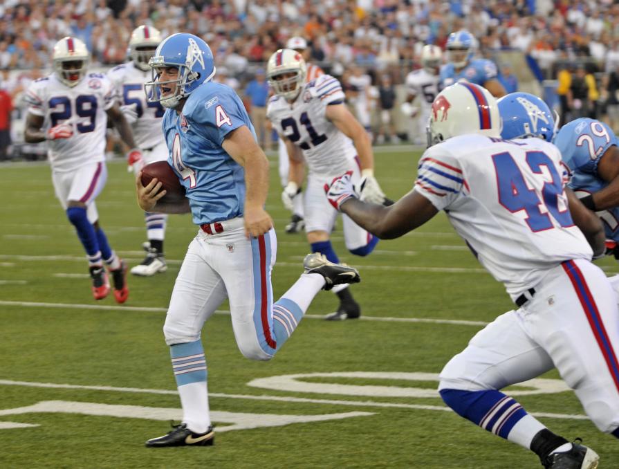
Come on, we all know these were the best Titans uniforms in history:

-
9
-
 3
3
-
 1
1
-
 3
3
-
-
2 hours ago, nuordr said:
now they have the second worst.
Dare I ask who is worst?
-
At this rate, the Bills may roll in mono-blue every week...
-
I shouldn't like that thin red line on the Ravens.....but I do
-
1
-
-
Why would TB in their right mind wear white pants with their Red tops--especially with most players wearing white socks
-
2
-
-
29 minutes ago, Echo said:
Have they ever worn those with white pants?
Sadly, no, But this would be an ideal redesign IMO
-
Come on y'all, these are the best (with white pants)
-
2
-
-
4 hours ago, Carolingian Steamroller said:
By 2027, when they're locked into a soulless dome playing on field turf, I wouldn't be surprised to some "modernization in keeping with our tradition."
Nike literally every year: "Honor the past, embrace the future"
Nike literally every year: *Destroys the past, embraces a five-year uni*
-
10
-
-
11 hours ago, Old School Fool said:
The Cleveland Bears
-
On 9/2/2022 at 9:13 AM, tBBP said:
 Them.
Them.
(That was from the 2009 Hall of Fame Game aka the AJ Trapasso fake punt game.)
Ah, the HOF Game. That makes sense I suppose
-
I've gotta disagree about keeping the current colors. If you fix those and remove the number outlines, I think you've got it.
Isn't this:
better than this?
-
1
-
-
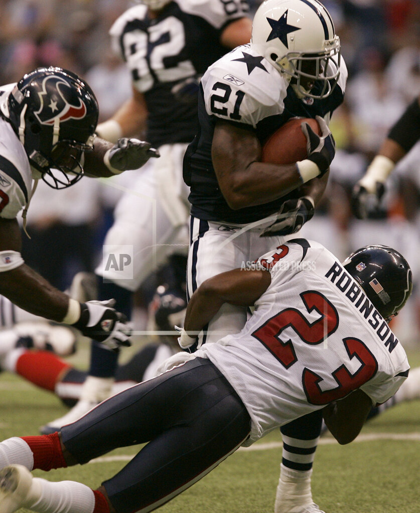
On 7/21/2022 at 10:33 PM, gothedistance said:
With the return of the Cowboys throwback uniform, I post this.
Texans vs Cowboys in 2005.
Who the heck wears a throwback in the preseason?
-
Take the stencil out of the number, get rid of the top and bottom lines on the wordmark, and that's a great look. Dare I say, an instant classic.
-
2 hours ago, TrueYankee26 said:
Imagine if Tampa Bay kept these uniforms for 1 more season. Brady's Buccaneers could have won Super Bowl LV in these.

Stuns me that the Rams have won the same amount of Super Bowls in these helmets
-
1
-
 1
1
-
 1
1
-
1
-
-
There will never be another Number 9*
*You know, until some punk kid decides he wants to unretire it.
-
2
-
 1
1
-
7
-
2
-
-
4 hours ago, AHcreative said:
You know what? You're right.
You think a smaller gap between the fish and the sun, and a larger gap between the helmet and dolphin head, would also be beneficial?
I think the other spacing is fine, personally
-
#WeWantTheFleck
-
 1
1
-
-
Needs a gap in the thick white streak where the arm is
-
1
-
-
Don't tell anyone, but I like the Cowboys' White Alternates.
-
5
-
-
4 hours ago, Brave-Bird 08 said:
I've never thought the Cardinals uniforms are bad, they just belong in the year 2003.
*ducks behind counter*
While their pre-2005 uniforms were pretty timeless, they tied back to a very rough time in St. Louis, and even though they're the oldest franchise in the league, I don't think anyone in Phoenix really has a soft spot for the "heritage" of Cardinals football.
A modern get up works since their existence in Arizona really felt like it required a facelift -- afterall, their temporary way of making themselves feel re-born was simply slapping the Arizona flag on the sleeves.
I have no interest in them reverting to the ultra-simplified look of yesteryear, I would even be more intruiged if they adopted a new color scheme, possibly something similar to the Coyotes/D-Backs deeper red and sand aesthetic.
This is what I've always thought. Especially since the Cards have been a historically bad team, Nike could afford to go more bold with them.
-
Really don't mind the Black helmets and in a vacuum think they're great.
-
3
-
-
5 hours ago, nuordr said:
You can see some of the options on this YouTube video:
Does this confirm a yellow pants option?
-
This is awesome. Of course, if Nike did it, the piping would be bright white and the numbers would be shiny
-
 2
2
-


2022 NFL Season week by week uniform match-up combos: From HOF Game to Super Bowl LVII
in Sports Logo News
Posted
E. All of the above including the Bills' Grey facemask