


VikWings
-
Posts
1,681 -
Joined
-
Last visited
Posts posted by VikWings
-
-
There's an interview with Bill DeWitt out there somewhere (I already forgot where I read it, might have been ESPN.com) where he said the Cardinals almost opted out of the City Connect program altogether and that he pretty much mandated that the Birds on the Bat be on the jersey.
-
 4
4
-
 1
1
-
-
5 hours ago, lahaye7 said:
with you on all these, I have never heard of anyone refer to St. Louis as The Lou. I'd go Red pants and a navy belt (you know, to rep the Mississippi River)
Nelly does/did. They even mention him in the Nike speak graphic leak.

-
3
-
-
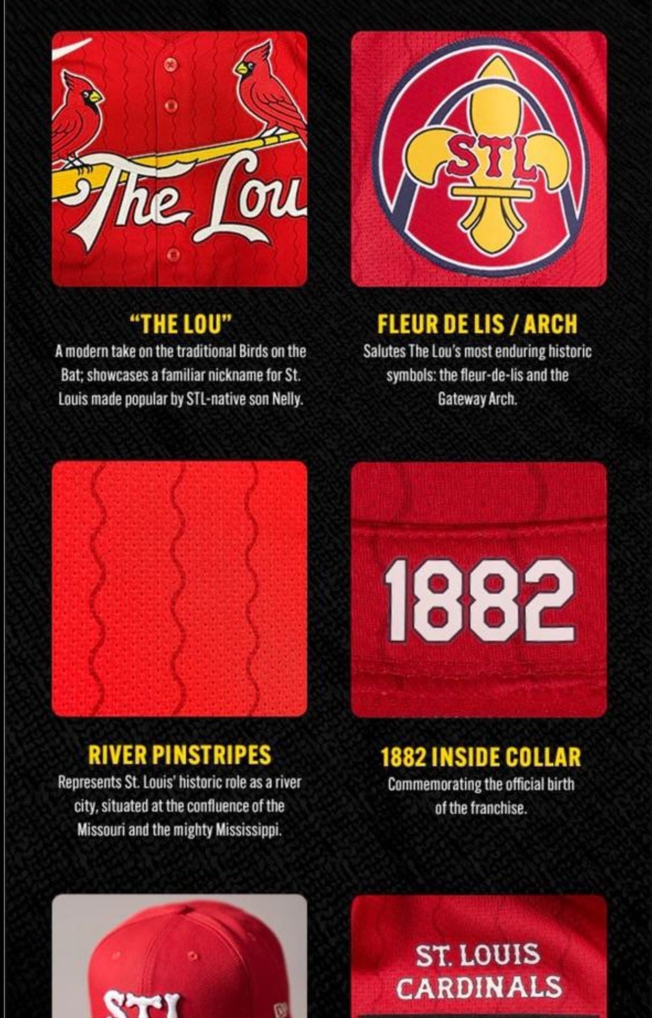
Cardinals city connects are solid and tame. Didn't expect them to go outside the box. DeWitt is good when it comes to that stuff. I don't really like the hat though, but I also can't come up with anything better for it that they don't already wear on one of their regular hats. Maybe that fleur-de-lis logo?
-
3
-
-
On the Giants:
-I liked them going to white pants at home. (Did not need the gray stripes though)
-I did not like them going to white pants on the road
-I prefer the stripes on the old gray pants more than the current/most recent.
I saw a fix for the Giants road that would goin a long ways and it was just changing either the inner or outer stripes on the sleeves to blue. Blue socks might help too.
-
2
-
-
54 minutes ago, aawagner011 said:
I wanted to check the source, and it’s straight from the Jaguars Twitter account. This would infer block numbers but I am not 100% convinced. Antonio Brown’s network showed a possible leak with the modern numerals.Now before you say “consider the source,” remember they absolutely nailed every aspect of the Broncos and Texans. I’m hoping it’s the modern numerals because those are definitely the better look. Block numbers are ok, and better than what they currently have, but still not as good.
Wouldn't read much into the font and such in that graphic. They're just playing off the X-Men '97 TV show that just came out.
-
6
-
 1
1
-
-
15 hours ago, Andrew_Gamer_NZP said:
If they actually put Cleveland instead of CLE and these wouldn't be half bad.
-
2
-
-
6 hours ago, aawagner011 said:
From the mothership:
Of these, I would say only half look somewhat or even vaguely like the club they are supposed to represent. And I think that’s the problem with the City Connect program. While it allows teams to explore alternate identities, too many of them stray too far from the norm and have zero relation to the team. I think a better approach would be to run a heritage program, as we have seen a bit in the NHL. It allows teams to offer variety without going too far outside their normal color palette. Heck, you could even tie it into the Cooperstown angle, as we have seen Majestic and Nike do the last decade or so with the merchandise they’ve offered.
The only ones in my opinion that are truly terrible are the Giants, Phillies and Reds. I'm not a big fan of the Rangers either but some people seem to like them. Boston is nice in a vacuum, but the Red Sox shouldn't be wearing blue and yellow and UCLA hats.
Seattle is ruined by the black pants. Pirates are ruined by the PGH. Colorado is more tolerable when they wear white pants,
I love the Marlins, White Sox and Rays (just wish they had colored numbers/word mark). Diamondbacks and Astros (wish this said Houston instead of Space City) would probably round out my top 5. I like that the Braves said "since we have to get rid of the throwback here's something close to it."
I like the Padres and Phillies hats. And the Brewers grill logo.
-
1
-
-
Voted: Black Dimonds, Swarm, Outlaws and Venom.
I don't think Hive is bad either. Caribou could be interesting. Don't really like Glaciers but it would lend itself to a nice color scheme based on light blue. Yeti needs to be Yetis.
-
These are my favorite Pacers uniforms.
-
6
-
 1
1
-
-
3 hours ago, PlayGloria said:
You are probably correct. I would imagine Cardinals will be a red jersey considering they got rid of the spring training reds this year.
I bet it's in the colors of the St. Louis flag with "The Lou" written on the front.
Hopefully the pants aren't blue or red.
-
1
-
-
Tigers' cities are mid at best. The hat is atrocious. And the vin number thing is stupid and ugly. Put that on the inside of the collar or something and it's fine, but it's bad on the hat.
-
20 hours ago, Ark said:
Not really, the "primary" Nuggets jerseys now are like the jerseys they wore in the Carmelo era but worse in every way.
By "decent" I meant a passable mediocre uniform instead of a steaming pile of trash.
-
So the Nuggets will only look half way decent for 1 of a potential 7 games.
-
1
-
-
The Eagles never needed to add the charcoal. It just muddies things up.
I always hated the original midnight green as a color. It's a little better since Nike took over since it's on the bluer side. But that's probably they're color as long as Lurie is around. They'll just double dip with the kelly alts.
-
On 4/28/2024 at 12:56 AM, bowld said:
Those old unis remind me of how much I use to crush it on NCAA 14? Using them. Pat White/Steve Slayton combo was unstoppable
Pat White and Steve Slaton had to be like NCAA 07 or 08.
-
2
-
-
I actually kinda like what the Rays did. It's fun and kitschy. I probably would have filled in the wordmark and number with a color, but otherwise it's one of the better city connects. (White Sox, Marlins)
The merch is awesome and I might grab a hat.
-
8
-
-
20 hours ago, Silver_Star said:
The highlighter yellow pants again. Errrr. It looks somewhat golden now, but geez. Also, their 1973-1999 classic uniforms were better. I wish they modernized those instead of going into a gradient direction.
I could live with the banana yellow for the Rams. Just fix the helmet horn and get rid of the gradient numbers and they're a fine modern update. Oh and burn everything 'bone'
-
2
-
-
21 hours ago, infrared41 said:
Sums it up nicely.
Honestly if they just throw out the blue pants, orange socks and white helmets it would go a long way.
-
3
-
-
15 minutes ago, Chawls said:
Maybe it’s too soon to be asking this now, but who’s on the shortlist of teams who need a uniform overhaul now that the Bengals, Cardinals, and Broncos have all updated their looks?
I elect the Jaguars and Commanders.
Titans and Commanders
-
5
-
-
New uni rankings:
1. Jets
-Really solid set. I don't even hate the BFBS uniform. Just please never wear black pants with any other jersey.
2. Lions
-They might have been #1 if they put stripes on the blue, white and black pants. And I'm sure they're wear mono-white far too often. I actually like their BFBS as well.
3. Texans
-Could be better could be worse, lateral move to slight downgrade.
4. Broncos
-Could have been a lot worse but again not great and too many gimmicks. Throwback is sexy.
-
1
-
-
39 minutes ago, bowld said:
Saw this on their website-
UPDATED DEEP STEEL BLUE COLOR MATCHES ORIGINAL DEEP STEEL BLUE UNVEILED IN 2000
This doesn't look as bad. Maybe it's just the 7 and 3 that weigh the whole thing down.
-
2
-
-
I don't hate the Texans set, but it's a definite downgrade, lateral move at best.
It's better than the worst of the Nike sets: Titans, Jags, Bucs, Browns, Rams bone, etc.
-The home is definitely the best of the bunch.
-The font drags the whole set down.
-I actually kinda like the horn helmet.
-Mono-red sucks please wear that with blue or white pants. (they won't)
-The H-Town jersey is unnecessary and just a way to force the Oiler blue in. Not a fan of the H logo either. If you're gonna do it swap the red and blue.
-And finally, why do teams hate contrasting socks?
-
3
-
-
1 hour ago, Lights Out said:
Not every team needs to look exactly the same as they did 50 years ago at all times. Especially for a team like the Broncos whose greatest success has come in modern uniforms.
They could have used the color rush with white pants and made a blue and white counterpart and knocked this out of the park. It would have split the two eras nicely and been a great modern classic. You could have even kept the current logo over the D.
But instead they needed to tell us for the million time in a sports uniform that Colorado has mountains and Denver is 5280 feet above sea level. Just like the Rockies and Nuggets have done before. At least the Rockies are actually named after the mountains. This is for a team called the Broncos.
Again, not everything needs to be a throwback, and I don't hate these, probably a mid-tier Nike-redeseign, but not every sports uniform needs a gimmick. Uniforms now a days are designed to have a shelf life.
I honestly rather the NFL have a City 4th alt that changes every 3 years or something like the NBA/MLB does than these that get designed to become outdated in 5-10 years..
-
6
-
-
4 hours ago, DCarp1231 said:
Our lord & savior gets it.
True, but if you can't come up with anything as good or better and keep trotting out gimmicky crap, then just give us the throwback uniform.
-
6
-
1
-
 1
1
-


2023 - 2024 NBA changes
in Sports Logo News
Posted
Could have fooled me...
Oh, so only throwbacks are frowned upon. But City jerseys, that a lot of times aren't in team colors and sometimes don't even have the team or city name on it (in the Nuggets case it has numbers!) are perfectly fine. Ok got it.
https://www.minnesotasportsfan.com/minnesota-timberwolves-classic-jerseys/