


VikWings
-
Posts
1,693 -
Joined
-
Last visited
Posts posted by VikWings
-
-
I like both of them for the most part. Not really a fan of the Oilers logo, but I understand what it's based off.
-
On 9/23/2023 at 8:38 AM, Cujo said:
Again.. Anytime the Dolphins combo white jerseys w/ aqua pants on the it's a W.
Miami has one of the better modern uniforms we have in the NFL. I feel they way go underappreciated.
Since they dropped the blue outlines the only real problems with the Dolphins uniforms is the logo. Any helmet wearing Dolphin is better than the soulless resort/cruise line/toothpaste one.
-
Vikings-Chargers was pretty good. Vikings ruined it a bit by wearing white socks though.
-
 2
2
-
-
But they play in ORANGE county, so they must have orange!
-
 1
1
-
-
We need a retroactive Week 1 list.

-
15 hours ago, ChiharuShiba said:

Did Fanatics design this?
-
3
-
 5
5
-
-
On 9/16/2023 at 3:34 PM, MCM0313 said:
They need to adopt a couple things from the throwbacks they’ll be wearing this year. Keep the current logo. Make silver the secondary color again. Keep the number font, or don’t. Bring back Kelly green, or don’t. Wear striped socks again, because they’ve shown they can’t be trusted with solid-color. Delete white pants - silver and (whichever shade of) green are only pant colors allowed. Boom, two eras merged and basic aesthetic improvements applied.
I prefer Kelly to Midnight by far, but I think the midnight stays as long as Lurie owns the team. And I'm perfectly fine with gray/silver replacing black I just don't think thats realistic the way the black jerseys and merch sell. And also all black uniforms are cool and tough and badass and fireemoji, etc.
-
2 hours ago, aawagner011 said:
This level of mix and match should be beneath Florida State. Leave it to the directional schools. You’re garnet and gold. Play around with garnet pants, white pants on the road, even the occasional all black. But this looks totally wrong.
You almost took the words out of my mouth that I was coming here to post.
It looks good in a vacuum but FSU doesn't need white helmets at all. They've done Gold/Garnet/White in the past in the Bowden days and it didn't look terrible, but not as good as gold of course.
-
6
-
-
The Eagles just need to drop the charcoal outlines and stripes.
I was never a fan of the midnight green (looks better under Nike though) but it's their color now.
Just do this again with the new crappy wordmark:
-
6
-
 1
1
-
-
4 hours ago, simtek34 said:
Oh?
1 hour ago, MNtwins3 said:I would imagine we're only getting white pants with the navy jersey now
This is ashame cause it looks so much better with gray. And if you are gonna make this change just throw out the silver/blue pants at this point.
If they are gonna wear the silver pants with the white and continue wearing them withe the navy as well, then leaving the navy stripes makes more sense since there is navy in the helmet, there's no royal anywhere on the navy set.
-
2
-
-
The Vikings satin helmets with the matching purple really looked fantastic with the throwbacks Sunday.
I think I'm starting to prefer the old horn too. And the gray facemask is definitely so much better than black.
-
4
-
-
DISCLAIMER: I haven't read the last couple pages of this thread yet.
Is it just me or did the Cowboys pants look just straight blue last night. I know they shifted from the seafoam green back to the blueish silver in recent years, but last night they looked almost baby blue. It's like they lost their pants and found some old Titans columbia pants laying around. Could have just been the rain though.
-
6
-
-
8 hours ago, pepis21 said:
Someone ask for City leaks? Here comes the Suns:
Imo it might be a really nice uniform.
As far as city jerseys go this one looks decent. Love the colors.
-
7 hours ago, CS85 said:
They'll definitely have a helmet with horns like that. Whether its the primary or just one of the alts remains to be seen.
-
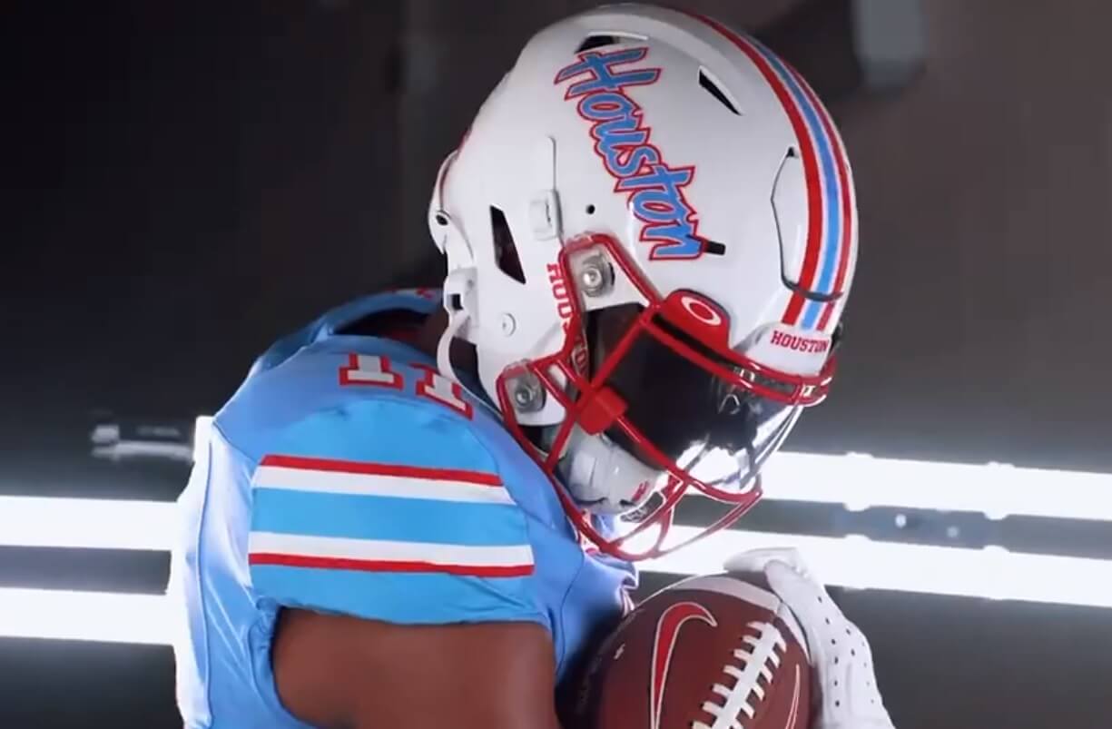
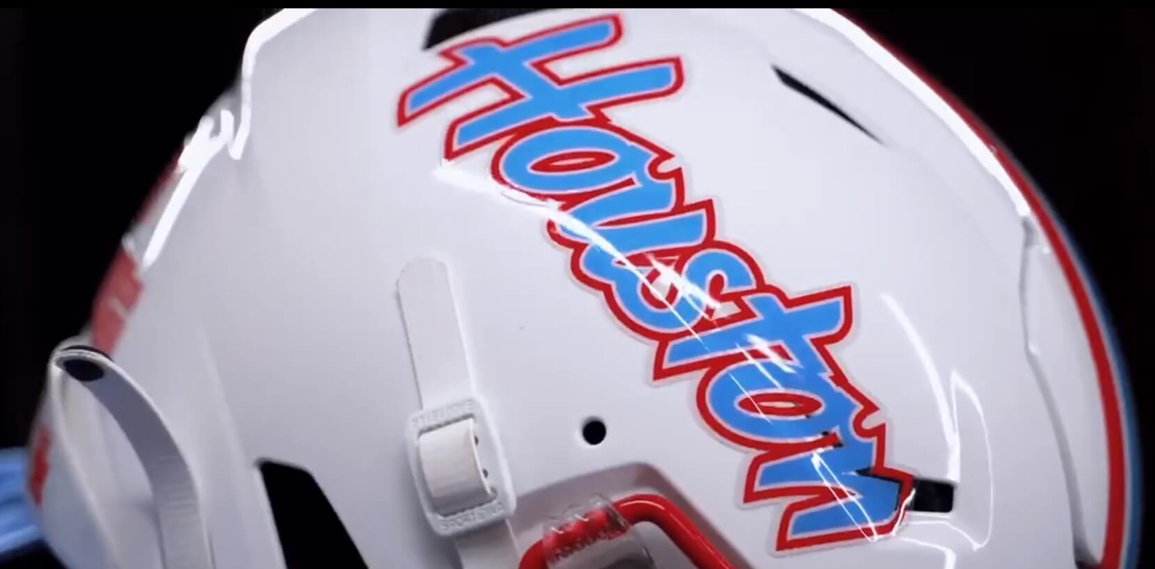
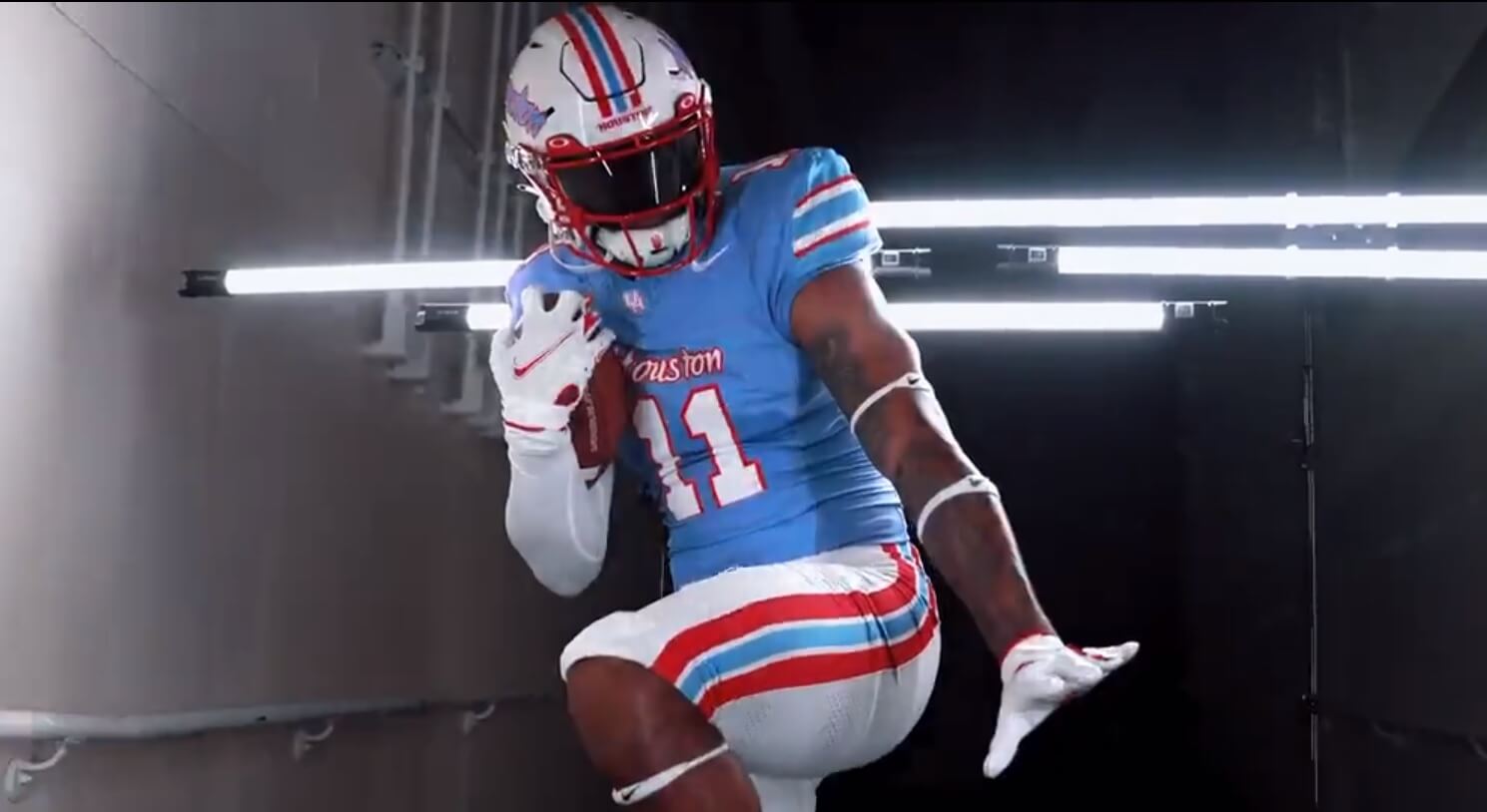
9 hours ago, coborjobs2010 said:
Here are some tidbits regarding the Texans updates:
"One was taken from player feedback and be very mean and tough looking. "
So it will be monochromatic and black.
And The "H-Town blue tribute" will probably be the Nike logo.
-
2
-
-
NVM beaten to it.
-
I like the Chelsea kit, but if the shorts are gonna be Navy they'll need the pattern too. Otherwise royal shorts is the way to go.
-
7 hours ago, MJWalker45 said:
One of them are actually the Oilers though.
These are Fantastic.
-
2
-
-
1 hour ago, tBBP said:
...Someone tell me how the Chargers were/are able to get away away with two alternate non-throwback uniforms again?
One (or both?) is considered Color Rush, which is still a thing when teams need/want it to be.
Believe the rule is the 2 alternates have to be some combo of color swap/throwback/color rush. Though given the Rams bone and Commies' black military cosplay I'm not sure that color swap rule still exists.
-
On 8/28/2023 at 9:16 AM, NickSixers said:
Sixers jersey with updated drop shadow is up on Fanatics this morning
It looked fine on the red jerseys last year, but does look a little too thick there.
-
8 hours ago, BBTV said:
The only three things I don't like about the Seahawks uniforms - and I trend towards traditionalist, but not "traditionalist for traditionalist's sake", is how Nike worked the swoosh into a carefully-crafted bright background, the unnecessary and gimmicky helmet thing, and how there's no green on the gray pants. Other than that, as far as I'm concerned, they're in their forever uniforms.
While I've liked the idea of the Seahawks being the NFL's Oregon, now that they've been in those for what - 11 seasons? - they should just stick with it. The overrated-throwback uniform twice a year should be enough to appease fans of the older look.
The chest stripe, and the wordmark on it for no reason still bothers me. It's better than the Browns chest stripe on their nike uniforms but I still hate it. That be nice jerseys is it was just the sleeve desgin and not the chest extension.
-
20 hours ago, Toronto206 said:
Should the Seahawks make the blue jersey gray pants their regular home uniform?
YES!
-
5
-
 1
1
-
-
20 minutes ago, MNtwins3 said:
Cardinals wearing their white uniform for the first time today vs the Vikings. I really like this look, would look great with some red socks. Significant improvement over the previous set
The white uniform is really nice, but like you said needs red socks. The problem is the red uniform, giant ARIZONA, no pants stripes, mono as the main look.
-
5
-
-
22 hours ago, Pigskin12 said:
And against the Lions, who have very similar colors. They seem to view it as primarily a *home-team-is-wearing-white* uniform these days, regardless of whether the heat is a factor or not. I miss when they'd wear them at home in the regular season either in primetime or in late October:
I miss when they used to wear silver pants with them. Seems to always be white or black more often than not recently.
-
3
-


:no_upscale()/cdn.vox-cdn.com/uploads/chorus_asset/file/9838921/3124388.jpg.jpg)


/cdn.vox-cdn.com/uploads/chorus_image/image/71997741/1247314623.0.jpg)


/cdn.vox-cdn.com/uploads/chorus_image/image/46653732/usa-today-8100223.0.jpg)
/cdn.vox-cdn.com/photo_images/4604005/130976936.jpg)
/cdn.vox-cdn.com/uploads/chorus_image/image/58139371/usa_today_10393536.0.jpg)
Seattle Sounders FC announce plan to "explore the club's identity"
in Sports Logo News
Posted
I really like that hoody.