


VikWings
-
Posts
1,693 -
Joined
-
Last visited
Posts posted by VikWings
-
-
On 6/25/2023 at 4:13 PM, VampyrRabbit said:
The Pelicans have revised their logo for next season.

Downgrade if you ask me. I hate the wordmark just floating like that. The Nets do the the same thing. Also feels very corporate-y.
Plus i like the little swirly design + fleur de lis at the top.
-
 7
7
-
-
I really like the helmet itself, but the throwback logo seems forced.
Also it's going to look absolutely terrible with the dark gray uniforms unless they wear blue pants (they won't) or at least blue socks (they won't)
-
2
-
-
1 hour ago, MNtwins3 said:
My unpopular opinion for alternate helmets is I think having them be only worn with alternate jerseys is stupid. Just enforce the "3 games for alternates" rule, but wearing the alternate helmet or jersey counts. Mix and match how you please, but you get 3 games total and that's it, so choose wisely
I think that's basically the case. At least it was for the Panthers because wearing the black helmet with the black jerseys took away one of their blue jersey games.
-
10 hours ago, JohnnyCowboy5 said:
I feel like it needs the black trim/piping to separate the orange and white, but that's not a deal breaker and my other nitpick is that the sleeve numbers give a knockoff feel without the outlines, but otherwise these are pretty good, the darker orange is an improvement.
And we all know the ad is bad.
Huge missed opportunity though by keeping the current black alternate, instead of color swapping the orange, but that might only be temporary. Those black jerseys from the Lindros era were beloved.
-
6 hours ago, TenaciousG said:
We can officially add the “tiny Denver” to the list of all time meh series-clinching uniforms. Of course nothing will ever top the horror of the Cavs long-sleeves
Teams clinching in city jerseys has to stop. But yes nothing will top the Cavs' sleeves.
Like if the Heat clinched in the red alts? I'm fine wit that, but these one year jerseys shouldn't be allowed. At least Denver's is still in their team colors, thank god.
-
3
-
-
5 hours ago, Old School Fool said:
Here are the Cardinals best combos from the Gridiron Uniform Database.
And they'll either rarely or never wear these. Socks and pants will always inexplicably match.
We'll never see that black jersey without black pants. I think it would look good with red pants as well as white.
-
5
-
-
5 hours ago, GriffinM6 said:
Looking at the whole lineup of caps, some of these could work within the current team identities.
- Twins could wear this with a powder blue uniform (which I assume their CC will be)
- Cardinals could wear that with their powder blue alternates
- Rays were already mentioned
- Rangers one looks better than the crappy cap they currently wear with the powder blues
- If the Jays wanted to make the secondary color of the powder alternates royal blue, this hat could work
I really like the Rockies one. I think purple and powder is an underrated color scheme.
The Marlins looks like their regular hat with a patch on the side aha.
-
2
-
-
6 hours ago, BC985 said:
The Father’s Day caps are out. I wouldn’t be mad to see the Rays switch to this:
I could do without the patch on the side, but these could have been a lot worse. Especially for a team like TB above where it just fits.
The Cardinals one for example would look great as a fashion cap worn with powder merch they sell. I'd argue they should wear the powder alts on father's day to go with it.
-
6 hours ago, shstpt1 said:
When you put them all together, it feels a little lazy and frustrating that 4 of the 5 this year have the same color pants:
Especially when you compare it to last 2 years:
And Seattle's didn't need black pants at all (I mean none of them do, but Seattle's really stand out in a bad way.)
-
8
-
-
Oh look another terrible City jersey. Who woulda thunk it?
Illegible numbers like the Marlins' alts, stupid black pants and the C logo is awful.
-
2
-
-
Those OK State unis are fantastic other than the pants not having a stripe.
I've still yet to seem a team whose not FSU or Penn St look good in stripe-less pants. And I think even they might be improved with them.
-
Black pants ruin an otherwise nice jersey. Royal actually would have been better. I'm sure they'll eventually switch to white like the Dodgers and Rockies.
-
I saw that and immediately thought Arkansas State.
-
2
-
-
2 hours ago, VDizzle12 said:
Glad to see mine is still in the top 10. But man there's some interesting options to say the least.
Yours is by far the best one. I guess bpodger and DannyDevito are ok too.
The one with the dawg pound bone is cool but doesn't look like a Browns logo.
-
3
-
 1
1
-
-
Remember shortly after the unveiling after the backlash and everyone was calling them the Maple Wings they then decided to add that thin, barely noticeable black double outline to the numbers and put the bolts (also with a thin black outline) back on the pants? And were like well there's your black! Then added a couple atrocious black alts over the years.
I've said it before but even just switching to black pants and helmets would go a long way for the 'Ning.
-
8
-
-
I don't think the red pants would look bad with the black jersey given the red number. It actually makes more sense than the white since there's no white in that uniform.
-
1
-
-
They aren't terrible, but wearing mono all the time makes them terrible. Hopefully they eventually mix and match. And please wear red socks on the road.
Other issues I have aside from the mono.
Red Jersey:
- ARIZONA wordmark. What is with Nike giving all these teams these giant wordmarks now a days? Previous Browns, Jets, Falcons etc.
-no stripes on pants.
White jersey:
-wordmark on the sleeve stripe. Did we not learn from the Lions?
Black jersey:
-numbers should be white or reversed, silver outlined in red. They look almost exactly like the Ohio St. black alts.
-
4
-
-
FSU looks fantastic again.
Maryland with a nice upgrade too.
-
5 hours ago, tBBP said:
Speaking of which, would y'all believe we're now going on year six of these??
Just sayin'...
They're only number outlines and a (real) pants stripe away from a good look.
-
7
-
-
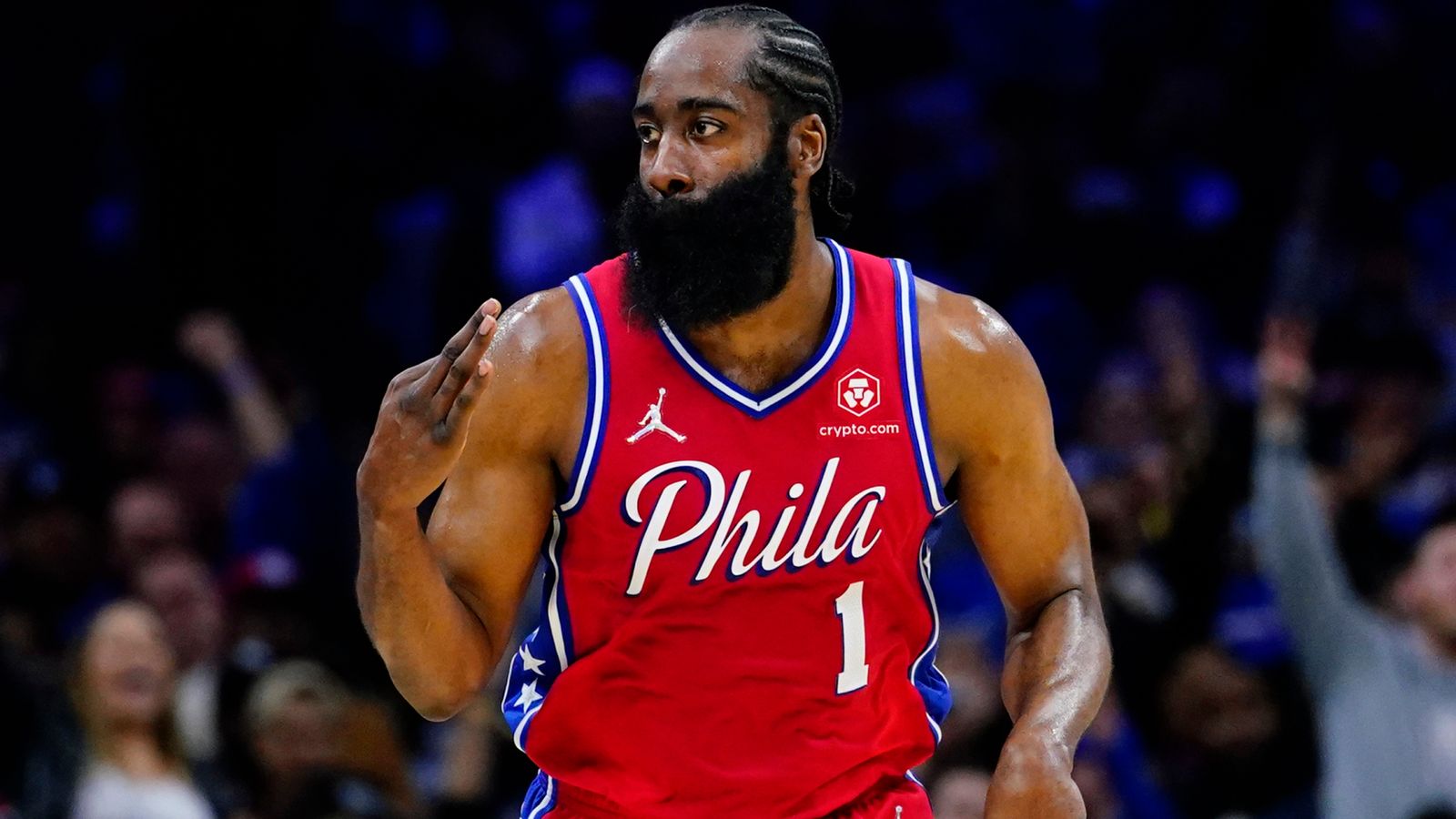
2 hours ago, GermanSixer said:
I think I read a suggestion here last summer that the Sixers might be getting new uniforms in 2023, could very well be the case...
If this is true I think it's just to change the shadowing to match the change they made to the red alts this year.
2019-22
This year-
-
6
-
-
22 hours ago, Dynasty said:
That's because of the Hardwood Classics. It has to do with the NBA selling throwback merch or something in that regard... I don't know all the details.
I know and it's stupid.
-
17 hours ago, throwuascenario said:
I think that both the Blues and the Sharks are wearing worse uniforms now than they were at one point before. If they switched tomorrow to their respective old uniforms, they would be switching to a superior uniform (in my opinion). There's nothing lazy about upgrading your uniform. It simply doesn't matter whether or not you've worn them in the past. They're just better uniforms. There shouldn't be some uniform police saying they can never go back to a better uniform (in my opinion).
That uniform police exists in the NBA where they don't allow teams to go back to exact old uniform or logo designs for some reason.
-
5 hours ago, WSU151 said:
Is this the basis of your questions?
Did he say Cardinals but mean Virginia Tech?
I doubt that's real, but those are horrible. Why are the numbers so small?
-
I think the Braves may be my favorite city connect so far. It's either them or the Marlins.
-
1
-


2023-24 NHL Jersey Changes
in Sports Logo News
Posted
I don't hate it, but can't say I like it either. The one from a few years ago was better, even if it was black.