


VikWings
-
Posts
1,693 -
Joined
-
Last visited
Posts posted by VikWings
-
-
9 hours ago, LogoFan said:
At last! The Showboats Instagram page just put these up. "Uniform unveiling soon."

Get major Toledo vibes from this especially from a distance.
-
 1
1
-
-
Fanatics pretty much has a whole collection of stuff that fit this thread:
-
2
-
-
I'd prefer a blue outline on the Twins script, but the unis aren't terrible overall. The biggest problems with them are the removal of Minnie and Paul and that atrocious road cap. Either bring back the Metrodome M, or just use the TC.
I'd have rather them done white panel at home and all navy TC on the road.
-
3
-
-
In other news it seems these new Nike rules have eliminated some Spring Training St Paddy's jerseys.
-
23 hours ago, Andrew_Gamer_NZP said:
Would be nice if instead of the tan crap they could wear the purple throwbacks. I'm kinda ok with limiting jerseys to 5th but the 5th being forced to be some stupid nike nonsense sickens me.
I love the teal, but if they weren't going to add it to the other uniforms they probably should have just kept the other home jersey to at least be cohesive.
-
2
-
-
17 hours ago, BBTV said:
If it's "4+1", and you're not getting your +1 till 2024, why can't you keep 5 in 2023? Not that I want anyone to have 5, just seems a little arbitrary.
Nike: "we only want to you to have 4 jerseys, well really 5 cause of our City connect program."
Team: "what if we don't want a city connect and want to keep or 5th jersey that actually fits our brand instead?"
Nike/MLB: "NO!
 "
"
-
4
-
-
6 hours ago, Ben in LA said:
Same thing happened last year. Rams fans wanted the white jersey but most places had the blue one.
I mean I'm no business or marketing major but you would think the first thing you'd want to put out in mass is the jerseys the teams are actually wearing and stock the most of them and then worry about the teams other jerseys or fashions ones. I mean you can even just iron the patch on existing stock.
-
3
-
-
3 hours ago, TBGKon said:
Look again, found these on the NFLshop site. They mightve sold out of the Mahomes red Super Bowl jersey and Eagles jerseys?
Yea but they're red. The Chiefs are wearing white. I'm not sure if they even made any in white. I know it was a problem last year with the Rams.
Even in the case that Eagles green jerseys are sold out, considering that Fanatics controls NFLShop, Lids and a few other places now you're options are limited for other sites to try. Hell there's not even many brick and morter stores you can even go to any more.
-
3
-
-
It's amazing how much sports merchandizing has gone to crap since the fanatics monopoly. Seems the only jerseys you can get with a Super Bowl patch anywhere are crappy gray fashion jerseys. Jerseys the teams are actually wearing are nowhere to be found.
Not sure if it's a Fanatics problem or a Nike problem, but its so stupid either way. And I'd be pissed if I was a fan of either of those teams looking for one.
-
6
-
 1
1
-
-
On 1/16/2023 at 9:32 AM, _RH_ said:
I guess the two-color scheme isn't terrible but IMO inferior to the green/orange. Interesting that after the revival of the popular Kachina logo theyd go with text - anything to make a buck, I suppose. IMO worst downgrade is the hem pattern- the original is just worlds better than this.
Stick the old howling coyote logo on there (or anything other than a wordmark) and it's not that bad. It's still mediocre but at least better.
EDIT: NVM. Just saw the side panels. Those are terrible.
-
8 hours ago, Carolingian Steamroller said:
Counterpoint:
This is the solution to the lack of shimmery pants fabric. It has precedent in Saints history, you can always go black over black, and its a good look for a handful of games or at least until they figure out the fabric situation.
They need to make the numbers white too then. I didn't look good when the Rams used to do it either when they had gold numbers.
-
1
-
-
K-State-Bama was effing beautiful.
-
7
-
-
20 hours ago, Brave-Bird 08 said:
So, I’m glad the Texans are exploring new uniforms. Their uniforms aren’t bad, never have been bad, but they’ve never stood out, either. The most important part of the identity is letting that helmet logo live and breathe on its own — they don’t need helmet stripes or anything else on a lid. It’s one of the best sports logos, and applies amazingly on a helmet.
With that said, I get worried with teams openly soliciting fan feedback on changes. Mainly because, unlike people on here, fans are going to ask for ridiculous things. I see people make nonsensical uniform takes all the time (ex: Falcons fans on their boards will be like “just bring back the 90s jerseys but do red helmets” and stuff like that).
Houston has a TON of potential in a redesign route. I wouldn’t want them to change their number font. Just simply bring some character to the design. But, I don’t have faith Nike will come through — they’ve failed on half their redesigns the last decade.
If it was up to fans every team would have an all black head to toe uniform even if black isn't or has never been part of the color scheme. (Seems like we're pretty much at that point anyway).
-
7
-
 2
2
-
-
22 hours ago, Germanshepherd said:
The term “Create-A-Team Generic” gets thrown around a lot more than it should, but I can’t think of a sports uniform that fits the description more than the Jags’ aways.
It’s a create a team default that the user makes no changes to and hits save team and exit.
11 hours ago, DCarp1231 said:Until the Jaguars change their set, they will always seem like what would happen if a video game didn’t have a single ounce of naming rights and just decided to merge the Raiders with Jacksonville
They remind me when you used to play against "Division 1-AA West" in dynasty mode in the old NCAA games.
-
4
-
-
On 12/21/2022 at 5:24 PM, tBBP said:
Well I guess after four years into these cosplay costumes, they may as well have redefined [whatever] their identity [is supposed to be]--but not in a good way, fa' sho. I can piecemeal everything that's wrong with their current look, but I've already done that once. The above photo does, however, illustrate the most glaring issue (and its one that's been around ever since the Adelphia Coliseum days): take a look at the wordmark painted on the field behind those guys. If one didn't know any better, one would think the light blue--which up until four years ago was their primary color--would be for some type of special promotion. See all the red accents? That's also about the amount of color distribution you'd have seen at Adelphia-turned-LP Field--there wasn't a trace of light blue anywhere on or in they stadium apart from the team store. I was just in there a few weeks ago and sure enough, they've removed just about all of it from inside there, too...it's mostly white and navy now. I'm not surprised; right before I moved from down there they started adding more and more navy and red signage all around the grounds and even changed the team name wordmark above the door to the pro shop from light blue to red. That's when I knew something [more) was up.
Isn't the story that Bud Adams' daughter isn't a fan of the columbia blue? That's why they went back to navy primaries towards the end of the original set and the light blue in the current unis is an afterthought? I mean the pit stains seemed like they were added at the last minute just get some more of it in there.
-
1
-
-
17 hours ago, MNtwins3 said:
The grey pants need some form of neon green to fit more with the navy jersey. It really feels unbalanced
I can agree with that. Just fill in the little 'feather' design in the stripe with green.
-
6
-
-
On 12/9/2022 at 10:35 PM, GoHawks said:
Looks like Seahawks in navy/grey on Sunday. Wouldn't be surprised to also see this combo on Thursday night if it's not a green jersey game.
Seattle's uniforms improve exponentially when they were gray pants. The chest stripes, which I hate, even bother me less.
-
5
-
-
Cincinnati should really be wearing the orange jerseys twice (once with black pants and once with white) and the only "white tiger" once for a Thursday night game. Instead they used the white for 2 of their 3 alternate games this year.
-
2
-
-
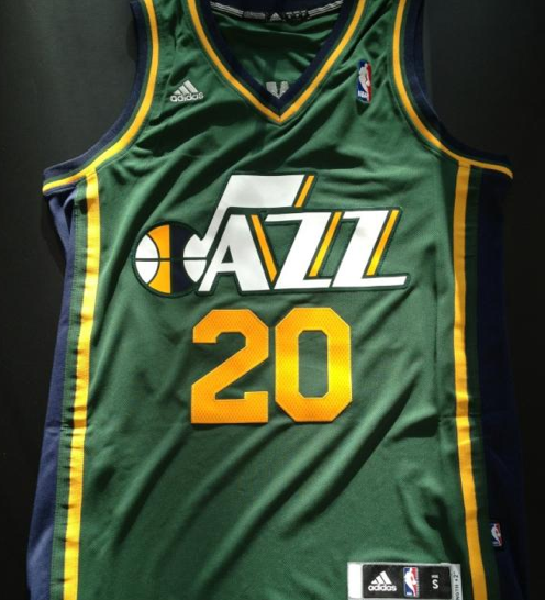
7 hours ago, Digby said:
I thought the ideal Jazz set was the one they just departed from (preferably though the Adidas-late-era green for the alternate). Purplish-indigo, darker and richer shades of golden yellow and green felt like a classy and modern take on what the Jazz have been before. This was one of the smartest modernizations in the league IMHO, showed how you don't need to nuke your brand every six years but also don't have to be a Celtics-level traditionalist, either, which is probably the space most teams should aim to occupy.
The ones before that were perfectly fine before they cut big chunks out of the side panels diagonally. The "incomplete" stripes bother the hell out of me. It's like the Titans floating boxes/pit stains.
-
11
-
1
-
 2
2
-
-
3 hours ago, GDAWG said:
Too much monochrome.
The Renegades would look fantastic with Black pants.
Houston's helmet is atrocious.
I like SA's yellow jersey. (Although the tried way too hard with that helmet)
Best overall set is probably Seattle.
Worst is Orlando. Remind of some awful franken-version of the Michigan St and USF alternates.
-
2
-
-
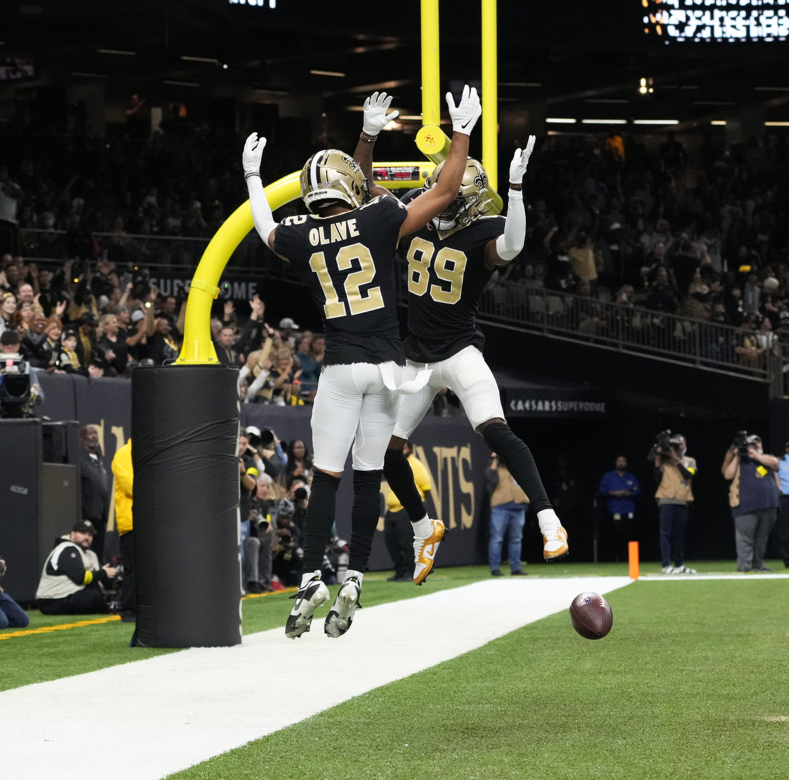
There were a couple guys on the Saints last night wearing black socks/tights and it improved the look so much, even with the stupid Louis V helmets.
-
5
-
-
12 hours ago, Froob said:
It’s red vs orange really that bad? I really enjoyed it.
It's not great. At least Cincy wore black pants. Enjoy both uniforms on their own, but it's just a little too bright for me.
Forgot about that Bengals-Browns matchup someone posted on the last page. Yeesh. I'll take orange against the Chiefs over ever seeing that again.
-
Why do the Bengals always seem to wear orange against the Chiefs? It's like they go out of their way to have :censored:ty contrast.
-
5
-
-
TCU really needs to move that pattern to the collar. It would improve the uniforms so much.
-
3
-


2023-24 NHL Jersey Changes
in Sports Logo News
Posted
This was horrible news to wake up to this morning. Chinese knockoffs will be better quality than the authentics.
Hopefully it's not a monopoly and companies like '47 Brand can still make merchandise.