


VikWings
-
Posts
1,693 -
Joined
-
Last visited
Posts posted by VikWings
-
-
2 hours ago, Pigskin12 said:
Absolutely! This was stunning:

Color wise, sure, but nothing about that Titans design is stunning lol.
-
 4
4
-
-
9 hours ago, gosioux76 said:
I think what you're seeing here is more about a broad disdain for alternates in general than a severe dislike for this one, particular example. Because if this example seems distasteful, then surely they all will. And I don't disagree with that sentiment, outside of the occasional throwback.
I love tertiary color swap alternates (Carolina and Houston for example) and of course throwbacks. It fits with the brand and is consistent. But it has gotten out of hand in recent years in all sports though. With completely different designs and the like. I'm glad throwbacks are back and I was begging for the one helmet rule to be lifted because of that, but things like Washington, the Saints and Bears, for example having me coming close to oldschoolvikings side of the line. I like the Panthers and Cardinals(and I think white helmets look better with the black alt), but at the same time don't think they need to exist. The NFL just couldn't help themselves and just go back the the pre-2013 helmet rule.
-
5
-
-
19 hours ago, CDCLT said:
Yeah, but they designated the all-black set as their "Color Rush". No clue why Cincy couldn't/didn't do the same for the whites.
Yep which sacrifices a blue jersey game which I don't think is being worn at all this season now, since they wore it twice in the pre-season.
-
19 hours ago, ltjets21 said:
They are Navy blue and dont go with the blue on the Color Rush unis.
But the color rush jerseys are just a throwback they once wore that helmet with that they decided to wear white socks with nowadays.
-
There was no reason for the Giants not to wear the throwback helmets last night.
-
1
-
-
Yea someone in that BC-FSU game should have worn gold pants. Preferably FSU.
-
9 hours ago, Survival79 said:
Looks like it is just bad lighting.
Love these.
9 hours ago, Kg54mvp said:Don't mind these, but are they dark gray or black? Either way not really part of the color scheme.
7 hours ago, SSmith48 said:Glad they ditched the pinstripe panels and switched back to full pinstripes. Although I think the star pattern in the side panels looks a bit cheesy.
What is the reason for the recent trend in the NBA for both the mismatched wordmark/number coloring AND color-on-color numbers? Fixing those two issues would make these uniforms so much better.
In other news, the Hornets unveiled a much improved statement look. No more CHA, and some cool new hexagon accents.
These are as good as the Magic's.
-
Sharks:
Love them but I think I would have went with black pants. Just a little bit too much teal for me. Love the fin logos return.
Canes alt/throwback:
This should be their full time look.
-
6 minutes ago, eRay said:
I'll make a statement. These are terrible.
And BFBS on top of it.
As a one year city jersey they'd be fine, but as a third their awful. Just give us a red jersey already!
-
6
-
 2
2
-
-
On 8/31/2022 at 5:04 PM, MrAstrodome said:
it's a coin flip at this point. Though for the twentieth season, it would be nice if they throw it back....
Still don't understand why they stopped wearing red socks with the blue pants.
-
8
-
-
I will definitely be buying a robo-penguin hat.
-
1
-
-
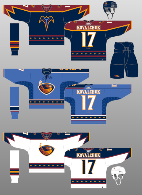
23 hours ago, Ark said:
I love these uniforms
The whole pre-edge set was amazing. I remember having a white one as a kid soon after they joined the league.
-
4
-
-
Well they should always wear silver pants with the blue jersey anyway. They should probably wear them with the throwback/color rush too.
The only white pants they should have are the ones for the Thanksgiving throwbacks.
-
7
-
-
On 8/13/2022 at 3:22 PM, Cujo said:
Commanders white unis looking like straight ass
The numbers look like when you wore/washed an old Reebok replica jersey too many times.
And that's no to mention the forced black and mismatching helmet.
-
10
-
-
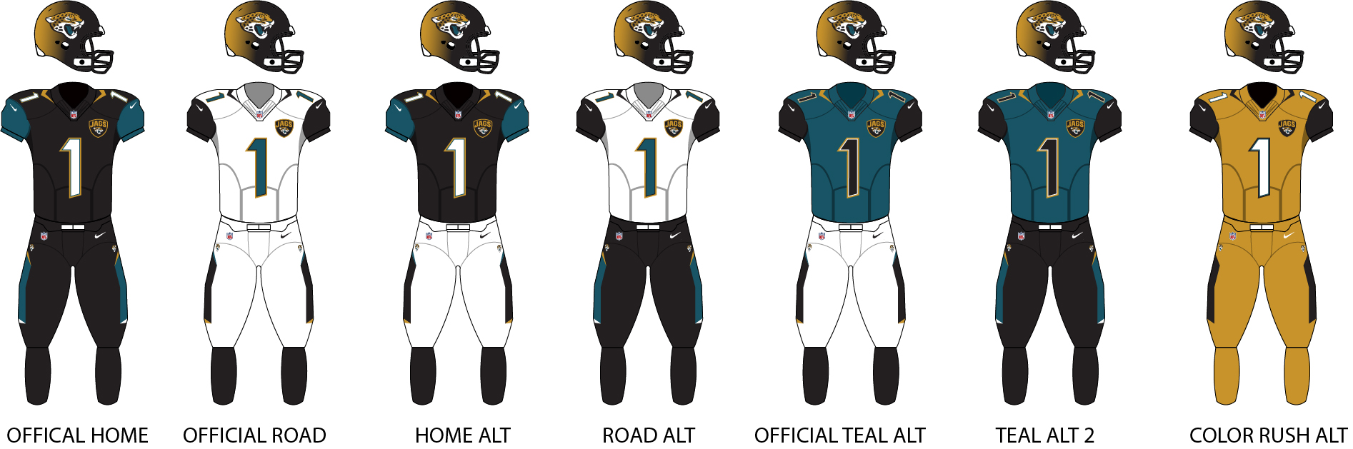
20 hours ago, DCarp1231 said:
From the shoulders down, this is the best the Jaguars have looked
I still prefer the 95-08 set (I know there were various tweaks along the way), but give me a full stripe on the pants and remove the unnecessary sublimation on the shoulders and these were pretty good sans helmet (and the Goldust uniform).
Even what they're wearing now is probably number outlines and a pants stripe from being very good. It's just between that helmet being such a disaster and Tom Coughlin having input made them go way too conservative.
-
5
-
-
The current road jerseys are definitely better than those awful CUBS alternates they wore a few years ago
.
-
2
-
-
5 hours ago, smarisca03 said:
The only teams that can get away with that many games in white are the cowboys and florida teams
And the now former (Commanders)
-
32 minutes ago, Magic Dynasty said:
Take off the manufacturer and sponsor logos and I would genuinely believe you if you said that these were for "Golden State College" in NAIA or something.
Might as well say 'Golden Bears'
-
1
-
-
On 8/1/2022 at 5:12 PM, Krona said:
Lakers dropped their 75th Anniversary logo on twitter this morning
At first glance you might think this is for the Sparks.
-
1
-
 1
1
-
-
That Cardinals helmet is fine if they must keep the color rush around. But the white looks so much better with the black jerseys.
There is absoluteley no need for the Cowboys to decal sway and wear the white helmet with the color rush throwbacks. The silver is fine. how about you just wear the silver pants with them instead??
That leaves me to the Bears:
In a vacuum, for a team like Syracuse? It's fine. But for the Chicago freaking Bears??? That's almost makes me want to join @oldschoolvikings on the 'return of beautiful throwbacks aint worth some of the abominations that will come with it' bandwagon. (FWIW I like the Panthers and Texans and the Bengals works with the return of the color rush unis)
-
1
-
-
23 hours ago, cajunaggie08 said:
Vrbo has replaced Playstation as the title sponsor for the Fiesta Bowl
#BringBackTostitos
-
3
-
-
1 hour ago, Echo said:
-
2
-
 1
1
-
5
-
-
23 hours ago, BJ Sands said:
Ughhhhhh
Manfred sucks, but he's also probably pandering to Nike here who are paying MLB a lot to have their logo on/designing the all-star uniforms.
-
2
-
-
EDIT: Just saw the mod post I'll take it to PM.


College Football 2022
in Sports Logo News
Posted
Bonus points for the Big Tymers.