


VikWings
-
Posts
1,693 -
Joined
-
Last visited
Posts posted by VikWings
-
-
9 hours ago, Cujo said:
Really? I'd say that and Lakers are both the right uniform for Shaq. I'll even throw in the Heat too. But these are sooooo much more wrong for him than the Magic:

-
 13
13
-
-
15 hours ago, Rj0498 said:
It is one of those occasions where the uniform is an upgrade but, the logo is a downgrade
Stars too.
-
12 hours ago, ColeJ said:
I want to say the new Florida Panthers sweaters are top-5 in the league...
but I hesitate to say it, because I'm scared someone will ask me to actually rank them in some tangible form.... and i'm not prepared to do that....
the moral of the story is that the new panthers jerseys are seriously great. i love them. i need a Jagr.
I like the actual uniform design but I don't like the logo. It's better served as a shoulder patch. Should have just cleaned up the original logo like on the helmets (or better yet left it alone). I also hate dropping the amazing stick/palm tree logo.
-
2
-
-
4 minutes ago, Chawls said:
The Dolphins current logo and uniforms are a superb update to their previous set. Considering how tame it is for a modern look, they don't deserve all the hate that they receive here.
The hate is more for the Dolphins Resort & Spa/Cruise Line/Travel Agency/Toothpaste logo and the minimal use of orange than it is the simplicity of the design.
-
2
-
-
17 hours ago, JerseyJosh said:
Devil Rays >>>>>>>>>>>> Rays
Agree. I still call them the Devil Rays.
I also still call the Marlins "Florida" and the Angels "Anaheim" too.
-
5
-
-
6 hours ago, worcat said:
This was posted by the St. Louis Blues on Facebook today in a GIF video format. Wish they posted more than just three concepts they considered.

The middle one isn't terrible. And I love that harmonica playing guy shoulder patch, but who the hell thought pink would be a good idea?
-
20 hours ago, FinsUp1214 said:
2) There hasn't been a single Carolina Panthers concept that I've ever seen that has actually been an improvement. I'm especially not fond of the idea that constantly gets floated around of them in a black helmet. They're one of the best looking teams in football as is, and you're better off tweaking things around with them than doing something drastic.
I know the Panthers love the all white look, but to me it just doesn't work with the silver helmet. They need start wearing silver pants on the road, at least occassionally.
Also they need to bring back the mono-black with blue socks at least once per year.
Other than that. I wouldn't touch their uniforms. Their blue alts are one of my favorite jerseys in the league. I even like their color rush and think they would look great with black socks.
-
2
-
-
16 hours ago, fl00dsm0k3 said:
Since we are talking about the Bufaslug I love the logo, and the jersey is my favorite hockey jersey ever,
I love the white jerseys from the Buffalsug era.
-
Just posted this in the color rush thread. Not exactly sure how unpopular it is but I think opinions are split enough that I think it belongs here too.
The Giants color rush really need to become their primary road ASAP. There's actually blue in the jersey. White pants instead of out of place gray ones. They're just gorgeous. Of course the only change I'd make is putting the current logo on the helmet. But I do love the GIANTS script.
-
3
-
-
19 hours ago, -Akronite- said:
Maybe use an example that matches because those two helmets look nothing alike. The giant logo is my favorite part. It makes up for the lack of stripe, where most stripeless helmets bore me.
I also agree that the Bucs jerseys are not that bad. In fact, I'd say they are good with a couple changes away from great. AND a solid upgrade from the previous set. The old jersey was boring and I find the old pewter ugly. The worst part of the old set, the alternate logo on the sleeves, remains unfortunately.
I wasn't talking about the helmet on Washington St. I was comparing the color of their gray jersey to Nike's new version of pewter.
The Bucs look more anthracite than they do pewter.
-
1
-
-
Also the obnoxiously large helmet logo and the fact that the pewter is no longer pewter and basically dark gray. (I do like the switch from black to red socks though.)
The Pewter used to look good and a color they owned.

Now they just look like Washington States alternates:

-
1
-
-
^ Coaches in the dugout were still wearing black jackets as The Show 16 for some reason.
-
I'm fine with the occassional monochrome as long as contrasting socks are worn but that's rarely the case anymore.
Good

Crap
The Chiefs manage to do it both right and wrong:
Decent, can live with it for a game or 2 a season
Crap
The Bengals did it right in the early years of the current set...

...but now look like crap

-
4
-
-
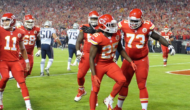
On 9/17/2016 at 10:37 AM, robbman21 said:
I looked and didn't see this matchup posted, but a Google Image search for Matt Asiata revealed this Vikes VS Jaguars game from 2012, and after a little more thought, I realized that going back to 2004, the Vikings and Jaguars have each had different uniforms for all 3 matchups. This uniform anomaly will continue when they meet again this season as well as both teams have made a change since the last time they met in 2012.


1998. Those same Vikings unis on the bottom vs the previous Jaguars road jerseys with Teal numbers and white pants.
-
6
-
-
The black looked awful on the whites. But didn't mind it on the road or the black alt. But the Royals should've never been wearing black to begin with.
-
6 hours ago, Justin7218 said:

Those Sixers jerseys were so dumb.
-
1
-
-
I love the original Seahawks set.
I even liked the slate blue when they would actually wear white pants. (:censored:ing hate mono without contrasting socks)
The new one, while I don't hate as much as I used to, is definitely the worst of the three. #1 because mono, when it looks so much better with gray pants and #2 I hate those stupid chest stripes.
-
1
-
-
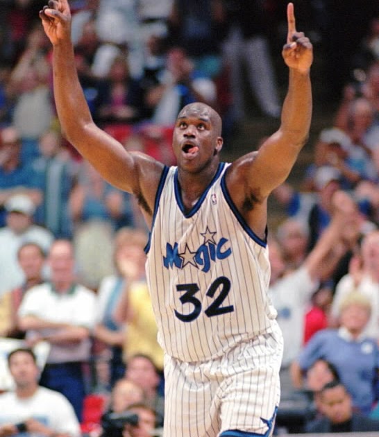
18 hours ago, Magic Dynasty said:
1. The ball-in-glove is extremely inferior to the Brewers' current look.
2. The Dbacks current set and colors are the best they've ever had, but I prefer sand over teal
3. A little biased, but the Magic have one of the best uniforms in the NBA.
4. Color Rush isn't that bad.
5. The Blue Jays' look is overrated.
6. Black-volt is actually a pretty good color scheme, if done correctly.
7. Aaaannnnddd... The Jaguars gold Color Rush was the best out of all of them, and they should adopt it as a full-time look (now, if they could fix the helmet, it would look even better)
I disagree with everything on here except #6.
-
I also like those Angels jerseys. But I also seem to like a lot of 90s stuff that's almost universally hated.
-
1
-
-
^ Same.
-
I prefer the old Bruins jerseys too. I just don't like the yellow yokes on the homes.
-
2
-
-
The teal jersey is the best one (wish it had white numbers though) and they've worn it once.
-
1
-
-
20 hours ago, chcarlson23 said:
Still better than this...

Neither are better than this though
-
5
-
-
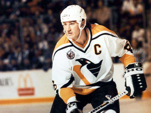
11 hours ago, mightyduck said:
This is still my favorite look the Penguins have ever had.
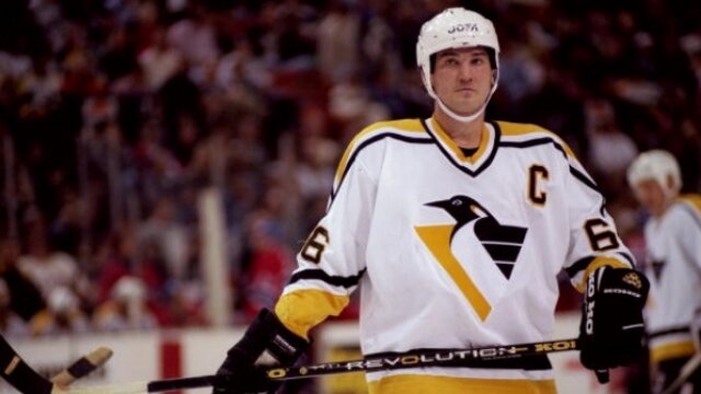
Agree with you.
That logo needs to return as a shoulder patch or 3rd jersey.
-
2
-


Unpopular Opinions
in Sports Logo General Discussion
Posted
Same. I thought it was such a cool quirk. I remember I loved playing at Enron in video games when that stadium first opened.
I honestly don't mind it other than the fact the numbers shouldn't be volt on the white jersey.