


VikWings
-
Posts
1,693 -
Joined
-
Last visited
Posts posted by VikWings
-
-
20 hours ago, ramsjetsthunder said:
Actually that cat was jumping into the shadows, much like its organization
That was the joke. aha.
-
17 hours ago, Old School Fool said:
Do this. Clear decal instead of black so the Panther blends with the helmet to create a panther in the shadows.

If they really want the Panther in the shadows effect they should paint the back half of that blue.
-
 12
12
-
-
On 10/18/2020 at 1:46 PM, SSmith48 said:
Unpopular opinion: their current look is the best they’ve ever looked. It’s a unique look that stands out.
It took like 5 years but they slowly but surely corrected every mistake from the initial unveiling (Helmet/facemask color, crossed spears, number colors on both jerseys) and they look pretty good now. I still prefer the previous set though. The collar and sleeve trim were more subtle and the Garnet was more leaned more towards red than burgundy/maroon.
-
9 hours ago, Gothamite said:
I mean, this is bad.
It would be pretty good, except for the bizarre tilt to the top of the letters. Looks stupid when the C is by itself, and worse when the CLT are together.
This looks like gelatin.
-
8
-
-
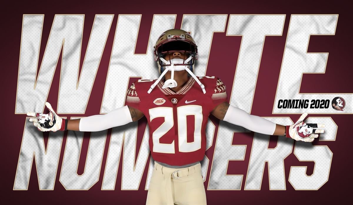
20 hours ago, aawagner011 said:
FSU finally showed off the updated jerseys with white numbers rather than gold. Much better, but highly disappointed that they did not use this opportunity to update to the much cleaner Vapor Untouchable template or clean up their overly designed look. They could definitely do with a streamlining.
This is such an improvement. I hated the Boston College-looking gold number.
It took 6 years but they've now slowly but surely corrected every mistake from the initial unveiling. Still prefer the pre-2014 look but this'll do.
-
I don't like the Bevels. I would like the hat on it's own as an alt logo but the shield and body ones don't work.
-
1
-
-
19 hours ago, alecgoff said:
It was announced a while back that Florida State is finally going back to white numbers on their home uniforms. Now they won't look like Boston College and hopefully they'll stop playing like them too...
t
It took 6 years but they finally fixed all the issues that should have happened from day 1 when these uniforms were designed (well besides shiny pants)
-gold numbers to garnet on white jerseys. check.
-Mustard looking helmet back to gold. check
-facemask too purple looking needs to be more garnet. check
-gold numbers to white on garnet jersey. check, finally.
-
Some of these aint bad. Ignoring the monochrome crap and wishfully thinking that some of these teams will wear their white pants here's how I'd rank them:
1. NY Guardians - This is what a football uniform should look like.
2. Dallas Renegades - these are sexy and I love that color scheme (I'm a sucker for baby blue). Replace black with navy and that's how the Titans should look.
3. STL Battlehawks - very nice and clean. Replace the colors with teal, black and gold and that's probably what the Jaguars should have done.
4. DC Defenders - solid if unspectacular.
5. LA Wildcats - basing this solely off the teaser since they haven't been released yet and it could move up or down a few spots. But I don't think they'll be better than DAL or NY or worse than TB or SEA.
6. Houston Defenders - look like if the Texans and Patriots had a baby.
7. Seattle Dragons - Cool helmet, but I don't think navy, green and orange work great together and not a huge fan of side panels.
8. TB Vipers - like the helmet, but not a fan of the double green. This is one team especially that should never wear monochrome.
-
On 6/30/2019 at 9:39 PM, simtek34 said:
Nike wanted their logo on the front, but the NFL wouldn’t let them because it would compete with the Collar Logo, brand integrity, etc...
Instead it competes with the integrity of good design (ruining some sleeve stripes)
-
2
-
-
On 2/20/2019 at 6:30 PM, ZipperClub said:

I understand they wanted/needed to make a generic jersey, but this is basically a Raiders jersey and the average person is going to think it's one. At least make the name and numbers white.
-
2
-
-
That would be a great look with Navy pants. Mono-uniforms usually suck in general, but mono bright green is just too much.
-
2
-
-
2 hours ago, BellaSpurs said:
Seahawks uniforms are really good outside of the Seahawks on the stripe, some of the top in the league. Bucs and Browns though? Should be burned
Remove the Seahawks stripe and stop going mono all the time (throw the navy pants out if you have too) and it's actually a pretty nice uniform.
-
2
-
-
22 hours ago, MCM0313 said:
Everyone's go-to look is mono-something-or-other anymore. I'll gladly be the grumpy old man and say that trend looks stupid and I hate it.
...that said, I don't think it looks terrible on the Seahawks for some reason. It just kind of seems to fit their style somehow. I'm also cool with Carolina going all-black. Beyond those, though, the jersey and pants shouldn't match unless they're both white.
I like Carolina's all black look, but it's because they have the electric blue socks to balance it all out. The Seahawks are in head to toe navy.
-
2
-
-
The thing that ruins the Seahawks unis for me is the chest stripes. I hate that element on the Browns too. That and the fact that their go to look is mono-navy.
-
21 hours ago, DouglasQuaid said:
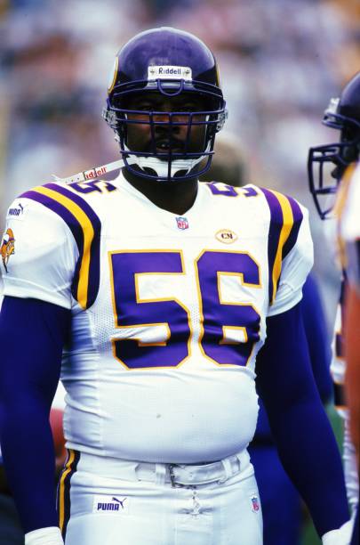
Which version? I like when they had the darker helmets before 2002.
I agree with the post above me, the lighter helmet. I just love the UCLA stripes with the logo on the sleeves and yellow outline on the numbers. Although I think I prefer the Tarkenton-era home jerseys to the Moss-era.
-
7 hours ago, Wildphil33 said:
Chris Doleman
Still my favorite Vikings uniform they’ve ever worn.
-
2
-
-
23 hours ago, Chewbacca said:
I really respect the Dodgers for keeping it simple and classy but I just cannot understand why they don't wear this jersey during the regular season. It's beautiful, and I think that if they only wore it a few times year at the most, it would be the perfect alternate.
I’d rather them wear this than the gray “Dodgers” jersey if they have to have an alternate.
-
1
-
-
If the gold and white on the jerseys were swapped it would be passable at least but as it’s its completely awful. Even worse when it’s mono blue.
-
1
-
-
On 10/16/2017 at 8:39 PM, daveindc said:
I think the Panthers might look better with dark gray instead of silver.


This look from the Cardinals ain't half bad the more I see it:


I love this Cardinals look even if it is BFBS. That crappy rebook template is passable here.
-
3
-
-
Was scared I was going to open this thread and see someone saying they thought the Rams looked good yesterday aha.
-
2
-
-
That was a really nice look. I love the jumping tiger on the sleeve too. Used to have a Peter Warrick (lol) jersey like that as a kid. The jumping tiger and bengal head are so much better than that stupid B.
-
3
-
-
Yea. I don't mind it either. I like the B-B-W look. Not as big of a fan of the all white look, and I'm someone who usually likes all white looks. And the orange just seems out of place for some reason and was best kept as an alternate. The mono-blue is just atrocious though.
I think it would be best for the Broncos to go to the color rush set with white pants and keep this B-B-W as the alt/throwback as an ode to their 3 Super Bowls (yes I know 2 of them were won in the white jersey)
-
2 hours ago, BJ Sands said:
Why couldn't they just change the decals and facemasks? Yeah, the satin/matte finish wouldn't be accurate but not a huge deal.
I mean I guess nothing is stopping them from just doing that, but they haven't yet.
-
15 hours ago, Rj0498 said:

I want the Vikings to drop the matte helmets so they could wear these as alternates again.
Or better the yet the NFL drops that asinine one helmet rule so they can.


NFL Changes 2021
in Sports Logo News
Posted
The Jaguars are so close to good unis (outlines and a pant stripe. Oh and bring back the flaked helmet) but what pisses me off about these is that they took the time to outline the numbers anyway, just in the same color as the jersey, why not make those outlines black or gold here? And teal on the black and white jerseys)