


VikWings
-
Posts
1,693 -
Joined
-
Last visited
Posts posted by VikWings
-
-
Brazil's away kit is fantastic.
-
The tie-dye kits didn't look terrible in action yesterday. The white ones still suck.
-
 2
2
-
-
The home jersey is meh, feel like the wordmark needs an outline though.
Road jersey - love the return of the road pinstripes but the wordmark is boring and the cap logo is terrible. Especially when they have the old M they could have used, even tweaked some.
Meh on the navy and I do like the cream alt.
Sad about Minne and Paul and the baby blues going away.
-
1
-
-
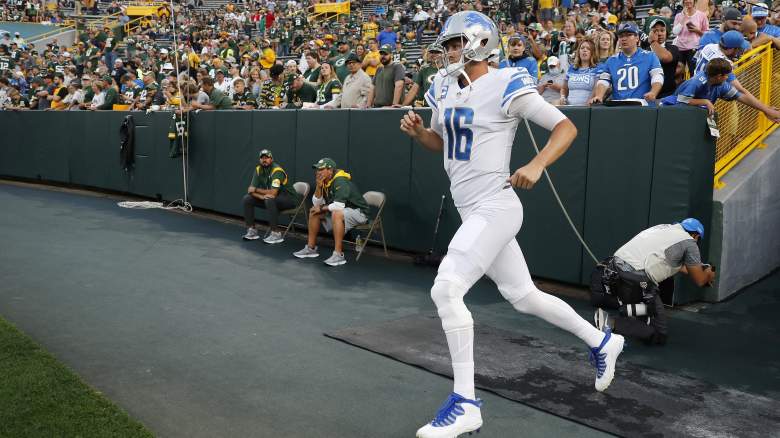
On Thanksgiving my mom said the Lions "look like they're wearing pajamas." It's flat out baffling how they didn't wear the throwbacks. Air balled a layup.
-
7
-
-
It's possible they could be introducing 3 NEW uniforms and just keeping the current powder blues as is (with update cap logo).
-
 1
1
-
-
4 hours ago, Pigskin12 said:
How bout just wear the regular black over gold look that everyone wants? I guess this is why Color Rush is only being worn twice this season. We now have multiple teams in Week 11 unexpectedly bringing back looks that haven't been worn in years.
Wish they would have used a matching helmet instead of introducing that stupid Louis Vuitton black one.
-
9
-
 1
1
-
-
^ Along those same lines, for some reason I love black and white with just a smidge of a 3rd brighter color. It's why I think the black alternate is the Cardinals best jersey. (among an admittedly bad set)
-
2
-
-
21 hours ago, DCarp1231 said:
Holy crap those tiny ass tv numbers are killing me

I miss when they used to wear blue socks with this uniform and it actually looked good.
Also I don't think the helmet looks as good with the full uniform as it does/did on its own and up close.
-
7
-
-
Wish we could see a matchup between the Hornets CLT uniforms and the Bucks old Cream City ones.
-
1
-
-
Kinda agree with the uniforms but I love the blue field.
-
4
-
 1
1
-
-
One on the right looks too much like Chelsea.
-
2
-
-
On 11/4/2022 at 7:28 PM, Sec19Row53 said:
That right there is some revisionist history.
Could have sworn I read an article about that before. Might have been Lukas or someone who did a story on it.
-
20 hours ago, DTConcepts said:
These would’ve looked so much better in black.
The gray yoke just doesn't work against white. Goes from kitschy and "so bad it's good" to just bad.
-
I LOVE powder blue. It's my favorite color. From as light as North Carolina to as dark as the Panthers, but powder blue wasn't anybody's team color back then. Some time in the 70s gray fabrics started having this blue tint to them (don't think it was on purpose originally) and by the 80s it was full on powder and most teams road jersey color, so basically acted as a gray jersey.
But at the end of the day IDC and am still a sucker for it and buy the merchandise.
That said there is a bit of an over saturation of it. Like I don't think the Rangers need/belong in powder blue uniforms. And I don't need the Braves or Cubs bringing them back unless it's a one time deal.
Wasn't alive back then, so maybe it's just because these teams were successful in the 80s so I'm used to seeing highlights, but when I think "throwback" and "powder blue" I immediately think of the Royals, Cardinals and Phillies. I love it on the Blue Jays too. And am sort of "ahh I'll allow it" with the Twins and to a lesser extent, Brewers. But that's pretty much it. (I'd add the Expos to this list if they still existed.)
*(Not counting the Rays as they came after the fact and made it an actual team color).
-
3
-
-
I would have had Bucs-Ravens #1 as I love the Ravens purple pants. It helps that they wear black socks with them. The Bills ruined what could have been an easy runaway #1.
Also agree that the white socks/white pants trend needs to end. Somehow it's even dumber when teams like the Eagles and Vikings wear them with the dark jersey than with the white. At least with a white jersey they have the "OMG ICY WHITES
 !!!" excuse, there's zero reason to do it with a color jersey. I think Patrick Peterson was the only Vikings with Purple socks this week,
-
2
-
-
On 10/29/2022 at 11:19 AM, aawagner011 said:
Ole Miss wearing the powder blue lids with white tops and bottoms. Gray pants would be better but still decent.
Georgia with a special helmet decal to honor Charley Trippi who passed away about a week and a half ago. Legendary coach Vince Dooley also passed away last night and the team said they wouldn’t have enough time to do anything for this today’s game but expect them to have something in place the next week.
A new worst uniform candidate has entered the chat.
Also, Auburn is in orange masks again. They have been mixing the masks up so much that there’s no consistency anymore, from a program who used to leave their uniforms alone for decades at a time. Lately, they seem to alternate between orange and navy masks at home and tend to prefer white masks on the road.Edit- here are the first on field looks at FSU. Horrendous. Disgusting. An abomination. No other words.That white helmet doesn't need to exist at all, but if you're gonna do that AT LEAST wear white pants too.
-
1
-
-
8 hours ago, shstpt1 said:
this will look bad…
There's a reason this combo hasn't been worn for 25 years...
-
5
-
-
16 hours ago, ripall90 said:
I really hope the Jags change their uniforms soon. They are so generic. Honestly a lot of the newer Nike uniforms are so generic
All the Jags need are number outlines (black or gold, either works) and a pants stripe and they have a great look.
Tom Coughlin and Co just went waaayyyy too conservative after the two tone helmet debacle. (And cause Coughlin wanted them to bascially be the Teal/Black Giants.)
-
14 hours ago, Old School Fool said:
I mentioned that NBA 2K23 had retro graphics for it's Eras mode awhile back but I feel like I should mention that the game also has holiday graphics too. It's pretty cool and would be even cooler if this happened in real life.
This reminds me of changing the date on my PS2 back in the day to holidays to get that presentation in Madden lol.
-
6 hours ago, bowld said:
Caps looks incredible (minus sponsor patch)-
This is basically what it would have looked like if they went with a color swap alternate instead of the Capitol building jersey back in the day.
-
7 hours ago, Survival79 said:
There's a lot of really good ones.
Panthers, Jets, Penguins and Wild are probably my favorites
The Red Wings is the only really terrible one. And the Hurricanes seemed like they missed the 'Retro' part of the memo.
Though I'm disappointed in how the Islanders turned out was looking forward to that.
And if I can't have eggplant and jade back, then at least give me that as the Ducks' full time jersey.
-
Oklahoma looks like Washington State.
-
4 hours ago, upperV03 said:
You can’t be serious, right?
At least the Bills pants have stripes.
-
4
-
-
I think the NFL needs a rule like soccer where teams can't wear the same color pants
(unless it's a team with only 1 pants option).


/cdn.vox-cdn.com/uploads/chorus_image/image/70542545/1272292286.0.jpg)

2022-23 NBA Logo & Jersey Changes
in Sports Logo News
Posted
Mitchell and Ness is already selling some.
I've seen 2009 Warriors Curry , 2010 Wizards Wall, 2012 Cavs Irving and 2014 Bucks Giannis to name a few. They even have 2017(!) Rookie Challenge jerseys.
It's only a matter a top before they start wearing them on the court.