


VikWings
-
Posts
1,693 -
Joined
-
Last visited
Posts posted by VikWings
-
-
The Kings update is a fine modernization and I'm glad it's back as the primary. There's no doubt in my mind we'll see that crown on a 3rd jersey eventually. Let's just hope it's purple.
-
On 6/18/2024 at 3:26 PM, riccirulesall said:

not sure of the source but these are almost definitely real
logo looks way better than i would have expected with the added eye (thank god no orange circle), and the other cleanups they did look fine to me.
i've absolutely loved the orange pants on the away since they introduced them with the RR 2.0, but not entirely sold on the all orange home look, then again I also grew to love the sharks all teal
I still think the eye doesn't make any sense, but it doesn't look terrible either. They'll need some marketing speak that a duck/person is wearing the mask now to save that. And I probably would have went with black pants (they probably did orange to try to differentiate from the Flyers), but otherwise these are fantastic and a very nice update since we're not getting eggplant and jade back.
Love that the duck mask is finally back full time.
-
 3
3
-
-
-
10 hours ago, adsarebad said:
DISCLAIMER: I'm gonna do one of those "break down each team" posts here:
Good/Has the makings of a solid alt:
Arizona: These are decent and thank god it doesn't say 'Los DBacks' aha. Helps that sand works as like a gray replacement like the Padres have done. Solid.
White Sox: These are pretty good even with the black pants. Would look better with white pants and with Chicago instead of Southside.
Cleveland: I like these, just wish it had a full spelled out Cleveland.
Miami: These are one of my favorite ones. Love the colors and design and fits with the brand, even if red is only a trim color usually.
Tampa: I was trying to decide if to put these in the "One thing ruins it tier" or the good tier, cause they badly need to color in the words and numbers, but these are fun and what this program should be about if it must exist. Love the colors and the logos.
One thing ruins the whole set:
Houston: 'Space City' much like Wrigleyville, belongs on a t-shirt not a uniform. Mono-navy.
Pitt: I dig the 70s throwback feel, but the PGH just throws it off. Would have rather seen Pitt like the college. The sublimated patterns aren't really noticeable from a distance.
Seattle: No need for black pants. At least it wasn't another mono-blue, but honestly that might have looked better.
Aren't completely terrible/Meh/Didn't know where to put em:
Atlanta: They had to have one and the 4+1 rule was added so they just made a worse version of popular throwback.
St. Louis: Seems like the reluctantly participated and kept it restrained as can be. Not completely awful, but the cap logo sucks. Shoulda used the fleur de lis/arch one.
Meh at best or just bad:
Baltimore: mono black (or blue) again and the most interesting part is hidden under the sleeve cuff. The B logo could work as a road cap though.
Boston: I get the marathon and all but the Red Sox shouldn't be looking like UCLA.
Cubs: Wrigleyville is dumb. Leave that for tshirts. Mono navy is bad.
Cincy: Mono black. Can barely read the fonts and isn't fun like Tampa's.
Colorado: I get it's the license plate and all, but doesn't do anything for me. Look better with white pants though.
Detroit: Mono navy again. Bad hat logo. Weird tire track gradient.
KC: Don't have much to say about this other than meh. Another mono-navy look.
Angels: These aren't awful. I don't really like the diamonds though.
LA: the boring Los Dodgers is way better than the confetti cake with the forced 42 and unfinished numbers.
Milwaukee: Another stupid nickname, and the hat logo seems forcing a bunch of things together. Like the colors and grill logo though.
Minnesota: Deviating from the brand too much. Wave lines don't look like waves. Loon logo doesn't look like a loon. Cap logo should be a shoulder patch. And more mono-blue.
Mets: This doesn't do enough for me to like it or hate it. Bridge on the hat is bad.
Philly: The hat is nice, but the rest? Looks like an early 2000s Fubu jersey or a Philadelphia Union alternate kit.
San Diego: I dig the color scheme and hat as like a fashion/beach vibe and that's probably what they were going for, but like most of the program it's deviates too much from team colors and shouldn't exit.
San Fran: The orange doesn't really contrast well against the white and the fade/fog stuff is bad and dumb.
Texas: Some people like these. I don't, maybe it's the black pants.
Toronto: Seems to be a bit much going on and the word mark and number get kinda lost. And like I said about Cincy, isn't as fun as the Rays.
Washington: Don't hate these but can't say I like them either.
So of it all it I found, IMO, maybe 5 good ones? And even 3 of those 5 I noted something I'd change. And the ones in my 2nd/3rd categories, ATL/ANA/PIT/SEA would be better off just wearing the throwbacks they're based on and Houston is essentially a re-design of their ALT/BP that had the tequila sunrise colors.
-
2
-
-
I kinda like the M*N chest logo but other than that it's another city connect dud.
And yet again blue or black pants (at least it's not navy this time). Team colors nowhere to be found.
-
The eyes being orange would dumb. They're supposed to be eye holes not eyes. And the color you see in the holes should be whatever color the background it's on is.
-
4
-
-
The black looks better on the mannequin than it did in the initial launch, but I still think they need to go with a Jazz script rather than JNote/number. I love the black shorts as well. Might get a pair.
-
At least the Ducks are FINALLY going back to the duck mask/Disney logo full time and not just as an alt. I'd def prefer they go back to purple and teal as well but the mask in current colors is a fine compromise.
-
1
-
-
Let me preface by saying those Vikings uniforms don't need to exist at all. If they must have a white helmet (they mustn't) just wear it with the regular white uniforms. But the NFL is becoming more and more like college football with uniforms so here we are. Would have rather them gone with the white throwback from either the 70s or 90s instead of frozen Kansas State...
With that being said; in a vacuum, They're ok and the white helmet looks great. The icicle numbers (which is barely even noticeable) are better than the sail numbers on the regular jerseys. I just hope Chris' speculation on the main site isn't true and they never replace their beautiful word mark on the main jerseys with the boring one on these.
If they're gonna have a non-throwback alternate, these are better than that crappy color rush one that is now officially retired after not being worn last year.
-
5
-
-
5 hours ago, kolob said:
I think we all assumed that this years city jersey was going to be the future primary or at least a basis for it, and I'm fine with that, but that new city jersey is just fantastic and should have been the new primary instead with a white counterpart, even though I do love the white version of the '24 city. But they both need a little more blue and one of the two should say Jazz on it.
The BFBS alt is meh at best. They should have just went with a 'Jazz' wordmark. The J note and number over the mountains just looks cluttered. Also that jersey should be sky blue instead of black, but that's just wishful thinking, we all know they just have to have a black jersey.
Overall it's a pretty good set:
City - A
White - A-
Purple Away/Icon - B
Black - C-
-
1
-
-
Another navy or black city connect.

But they aint terrible. There are definitely more than a few worse city connects.
-
Quote
According to Jon Krawczynski (The Athletic), it’s not as simple as just wearing whatever jersey a team wants, as long as it is opposite of what the home team chooses. During the playoffs, teams must coordinate with the NBA before each series. Alternate uniforms are apparently frowned upon and need special permission to wear.
Could have fooled me...
QuoteAfter winning that do-or-die contest, the Wolves wanted to wear the classic whites again. But to do so, they had to request approval from the league, something that normally isn’t allowed, especially under emergency, last-minute circumstances like this. But… permission granted.
The NBA typically wants teams to avoid using throwback jerseys in the playoffs. But the Timberwolves got a waiver to wear them for Game 6, and after blasting the Nuggets by 45 points to even the series at 3-3, they were granted permission to wear them again.
Jon Krawczynski – The AthleticOh, so only throwbacks are frowned upon. But City jerseys, that a lot of times aren't in team colors and sometimes don't even have the team or city name on it (in the Nuggets case it has numbers!) are perfectly fine. Ok got it.
https://www.minnesotasportsfan.com/minnesota-timberwolves-classic-jerseys/
-
8
-
-
There's an interview with Bill DeWitt out there somewhere (I already forgot where I read it, might have been ESPN.com) where he said the Cardinals almost opted out of the City Connect program altogether and that he pretty much mandated that the Birds on the Bat be on the jersey.
-
5
-
 1
1
-
-
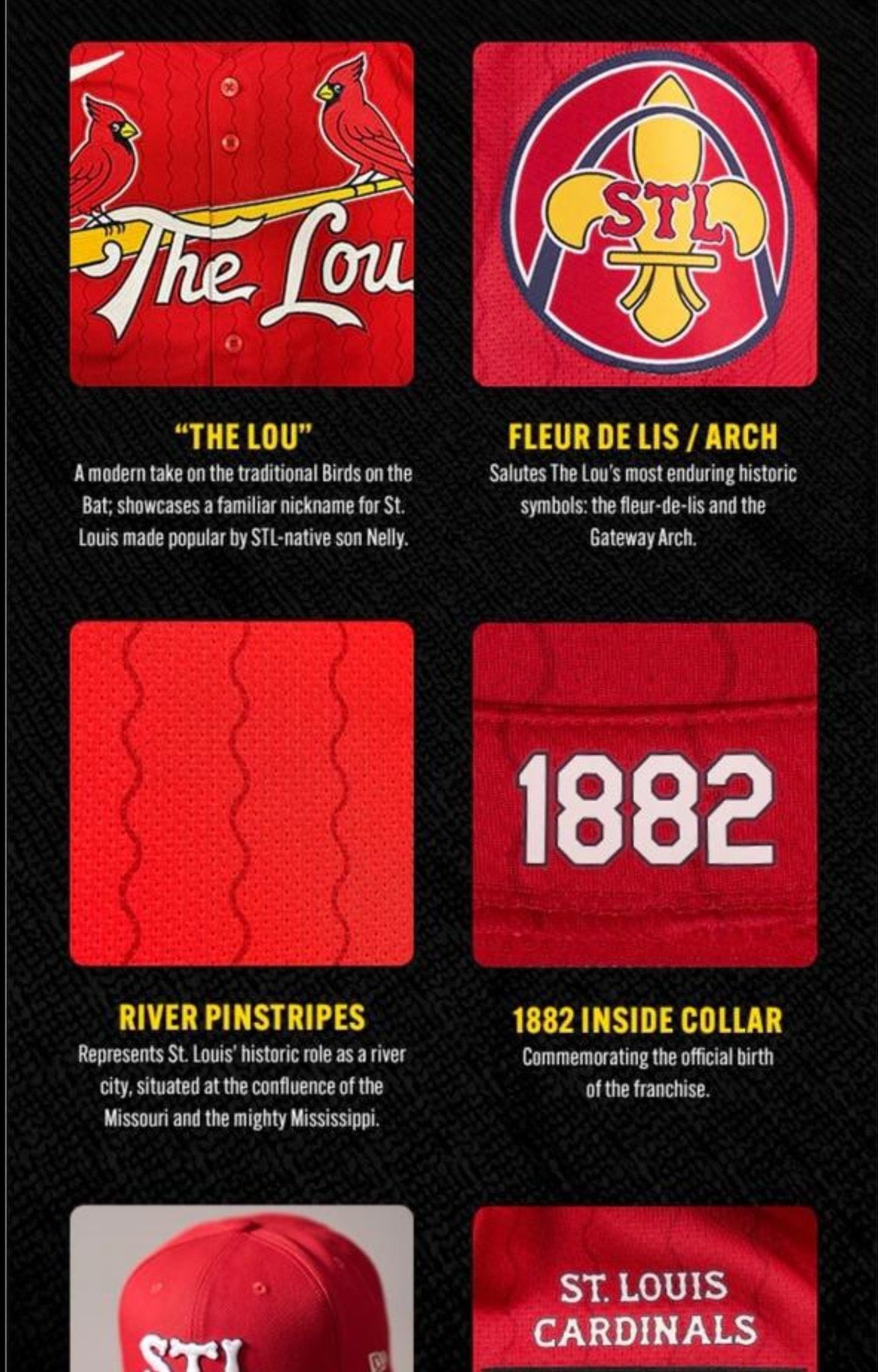
5 hours ago, lahaye7 said:
with you on all these, I have never heard of anyone refer to St. Louis as The Lou. I'd go Red pants and a navy belt (you know, to rep the Mississippi River)
Nelly does/did. They even mention him in the Nike speak graphic leak.
-
3
-
-
Cardinals city connects are solid and tame. Didn't expect them to go outside the box. DeWitt is good when it comes to that stuff. I don't really like the hat though, but I also can't come up with anything better for it that they don't already wear on one of their regular hats. Maybe that fleur-de-lis logo?
-
3
-
-
On the Giants:
-I liked them going to white pants at home. (Did not need the gray stripes though)
-I did not like them going to white pants on the road
-I prefer the stripes on the old gray pants more than the current/most recent.
I saw a fix for the Giants road that would goin a long ways and it was just changing either the inner or outer stripes on the sleeves to blue. Blue socks might help too.
-
2
-
-
54 minutes ago, aawagner011 said:
I wanted to check the source, and it’s straight from the Jaguars Twitter account. This would infer block numbers but I am not 100% convinced. Antonio Brown’s network showed a possible leak with the modern numerals.Now before you say “consider the source,” remember they absolutely nailed every aspect of the Broncos and Texans. I’m hoping it’s the modern numerals because those are definitely the better look. Block numbers are ok, and better than what they currently have, but still not as good.
Wouldn't read much into the font and such in that graphic. They're just playing off the X-Men '97 TV show that just came out.
-
6
-
 1
1
-
-
15 hours ago, Andrew_Gamer_NZP said:
If they actually put Cleveland instead of CLE and these wouldn't be half bad.
-
2
-
-
6 hours ago, aawagner011 said:
From the mothership:
Of these, I would say only half look somewhat or even vaguely like the club they are supposed to represent. And I think that’s the problem with the City Connect program. While it allows teams to explore alternate identities, too many of them stray too far from the norm and have zero relation to the team. I think a better approach would be to run a heritage program, as we have seen a bit in the NHL. It allows teams to offer variety without going too far outside their normal color palette. Heck, you could even tie it into the Cooperstown angle, as we have seen Majestic and Nike do the last decade or so with the merchandise they’ve offered.
The only ones in my opinion that are truly terrible are the Giants, Phillies and Reds. I'm not a big fan of the Rangers either but some people seem to like them. Boston is nice in a vacuum, but the Red Sox shouldn't be wearing blue and yellow and UCLA hats.
Seattle is ruined by the black pants. Pirates are ruined by the PGH. Colorado is more tolerable when they wear white pants,
I love the Marlins, White Sox and Rays (just wish they had colored numbers/word mark). Diamondbacks and Astros (wish this said Houston instead of Space City) would probably round out my top 5. I like that the Braves said "since we have to get rid of the throwback here's something close to it."
I like the Padres and Phillies hats. And the Brewers grill logo.
-
1
-
-
Voted: Black Dimonds, Swarm, Outlaws and Venom.
I don't think Hive is bad either. Caribou could be interesting. Don't really like Glaciers but it would lend itself to a nice color scheme based on light blue. Yeti needs to be Yetis.
-
These are my favorite Pacers uniforms.
-
6
-
 1
1
-
-
3 hours ago, PlayGloria said:
You are probably correct. I would imagine Cardinals will be a red jersey considering they got rid of the spring training reds this year.
I bet it's in the colors of the St. Louis flag with "The Lou" written on the front.
Hopefully the pants aren't blue or red.
-
1
-
-
Tigers' cities are mid at best. The hat is atrocious. And the vin number thing is stupid and ugly. Put that on the inside of the collar or something and it's fine, but it's bad on the hat.
-
20 hours ago, Ark said:
Not really, the "primary" Nuggets jerseys now are like the jerseys they wore in the Carmelo era but worse in every way.
By "decent" I meant a passable mediocre uniform instead of a steaming pile of trash.


2024 NFL Changes
in Sports Logo News
Posted
I like the Ravens alternate helmet, as far as alternate helmets go.* I always preferred that logo to the primary one too. It looks good paired with the color rush jersey, but none of it needs to really exist, they don't need two purple jerseys and it will be dragged down by being head to toe purple. The mustard pants would actually look better than purple here.
As far as the Ravens uniforms as a whole, the only thing they really need to do is either get rid or the black pants, or at least add some stripes to them. I'm fine with the font.
*While none of these non-throwback alts need to exist. The Ravens, Panthers, Vikings, Lions and Texans are pretty nice in a vacuum.