


VikWings
-
Posts
1,693 -
Joined
-
Last visited
Posts posted by VikWings
-
-
22 hours ago, oldschoolvikings said:
I get that a lot of people feel this way. Personally, I've always had a soft spot in my heart for the white helmet over colored jersey and pants look, provided the pants are gold or silver, and significantly lighter than the jersey. (The Titans' white/columbia/navy combo was horrible.)
This may be a candidate for unpopular opinions, but these are some of my favorite uniforms...

Like I said I like the Chargers, I prefer white pants but the yellow still works. I think Wyoming kinda works too (must be the yellow pants) but I'd probably go with white numbers. The Breakers I can barely tell those pants are even gray. Air Force I think would look better with either white pants or a silver helmet, even just white numbers might go a long way. I think silver/gray and yellow/gold pants are the only way it's passable.
-
On 8/21/2023 at 2:33 PM, oldschoolvikings said:
Having all three major elements (helmet, jersey, pants) a different color, without one of the being white, is a terrible idea in football. There are very few "rules" of uniforms I would consider an absolute, but this might be one of them.
Ghastly.
I (mostly) agree with this rule, but I say the jersey or pants must be white, a white helmet almost never works (unless you're the Chargers). I always hated how the Titans looked going White/Columbia/Navy or White/Navy/Columbia, for example.
-
I like the Black/Lime/Blue color way on the ATL kits but the design is terrible.
-
 1
1
-
-
On 8/19/2023 at 8:57 PM, MJD7 said:
He wore those when he was with the Angels, too. It worked well with the City Connect’s surfer aesthetic.
This is a beautiful matchup. I don’t think it’d quite be my favorite ever, but it’s definitely up there.
The jersey was actually inspired by México’s alternate jersey in the 2023 World Baseball Classic:
The Twins fixed this same issue with their recent rebrand:
I could see the Mariners doing a similar brand refresh sometime soon, but I’ve also thought that for the past 6 years or so, so who knows.
Were the pants solid white (no piping) when they originally added them, or am I misremembering?
I like the Twins new set overall but still think that new M logo sucks. Should have went with the metrodome M or some update of it or just stuck with the TC.
-
4
-
 1
1
-
-
39 minutes ago, fouhy12 said:
The Titans were just fine with these two sets.
They could play with the number font or the stripes on the helmet, but those were much better than what they have now.
I loved those Titans columbia jerseys, but they wore navy pants with them far too often and it looked so off balance.
-
12
-
 1
1
-
-
On 8/9/2023 at 5:22 PM, Germanshepherd said:
UAB doubling down on neon green alternates and gold away numbers.
These would actually be nice uniforms, even the black/neon one, if they just got ride of whatever those Jets-like pointy stripes are. (The gray one sucks and is completely unnecessary either way).
-
17 hours ago, Pigskin12 said:
This was a rule until 2019. No idea what genius came up with the idea to nullify it.
That was just the rule were guys had to have on like the sanitaries (white bottom part) instead of just tights and regular socks. That rule needs to come back as well as it's made the non-contrast/legging look so much worse. For example the Vikings have been wearing purple socks with purple pants and the texans dropped red for navy years ago.
Like below the Vikings are still wearing purple socks, but with the white bottoms, which under my rule would need stripes. The socks on the color rushes, which you were referring to, used to be illegal, other than for color rush.
EDIT: Posted this before I saw Caroligian Steamroller's reply.
-
The NFL needs a contrasting sock rule.
"Socks may only be the same color as pants if they include stripes, otherwise they must contrast."
There, someone go paste that into the NFL rule book somewhere.
-
17
-
1
-
1
-
-
So about the article on the main site about the Red Wings survey to STH about an alternate jersey and mascot...
The Red Wings don't need an alternate, but if they must have one it better be a throwback. I prefer one of the Cougars, specifically the one from the 09 WC, but the one that was worn in 92 is fine too. I'll also accept the 2014 WC classic fauxback. Anything else new or god forbid, black, is no from me dawg.
(I couldn't careless about a mascot)
-
2
-
-
It looks like a knock off Great Gazoo with an orange for a body.
-
4
-
-
On 7/31/2023 at 1:14 PM, Morgan33 said:
This might belong in the unpopular opinions thread, I'm not sure. But in my opinion there was no reason to change either of these things... They got it right the first time and everything since has been a downgrade, starting with the decision to promote the navy alternate to primary status.
I liked this logo so much as a kid that I had a pillow with it on it and I'm not a Panthers fan and even though there were still a few other logos I liked more (Red Wings, Whalers, Mighty Ducks)
-
I'm with everyone else that the ball should be orange but otherwise the new Suns jerseys are terrific and by far the best they've looked since the 90s.
-
3
-
-
4 minutes ago, HOOVER said:
This certainly sounds like a solution cooked up between Nike & Fanatics to cut costs and maximize profit while delivering an inferior product to fans. It’s freaking sad, but that’s what Fanatics does.When I first started seeing this, I thought maybe they just switched to heat-applied twill as a way to produce jerseys faster. But what you said makes sense: Nike probably is just stocking a crap ton of blank replicas at Fanatics, and Fanatics just knocks them out with heat applied names & numbers on demand when an order comes in.
I get it from a production standpoint - as a business, that would make the most sense, as you’re not trying to forecast how many jerseys to manufacture per player, and you’re not stuck with inventory if the jerseys don’t sell or if the player is cut or traded. Having blank stock on hand to fulfill as ordered means all you have to do replenish blank inventory. It cuts down on SKUs exponentially. It’s the way to do it.
But it sucks for fans who expect stitched twill. I wouldn’t spend $175 on one of these for that reason alone.
Exactly. It was funny that it said it wasn't going to ship until the end of August, but it came in less than a week.
And I ordered it expecting it to be exactly like my other Limited's just on the new template, because I like the less cheap look of them and also they fit nicer. I have a Game replica and the sleeve area is really baggy and kinda long. Limiteds are more fitted. Had I known the step up wasn't going to be as big as before I would have just said F it and ordered the Game version or just went the Chinese knockoff route.
-
2
-
-
On 7/24/2023 at 10:18 AM, monkeypower said:
Did Nike switch to screen printing names and numbers for retail jerseys with the new template?
I seem to recall there being three levels of Nike jerseys when I last bought an NFL jersey in 2019, most expensive, middle, cheapest, where the middle one was stitched because that's what I got. Now looking at these new Jets jerseys, the middle price point one is screen printed and same with all the other different throwback jerseys.
There are still stitched jerseys in the middle price point of the old templates available.
They most certainly did, kind of, it's not exactly screen print but definitely some type of cheap plastic like iron on. I recently got one and there's no comparison to the old limiteds I have (Have 3: a Flywire, and 2 Vapor untouchables, but name/number application is the same on all 3, the sleeve stripes are also stitched.).
On the new one, the nike logos are stitched that's it. It's like Nike just sends blank ones to Fanatics for cheap name/number application. I believe the Limited only used to be 150 as well, so now you're paying an extra $25 for lower quality.
Same thing happened with some Mitchell and Ness stuff with the Fantatics takeover. I have a couple swingman basketball jersey where the name/number is embroidered and if you didn't know any better, probably couldn't tell the difference from the authentic. I got one recently and the numbers are applied the same way as the new NFL Limited. You're honestly better off looking for cheap knockoffs from China at this rate.
Here's the product details between the new template and the previous ones for Nike's Limited (middle version)
Vapor Untouchable Limited (Old):
- Brand: Nike
- Imported
- Chainmaille Mesh Grill at front neck and back seam lines inspired by the authentic on-field jersey
- Embroidered accents
- Metallic-effect NFL shield at collar
- Satin twill woven jock tag
- Stitched tackle twill name and numbers
- Tagless collar
- Vapor untouchable limited chassis
- Material: 100% Recycled Polyester
- Machine wash, line dry
- Jersey Color Style: Primary
- Officially licensed
- Nike Limited
Vapor F.U.S.E Limited (New):
- Brand: Nike
- Imported
- Chainmaille mesh grill and metallic-effect NFL Shield at collar
- Vapor F.U.S.E. chassis delivers an authentic look and feel on game day
- Dri-FIT® technology wicks away moisture
- Heat-sealed twill name and numbers
- Screen print stripes
- Flatlock stitching
- V-neck collar
- Satin woven jock tag
- Standard fit
- Embroidered team details
- Short sleeve
- Material: 100% Polyester Double Pique
- Machine wash, line dry
- Jersey Color Style: Team
- Move To Zero is Nike's journey toward zero carbon and zero waste to help protect the future of sport. Apparel labeled “sustainable materials” is made with at least 55% recycled content.
- Officially licensed
- Nike Limited
-
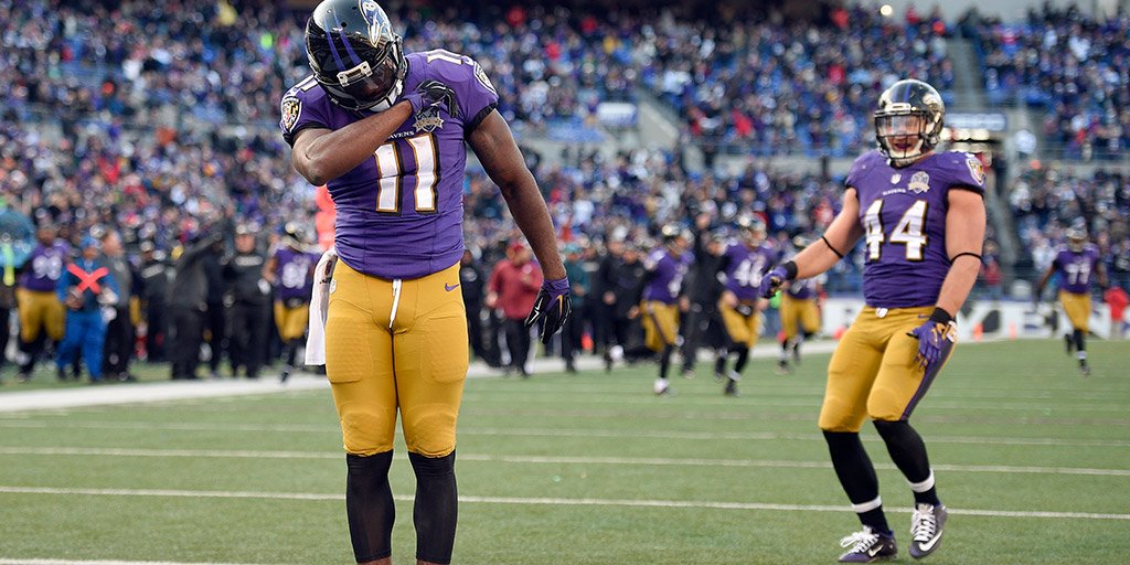
IDK where to even start with those Colts unis. They seem like an April Fools joke. Talk about something nobody wanted or asked for. They just look like Duke.
BFBS helmet is unecessary, the C logo on the chest will be mistaken for a captains patch, I love me a nice heathered T-Shirt, but a football uniform? And I didn't even get to the monochrome yet. These might be passable in a vacuum with white or black pants, but not for the Colts. It really looks like college comes to the NFL more than any other uniform. Even awful Nike designs like the Bucs, Browns, Jags and Titans looked more professional.
-
8
-
-
4 hours ago, bowld said:
Crazy how much better Minnesota and Seattle used to look. Side by side is no contest-
I'm convinced one of the reasons the Vikings went with the 60s set with the outlines instead of the sans outline 70s again is for the "I can't tell the difference from the current ones" crowd. I mean you still have people saying that anyway though, I think even Cousins did in the release video.
Personally I prefer the outlines anyway.
-
3
-
-
5 hours ago, gothedistance said:
Buccaneers and Vikings in week 1 will be good.
Minnesota should wear the throwbacks for at least one more game.
I'm sure they'll break them out again against the Packers or Bears, (and both games are in prime time, for now at least).
Then they'll wear the color rush, or "Primetime Purple" as they call it, probably for the MNF game against the 49ers.
But I also wouldn't be surprised if they don't wear the color rush at all either. They didn't wear them in 2017 or 18.
-
3
-
-
5 hours ago, PERRIN said:
Might be a scorching take but this throwback set is a just a tiny bit overrated. Still very much worthy of bringing back and a damn good uniform, but I honestly prefer the Vikings' current set to these by a good amount. The yellow and white on the stripes get muddied together at a distance due to lack of contrast and the gray facemask, though historically accurate, doesn't match the rest of the set at all. Feels weird to me having a dull gray element on an otherwise bright and cheery uniform. Easily the next best set the Vikings have had, just wouldn't be my cup of tea if it returned as a full-time set.
Again, still a great uniform, love it as an alternate, I just wouldn't want to see this era's set return full time. The Vikings current set - so long as monochrome is avoided - is a modern classic and among the NFL's best uniforms.
Don't get me wrong, I like the current set, even the 'sail' only being on one number instead of both (or none), which annoyed me to no end at first, I have gotten used to. I just prefer the throwback.
But with that being said. All they gotta do is wear the throwback 3x and make the color rush disappear and I'm still a happy camper. I'll even allow one mono purple game if they must.
-
2
-
-
51 minutes ago, Pigskin12 said:
The Vikings said they are "debuting" their throwbacks on opening weekend, meaning they are probably wearing them again, but I saw in the article it said they can wear them once per season, which is simply incorrect. They can wear them three times.
They should wear them 3x and hold a bonfire behind TCO center with the color rushes.
-
1
-
 2
2
-
-
1 hour ago, simtek34 said:
YES! YES!
 These should be their permanent uniforms, I even like the Satin helmet with it for the 'modern retro' feel. Give me a white counterpart or better yet bring back the ucla stripe whites and this is what they should be wearing full time.
I do hope though, for authenticity's sake, they introduce the era accurate helmet next year.
-
7
-
1
-
-
I really like the ASG jerseys by themselves. But the caps didn't really go and I don't know what color they were supposed to be (gray? tan? greenish?) and whoever decided the NL should wear black pants was an F'ing moron. Black pants are terrible as is, but with navy jerseys it's even worse, then you add in the whatever color the hats are on top of it.
(PS go back to the old format we're players wear their normal uniform)
-
2 hours ago, Pigskin12 said:
They can wear them three times but instead are choosing to wear them only once for a non-primetime game, which is why I feel like all this hype is excessive.
God forbid we lose 1 (or both) stupid all
pewteranthracite games!-
6
-
-
Remember when Florida State tried gold numbers on white and had to change cause it couldn't be seen from a distance? And those had garnet outlines. UCF's aren't gonna be long for the world.
-
3
-
-
I wish the away/colored jerseys were purple, but other than that I love the Kings new set, even the gradient alt. They did that so much more tastefully than the 90s version.
-
1
-


NFL 2023 Changes
in Sports Logo News
Posted
The idea applies IMO, but the bigger problem with the Ravens was Nike's fabric giving it that mustard look. That and the fact white or black pants look so much better.