


VikWings
-
Posts
1,693 -
Joined
-
Last visited
Posts posted by VikWings
-
-
I think the Ravens are the only mono-black I like, it works for them for some reason. I mean I still like the black jersey better with white or purple pants, but all black isn't terrible. Just get some stripes on those bad boys.
In other news of course the Broncos aren't wearing white pants this week, decided to wear the crap mono blue.
-
 4
4
-
-
1 hour ago, MJD7 said:
I’d never liked the D-snake logo, but this hat honestly looks really nice. I’d just drop the all black ‘A’ cap at this point to be honest.

I think of the 4 the all red DSnake is the least necessary, and probably the worst one too. Can easily just wear the black/red D one or the red A hat with the red jersey.
-
I actually really like what the Diamondbacks did. If we can't have purple and teal back this is the next best thing. And it's not half in half out like the last set. I actually kinda like the D snake *shrug* glad they kept the snake head on the sleeve to. Wonder if that remains on the BP cap. Glad they went with the A on the home jersey. Black is my favorite of the 4.
I have a few nit picks but otherwise, well done Arizona.
-
2
-
-
20 hours ago, ruttep said:
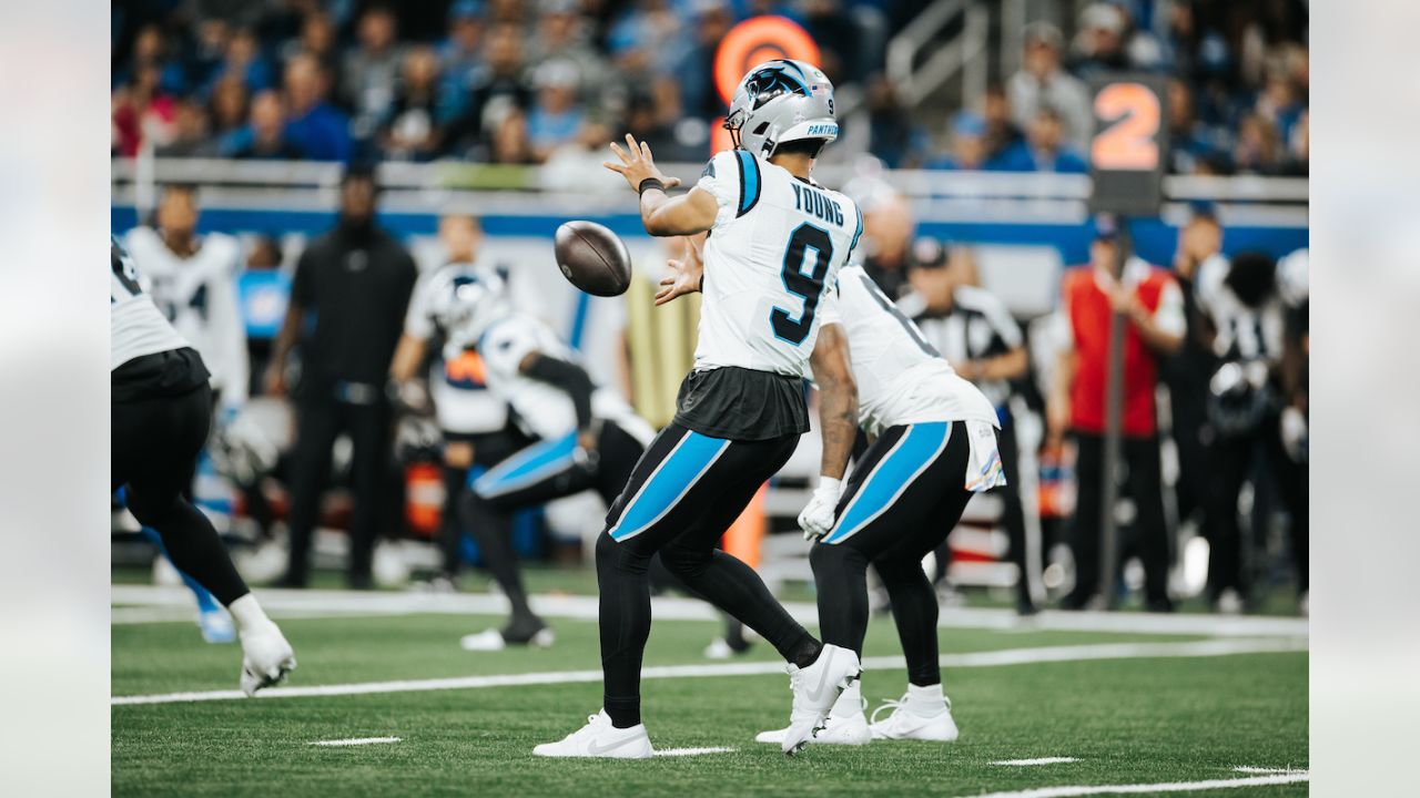
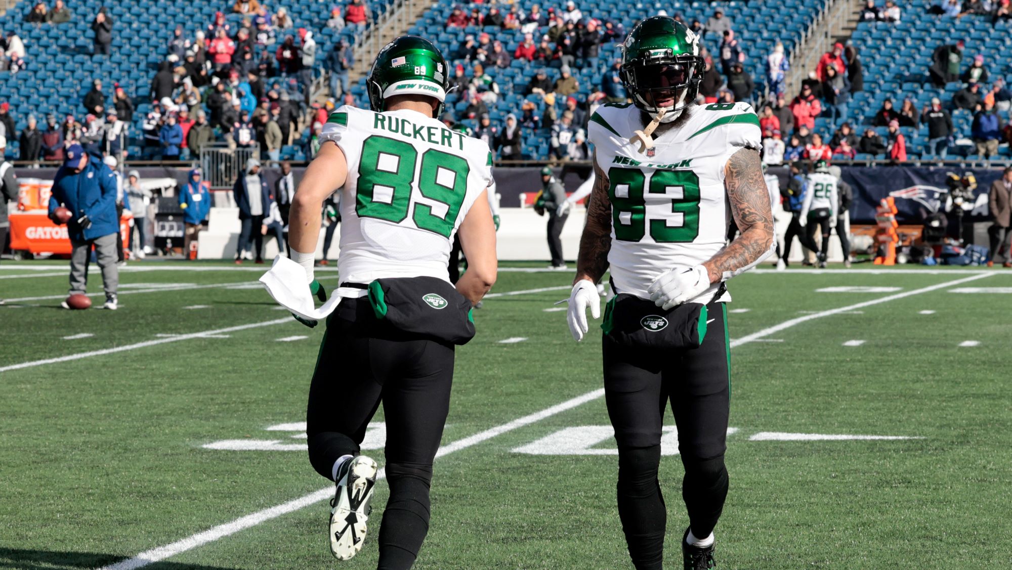
No. White jersey and black leggings just does not look good. As much as we make fun of all black and all white looks, there are way too many of these combos.
What makes this worse is that the Panthers, Jets, Ravens (from their color rush), and Jags all have contrasting color socks in their wardrobes too. So there's no reason for this. At least the Eagles wore white socks when they wore the black pants this year.
20 hours ago, kaleb_girod said:It really bugs me how the Panthers have gotten into more mixing-and-matching the past few years. While their uniforms aren’t the greatest, their once default road all-white uniforms were really
nice looking, especially paired with blue socks. They never needed to be paired with black pants/socks. Some things should really just be left alone.
It’s only a matter of time before they try white jerseys/silver pants…
What pisses me off about the Panthers is when they first debuted the black pants they used to wear blue socks with them and it actually looked somewhat decent. Now it seems they NEVER do it with either jersey.
-
3 hours ago, ruttep said:
With the Lions I'm still wondering how they were ever allowed to wear white pants. They literally don't match with anything, they're just plain white. No design or thought put into them.
For real. If you must have white pants (they didn't) you can't even put stripes on them? It's like the players said "we wanna wear all icy white" and they just ran to Dick's.
Or are stripeless pants cool now and I missed it? Who other than FSU, Notre Dame, Penn St. and Michigan (and even they put stripes on the white ones and you can argue the navy ones suck) pulls off stripeless pants? (And none are NFL teams) And honestly they probably only do cause it's always been that way. And in FSU/ND/Michigan's case the gold/maize color is able to stand out on its own.
Ravens black pants look like crap, Saints white and black pants look like crap. I'm sure I'm forgetting others.
Waiting for them to wear them with the blue jerseys that feature no white at all. You know that day is coming and it's gonna be mismatched Rams bad.
-
3
-
 2
2
-
-
On 11/5/2023 at 12:57 PM, Cujo said:
Sooo this isn't europe. We don't do soccer here. We do not care about soccer here. We don't do gaped out in-season meaningless tournaments here.
The soccer tournaments at least involve teams in other leagues. The NBA one makes no sense at all.
-
4
-
-
3 hours ago, tscuzzy said:
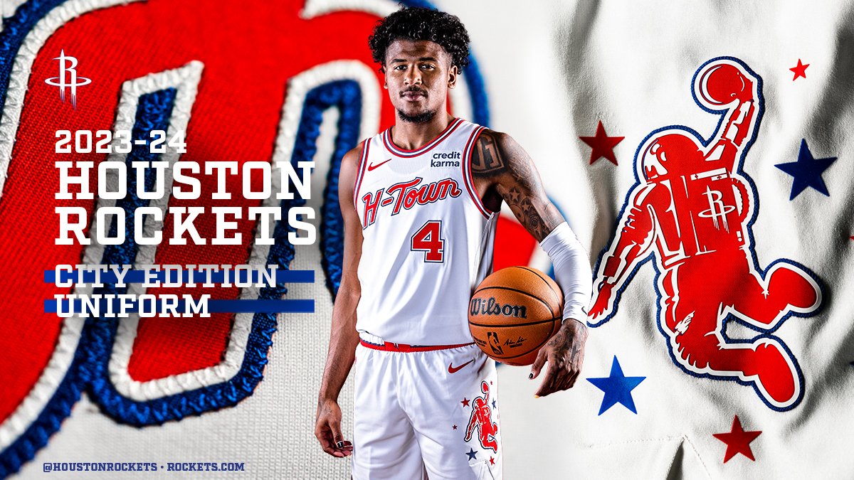
Rockets are calling this logo the "dunkstronaut". Lot of potential here for an official secondary logo one day. They need to drop the R ... there is just so much potential behind a space/earth/rocket logo.
I was a little offended by the shade of blue (very Clippers like), but they are staying true to the old UH uniforms:
Was coming to say, while most of the city uniforms are terrible, I love the dunking astronaut on the Rockets shorts.
-
4
-
-
delete.
-
Surprised not to see Chargers-Bears or Packers-Vikings.
A lot of good looking games this week.
-
3
-
-
What is going on in the key on these court designs. Is the in-season tournament actually a backgammon tournament?
EDIT: I just realized that's supposed to be the trophy. Seems redundant given that it's at center court too.
-
Red and Turquoise might be decent enough and split the different between the two eras.
Instead of DBacks or Diamondbacks they have to go with A logo on the chest, IDK why they seem so reluctant to bring that back. You can stick DBacks on one of the alternates if you must.
-
5
-
-
14 hours ago, ruttep said:
Full look at that jersey. Not the biggest fan - too many stripes on the sleeves imo.
Meh.
How hard was it just to take one of the RRs and make it the third?
Lady Liberty logo >>>>>
-
3
-
-
On 10/23/2023 at 10:51 PM, Pigskin12 said:
I feel like tonight would’ve made way more sense for Minnesota’s throwbacks than a random opening day 1pm game, but I still don’t hate what I’m seeing. The Vikings use this combo very sparingly, so it’s tolerable to see once per season as they generally do.
Agreed. I can live with this ONCE per year. The color rush, though, needs to die and hopefully adding the throwback has finally put it out to pasture.
-
2
-
1
-
-
The only good city jerseys are the Hornets, Jazz, Raptors and Suns.
-
 1
1
-
-
The Sixers jersey isn't terrible, but it isn't good either. Why is the arrow thingy only on one side? Another example of running out of ideas.
-
1
-
1
-
 1
1
-
-
4 hours ago, ruttep said:
I think that was mostly due to Reebok's 2007 obsession with removing hem stripes for no apparent reason. At least Original Six teams (with the exception of the Leafs) were safe from that trend, but it affected like half of the league.
Not to mention the most boring designs I've ever seen, courtesy of Dallas and Edmonton:
Reebok designed the jersey with the attention of being tucked in which is why they removed hem stripes (ironic cause the NHL banned jersey tucks shortly after) but the O6, sans Leafs, and Devils* (Lou Lam) (I may be forgetting another team or two) told them to go pound sand.
*Then Lou leaves and the Devils inexplicably removed their hem stripes for no reason about 10 years after the fact. They were trashed for it and surprisingly haven't gone back yet.
-
On 10/16/2023 at 7:51 PM, FiddySicks said:
This is a perfectly fair point. The current look is a cheap imitation of the first Super Bowl look, but I’m totally fine with that because the uniform set they won their first Super Bowl in is my favorite sports uniform of all time. Even a downgraded version of that is still better than the original 70s look that they were awful in, or the entire alarm clock disaster.
My biggest gripe with the Bucs is that they “modernized” their flag and ship logos. The original flag is just a perfect logo, and again is the reason I’m as big of a Bucs fan as I am, and the reason why I’ve wasted so much of my life on this weird sports logos “hobby”. Both of the “upgraded” logos are enormous downgrades from the original, and is the one thing that was kept from the disastrous alarm clock era, from which everything should’ve been incinerated and then stomped and spat on.
On 10/16/2023 at 7:58 PM, ruttep said:
I'll be honest, I never even realized there was a difference. The original does look cleaner without all the silver/grey shoehorned in.
The old logo is definitely so much better, I remember when that came out when I was a kid I thought it was so cool and was in Disney world that season and made my parents buy me things with that logo on it at the wide world of sports.
The old one actually looks like a pirate flag, the new one just looks like 'ask my corporate design team to come up with a pirate flag.' the gray outline is so unnecessary as well.
-
5
-
1
-
-
8 hours ago, buckeye said:
I get the nostalgia aspect of the navy helmet, but I just don't see how a mismatched helmet versus jersey is a better look. Give me this anytime.
This looks so much better aesthetically but for a throwback accuracy sake I prefer the navy. Now if they were to switch to them full time? Royal gloss all the way.
Same goes for the Vikings. I love how the throwback looks with the matte but it kinda bothers me their not using the old deeper purple at the same time.
-
6
-
-
Was thinking the Vikings may break out the Throwbacks for MNF but I think they'll wait for the Bears (this surely gets flexed) or Packers (this might be too) games to do that.
-
3
-
-
22 hours ago, upperV03 said:
The Ducks are breaking out the eggshell uniforms for the first time this year and pairing them with the chrome helmets:
I actually like the helmet, but the uniform still looks more cookies n cream than eggshell.
-
4
-
-
RE: Cowboys
I could live with the royal at home, navy on the road, IF, they:
1. wore the silver pants that go with with the navy uniforms at home and got rid of the gray/silver-blue/seafoam ones and
2. changed the random and pointless black stripes to navy, which I thought was the color for the longest time to begin with and it pissed me off when I found it was black.
The black stripes and weird pants color were supposedly so the silver and blues looked correct on TV 30-40 years ago, well HD and 4k exist now, so you can fix the colors instead of looking stupid.
Just those two changes and you're not really messing with your "iconic" look, just tweaking it to join us in the 21st century.
-
8
-
-
The Lions white pants really look like they forgot the silver or blue pants and had to run to Dick's real quick.
-
7
-
1
-
-
Resounding meh for the Mavs and the Bulls one is horrible. Way too much spacing.
-
2
-
-
6 hours ago, DCarp1231 said:
Georgia Tech’s “ghost” uniforms
I just don’t get it. How are these teams doing a better job at being the Saints than the actual Saints?
I opened the thread and thought this was Purdue at first.
-
1
-
 2
2
-


/cdn.vox-cdn.com/uploads/chorus_image/image/72759232/1737995841.0.jpg)
/cdn.vox-cdn.com/uploads/chorus_image/image/72739638/usa_today_21604895.0.jpg)


Unpopular Opinions
in Sports Logo General Discussion
Posted
Love those Expos road jerseys.