


VikWings
-
Posts
1,693 -
Joined
-
Last visited
Posts posted by VikWings
-
-
1 hour ago, CS85 said:
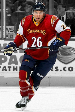
Before these dropped the BASS podcast was going to do an All-Time Big Four Alternate Jersey Hall of Failure, so I've been looking up some of the worst thirds in sports history, and I mean, I don't know how I don't give it to this.
I mean this is probably the worst:

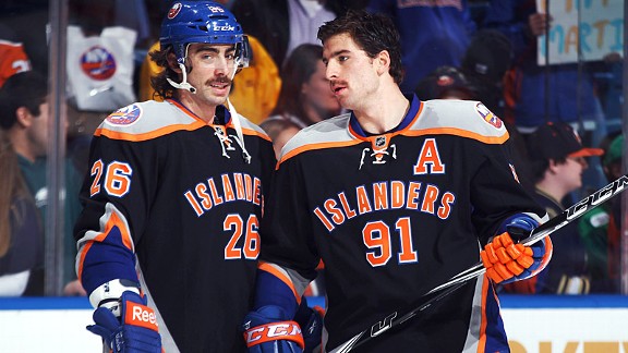
Then there's this guy:
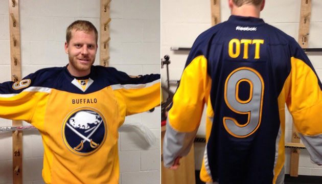
And these:
But I feel like those are even mildly superior to the Smashville disgraces. It's a close thing.
I don't think the Cancuks are nearly as bad as the other two. I'd throw the DALLAS Edge jerseys in the mix even if they weren't technically an alternate (Although I think the White version was originally). And also there's this:
-
 2
2
-
-
Why is the E so big/wide in the Nashville jersey? It could just be an illusion but it seems so disproportionate to the other letters.
EDIT: Holy crap I just noticed the S's, Captain patch and the numbers. This jersey keeps getting worse.
-
1
-
-
Predators jersey is terrible. Lightning is ok.
"Smash
ville"
Is the NHL becoming the NBA now?
-
2
-
-
The Devils could've done a straight color swap to a black base of any jersey in their history since they moved to NJ and no one would have complained. Instead they came up with that over-designed mess and the cringe marketing speak with it.
I think the only script as crest NHL jerseys I've ever liked were the recently retired Aviator blue Jets ones and the old green alts the Wild used to have.
-
4
-
-
On 11/19/2021 at 11:04 AM, WSU151 said:
New road uni, two new alts. Sleeve piping is now thick stripe. And I think the sleeve patches no longer have the black drop shadow that had been around forever. The powder blue jersey is really cool.
Why would they get rid of the beautiful script for a generic block font?
If anything remove the white outline and call it a day.
-
6
-
-
4 hours ago, Ridleylash said:
The dumbest thing about that Devils alt is that it seems to prove that they're just, for some reason, absolutely allergic to hem striping in a non-throwback jersey. Here's what the Newark Bulldogs jerseys they're very clearly trying to homage with this third looked like;
Put an arched "DEVILS" on the front and actually give it the correct hem and shoulder striping and you have a pretty solid fauxback alternate. Instead, it's just a half-assed design with a baseball script slapped on it.
Either go full fauxback or full new design, don't try to do both and succeed at neither.
Did they hire someone from the Sharks in their FO recently or something?
**runs and hides**
-
1
-
-
5 hours ago, ldconcepts said:
They need Lamoriello back bad.
-
6
-
-
2 hours ago, Bathysphere said:
The Jaguars held a salute to service charity event where volunteers were given teal #21 jerseys left and right, and many of them (would appear to be all in the men’s cut) were mistakenly screenprinted with numbers made for the black jersey, making the flushed black outline into a contrasting one. In case you were wondering what that would look like. I could take it or leave it, personally. I’ve come to appreciate the outlineless aesthetic and really wasn’t a fan of the single outlines that the 2009 set used. I would also rather they added more gold before putting any more black on there.
Such an improvement.
I wouldn't even mind a double outline to bring gold back into the equation. Or maybe just replace the black outline with gold? Either way all of their jerseys need real contrasting outlines.
(And the pants need stripes too)
-
10
-
-
I prefer the Disney Angels look to what they've sported since 02.
-
2
-
-
4 hours ago, monkeypower said:
Also, not for nothing (because it is really nothing), but in an Athletic fan Q&A out today, Zegras said he prefers the Mighty Ducks logo over the Webbed-D.
I think everyone does besides Ownership, Brian Burke and people who hate Disney.
-
3
-
-
8 hours ago, Sport said:
There's a gaggle of issues with the Panthers update too. I like it better than the original, but it's really sloppy and has some really amateurish rough parts that should've been caught and corrected before it was approved as final.
It's been a while, actually, since the NFL released a new logo for a team that I didn't find some fundamental basic error in the logo's construction.
The most amateur thing I ever saw with a professional logo was the Bucs new ship logo from the alarm clock era had the mast in front of the sail. And it took them five years to correct it. Like how was that missed?
-
6
-
-
23 hours ago, SSmith48 said:
NFL Instagram with an interesting graphic... teal outlines on the Jaguar's black jerseys. I'm sure it's more of a case of bad photoshop than anything else though. To my knowledge, Trevor Lawrence has not yet worn the Jags' black jerseys.
That mistake is how their jerseys should look and would be a massive improvement.
(They also need gold somewhere (double outline?) and a proper pants stripe, but I'll settle for just number outlines at least.)
-
2 minutes ago, Patchey13 said:
How much lighter are the uniforms now with the removal of the pants logo. They better make the second round AT LEAST with this change.
They had to counter balance whatever weight was added by the new logo embroidery.
-
1
-
-
7 hours ago, CitizenTino said:
I really wish I hadn’t noticed the swooshes on the jersey and pants not matching for no discernible reason. That’s going to drive me nuts.
The white pants probably exist because people love the throwback/color rush but I think the Giants are too stupid to realize that people love them more cause there's actually blue in that the fact they're all white.
The blue stripe in the gray pants was literally the only blue on the entire uniform (sans helmet) and now it's gone. They gotta at least make the two thin stripes on the sleeves and pants blue or something. Or throw a blue outline around the numbers. Get some blue in there somewhere.
-
6
-
-
1 hour ago, logo-maker said:
Chest stripes ruin this for me.
-
I loved the Jets light blue jerseys, the color, the script, the striping were all great, but it's hard to blame them for going to the heritage jerseys. At least they're not being dropped for something awful.
-
4
-
-
On 8/1/2021 at 2:18 AM, the admiral said:
Why?
Why what? That the moon is the best center ice logo? IDK I just loved the way it looked.
-
11
-
-
I wouldn't mind the howler as a shoulder patch if the moon logo wasn't so good. It's also the best center ice logo of all time.
-
11
-
-
On 7/13/2021 at 12:41 PM, auguststaley said:
I like Paul Lukas' site and his work but how does he think this unveiling confirms last week's leak?
These immediately become the best jersey in the set (not that that's saying much) and should be elevated to primary away immediately with the bone ones thrown into a bottomless pit. If they would have done this from the get go and also never touched the helmet horn or used gradients, I don't think there would have been many complaints.
I do lol at them comparing it to the original trying to get some goodwill back. No, no the original is still a 1000x better and that side by side photo they posted only accentuates that.
Let's hope the uniform they unveil next year is yellow (hopefully not mono) and not black.
-
12
-
-
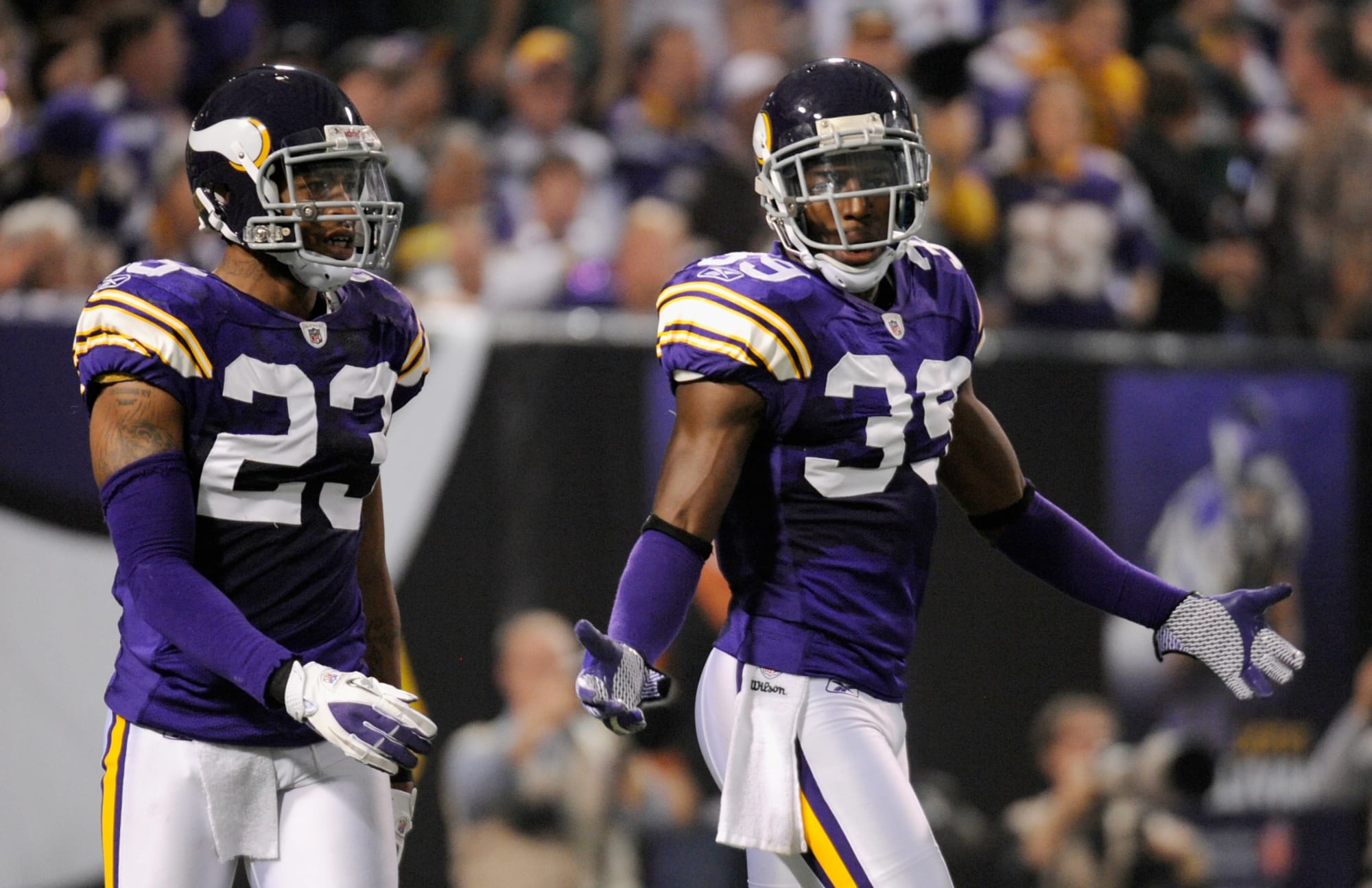
12 hours ago, DNAsports said:
I hope the Vikings do this right and bring back these-
and even though I loathe the purple mask with purple helmet, these would be nice too-
I like the current uniforms, but the Vkings should look like this every game.
-
4
-
-
4 hours ago, MNtwins3 said:
I'd say overall, the non-white monochrome look doesn't work for ~95% of looks. IMO, the Seahawks mono-navy actually works, and they've owned that look. Their all grey also works (but that's closer to white). I honestly can't really point out another NFL team where it works
It can work sometimes only when contrasting socks are worn. Like I think the Panthers look great in Black/Black/Blue but look like complete dog poop when they go head-to-toe black.
-
1
-
-
6 hours ago, raysox said:
Good. I think the black jersey looks better without the yoke. And I always liked the meth bear shoulder patch. Also it reminds me of Happy Gilmore, which is never a bad thing.
-
3
-
-
On 5/11/2021 at 5:33 PM, NYRFan said:
Not that the current jerseys are bad, but these are both better than what they came up with. Gold > Silver.
-
2
-
-
29 minutes ago, Chromatic said:
On the flipside, some really great looks can come out of it too. I think this Denver fauxback from their colour rush where they were forced to switch the royal to navy looks really, really good.
This should be the Broncos full time look. (keep the Navy from the current set as a throwback/alt and only keep the white pants with it.)
-
8
-
.jpg)


Unpopular Opinions
in Sports Logo General Discussion
Posted
I've probably said this before I but I drink a lot and forget things, but the talk in the NHL thread brings me here to say I love the Fisherman logo, maybe because I was 5 when it came out, IDK, but I even own a hoody with that logo on it (it's actually may favorite fitting hoody) and I'm not even an Islanders fan.