


MCM0313
-
Posts
4,368 -
Joined
-
Last visited
Posts posted by MCM0313
-
-
1 hour ago, Bmac said:
In addition to the inclusion of "The" in front of Orlando Magic in most of those logos, it's interesting that many of them use OrlandO. I wonder why the capitalizing of the second O was such an important design choice.
Nice catch...and I have no idea.
-
2 hours ago, C-Squared said:
Purists aren't crazy about it, but unique branding could be a goldmine for teams like these who would otherwise generate zero interest outside their regions.
Bingo. And why should it matter? The vast majority of baseball teams, especially pro ones, will continue to feature traditional looks. Let these guys have their fun.
-
 2
2
-
-
So the front page of the mothership had an article about the brand-new Savannah Bananas who will begin play this summer in the Coastal Plain League, an amateur summer collegiate baseball league. I looked on Wikipedia and there are quite a few interesting team nicknames and color schemes in that league. Some of the team nicknames alone are worth the price of admission: besides the Bananas, they have the Asheboro Copperheads ("Texas orange" and white), High Point-Thomasville HiToms (red and navy, but what a name), Lexington County Blowfish (red and blue), Edenton Steamers (teal, black and white, with a clam for a logo), Fayetteville Swampdogs (navy blue and fluorescent green), Holly Springs Salamanders (Vegas gold and steel blue), Peninsula Pilots (orange, navy blue and light blue, with a bird wearing flying goggles for a logo), and Wilson Tobs (short for Tobacconists, wearing athletic gold (yellow) and black, with a tobacco worm for their mascot). There are several more, but those were the most interesting nicknames I found. Low-level baseball branding is fun.
-
19 hours ago, rxmc89 said:
But it's not a "wrong" uniform if he spends almost half his career there.
Agreed. I'm not a particularly big hockey fan, but I immediately know that Thornton played for both Boston and San Jose upon hearing his name. If it surprises you that someone played for a team, then that team's jersey is the "wrong" one for him. I think almost everyone knows that Thornton played for Boston.
-
13 minutes ago, FinsUp1214 said:
Awesome! That's a great jersey to have!
")
And yeah, those three were something else. My favorite sports memories as a kid are pretty much monopolized by those late 90's Jazz teams. Still gets me down thinking they never could get a ring, haha. Dang MJ.

Ugh, I know. I also came to be not-a-fan of certain Jazz players who stunk, like Greg Ostertag and Shandon Anderson. I can still remember Anderson missing a dunk in a playoff game! (Not sure if it was NBA Finals or conference playoffs.)
-
On 12/23/2015 at 8:18 PM, mattb6 said:
Cleveland Browns: Parents were fans of the Browns, and couldn't cheer for my Grandpa's team (the Bengals) because of those god awful uniforms
I'm a Bengals fan, but I hear ya about those unis. Every year I hope it's the year they finally drop the stupid mid-00s side panels and terrible number font, and every year they don't. I love the tiger stripes everywhere, though. Especially on that awesome helmet.
-
1
-
-
NBA: Cleveland Cavaliers
MLB: Cincinnati Reds. In the AL the closest thing I have to a team is Minnesota.
NFL: Cincinnati Bengals. I also sort of liked the Lions with Calvin Johnson, and also with Barry Sanders, but that was more the players, not the team. I root a little bit for the Giants because I love their helmets and quirky red-heavy road jerseys and Eli Manning and OBJ.
NHL: Blue Jackets, sort of, but if not them, then the Islanders, because I've always liked the name. I'm not a huge hockey fan.
MLS: Crew, though I don't watch soccer much at all
College: Ohio State, naturally, since I'm both an Ohioan and a two-time OSU alumnus (B.A. and Master of Education).
-
On 12/31/2015 at 2:45 PM, FinsUp1214 said:
Born and raised in Utah, I've always been a Jazz fan. It's a frustrating way of life sometimes - usually consisting of sub-par seasons, painfully longing for the Finals days and missing the heck out of "Stockton to Malone", and our best players eventually bolting for larger markets - but I'll always love 'em. I hope I live to see the day they win the Finals. Even if I'm 99 at that point, I'll be right in the thick of the surely ensuing impromptu parade in SLC when that happens.
In the NFL, I've been a huge Colts fan for many years. My favorite player as a kid was Peyton Manning, and I just figured naturally I might as well root for the whole team if I was going to root for him anyways. Even after he left, I'd been a Colts fan for 10+ years by that point, so there was no way I was leaving 'em.
In the MLB, I've been a very casual Dodger "fan", really only because that's always been my Grandpa's favorite team. I don't get extremely into them though. I've got a lot of family from Seattle and I loved Griffey as a kid, so I naturally like the Mariners a lot as well. I attended Iwakuma's no hitter this summer at Safeco, and that was my first MLB game I've ever attended, so the Mariners will always have a special place in my heart for that reason as well. That was an awesome, electric experience.
I don't really have an NHL team personally. Used to like the Mighty Ducks as a kid, and really got into them during their 2003 Cup run, but after their horrific rebrand it felt like they didn't even exist anymore. Sounds dumb I know, but I lost any interest in them after that. So I guess you could say I'm a fan of 1993-2006 Mighty Ducks, but also really anyone that isn't Detroit or New Jersey.
In College Sports, I've become a big Ole Miss fan (which is the inspiration behind my user name, the "Fins Up" slogan behind the "Landshark Defense"). I served a two-year mission for the LDS Church in Mississippi and absolutely fell in love with the place. It's pretty much my second home, so I naturally adopted the Rebels and root for them even above the Utah teams. If I do root for a local school though, it's usually Utah State.
And in the MLS, it's Real Salt Lake for hometown reasons.
I'm an Ohioan, but I was a Jazz fan in the '90s due to Stockton, Malone, and Hornacek. I got a purple Malone jersey right before they rebranded in '96, and I still have it. It's the only NBA jersey I've ever owned.
-
1
-
-
On 4/7/2016 at 4:22 PM, Ferdinand Cesarano said:
Similarly, the Rams used the full names of the (unrelated) pair Jack Youngblood and Jim Youngblood.
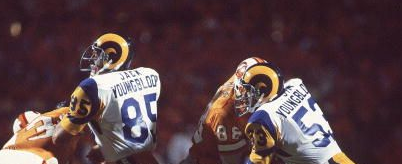
How bizarre is it that they'd have two guys named J. Youngblood...let alone both starters on the same side of the ball...and they'd be unrelated?
-
1
-
-
4 hours ago, Ferdinand Cesarano said:
My New Orleans Zephyrs hat from around 1995.

Every picture you post, my eyes are immediately occupied by that epic moustache.
-
7
-
-
11 hours ago, Germanshepherd said:
The best look the Falcons ever had was their 1988 look, with the early 2000s a close second.


Those are both fine looks. I don't think the Falcons have ever had a truly bad look. Their worst is their current, just because of the unnecessary piping and asymmetrical striping, but even it is far from horrible.
-
2
-
-
On 4/5/2016 at 9:35 AM, Cujo said:
The Admiral
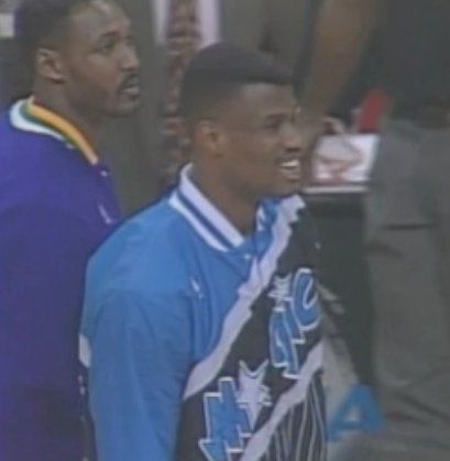
Is this from an ASG or something, and he and Shaq switched warm-up jackets? I'm confused...all I know is he's wearing a Magic jacket and standing next to Karl Malone, who's wearing his regular Jazz jacket (at first I thought Lakers till I saw the green in the collar).
-
I don't mind the waist stripes on the Miami Hurricanes' basketball unis.
-
19 hours ago, Harmening said:
What I wouldn't give to get either of those Bengals looks back...
Amen, brother!
-
1
-
-
17 hours ago, mjd77 said:
I still think the original Magic unis were the best they've ever had. There was no need to ever change them. That set looks just as good today as it did when the franchise was born. IMO, everything has gotten progressively worse since then.
I agree that the original is their best look. I also think, as mentioned above, that the Vince Carter unis were pretty good. For sure, though, they've gone downhill design-wise in recent years. Too conservative for a team with their name.
-
Just now, Walter Sobchak said:
The numbers went up to the shoulders and the logo was added to the sleeves.
Okay, thanks. Pretty subtle compared to what the Eagles and 49ers did that year! Not to mention the Browns becoming the Ravens...
-
On 2/23/2016 at 4:07 PM, SabresRule7361 said:
2002-03: First year of those Kings jerseys/last year of the Star 'A' Magic on jerseys
 [
[
Those Magic unis were pretty good. Have they had anything good since? I feel like they've really squandered the potential of that name lately...and not just with their play.
-
1
-
-
On 2/23/2016 at 2:29 PM, johnnysama said:

Only happened in two matchups in 1996; first year of the tweaked Vikings uniforms and the last for the Creamsicle Buccaneers.
Video, but those same Vikings met the Broncos that same year in that teams final year of the classic Orange Crush unis.
I wasn't aware the Vikes made a signficant change in '96. They kept the UCLA stripes on the roads (classic) and...did the home change? I honestly can't tell.
-
On 2/11/2016 at 6:32 AM, WavePunter said:
apart from the side panels and the white at the very top of the pants stripe, i actually REALLY like the Bengals uniforms.. i think it's a great look and all their combinations work well together.. if they would remove the white side panels from the colored jerseys, and fill in the white areas with black at the top of the pants striping, they'd have one of the best looks in the league IMO.. i'd also like the see the "B" chest logo changed to a similarly stylized "C" or a small "BENGALS" wordmark... the "tiger dress up" doesn't bother me at all, and neither does the number font or drop shadow.. apart from a few small tweaks, the Bengals have one of my favorite looks in the entire NFL.. their white jerseys are almost perfect as-is with either pants (because the white side panel is actually appropriate here, and the white on the pants stripe is much less noticable).
I agree except for the drop shadow and number font, both of which are very 2005. Change those up and get rid of the empty space (white side panels and top of stripe) and you're good. Yes, they look very tiger-y. They're the only team in the NFL with a tiger nickname/mascot, are they not? Own that shizz.
-
4 hours ago, TheOldRoman said:
They wore those blue pants on the road as recently as 1986, so they used the spare ones as practice pants into the '90s. If they reversed the red and white, then made the center stripe proportionately thicker to match the sleeve stripes, those pants would have looked great on the road. I always felt the road look of that set was lacking. Too little blue.
Not too bad.
-
8 minutes ago, jrodsep said:
Was watching the 30 for 30 on the Buffalo Bills and noticed that they used blue pants in 1991 training camp. Was this an unused uniform or just for practice?
Hmmm, that's interesting. It wouldn't be the first (or last) use of blue pants by them, but ASAIK they never wore blue pants with the red helmets in games.
-
3 hours ago, OnWis97 said:
This is probably about right on. I grew up in that era and I admit, I enjoyed seeing them wear these as throwbacks once (or a few times, I think), but I recognize that this should absolutly not be their full-time identity. And while I don't have my finger to the pulse of the fan base, I tend to doubt many people would disagree. It's fun because it's nostalgic and maybe even because it's gaudy. But the clamor for and 80s identity is not like it is in Milwaukee. If you don't like the 80s Brewers look, that's more of an unpopular opinion.
Man, it's amazing how frequently the White Sox used to change. The older looks (red/powder and whatever else before my time) the atrocious big-collar uniforms, the slightly better (by default) beech blanket look, the late 1980s look (which was, in a vacuum, serviceable, but did not fit the team, particularly the "C" cap). And then they change to black, at least partly to hop on a trend...and they've kept it for like 25 years and have one of the most stable identities in MLB. When they made the change, I'd never have thought that would be the case.
I actually like the red and powder. Is that unpopular enough?
-
Just now, TheOldRoman said:
I'm not sure that's an unpopular opinion. They gained fame in the last decade when the fad became wearing throwbacks that were ugly or gaudy. My generation loves them because they were born in that era, but outside of a few dopes, Sox fans don't want those back.
I would've liked them more if they'd found a way to work the logo onto a primarily blue or red shirt. Still, it's a very dated logo and it couldn't have been that good even in the '80s.
-
I've never much cared for the White Sox' 1980s "beach blanket" look.


Unused Logos and Uniforms
in Sports Logo General Discussion
Posted
Hey, now...