


MCM0313
-
Posts
4,311 -
Joined
-
Last visited
Posts posted by MCM0313
-
-
11 hours ago, Ark said:
The Rams current uniforms are arguably best they've ever worn, even as good as their royal blue and athletic gold uniforms are.
Just one problem, they are wearing the wrong pants for some reason.
Look how good these are:

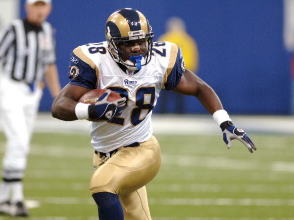
That color scheme is so 2000. The pants were nice, sure, but with today's trend toward matte finish on metallic objects (and not just on helmets), they'd look dull and lifeless.
-
 1
1
-
-
14 minutes ago, dont care said:
There helmet logo has never changed. It's always been a ram horn on the helmet only the colors have changed.
Actually, I think what @1937redskins was saying is that the horns used to be thicker. I actually have noticed that they seem to have thinned a bit.
-
6 minutes ago, 1937redskins said:
gonna have to wait a couple years I guess before the Rams finally get rid of this cookie cutter crap
I don't think dislike for their current look or desire for a different one is at all unpopular.
-
5 hours ago, chcarlson23 said:
Still better than this...

-
1
-
-
36 minutes ago, dsaline97 said:

I was talking about that one.
That one isn't awful, but it's nowhere near the classic that is their regular hat.
-
1 hour ago, Josh.0 said:
Don't touch the logo. But, the jerseys could use a little refresher?
Honestly, though, I'd love to see them bring this road back ...
Yep, script wordmarks are criminally underused in the NBA, which is a shame because they almost always look good. This one was pretty sweet.
-
12 hours ago, johnnysama said:

Here's the late, great Deacon Jones in a different shade of blue; that of the San Diego Chargers.Huh...I'd have thought he'd be in a blue helmet. When did the Chargers first use blue helmets, anyway?
EDIT: 1974 was the first year the Chargers wore blue helmets.
-
44 minutes ago, dsaline97 said:
While I don't mind them, and it's certainly a nice idea to have grey lettering on top of grey pants, but the new cap they started wearing last year with it is overkill, and frankly, horrible. The Mets only need one cap, not eleventy-five.
I hadn't noticed them doing that. Is that the one where the "NY" is set against a white backdrop?
-
31 minutes ago, OnWis97 said:
LOL...My "two" shoulda been "too." I don't think I've made that mistake since second grade. Yeah, the gray letters and numbers look great on the gray pants. And not having gray on the home alts makes sense too.
Hey, mistooks happen.
-
29 minutes ago, OnWis97 said:
I like those two. I think the gray looks great, particularly atop the gray pants (I don't watch enough to know whether they wear these at home too).
You mean the gray numbers and letters? I agree that they do look great on top of the gray pants---that's really why I like them so much. I don't think they wear those at home---they have a separate blue top that they wear on top of white pants for a home alt.
-
On 5/10/2016 at 11:51 PM, MCM0313 said:
Can't post a photo right now as I'm on a Windows Phone (don't get one btw), but I think the Mets' blue road alts with the grey numbers are better than either the blue home alts or the regular roads. Undecided on how they stack up to the home pinstripes.
Here we go. These. I love these:

-
2
-
-
Can't post a photo right now as I'm on a Windows Phone (don't get one btw), but I think the Mets' blue road alts with the grey numbers are better than either the blue home alts or the regular roads. Undecided on how they stack up to the home pinstripes.
-
11 hours ago, Cosmic said:
Man, $375 per seat (~$16 per game) gets you close seats, unlimited food and drink, special parking area, ability to trade in tickets for games you won't make, merchandise discount, runners to get your food, etc. And also the mascot is named Split. You can't beat that.
Edit: You can also get the same package for only a five game commitment for $15 per game.
That...that makes no sense. It costs less per game to get a week's worth of tix than to get a season's worth?!
-
On 5/6/2016 at 7:23 PM, Sykotyk said:
Now that's awesome brand identity. Is that all tickets or just the season tickets?
Either way, I like it.
I don't know, but I hope they're all like that.
-
13 hours ago, Chauncey917 said:
Although I very much dislike the pseudo camouflage rubbish on the shoulders and stripes, I do like the Cowboys' khaki uniform look. It's a good choice for an alt. Nix the camo crap and it's pretty sharp.

Am I missing something? That doesn't look khaki to me, it looks grey...
-
On 5/3/2016 at 10:04 AM, BlazerBlaze said:
The irony of it is they play in Grayson Stadium which the city of Savannah is very proud of being an old stadium experience like Wrigley.
Ha, that's pretty funny.
-
17 minutes ago, KittSmith_95 said:
I always liked purple and green too.... I always wanted to see another team use it (Kings or Jazz could work.).
It has worked for the Jazz, actually (1979-84).


Admittedly, they didn't put much green on the homes or much purple on the roads. Some purple trim on those green jerseys would've gone a long way.
-
2 hours ago, FinsUp1214 said:
I feel like I really shouldn't, but I really liked and still like everything about the 90's purple and green Bucks. Like, I don't know if it's just being a 90's kid and the natural nostalgia attacks that come with it or if it's a genuine design tastes thing, but for some reason I look at this:
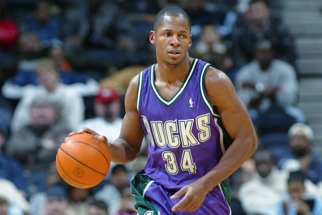
And my brain is like, "yep, looks good!" Although admittedly I think for long-term purposes I'd have switched the purple and green around to make the jersey green primarily, like their alternate was.
I was reading the text above the picture and thinking the text below the picture. That template would've looked good in green with purple trim instead of the other way around. Would've looked better than both the purple regular road jerseys and the crappy buck-head green alternate.
-
1
-
-
3 minutes ago, B-mer said:
Mickey Mouse ears?
That seems very possible. Subtle nod to Disney...although as litigious as Disney is, they probably couldn't have gotten away with it, hence the lack of a second capitalized "O" in the final version.
-
On 4/4/2016 at 9:02 AM, leopard88 said:
It's obvious that many of these were designed by a graduate of THE Ohio State University.
. . . and they're all pretty bad.
Hey, now...
-
1
-
-
1 hour ago, Bmac said:
In addition to the inclusion of "The" in front of Orlando Magic in most of those logos, it's interesting that many of them use OrlandO. I wonder why the capitalizing of the second O was such an important design choice.
Nice catch...and I have no idea.
-
2 hours ago, C-Squared said:
Purists aren't crazy about it, but unique branding could be a goldmine for teams like these who would otherwise generate zero interest outside their regions.
Bingo. And why should it matter? The vast majority of baseball teams, especially pro ones, will continue to feature traditional looks. Let these guys have their fun.
-
2
-
-
So the front page of the mothership had an article about the brand-new Savannah Bananas who will begin play this summer in the Coastal Plain League, an amateur summer collegiate baseball league. I looked on Wikipedia and there are quite a few interesting team nicknames and color schemes in that league. Some of the team nicknames alone are worth the price of admission: besides the Bananas, they have the Asheboro Copperheads ("Texas orange" and white), High Point-Thomasville HiToms (red and navy, but what a name), Lexington County Blowfish (red and blue), Edenton Steamers (teal, black and white, with a clam for a logo), Fayetteville Swampdogs (navy blue and fluorescent green), Holly Springs Salamanders (Vegas gold and steel blue), Peninsula Pilots (orange, navy blue and light blue, with a bird wearing flying goggles for a logo), and Wilson Tobs (short for Tobacconists, wearing athletic gold (yellow) and black, with a tobacco worm for their mascot). There are several more, but those were the most interesting nicknames I found. Low-level baseball branding is fun.
-
19 hours ago, rxmc89 said:
But it's not a "wrong" uniform if he spends almost half his career there.
Agreed. I'm not a particularly big hockey fan, but I immediately know that Thornton played for both Boston and San Jose upon hearing his name. If it surprises you that someone played for a team, then that team's jersey is the "wrong" one for him. I think almost everyone knows that Thornton played for Boston.

Unpopular Opinions
in Sports Logo General Discussion
Posted
What secondary logo? Can you post a picture of it?