


MCM0313
-
Posts
4,368 -
Joined
-
Last visited
Posts posted by MCM0313
-
-
2 hours ago, FinsUp1214 said:
It's weird, if I'm not mistaken Bagwell played just as long in brick/tan/black as he did in navy and gold, but the latter just looks 10x more "right" to me. It's the first uniform I see when I think of him.
Yeah, same here. I guess it's because those were the uniforms he wore when I first became aware of him, and for several years after. Ditto Biggio.
-
 1
1
-
-
56 minutes ago, BJ Sands said:
I was referring to Rock and Pudge. Always think of Pudge in the Rangers' red era.
Oh, right. For some reason I thought you meant all three even though you said two. D'oh!
-
1
-
-
On 1/19/2017 at 3:47 PM, BJ Sands said:
MLB giving us two examples of right team, wrong uniform.
I think the Bagwell uniform is pretty appropriate.
-
1
-
-
11 hours ago, chrispw12 said:
From 2000 last year for Suns, first for Raptors
This may be unpopular, but I never liked that look for Toronto.
-
4 hours ago, bkknight95 said:
The NHL needs more green.
Yes, they do.
-
1 minute ago, insert name said:
Here's his time with the Astros.

Yikes, I forgot he'd even played for the Astros!
-
1 hour ago, kroywen said:
And while the other man elected played his entire career with the Astros, Jeff Bagwell was originally a Red Sox prospect:

(And Sox fans are still angry about that trade.)
I'd make a Larry Andersen crack, except I'm a Reds fan, so I've seen plenty of similar trades just within the past few years...
-
2 hours ago, SCalderwood said:
I think that around the time those Jazz unis came out, teams were in such a rush to de-90s themselves that colors like purple and teal quickly disappeared in favor of more traditional colors like red and blue. In the Jazz case specifically, I can only reasonable conclude that they held onto the purple in their primary logo as a way to at least hold some common connection/cohesion to their previous identities. An all-blue logo wouldn't have felt very Jazz-like at the time, I think. Maybe they were trying to eventually phase out purple (which it turns out they eventually did) and didn't want to change their entire identity too abruptly, so they just kept some in the logo. Not great logic but the best I can come up with.
The Raptors are another example of a team that held onto prominent purple for a few years in their primary logo despite not having it on their uniforms or on the court.
Yeah, forgot that Toronto did that too. The bad thing about that whole post-90s backlash was that teams actually tried to look good, and unique, in the 1990s, and in getting away from that style, many teams also stopped trying, it seemed.
-
On 1/15/2017 at 9:58 PM, insert name said:
Rare Patriots uniforms matchups from 1999.


First one feels more weird than the second. The big-shoulder-logo Pats and the midnight-green Eagles coexisted for several years. Also, has the Eagles' shade of "green" gradually changed over the years? It doesn't look teal here. Could just be the lighting, I guess.
Also-also: nice facemask, Bruschi!
-
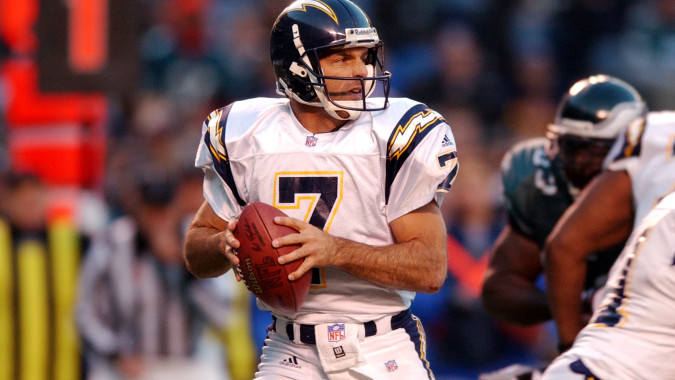
9 hours ago, Lights Out said:
That's the popular opinion on this board. Personally, though, I've always hated that look. It's just boring. The Chargers should never wear navy or any shade of blue other than powder. The only reason why they ever wore navy to begin with is because it's the Spanos family's favorite color - which should be reason enough to consign it to the dustbin of history.
Now, had the Chargers gone with something like the powder-blue mockup shown on the right in this picture, that era would have been a little more tolerable even in spite of navy:

The road look would have still been bland without any powder blue, but it still would have been an improvement overall.
As I mentioned before, I feel like lightning bolts look better against a dark background, as if against the night sky. I like the Chargers' current color scheme but think they could do better with the uniforms.
-
2
-
-
1 hour ago, ImmortalChef said:
I feel like the current Rockets logo looks really lazy, like a 6 year old did it. The Rockets should bring back a modernized version of their 80's logo.

Actually, I'm okay with the logo - it does look like a rocket launching - but I feel like their uniforms are lazy and don't try. And then when they do try, we get BFBS and the unnecessary addition of grey to the color scheme.
In fact, the various iterations of their current uniforms have never really impressed me, even back in the Yao days when they first unveiled them.
-
1
-
-
56 minutes ago, Typhoon said:
Not sure if it's the number font or the placement of the bolts on the shoulders but I prefer this look for the Chargers

That was a very solid look, and I say that as an OSU alum and fan who is disinclined to like navy and yellow. The helmet is their best ever IMO (lightning looks best against a dark background), and the pants look much better in white than in yellow. Navy beats royal for me, too. If they could only have found a way to work some powder blue into this set it could have been an all-time classic.
That said, I don't think this is really an unpopular opinion on these boards.
-
1
-
-
10 hours ago, SabresRule7361 said:
Only 8 games with these unis over 2 years (Mavs debuting Cuban-era unis, Nuggets at tail-end of the navy/gold/wine Dikembe era unis)
Those Nuggets unis were pretty good. They just never really did anything with them as far as alternates go.
-
13 hours ago, Dabbaby17 said:

I absolutely love the old Rockets' jerseys, in tenure from 1995-2003.

In addition to the light blue colorway of the Utah Jazz from 2004-2010.
Curvy Vikings' jerseys. 2006-2012 (pretty sure).
49ers'1998-2008 dark red jersey.
Eagles' 2003-2006 alternate look.
The Jazz' double-blue unis looked pretty good and appropriate (jazz music is, after all, based on the blues), but it always bugged me that they featured purple pretty prominently in their logo but didn't have any on their uniforms, not even as trim. Purple-and-light-blue would've looked better than double blue, IMO.
-
1
-
-
8 hours ago, johnnysama said:
Although he was only there in the preseason, Jerry Rice in a Broncos uniform is also awkward to see.
Not to mention Jerry Rice wearing #19.
-
30 minutes ago, FlyEaglesFly76 said:
@MCM0313 I didn't actually know Warren was a Chief once. It's weird seeing him in anything but an Oilers uni but this is.. bad...

It's actually kind of impressive...he was 44 his last season.
-
1
-
-
17 hours ago, FlyEaglesFly76 said:
Not sure if this has been posted yet and i'm not going through 274 pages to find out, but, Warren Moon, famous Oiler as a Viking.
There are plenty a QB who have gone to the Vikings in the twilight of their career.

Also, Warren as a Seahawk.

Moon was actually pretty much still in his prime when he went to Minnesota in '94. Bud Adams was just breaking up his team, as he had said he would do if they didn't make a Super Bowl run. Now, Moon in Seattle and (better yet) Kansas City...those are examples of an old, past-his-prime QB hanging on.
-
2
-
-
Apologies if someone else has posted this already, but this is a classic rare: last year of one set vs. first year of the other. Enjoy Falcons-Seahawks in December 2002:
.jpg.f9b9d7f1d1f3fc79188be298c10ac03b.jpg)
.jpg.0d0eba998d73fa577c372b7bfeb495a6.jpg)
-
3
-
-
Randall Cunningham in not just a Cowboys jersey, but a blue Cowboys jersey:

-
5 hours ago, Rj0498 said:
For real? I must have been thinking of those v jerseys
Probably. I don't think those get much love around here.
-
2
-
-
54 minutes ago, Jacobseye said:
not sure if this was already posted but here's 98 jets vs (Tennessee) Oilers.
Wow. What a great photo of a great-looking game.
-
2 hours ago, Chico said:
Found this New Jersey Devils jersey on ebay today. I believe the Devils introduced these logos in 1996. They were mainly used for promoting the Devils Den merchandise catalog but do remember having a hat with the shoulder logo on it.
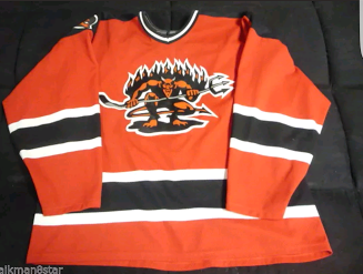


That logo is legitimately frightening. They're already not using what they're actually named after (an animal) in their branding; why not take it a step further and actually adopt a non-cartoonish devil...no, that would be awful.
-
43 minutes ago, kimball said:
He wasn't in 1994-99, but when he came back in 2002 he was -- I should have clarified that's from his 2002 stint.
Oh, I didn't realize that. Thanks for the clarification.
-
20 minutes ago, kimball said:
The Florida teams seem to have picked up a bunch of 'washed up' All-Stars over the years. Some more shocking then others. Maybe it's Florida's no income tax or the chance to play with Orlando's Shaq & Penny or Miami's Shaq & D-Wade or Big Three.
Here are some former All-Stars in Magic uniforms later in their careers (with the exception of Big Ben of course ... still odd seeing him in any uniform other than Detroit).


I don't think Horace Grant was washed up when he went to the Magic. Didn't he actually play a big part in getting them to the Finals against Houston in '95?


.jpg.f9b9d7f1d1f3fc79188be298c10ac03b.jpg)
.jpg.0d0eba998d73fa577c372b7bfeb495a6.jpg)


Players in the "wrong" uniforms
in Sports Logo General Discussion
Posted
Heck, he looks sore in this picture.