


MCM0313
-
Posts
4,368 -
Joined
-
Last visited
Posts posted by MCM0313
-
-
Sadly, it seems the 1997-2002 Falcons set never met the spear-helmet Redskins or the "look how 2000s we are" Bills.
-
This game was for the birds! Dirty Birds in their last season against bird-head Ravens, 2002:

-
 1
1
-
-

Not as rare as you might think- these sets coexisted for three years and were in the same division for two of those years, so they met at least four times. Still, Dirty Birds vs New Millennium Rams seems like a clash of two different eras, even as '90s stars Terrance Mathis and Aeneas Williams battle it out for a pass.
-
1
-
-
Dirty Birds vs. Angry Dolphins, 1998:
.jpg.3612bcff4ccf19897ae52a27b39e5ae9.jpg)
-
1
-
-
 Falcons vs. Jets, 1998, in a battle of two of the NFL's best teams that year. 44-year-old QB Steve DeBerg is being sacked by the New York defense in a game the Jets won 28-3; his presence in the photo arguably makes it even rarer and more stark a contrast between old and new (although, the Jets' unis were based on throwbacks and the Falcons were in just the second year of those road uniforms, so ymmv).
-
3
-
-
Dirty Bird Falcons vs. first-year Titans, 1999:

-
2
-
-
Just now, Matito said:
The Lions added black in 2003, and redesigned their uniforms in 2009.
Okay, so no Dirty Birds vs. Millens.
-
The "Dirty Bird" Falcons have been mentioned here before (specifically against the Brady-era Pats IIRC), but there should be a lot for them. That specific look lasted from 1997-2002 (1990-96 had less red), in a time when uniform changes were happening left and right, and then the Falcons finally changed theirs too. I'll look into it later today, but there should be pics of them against the "look at how 2000 we look" Rams, the white-helmet Jets, the "angry" Dolphins, the McNair-era Titans, and possibly the "holy crap do we look terrible" Bills, and there may also be pics of them against the "ny" Giants, the spear Redskins, the bird-face Ravens, and/or the Pacific blue Seahawks. (What about the Millen-era Lions? Did they add black in or before 2002, or was it later? I don't recall right offhand.)
-
1 hour ago, johnnysama said:
 vs
vs 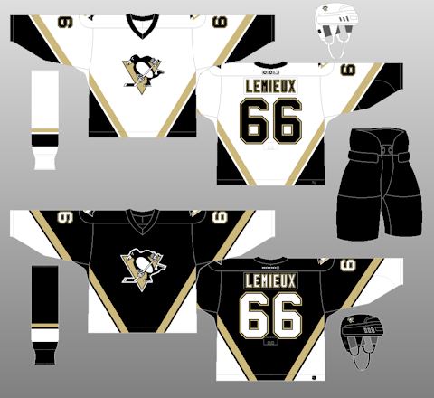
No game pics, but these two uniform sets met for only two times in one season- the 2002-03 season.
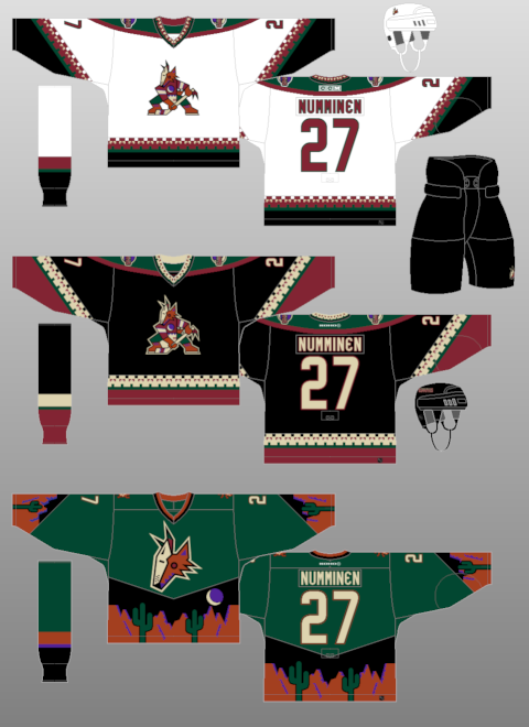
The Coyotes were still wearing "Mysterious Voyage of Homer" alts that late?!
-
1
-
-
On 12/24/2016 at 6:32 PM, M4One said:
Edwin Encarncacion playing for the other Ohio team in two different numbers.

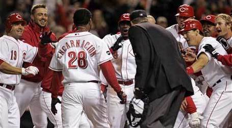
Also, he's probably more known for the number 10 he wore for the Blue Jays, but the guy also wore number 7 and 12.
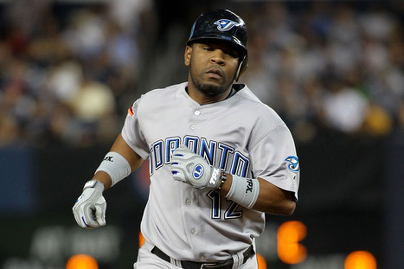

...not to mention in those awful Black Jays uniforms.
-
2 hours ago, SabresRule7361 said:
Greg Townsend- the Raiders' all-time sack leader- as a Philadelphia Eagle
He was an Eagle when I first started watching football, so that's how I first knew of him.
-
9 hours ago, MCM0313 said:
It's pretty cool in a 1996 way. I really miss '90s sports fashion, aside from the BFBS boom at the end of the decade. Heck, I miss '90s fashion in general. I had the sweetest bowl cut from 1994-97. It legit looked good on me because I have thick hair and it was still kind of light brown/sandy-colored before darkening to the current shade of brown around my 13th birthday.
Back on topic, here's an unpopular opinion: bowl cuts were cool! Of course that racist dickhead whose name shall not be mentioned had to ruin them for us...but here are some pics from back in the day, featuring yours truly:


-
1
-
-
9 hours ago, Dolphins Dynasty said:
It's not exactly on par with most of the logos in the MLS, but I still think this is a pretty solid logo.
It's pretty cool in a 1996 way. I really miss '90s sports fashion, aside from the BFBS boom at the end of the decade. Heck, I miss '90s fashion in general. I had the sweetest bowl cut from 1994-97. It legit looked good on me because I have thick hair and it was still kind of light brown/sandy-colored before darkening to the current shade of brown around my 13th birthday.
-
1 hour ago, SabresRule7361 said:
Levon Kirkland, best known as a Steeler, played for the other Pennsylvania team at the end of his career
This is a 2-fer, because Levon Kirkland, best known as a linebacker, looks for all the world like a defensive tackle here. (Yes, I know he was always big for his position, but still...)
-
4 hours ago, Rj0498 said:
a bit of a hometown thing. I think these:

were not that bad. a bit dated sure but, not as terrible as say the bills 2000s rebrand or the cardinals rebrand
Well, yeah. The Vikings can't look horrible as long as they wear purple and yellow and have the horn that wraps around their helmet. That was still a huge downgrade from the Cris Carter-era set, though.
-
2
-
-
4 hours ago, Rj0498 said:
in case you couldn't tell, I really like following themes. Here is good ole Andre Rison. sure, he went to a pro bowl his first year there but imo, I think he belongs more in a glanville era Falcons uni
I'm not sure he has a *right* uniform. I would also go Falcons first, but he was also a high draft pick of the Colts, scored that memorable touchdown for the Packers early in Super Bowl XXXI, and had a stink-'em-up season with the Browns as well (and yes, I vaguely remember him on a really good Chiefs team that couldn't win a playoff game). I may yet be missing someone else he played for...am I?
-
2 hours ago, Ben in LA said:
Even though they're decals, I doubt the league would allow that.
Indeed. They are, after all, the "No-Fun League".
-
10 hours ago, mjd77 said:
I'm actually the opposite. I'd keep the silver/green pants and keep royal, matching the road jersey to the current home.
That could work too but I feel like navy would give a better contrast. Silver-green pants with both jerseys?
-
On 12/13/2016 at 6:11 PM, bkknight95 said:
Cowboys white uni's suck. Just match the navy jersey already.
I'll expand that a bit. Cowboys should go to navy and silver-green, drop the royal, and make regular silver/silver-blue accent-only.
-
2 hours ago, johnnysama said:

Also a "Right team, wrong uniform" entry: Drew Bledsoe, who was replaced by you-know-who, spent two seasons in the Pats' current look. (Hard to believe that look has been in use for 15+ years now.... it is a modern classic.)
That look isn't horrible, but it's vastly inferior to its predecessor.
-
2
-
-
On 12/10/2016 at 2:17 PM, larrypep said:
A nice little collage here.

Montana and Favre aren't as wrong as the others. Till this January Montana was still the last QB to win a playoff game for the Chiefs.
-
2
-
-
On 12/10/2016 at 11:34 AM, DNAsports said:
I actually really like the Minnesota Wild identity. Easily the best "singular" named sports team beating out Miami Heat, Utah Jazz, Oklahoma City Thunder, Tampa Bay Lightning, Chicago Fire.
I think the Wild look good too (at least they have a unique color scheme and own it!), but aren't you forgetting about the Magic?
-
18 hours ago, larrypep said:
Hard to argue the iconic nature of the 1981 unis, they were cutting edge at the time they were unveiled. That said, while I think the original uniforms were bland and definitely similar to the Cleveland Browns, I just dig that original helmet with that simple black font outlined in white. "BENGALS". I even bought a mini helmet of that version and I'm not even a Bengals fan.
But there's no turning back, the tiger stripe helmets are awesome and has withstood the test of time.
It's kind of cool how simple that helmet is, but also kind of lame once you realize the myriad design possibilities that the name "Bengals" gives you. One of the initial helmets Paul Brown was given to look at was similar to what the team adopted in '81; kinda sad he went so plain.
-
18 hours ago, larrypep said:
Charlie Joiner as a Houston Oiler
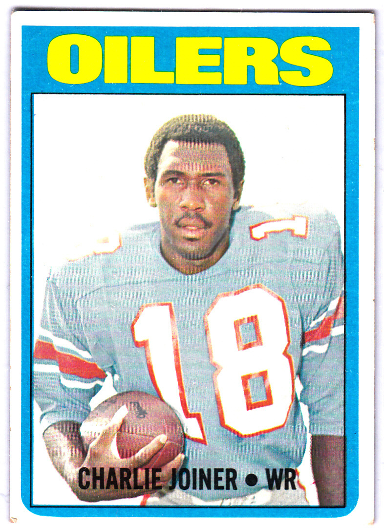

Didn't he actually have some good seasons in Houston, though?


.jpg.3612bcff4ccf19897ae52a27b39e5ae9.jpg)
 Falcons vs. Jets, 1998, in a battle of two of the NFL's best teams that year. 44-year-old QB Steve DeBerg is being sacked by the New York defense in a game the Jets won 28-3; his presence in the photo arguably makes it even rarer and more stark a contrast between old and new (although, the Jets' unis were based on throwbacks and the Falcons were in just the second year of those road uniforms, so ymmv).


Unpopular Opinions
in Sports Logo General Discussion
Posted
I hate the Steelers, but I also think they look better with their current number font than they did with the old one. Although the old one did give the whole set an old-time intimidation factor, calling to mind the Steel Curtain defense of the '70s.