


MCM0313
-
Posts
4,406 -
Joined
-
Last visited
Posts posted by MCM0313
-
-
4 hours ago, chcarlson23 said:
Here's my unpopular opinion...
I hate soccer jerseys...
It seems like every year they're switched up, and the only thing that stays the same is the ad in the front. And then I don't understand the clash kit. I mean I get why they have it, and that makes sense, but they almost never seem to share any of the same colors, or the same design.
Almost every other sport follows some unspoken uniform rules, but soccer doesn't really follow anything...
It had to be said. Thank you.
-
5 hours ago, Rj0498 said:
Only player to try his number retired by the rays and yet, this is one of his wrong uniforms

Pitt the Elder!
-
 4
4
-
-
1 hour ago, hawk36 said:
Would be a cool look (hot pink / black) for the new MLS Miami team if it ever happens.
I don't get soccer uniforms, at least most of them, but I agree.
-
Here's another one from yours truly: Hot pink (255-0-255 in RGB) is an awesome color. It's less girly to me than other shades of pink and more just super intense. I'd love to see it in the pros someday.
-
1
-
-
22 minutes ago, ltjets21 said:

That happened?!
-
1
-
-
mod edit
-
How 'bout this: Mauve (greyish-purple) is a fantastically underrated color that should really be used more often.
-
1 minute ago, NoE38 said:
To piggyback off of this, Am I the only one here who thinks green and gold is the most underrated and underutilized color scheme out there?
Metallic gold, or yellow? I like both with green, but I'm not sure I'd agree with such a grandiose statement...not with purple-and-baby-blue almost never seen, or the '90s awesomeness of purple-and-teal, or UNC-Wilmington's wonderful scheme of teal-navy-champagne...I may be getting into unpopular opinion territory myself here.
-
1 hour ago, Magic Dynasty said:
These...


...are the most overrated uniform set of all time. In fact, I would say that the modern-day version of them are much better. The gaudy, prime 90s giant sun across the front, purple, gradients on the logo, the asymmetrical shorts with "Phoenix" written on them... while the 90s in particular are extremely overrated, this takes the cake in my mind.
*ducks*
You can say these are overrated all you want, but there's no way the current ones beat them. Not in a million years.
-
3
-
-
1 minute ago, Kaz said:
Mono-navy is the best the Broncs have ever looked.
Well, there's an unpopular opinion...
-
1
-
-
On 2/18/2017 at 0:00 PM, pianoknight said:
Remember when games in general were completed BEFORE they were released? Now we get rushed-to-market product riddled with bugs that are addressed in future DLC ($$$).
It's like buying a car without a transmission. "Oh, you wanted to get into SECOND gear? There's an optional purchase for that."
I don't think rushed, unpolished releases are anything new (Google "Football Pro '99" if you don't believe me). The only new part is charging extra to get the fixes.
-
15 hours ago, Chromatic said:
I think Red and Green make a fantastic and underused colour scheme, and I don't understand the "but it looks like Christmas" criticism. Nobody rags on the Flyers for wearing Halloween colours.
...or the SF Giants, or the Orioles, or the Bengals...
Side note, I've also always thought of bright fluorescent/phosphorescent green as sort of both a summer color and a Halloween color. I guess the latter is due to early-childhood experiences at haunted houses in the late 1980s.
I agree with the point that red and green can be a good color scheme, but I think designers have to be more careful with it than with others, because it CAN look very Christmas-like (kinda like black and orange CAN look very Halloween-like; thanks, Bengals).
-
On 2/18/2017 at 4:10 AM, slikye1 said:


don't know it's an unpopular opinion or not, but i love jerseys with players' first name on.
it seems that they were disappeared in the nba, and only few players wear them in nfl, such as Derrick Johnson
You mean first initial. A very few players have had their full first names but it's always been extremely rare. I agree with your point, though.
-
1 hour ago, Echo said:
Tugnutt only played 18 games (7 regular season, 11 playoff) as a Penguin. He played the most games and had his best career numbers with Ottawa.
Huh. Wonder why I had always thought of him with Pittsburgh. I think he might've been with the Penguins in a video game I played...
-
25 minutes ago, BigEd76 said:
The original Blitz games were usually color-vs-color unless the teams had similar uniform colors (Eagles/Dolphins, Chiefs/Redskins, etc.).....which doesn't explain Arizona vs Baltimore at all

Right...I mean, both games you posted were purple against red, but the system turned one of the purples white...that doesn't make sense.
-
1
-
-
3 hours ago, BigEd76 said:
Here's another angle of Arizona's facemasks. It's weird because they're light gray on the team selection screen but are dark gray or black during on-field action. Definitely darker than what Jake Plummer and crew actually used as seen below. Also for some reason, the Cardinals endzones are dark gray instead of red.


For Baltimore, I don't remember any plans back in the late 90s or early 2000s for them to wear purple pants, and if the developer was trying to be creative, at least give them the correct purple!
Speaking of black facemasks, I just noticed Tampa Bay doesn't have them on the field.....they have pewter instead, matching the helmet. Also notice the Bucs and Vikings are each missing their sleeve patches.
How come Vikes vs. Bucs is color-v-color but Cards vs. Ravens isn't?
-
1 hour ago, BrianLion said:
Tugnutt played for like EIGHT different teams and wasnt with any one team for more than like 3-4 seasons. I'm not sure which uniform would be his "right" one?
I always thought of him as a Penguin.
-
1
-
-
3 hours ago, BrianLion said:
Blue Jackets are like the NHL poster children for player's in the wrong uniform.
Sergei Fedorov, Brian Boucher, Bryan Berard, Adrian Aucoin, Jeff Carter, Adam Foote, Marian Gaborik, Scott Hartnell, Scott Lachance, Lyle Odelein, Mike Peca, Luke Richardson, Geoff Sanderson, Anton Stralman, Raffi Torres, Scott Upshall, Antoine Vermette, Jakub Voracek, Ray Whitney, etc.
Don't forget OG Jacket Ron Tugnutt!
-
24 minutes ago, daniel75 said:
This is my favorite thread.
It's definitely close to the top of the list for me too. "Rare team matchups" is another fave of mine.
-
2
-
-
5 hours ago, MCM0313 said:
The Royals and Rays both need to own powder blue. The D-Backs need to own turquoise. All three are too conservative with these colors for my tastes.
Self-correction: Actually, if we're going to be historically accurate, the Royals need to own periwinkle.
-
2 hours ago, jmac11281 said:
I don't think this is unpopular at all. But someone really needs to own powder blue. The Royals, more or less, just dabble with it.
The Royals and Rays both need to own powder blue. The D-Backs need to own turquoise. All three are too conservative with these colors for my tastes.
-
3
-
-
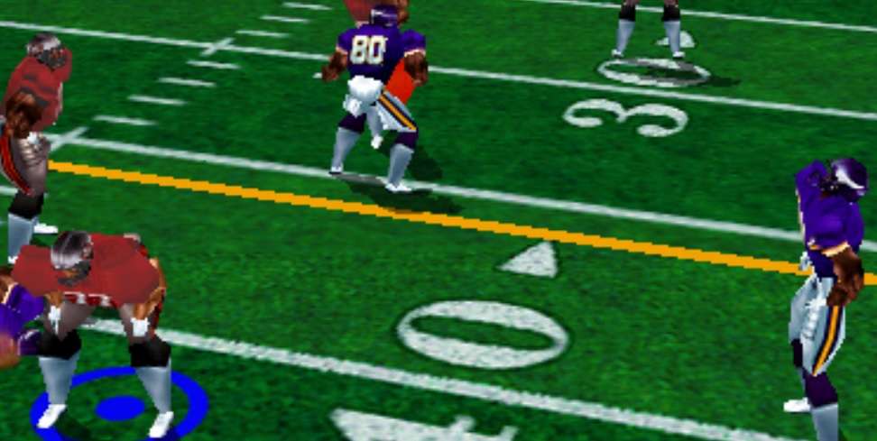
On 12/9/2016 at 8:46 PM, BigEd76 said:
Another one from Blitz '99: Arizona with black facemasks vs Baltimore in mythical purple pants!

I think those are actually grey facemasks like they really wore, but look darker because of the angle or the lighting or something. At least that is what I see. Do you have any other screenshots?
Also, that's weird about the purple pants. Was Baltimore ever supposed to wear those IRL, or did an animator mess something up (or just choose to get creative)?
-
59 minutes ago, BringBackTheVet said:
The first time I heard it was when I went away to college in western PA. Since then I've associated that pronunciation with the western PA hillbillies, along with "dahllar" for dollar, "arn" for "iron", "yinz" for the plural of you, and so on.
I think it's kind of an Appalachian thing. My dad's Appalachian though and he's always said it correctly. My mom's from Iowa and that pronunciation annoys her just like it annoys me. Most of the kids who say it like that have deep roots in the area, I think.
-
45 minutes ago, wyopokes2 said:
Was watching the NFL Network today and saw something that I had totally forgot. He's been posted before in this thread for the Allen Wranglers and the Bengals and Bills, but hadn't seen Terrell Owens for the Seahawks.


When was this? I seem to have forgotten it.


Unpopular Opinions
in Sports Logo General Discussion
Posted
This. Did you see Cincy's mininalist white Color Rush jerseys? They were absolutely fantastic. No side panels, no drop shadows, block numbers, just a few splashes of orange...yet it had the requisite tiger stripes and very much looked "right" for them, IMO.