


MCM0313
-
Posts
4,406 -
Joined
-
Last visited
Posts posted by MCM0313
-
-
25 minutes ago, kimball said:
It's really odd to see the Bad Boy-era jerseys next to the Grizzlies. So odd.
It's like foreshadowing of what was to come for Detroit.
-
 3
3
-
-
1 hour ago, TRoyConcepts said:
Then again that's with basically every helmet color
In football too. When the helmet is gloss and the jersey isn't they won't look like exactly the same color. When the helmet is matte it generally looks like a crappy helmet.
-
-
13 minutes ago, ImmortalChef said:
It's just as bad as the rest
Huh. For some reason I really like it.
-
On 3/4/2017 at 9:05 PM, ImmortalChef said:
I hate the Predators logo and identity as a whole
What do you think about this unused variation?:

-
On 3/5/2017 at 8:00 PM, Rj0498 said:
In honor of being march i will say this, I think the st pats day unis are good.


I think the Celtics' St. Patty's Day uni looks great for a once-a-year thing. It should be their only alternate. I don't particularly care for the green unis of teams whose actual color schemes don't include green. I mean, if you play physical basketball you'll probably get pinched no matter what color you wear, right?
-
3 hours ago, McCarthy said:
This was during his brief comeback with the Reds in 2001 also the same time when they inexplicably wore red hats with black sleeves. Looked awful. Amazing he was such an athlete that he could dabble in Major League Baseball.
Hated those uniforms. Deion was pretty good though.
-
2 hours ago, Ark said:
I love this

But hate this

NFL uniforms were just better back in the day
Yeah, they were definitely more aesthetically pleasing before the emphasis on making everything as tight as possible.
-
3 minutes ago, San Diego said:
I first knew him as a Laker, but he definitely did more of note with the Kings.
-
1
-
-
The Steve Nash set was the Suns' worst, with the needless abbreviation and the random grey. Their current set is their second-worst. Literally everything they wore prior to 2000 was good...
...although their main roads should be orange, not purple. Our sun is not purple. It just so happens that their sets with purple roads were designed better than those that included orange roads or alts.
-
5 hours ago, SabresRule7361 said:
I actually liked the Robo Penguin NHL unis

Were they going for a "Dark Side of the Moon" effect with the striping around the logo? Whatever it is, it's hypnotic...and starting to grow on me a bit.
-
2 hours ago, mike2sana said:
Hawks identity is hated on constantly. I feel like its a good refresh. Both the away and Alt jerseys are my favorite non-traditional jerseys in the league right now. My only complaints are the bat-winged Alt logo and i'd agree about the volt numbers on white. Overall its a pretty fun and fresh identity for the league.
I hate the mix-and-match that they sometimes do, but when the jersey and shorts match, the Hawks look decent. I like their red alt.
-
2
-
-
1 hour ago, anythinglogos said:
None of the striping matched because they kept wearing monochrome when those uniforms were intended to be worn with contrasting pants. They only really wore them as intended in the first season. If worn as intended they would still have been bad, but probably not 'undisputed worst uniform in the NFL' terrible


I actually kind of liked the road jersey, with the royal blue numbers and navy shoulder yoke. Could've done without side panels. This set had some potential, but it was too busy (thanks, early-2000s!), too dark (thanks, early-2000s!), and badly executed (thanks, Bills!).
How's this for an unpopular opinion, though (different thread, I know): even this red helmet, with its forced inclusion of nickel in the striping, was better than their standing buffalo helmet.
-
4
-
-
11 hours ago, Cujo said:
D.Rodman - Spurs
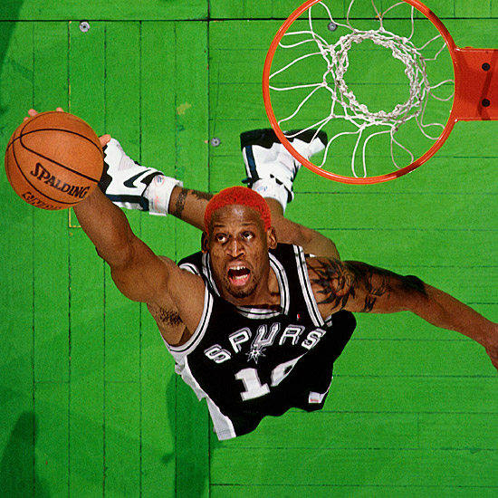
I first knew of Rodman as a Spur, not a Bull. I'd say Detroit, San Antonio, and Chicago would all be right uniforms for him, and the Lakers would be wrong.
-
3 minutes ago, chrispw12 said:
More Knicks
Baron Davis

Antonio McDyess

Keith Van Horn

Dennis Scott

Buck Williams

So the Knicks for awhile there were sort of the dumping ground for washed-up vets, kind of like the NBA's version of the 2003-14 Raiders?
-
1
-
-
29 minutes ago, Rj0498 said:
I kind of wish the angels would add more blue to their uniforms. I also think their red alts are ugly
Having red numbers on red shirts doesn't make sense.
-
7
-
-
17 minutes ago, Ferdinand Cesarano said:
I am happy to have contributed to your education.
(All of the hockey players shown in this thread are completely unknown to me.)
Haha, well, thanks. My knowledge of individual soccer players is limited to the mononymous guys, plus Rooney, Beckham, Messi, and a handful of present and former U.S. national team members (both men and women), so thanks for teaching me.
-
1
-
-
1 hour ago, Ferdinand Cesarano said:
Tony Meola never played for the Jets in the regular season. But this still counts.

Anyway, this thread jumped the shark long ago, as the recent mention of Shaq in Orlando conclusively proves. I should flog myself for continuing to contribute to it!
The standard should be Namath with the Rams or Killebrew with the Royals -- teams that no one would associate with the player without the pictorial reminder. There are only a handful of such cases.
And, by that standard, Meola would qualify, but Jordan would not, because everybody remembers Jordan in a Sox uniform that spring, especially his hit against the Cubs at Wrigley.
Had no clue who Tony Meola even was till this post.
-
1
-
-
On 2/25/2017 at 9:48 AM, insert name said:

I'm assuming that was spring training? He never played a regular-season or postseason MLB game. Most of his professional baseball career took place with the Birmingham Barons.
-
2 hours ago, Dolphins Dynasty said:
Okay, I'm going to ask... Why do so many of you refer to the Patriots' logo as "Flying Elvis"? How does it look like Elvis?
I never even noticed the hat looking like hair...the face has Elvis-like features, and the "flying" part is because the red tail can look like a wing.
-
10 minutes ago, Tanny81 said:
I really hate the "A" logo that Arizona insists on always using. It's unoriginal, awkward and doesn't mesh well at all with their "futuristic" uniforms which are pretty terrible as well. Also, get rid of the teal already! It doesn't make any of the colours pop for me and just looks like someone spilled their toothpaste on the jerseys.
Funny, I think they need more teal/turquoise and less black.
-
2
-
-
3 hours ago, ImmortalChef said:
I don't think that the new Dolphins logo is better than the old ones, I just don't think its a bad logo
If the Fins were a new team it would be okay...it's just such a step down from their previous logos. In my opinion, anyway.
-
1
-
-
1 hour ago, slikye1 said:

I like the volt on the current hawks' set.
I want to see a volt home alt. Ideally it should glow in the dark...actually all volt elements of all Hawks uniforms should glow in the dark. Go big or go home.
-
15 minutes ago, ImmortalChef said:
Some logos/jerseys I don't get all the hate for


Flying Elvis, mid-90s Hawks, and Wizards logo are all decent-to-good in my book. (I've always had a soft spot for Flying Elvis, myself.) That green Bucks jersey was just a bad design. If they'd used the same template as the white and the purple it would've looked fine.
The Dolphins' logo isn't bad in a vacuum, but it looks more like a cruise line logo than a football logo. It also bucks team tradition by removing all traces of facial expression from the dolphin, and also the little helmet with an M on it. In every other iteration the dolphin was looking at the viewer; the pre-1997 versions all seemed to be smiling, and the 1997-2012 version was fierce-looking. This dolphin has barely distinguishable facial features, no expression, and no helmet. It's also worth noting that the previous logos were jumping through the sun-hoops, giving them an active posture; this one looks almost limp.
-
1
-


Rare team matchups
in Sports Logo General Discussion
Posted
Yeah, and guess who the Canadiens' leading scorer was? Gros Oiseau...do your research, pal.