
MCM0313
-
Posts
4,406 -
Joined
-
Last visited
Posts posted by MCM0313
-
-
-
On 3/31/2017 at 7:22 PM, insert name said:
Although Faulk played but one season in these threads, I cannot think of them as "wrong" for him. The 1999 Rams' turnaround was so shocking that it was dominating NFL news that season, and Faulk's acquisition was right in the middle of that. Even if they hadn't won the Super Bowl, we would still remember Faulk in these uniforms along with the Y2K crap that's really starting to grate on me.
-
 6
6
-
-
-
37 minutes ago, eRay said:
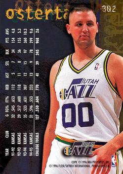
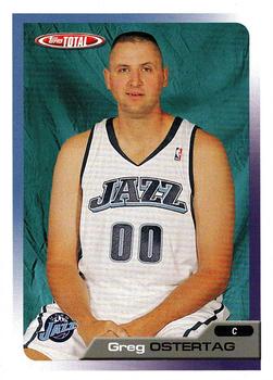
Osterfat wore the double-blues? How did that guy have such a long career?
-
 1
1
-
-
-
4 hours ago, anythinglogos said:
The cursive script doesn't really look "wrong" on Jordan to me. No, it isn't the jersey design in which he won six NBA Finals, but he first became an NBA star in this style. He was wearing cursive script when he dropped a playoff-record 63 points on the Celtics (in a loss, and in a series in which the Bulls were swept, but a record nonetheless). He's wearing cursive script on his sought-after rookie card. MJ has no wrong uniform in Chicago...well, except #12.
-
 1
1
-
-
20 hours ago, SFGiants58 said:
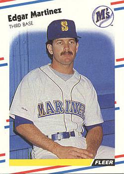
About the first: Edgar Martinez with a moustache looks weird to me no matter what he's wearing.
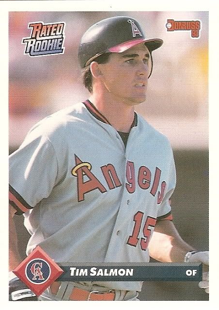
About the second: A bit off-topic, but I LOVED the design of '93 Donruss. That little thing on the bottom allowed them to use both the team's TWO main colors AND their logo on the front of the card...plus it looked kind of 3-D, almost, so that plus the gloss made it look more high-tech than competitors' cards. Shame that set is worth so little. I remember pretending the logo diamond was a button and pushing it (I've always liked to push buttons, lol).
-
 3
3
-
-
-
-
6 hours ago, BrianLion said:
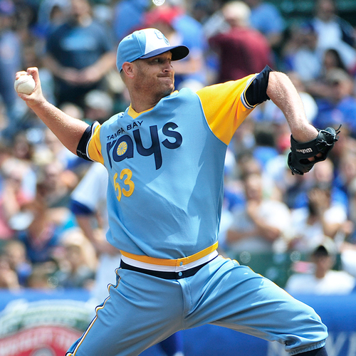
Alright I'm throwing the flag on including 3rd jerseys or one off throwbacks in this thread. You'd just get out of hand with those as every player under the sun has worn one at one time or another.
It's much more interesting (and probably the intent of the OP) to post guys wearing a team's regular uniform at that time that isnt the look you associate him with for that team.
I would agree, but seeing ANY Yankee wearing that in a color photo is jarring enough that I think it works. For non-Yankees, though, yeah, I'd say throw the flag.
-
 3
3
-
-
6 hours ago, SilverBullet1929 said:
Unveiled in November of 1995, this is what the 1998 Inaugural Tampa Bay Devil Rays were supposed to look like...
By the time 1998 came around, the caps were dropped in favor of the TB cap which was originally intended to only be an alternate cap and the purple undershirts of the home jersey were switched to black like the road undershirts. This "unused" uniform is a bit interesting because the Rays did a 1998 throwback in 2009 and wore the above caps which were never actually worn in 98. So, in an interesting oddity, this is one of the only times a team has worn a uniform for the first time as a throwback and not in the year it was actually worn. The 1998 Devil Rays uniform was first worn on the field in 2009. Enjoy that one! lol
Sticking to the 1998 MLB expansion teams, the Arizona Diamonbacks unveiled a look in 95 that was also tweaked once it got to the field in 98. Here's a pic from the unveiling...
By 98 all the jerseys were the same but all the white caps were gone and the all teal caps as well. The black cap with the teal brim was kept as the road cap and, ironically, the cap that became the home primary, the all purple cap, was nowhere to be seen in this unveiling. It's funny because we always remember the original DBacks as a purple team but looking at this picture, they seemed to be a teal team first with purple being secondary. Of note, while the cap arrangement did change, the white and teal caps may have still gotten sporadic use in 98. I haven't been able to confirm that they were dropped completely.
I have a helmet version of that white hat. Obviously that doesn't mean they wore it in the regular season though.
-
4 minutes ago, bucky_bleichert said:
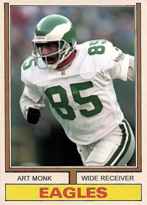
i don't own the card myself, i just used the best image of monk on the eagles from a google image search. i went back and checked for you, and the card is apparently a custom that some guy made:
http://condition-sensitive.blogspot.com/2012/12/custom-card-1974-topps-art-monk.html
"A "Card the Never Was" style custom with Hall of Famer Art Monk who spent the last 3 games of 1995 with the Eagles before retiring."
Okay, thanks. Yeah, that design didn't look very mid-90s to me at all.
-
 1
1
-
-
On 3/25/2017 at 10:46 AM, bucky_bleichert said:
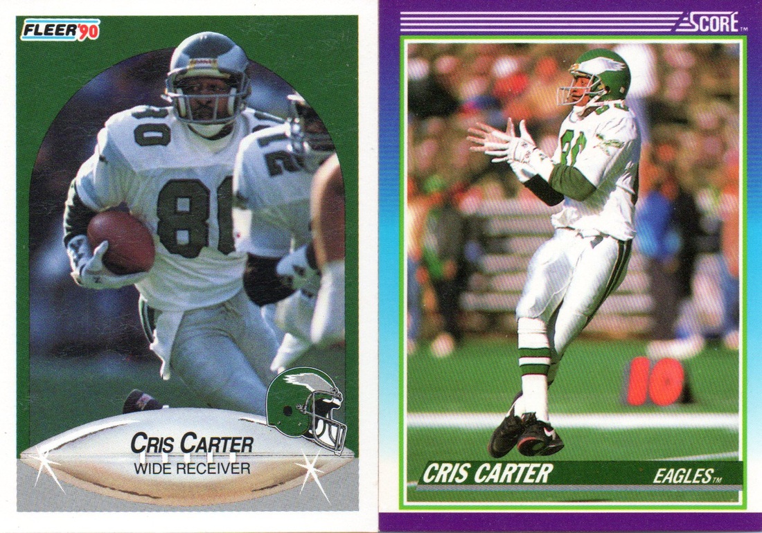
I have that Cris Carter Score card. I'm not sure whether I have the Fleer one too. Haven't seen the Monk one, though. What brand is that? It was 1995, right?
-
-
1 hour ago, San Diego said:
He made 3 pro bowl's and 3 all pros as a Charger. I remember him for being Tomlinson's full back.
It does seem as well that the five seasons he spent in San Diego were the longest time he was with one team. I guess there is a good case for what you're saying.
-
 1
1
-
-
11 minutes ago, San Diego said:
Chargers
Why? He played in a Super Bowl with Tennessee.
-
-
5 hours ago, Ray Lankford said:
One thing about the Giants' cream look is that the pants look terrible when paired with the orange jerseys.
I agree that the Giants need orange pants to go with their orange jerseys, and that this combo should be their primary road look. Great ideas!
-
10 hours ago, Dolphins Dynasty said:
IMO only the Giants make cream work. I don't know... some about cream next to black and orange looks good. It makes me think of cream soda for some reason (and I've never even had cream soda!).
Phillies' alt really works well in cream too IMO. Also, if you've never had cream soda, you need to try it. A&W has a really good one. Delicious!
-
With the exception of the one from the classic Expos' set, I don't like baseball caps with front panels that are a different color from the rest of the cap. I like white caps, but not white-paneled caps.
-
 1
1
-
-
On 3/16/2017 at 6:17 PM, kimball said:
Is it just me, or does Bryant Reeves have some weird hair? Look at how thin it is in the middle...and it's not a sign of balding, because his hairline hasn't changed a bit in retirement. Also has a few small hairless scars on the back of his head (no, not hair-transplant scars - I know what those look like and, plus, he's always had these).
-
-
21 minutes ago, Ark said:
lmao
I was hoping someone would get that.

-








Players on the "RIGHT" Team, but "WRONG" Uniform
in Sports Logo General Discussion
Posted
What's with the 67 on the ball? Was that the year the SuperSonics were founded?