


MCM0313
-
Posts
4,406 -
Joined
-
Last visited
Posts posted by MCM0313
-
-
1 hour ago, jmac11281 said:
Yes. Only 5 weeks apart too. It was a weird schedule quirk.
Huh...when did that stop? I remember when I'd play the old Football Pro computer games (think mid-90s), I'd occasionally get matched up twice in one season against a non-divisional opponent, and that always frustrated me because I felt like it was unrealistic. I think sometimes it'd be a non-conference opponent too though.
-
On 2/10/2017 at 1:02 PM, cubsfan2015 said:
Lions vs. Bills 2010
![Matthew_Stafford_Lions_Bills_Preseason[10].jpg](//content.invisioncic.com/r224567/monthly_2017_02/589e0045e0605_Matthew_Stafford_Lions_Bills_Preseason10.jpg.8e0acd06abffa6443cb27fa5bcc519d8.jpg)
"Yuck" vs. "meh."
-
16 hours ago, bwburke94 said:
The Seahawks and Patriots actually played twice that season, thanks to the fifth-place schedule.
Wait...really?
-
On 2/10/2017 at 11:30 AM, DC in Da House w/o a Doubt said:
Just curious, does anyone else pronounce crayon as "crown"? I do. I've gotten a lot of s for it. I've been bullied into just quietly muttering it whenever the rare occasion happens where crayons are brought up.
I guess it's kinda low brow, but it's just always what I've called them. Hah, low brow makes me think of: "oh yeah???" and "come here a minute".
Hey, happy Friday guys.
I'm from southern Ohio, and I'd say the "crayon-crown" divide is about down the middle here. I've always said "crayons" but I grew up with friends who said "crowns" and it annoyed me. Still hear kids say "crowns", and occasionally adults too. Being a teacher, sometimes I'll correct both.
-
42 minutes ago, ScubaSteve said:
Ridiculously photogenic bear
He's so much better looking than me that I can't help feeling buh-lue.
Okay, I'll show myself out.
-
2 hours ago, VikWings said:
The hate is more for the Dolphins Resort & Spa/Cruise Line/Travel Agency/Toothpaste logo and the minimal use of orange than it is the simplicity of the design.
Also the fact that the update left the team's logo without a face for the first time in their history.
-
 1
1
-
-
On 2/8/2017 at 2:01 PM, Bmac said:
I've seen those Blues concepts before but I just now realized the harmonica playing figure is a human in one mockup and a cat in the other.
Wow, you're right! I had just thought they were identical aside from color.
-
2 hours ago, johnnysama said:
In addition to the "Flying-V" jerseys from 1978-85 for the Vancouver Canucks, I like their replacements, worn from 1985-89:
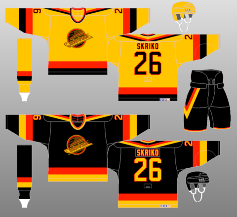
I think the red alternate of this set was pretty sharp.
-
On 2/5/2017 at 9:43 PM, Ferdinand Cesarano said:
On account of the fact that "Houndogs" is not a word, I am glad that this team did not materialise.
If you're from Columbus, Ohio (or went to school there), "Houndogs" may still not be a word, but "Hounddog's" most certainly is...delicious pizza.
-
1
-
-
6 minutes ago, habsfan1 said:
This just popped on Instagram today and I've never ever seen any of these before...
(press play)
For some reason I find myself liking the one with purple trim, but the logo of the double-blue one.
-
1
-
-
On 2/4/2017 at 3:34 AM, SabresRule7361 said:
The original New Orleans Hornets road uniforms were a thousand times better than the pinstriped version
I like the idiosyncratic originals (although the lack of pinstripes on the shorts bothers me), but this set really worked well for a New Orleans-based team. Just adding yellow to the teal-and-purple (and changing the shades a bit) kept the franchise's continuity going while simultaneously representing its new city.
-
5 hours ago, mcj882000 said:
My all-time favourite New York Rangers jersey:

Not even just the "NEW YORK" logo either, the gapped stripes - that actually match the white jersey, too - look so good on that jersey to me.
It is pretty symmetrical. I don't follow hockey all that closely - when did they wear these?
-
1 hour ago, JerseyJosh said:
Another one of my unpopular opinions - I only like the Pats set because it reminds me of the past Nets set. It's basically the football version of these:
Wow. I'd never thought of it before but it does look similar.
-
1
-
-
9 hours ago, ADW77 said:
I'll take the opportunity to post these again so others can see them.


Bombers had nice proposed unis but a weak logo, Houndogs had weak logo and mediocre unis, Stallions had good unis and mediocre logo (which definitely looks like what the Broncos adopted in '97, so maybe it would've looked better and more original in '95 than today). The Panthers have the strongest look of these five proposals, and I'd say the Jags and Stallions would be tied for second. The two that were ultimately chosen definitely make sense from a visual perspective.
-
1
-
-
13 hours ago, ImmortalChef said:
The Baltimore Bombers were a proposed NFL expansion team passed up for the Jags and Panthers

This, to me, is much weaker than the logos that the Jags and Panthers eventually adopted.
-
2
-
-
13 hours ago, ImmortalChef said:
My favorite unused logo of all time, for the Pats

Bet they sell some rock-solid life insurance there...
-
6
-
-
42 minutes ago, insert name said:
Imagine the Super Bowl looking like this.


Well, it would still have been Rams in white and Pats in blue (I know, that never actually happened with those sets so no pics), but yeah...it would have looked like the classic it was.
-
3
-
-
26 minutes ago, Cosmic said:
PLEASE say you had the laser background. Please please.
Haven't seen it in awhile, but I think the background was a bit more subdued. This was...I want to say December 1995 or January 1996. I had a laser background for some individual photos earlier, in '92 I think, but that was pre-bowl cut.
-
21 minutes ago, FinsUp1214 said:
That's probably my favorite part of the whole thing. It should've survived a whole lot longer than it did. I also like how the helmet looks with a gray face mask better than red as well.
I'll admit too, there's this sort of psychological thing with the royal blue 90's Patriots in general for me; as a young elementary school kid, Drew Bledsoe was one of my favorite players (along with Steve Young and later Peyton Manning). So naturally of course as a kid, I rooted a little for the Patriots. But then Bledsoe left, and then everything with spygate/imperial empire/deflategate and Brady and Belichick being terribly unlikeable happened and the dynasty navy Patriots are now a team I just can't stand. Thus, the idea of the Patriots and Flying Elvis in royal blue remind me of a long-ago team I used to like and a player I rooted for as a kid (and still like) rather than a team I frankly despise now. Sounds weird, but that's how it works in my head.
It's not crazy, it's just sports

Not crazy at all! The Pats ended the '93 season on a hot streak just as I was gaining interest in football. That, plus their young star QB, plus their logo, plus the fact that I had played a year of flag football in '92 for a team called the Patriots (when I went back in '94 they had become the Cowboys though), led to the Pats being my first favorite NFL team. I rooted for them during their 1994 playoff season, in which Bledsoe set a new record for single-season pass attempts IIRC, and then during their Super Bowl loss to Green Bay.
I remember trying to find NES games where I could play as the Pats. I borrowed John Elway's Quarterback from a friend but didn't like the generic red-vs.-blue gameplay or the lack of team and player names. I rented Tecmo Super Bowl and was amazed that it had all 28 teams AND their helmets AND real players! Then I got Madden '95 for Game Gear and my family got a computer for which I got Football Pro, then FBPro '95, then '96, and enjoyed playing with the uniform editors and play editors.
To complete the '90s-ness, I also had a Patriots Starter jacket, in which my bowl cut and I were professionally photographed sitting back-to-back with my next-door neighbor and flag football teammate in his Cowboys Starter jacket.
-
3
-
-
5 hours ago, FinsUp1214 said:
Two random ones:
1) Of all the Flying Elvis uniforms, this one looks best to me (even with the mismatched number color):

P.S. on that one: Flying Elvis is better in royal blue than navy to me.
2) There hasn't been a single Carolina Panthers concept that I've ever seen that has actually been an improvement. I'm especially not fond of the idea that constantly gets floated around of them in a black helmet. They're one of the best looking teams in football as is, and you're better off tweaking things around with them than doing something drastic.
Freaking love the "'Murica" pants stripe on those. It's like a non-sucky version of the Sixers' star-spangled unis from the same era.
-
3
-
-
1 hour ago, Rj0498 said:
I actually thought that light blue roads were one of the things from the 80s that never should have died. In general I like unique road unis, that's why I like the d-backs road unis
If you're referring to the darker shade of grey, the White Sox also have a darker shade than most, I believe.
-
1
-
-
How's this:
I would love to see the Royals return to light blue road uniforms instead of grey. I'd also like to see the Diamondbacks and/or Rays come up with their own take(s) on the ol' light-blue-roads look.
-
1
-
-
17 minutes ago, Dolphins Dynasty said:
I like seeing colored alternates against each other in baseball, as long as they are different enough from one another where they can be appealing to the eye.
I like seeing the A's wearing yellow shirts and wish they'd break out a road alt that also has yellow pants like their '70s look (even though I'm pretty sure that would be against current MLB rules).
-
1
-
-
4 hours ago, chrispw12 said:
To think the Dolphins passed on signing Drew Brees to sign him instead.
Wow, that was the same offseason? I wish the Dolphins would make better decisions, because they have the best color scheme in the NFL in my opinion and I'd like to see them in the playoffs regularly.
![Matthew_Stafford_Lions_Bills_Preseason[10].jpg](http://content.invisioncic.com/r224567/monthly_2017_02/589e0045e0605_Matthew_Stafford_Lions_Bills_Preseason10.jpg.8e0acd06abffa6443cb27fa5bcc519d8.jpg)


Unused Logos and Uniforms
in Sports Logo General Discussion
Posted
Interesting! Can't tell whether this has pinstripes, but the numbers and text look different in both color and (I think) font from what they ended up wearing.