


MCM0313
-
Posts
4,406 -
Joined
-
Last visited
Posts posted by MCM0313
-
-
15 hours ago, WavePunter said:
I never saw the F in either version of the logo until it was pointed out to me.. Probably on this site.. It's a picture of a falcon.. I don't need the first letter as well to help me understand that it's a falcon.. They drew a falcon, I saw a falcon, equation should've ended there.. This subtle/abstract stuff has gotten out of hand, and the falcon/F is partially responsible
Really? I mean, the original logo had the F too, and that was mid-60s, and I don't recall a lot of other 1965-2000 logos with similar subtleties, except in baseball. I think it's more a modern thing, period. The process of choosing a logo is more involved, so the process of designing and presenting a logo has become more involved as well.
-
 1
1
-
-
11 hours ago, SabresRule7361 said:
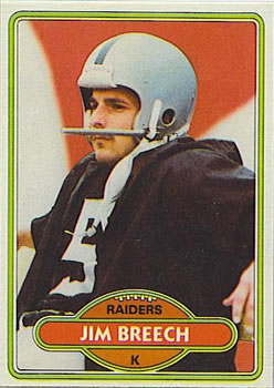
Jim Breech, who spent 13 seasons with the Cincinnati Bengals, kicked one year for the Oakland Raiders in 1979
What weird logo-less card is this?!
-
3 hours ago, OnWis97 said:
I love the 1997-2002 look, too. If the old falcon needed an update, it needed a different update. I have to admit that it took me an embarrassingly long time to recognize that the logo was a side view of a falcon in flight with its wing pointed down. I'd always thought it was more of an abstract design. Once you see it "in flight" it makes sense. I think the right update would have been to make the "in flight" aspect slightly more obvious.
I never had a problem seeing the falcon in profile in the old logo. It seemed to me to have come from the world of the old Pink Panther cartoons, where the characters would skulk around in silently nonchalant fashion to a bluesy tune. It was that "cool" in my eyes.
That said, I didn't see or conceive of the letter F in that logo. The 2003 update made that connection a lot clearer.
-
1
-
-
2 hours ago, Jimmy Lethal said:
The old Atlanta Falcons logo was awful. Their current logo is a gigantic improvement.
I consider the old Falcons logo the epitome of a "less is more" look, and when you combine that simplicity with a plain black helmet and sharp - but not overdesigned - uniforms, you have what I consider a classic look - in my opinion the Falcons' 1997-2002 look was their best ever. Mine is probably an unpopular opinion too.
-
4
-
-
On 7/12/2017 at 9:54 AM, RichO said:
Anything but red or white is wrong on MJ.
Really? I was under the impression that he was the biggest reason they wore the black alts with red pinstripes so often. I thought those were his favorites, kind of like LeBron and navy blue.
-
8 minutes ago, JosiahWVU said:
I agree that it does not look good as they use it, but thy would never take navy blue out as the primary color. Old gold and blue are the state colors, so that would probably not happen.
https://en.wikipedia.org/wiki/List_of_U.S._state_colors
I would not be opposed to a black and old gold(yellow) uniform worn once a year in a night game, though. Such as these:

Yellow is not old gold. Old gold is metallic, like what the Saints wore till the league started moving toward pale, dull gold for some reason.
Also, those helmets are grey.
-
1
-
-
On 7/6/2017 at 0:04 PM, BrianLion said:
technically I think he played just as many seasons with the Wizards as the Wolves, so you could make the claim there as well.
NBA Jam breaks the tie.
Also, in that Wizards photo, Jordan looks like he's about to call Laettner an ambulance. lol
-
4 hours ago, sleuthpanther said:
Speaking of Black and Blue, I thought West Virgina using black on football uniforms was a good idea. The execution was poor just putting it on the shoulder caps, but if done right it's unique in the FBS and makes sense in the coal miner, mountaineer identity.
It makes sense in terms of their nickname but it's hideous. If they want to emphasize coal-mining they should make black an official school color and phase out navy blue.
-
1
-
-
17 hours ago, kimball said:
Buuuuuuut ... he was an All-Star with the Hawks. I would say Hawks.
Wow, I didn't know he was ever an All-Star. Good catch.
-
1
-
-
5 hours ago, KRZYBDGRZ said:
The only right one is duke


I'd say if Laettner has a "right" NBA uniform, it's Minnesota's. That was where he started his career and he wad a starter on that team for several years. He was even in NBA Jam as a Timberwolf.
-
1
-
-
1 hour ago, dont care said:
You don't recognize mike modano?
Name, yes. Face, no.
-
Not being that much of a hockey guy, I don't recognize any of those faces. I stand by my previous misstatement, whoever they may be - the Stars' current set may be wrong historically for these guys, but aesthetically they are SO right.
-
On 7/2/2017 at 1:28 AM, chcarlson23 said:

Those beauties can't be wrong for anyone.
-
1
-
-
4 hours ago, oldschoolvikings said:
You don't miss the creamcicle Bucs?
Well, sorta - but that's what the throwback is for. They've established a red primary identity over the years, and I think they need to keep it that way as long as pewter is the secondary. I don't think creamsicle orange is a strong enough color to work as a primary with all that dark pewter. JMO
-
1 hour ago, oldschoolvikings said:
Another Buccaneers' concept. This one gives them the chance to use a throwback;
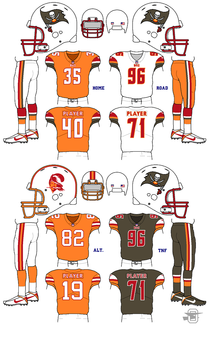
Ooh, all-pewter alt, I like. I'd make their primary home red though.
-
On 6/26/2017 at 0:43 AM, BelfourThibault said:
I actually really like the Cowboys "green" pants
Ditto. I think they'd look kinda dull with just navy and silver.
-
1
-
-
On 6/21/2017 at 10:43 PM, Top Shelf said:

Marc-Andre Fleury, Vegas Golden Knights
So they're not wearing greenish-grey sweaters like they were originally going to?
-
45 minutes ago, msubulldog said:
Why don't the teams that wear powder blue tops pair them with powder blue pants?
Right?!
-
22 minutes ago, oldschoolvikings said:
Yeah, IMO "just OK' is about as good as a color rush uniform is gonna get.
As for the alt., it's a throwback to this;

I knew it was a throwback; I'm just not crazy about the design. lol
-
1
-
-
16 hours ago, oldschoolvikings said:
Regular home and road look good. Not sure about the alt or the Color Rush.
-
1
-
-
43 minutes ago, KittSmith_95 said:
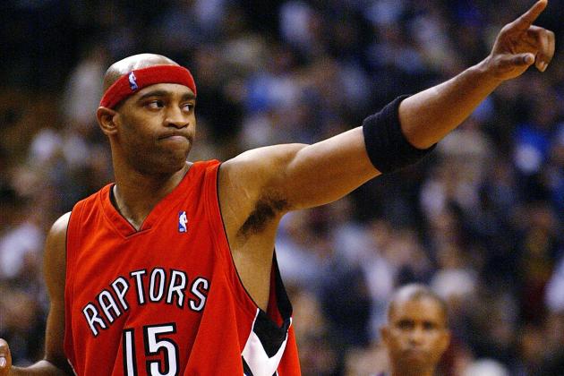
Carter in the Red Raptors Set.
P.S. Now, can someone correct me if I'm wrong..... but didn't Peja Stojakovic wear the Powder Blue Kings set? I can't find any pics of this, but I swear he did for one year or preseason.... if someone can help me find a picture, it'd be much appreciated.
The jersey being worn by Carter there looks pretty good, and I didn't otherwise care for that set.
As far as Peja goes, are you talking about him wearing the baby blue set as a throwback? He might have done that, but he was definitely not in the NBA during the 1980s.
-
1 hour ago, Echo said:
86 with the Raiders, and 81 with the Panthers and Cowboys.
Thanks.
-
17 minutes ago, Echo said:
I get where you're going with this, but 25 was Ismail's number at Notre Dame.
...and, um...85 with the Raiders? 86? I forget. Brown was 81, Jett was 82. Amazing that they never got farther than they did with a Jett AND a Rocket! lol
-
On 5/19/2017 at 5:38 PM, KRZYBDGRZ said:

I think this is kind of a borderline case. Same franchise, different team name...kind of a tricky one.


Players in the "wrong" uniforms
in Sports Logo General Discussion
Posted
That's bizarre. I know this is a topic for another thread, but do you know why this was? Topps was always the leader in cards; it's odd to think that they might have lost their NFL license, even for just a year.