


Carolingian Steamroller
-
Posts
2,498 -
Joined
-
Last visited
-
Days Won
11
Posts posted by Carolingian Steamroller
-
-
Dude, the Bengals own social media team is using pictures or mockups of a white helmet with black stripes on the verified Twitter account of the team.
Either that's the style they're using or they've left the marketing department in the dark.
-
 3
3
-
-
7 minutes ago, willforgetmylogin said:
It is black with white stripes. I'll bet you a thousand dollars.
EDIT Where's Canzman at?
Someone should tell the Bengals social media team then:
-
4
-
-
Someone already pointed out the inaccuracy of the Cincy leak. So apologies for double tapping that one.
Furthermore, the hemming and hawing over which leaks are accurate or not accurate or who really has "a guy" is played out on these boards.
This isn't a contest and all of this comes out eventually, it's not like a secret menu at a restaurant. Nobody dorky enough to be on these boards should care about clout or who has better or worse information.
-
2
-
-
15 minutes ago, willforgetmylogin said:
You said Cincinnati was going with black with white stripes. Not white with black stripes.
-
5
-
-
17 hours ago, LA Fakers+ LA Snippers said:
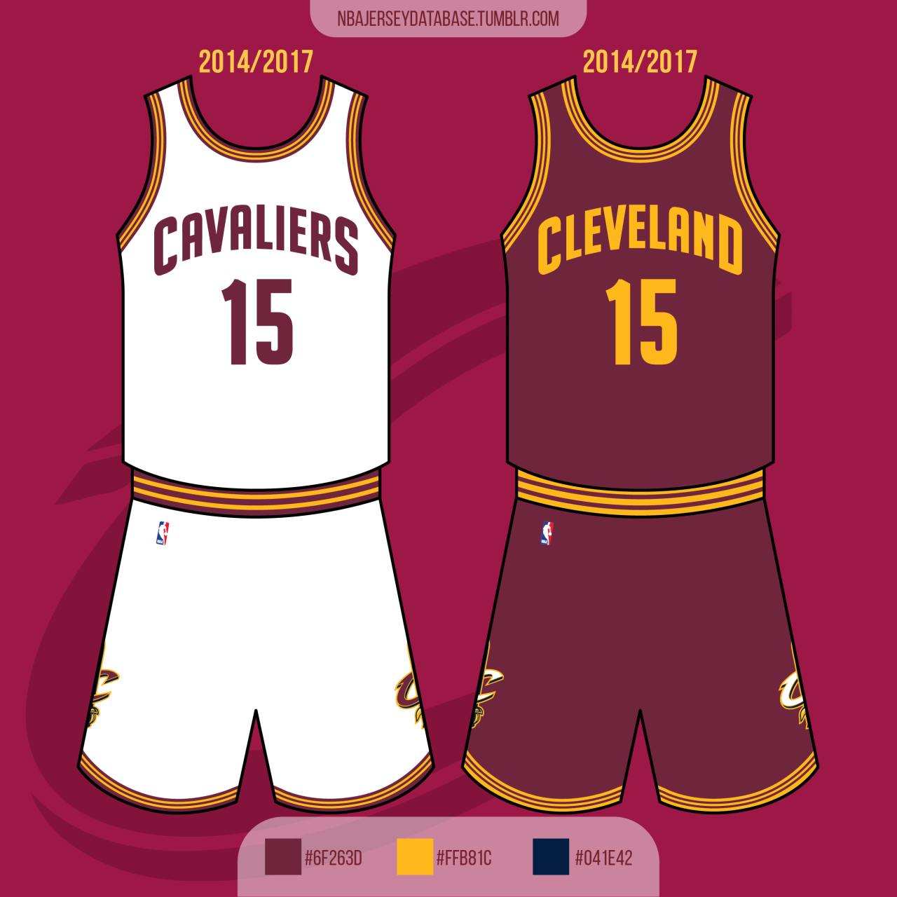
And Cleveland just happened to release their set when the league switched uniform providers? 5 other teams changed as well, and they didn't have the same situation as the Cavs. I don't know whether the team wanted to switch because of a new template, or the template forced them to, but the change defintely involved the Nike switch.
I'm sure it was viewed as a good opportunity. A lot of teams do that when a new manufacturer or template comes in (e.g. Reebok Edge in the NHL) even though they can easily carry over their existing design.
What I find dubious is the idea that the Nike template necessitated the changeover. (Perhaps I'm misreading the opinion? I've done that before.)
The Cavs could have easily carried over their 2011-2016 design over to the Nike template but chose not to. There's nothing in the current template that would have prevented them from using that exact design, which leads me to suspect they made the change because of independent reasons.-
2
-
-
38 minutes ago, LA Fakers+ LA Snippers said:
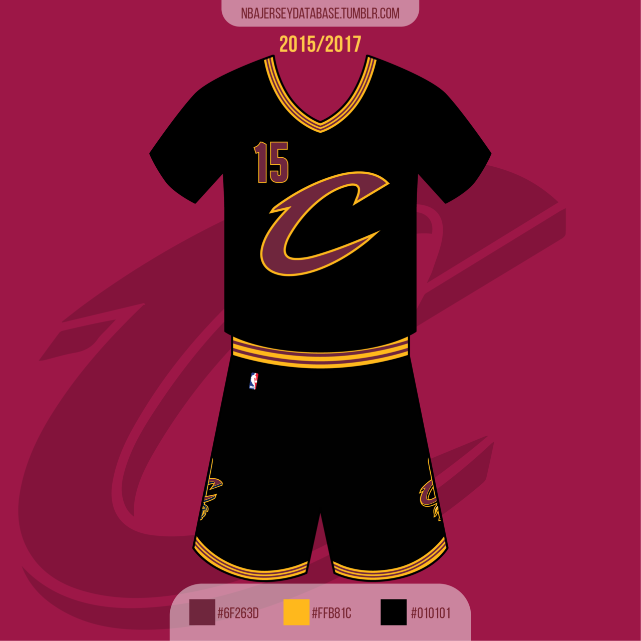
My theory is that these, along with the Wolves, Clippers, Nuggets, Pacers and Suns' jerseys in 2017, were impossible for Nike to create on their new template, so they just made new designs (which is how we got the last Cavs set with bevels and stuff).
No I disagree on this one. The pre-Nike Cavs design isn't that different from the Celtics and Nets which are pretty similar in their use of striping and minimalist aesthetic. I don't see anything in the current Nike template that inhibited that design.
My suspicion is that the Cavs had long been planning a redesign based on the theory that their 2011-2016 set was viewed as the post-Decision hangover uniforms and were looking for a do-over after a few failed title runs once Lebron came back.
Of course, the team didn't count on winning a title in the year immediately before the change was scheduled to happen.
-
1 hour ago, LA Fakers+ LA Snippers said:
If you look closely, there is trim on all 3 jerseys, they just are the same color as the base. It won't show up on TV, but it's something.

They took this identity and stripped it of everything that made it good:
If you look carefully at the high res photos of the actual uniforms the sublimated piping doesn't have quite the same proportions. The 2010's design had stripes that were 1-1-1-1-1 and this looks more like 1-1-3-1-1, sort of Northwestern-stripe-y.
https://www.nba.com/cavaliers/jerseysShorts seem tailored a little shorter than typical. I wonder if there's a template change coming down the road for the NBA and this is the Cavs getting ahead of it.
-
1
-
-
1 hour ago, Sport said:
Like the Jazz they've chosen non-design.
It's really interesting that the Jazz and Cavs both went with de-colored details from previous designs. That's a trend in itself.
-
2
-
-
Original Uni-Watch article on the issues around the Dodger "B"
https://uni-watch.com/2011/05/07/hats-off-to-brooklyn-part-ii/
-
1
-
-
I remember Uni-Watch did a whole article on how you couldn't get the OG version of the Dodger "B" for years and years apart from when it would show up on the white/pinstriped cap sold by American Needle in the 90's.
So it's a weird part of uniform lore that's just never quite gotten fixed.
-
1
-
-
1 hour ago, Anubis2051 said:
It was 1956 I think. Right before the move to LA, making the Boston-style "B" the last cap logo for the Brooklyn Dodgers that was officially on record.
-
20 hours ago, FiddySicks said:
TBH that’s why I like that particular hat so much. It goes with the home set almost as well as the red cap does, and really shows off the versatility of that home uniform set. It’s nice because it feels like the Cardinals have an entirely different alt set without even changing the home uniforms, which are iconic enough. It kind of gives you the best of both worlds.I kinda feel like the Cardinals should wear the navy blue cap with the cream alternate and just combine their two home alternates into one look.
Somehow I feel like the Cardinals work best when they don't have too many unique on field looks.
-
1
-
-
7 minutes ago, Brave-Bird 08 said:
The issue is the disagreement between the silver trim inside the numbers and the lack of silver trim in the shoulder and pant stripes.
I think the most general consensus is the striping pattern should be reversed on the road jersey and the silver trim needs to be removed.
Currently they look like a high school team.
That sort of bugged me when it came out but I've come around on the silver. Maybe, maybe I could see switching the position of the silver on the numbers to the outer rather than the inner outlining but that's not a deal breaker for me.
I'm not sure what direction they're really going with the blue pants. Sometimes they're rolling with plain white socks, which looks good but they also have the navy socks with the red stripe, so not sure if there's a white equivalent.
Overall, I think the post 2020 uniform looks quite good and returning to the Brady-era pattern of navy over silver at home and white over navy on the road definitely works for me.
-
1
-
-
43 minutes ago, gosioux76 said:
You're absolutely right on this point. But it's also worth noting that, for the most part, all of those looks are substantially different from one another. There's no continual thread between them. With maybe one exception, they could be looks for completely different teams.
The Hawks have had some really appealing themes over the years, too. But most of them appear built off the same foundation. That's where the Jazz differ.
Right, and therein lay the rub.
In particular, the red rock design, though sharing fonts with the base design, was dramatically different in color tone and ornamentation from the base design. It did feel to me like at some point, they needed to pick a lane (see e.g. pre-2020 Brewers).-
4
-
-
Just now, gosioux76 said:
Playing Devil's Advocate here, but if the underlying brand was strong enough to begin with, there wouldn't have been a need to continually tweak the team's look.
As much as I disagree with the direction of this re-brand, I don't think the intent was misguided. You ask five people on this board which look works best for the Jazz, you'll probably get five different opinions. The new owners were taking a swing at addressing they. They just missed — badly.
This is an interesting insight.
You might be right though I would add that the Jazz suffered at the time for an embarrassment of riches. They had several themes in their brand that were all, on their own, really very nice: the basic set, red rock, 90's, classic 80's.
-
5
-
-
42 minutes ago, pepis21 said:
Yes that true but Bone (by most of community) was and still is trashed to the max compare to rest of the set. To be fair Rams look is easier to fix than Jazz because Rams needs few tweaks here and there and Jazz need a new full re-brand.
I don't think there's a good argument about a full Jazz rebrand since the new uniforms are broadly just a recolored version of the previous uniforms. They still have the angled stripes under the arm and on the shorts. The font is very similar (changing serifs but little else) and note logo is unchanged.
-
2 hours ago, CaliforniaGlowin said:
Not anymore they're not

Nets do have a grey third uniform. (Called Concrete Grey on Lockervision).
-
1 hour ago, McCall said:
Those are alternates. Their primary home and away (sorry, association and icon
 ) are just black and white.
Right, and also they're using grey/charcoal (not really silver) as the base color of an alternate jersey in GFGS fashion and not in any details/piping on the primary home and away uniforms tells you that it's not really the team secondary color like it is for the Spurs.
-
Just now, TaylorMade said:
The Yankees?
Midnight blue.-
5
-
-
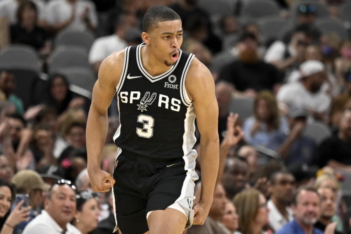
2 hours ago, the admiral said:
intentionally obtuse alert, the Spurs are for all intents and purposes a black and white team, they wear black jerseys with white details or white jerseys with black details, you knew where I was going and pretended not to
I suspected there was a Spurs reference there but wasn't 100% sure so just genuinely obtuse but I do not count the Spurs as black and white team because silver is very prominent. There are silver side panels on the black uniform, silver piping on the white uniform, and an entire silver (yes, I know its grey because of the fabric) uniform.
I consider this to be fundamentally different from a strictly black and white team like the Nets.
Indeed, the Nets are the only team in the Big Four of North American sports to wear strictly black and white like Juventus or Siena.-
7
-
-
12 hours ago, the admiral said:
The Nets' rebrand was terrible. There shouldn't be more than one black/white team in a league, the Nets B Brooklyn logo remains terrible, and the minimalist design of the uniforms was a poor fit for a team that had always been just a little bit creative with what they were doing (vertical letters, pseudo-tie-dye, netting). Of course, that matters less now that NBA teams just invent new uniforms every month based on something a graphic designer saw on the way from his condo to the arena. I hated every bit of it.
Vehemently disagree.
The Nets are the only black/white team in the NBA and I feel like they did it right by focusing on the details. The herringbone pattern on the side stripes are great because its a detail that you can only really see up close but was matched by the original floor. The extra stripes on the collar, arm holes, and shorts break up the stripes. The font is well sized and spaced. They also given us gems like the charcoal retro BKLYN jerseys and the Notorious BIG alternates (one of my favorite things to come out of NBA uniforms in recent years).
-
4
-
-
Here's a crazy thought, two years from now the Patriots will have worn the Flying Elvis (1993-2024) for longer than Pat Patriot (1961-1992).
-
2
-
 5
5
-
-
On 6/25/2022 at 3:10 PM, Crabcake said:
And blowing up that logo to 3x the size of a normal sleeve logo and placing it on the shoulders instead of the sleeves only exacerbates the issue. I continue to fail to see what everyone else seems to see in the Bledsoe-era uniforms.
Sometimes a convention of design can be broken so thoroughly and absurdly that it comes back around and becomes awesome.
The Bledsoe era sleeve Elvis's are comically oversized but that's also what makes the cool.
-
9
-
-
From reading the press releases, it looks like the Jazz front office wanted to simplify the brand and go minimalist.
There are no black and yellow teams in the NBA, despite that being a fairly popular scheme (Steelers, Penguins, Bruins..). The Salt Lake Bees wear black and yellow in the same market. And the Jazz have worn black and yellow in different combinations over the last two seasons.
-
1
-


/cdn.vox-cdn.com/uploads/chorus_asset/file/22784552/usa_today_16475414.jpg)
/cdn.vox-cdn.com/uploads/chorus_asset/file/22795881/1232097931.jpg)

NFL 2022 Changes
in Sports Logo News
Posted