-
Posts
2,474 -
Joined
-
Last visited
-
Days Won
9
Posts posted by Carolingian Steamroller
-
-
2 hours ago, DCarp1231 said:
I am disturbed by how much I like the blue over bone combination. -
1 hour ago, DCarp1231 said:
It's certainly close. I like the GB/CHI in Lambeau matchup because of autumnal blend of yellow, orange, and green with cool navy blue. Raiders and Chiefs is terrific in no spall part because the white elements are similarly minimized. Maybe third on my list behind this one because the Chargers have the softer powder blue:

If we could get this consistently it might challenge for the top spot.

-
 7
7
-
-
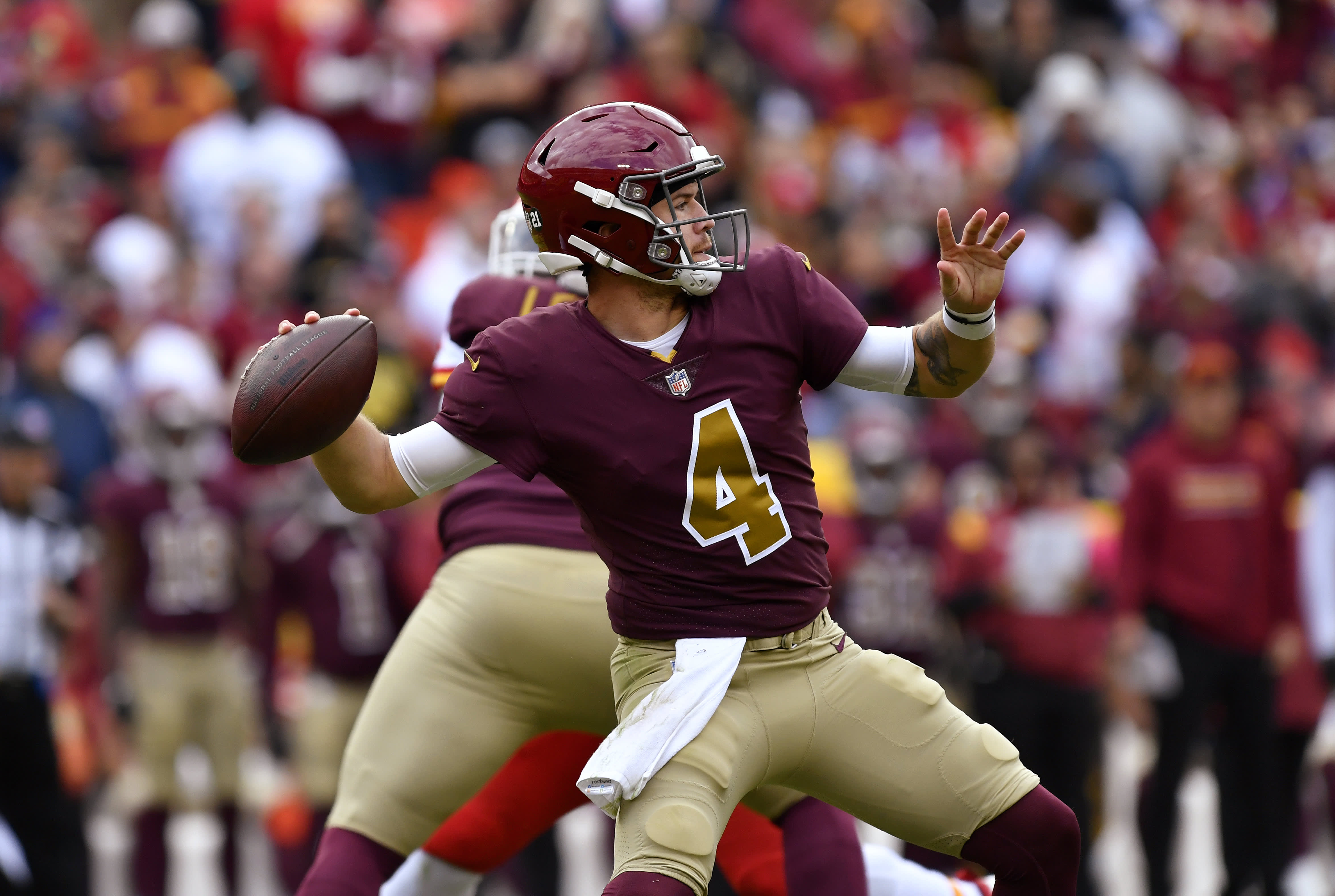
I'll be honest, the new Rams set has really grown on me. I think the yellow could be little more athletic gold and less highlighter but the general layout, I kinda like.
-
 8
8
-
 1
1
-
 1
1
-
-
While we're discussing Green Bay... Don't change a stitch.
As much as I hate that team, this is best looking game every single year.

-
 10
10
-
 1
1
-
 1
1
-
-
-
I can understand people down ranking the Bears because of the orange alternate. That said, this is still the best in football to me:

-
 4
4
-
 1
1
-
 1
1
-
-
16 hours ago, tigerslionspistonshabs said:
That looks EXTREMELY Chicago Bulls.
If someone gets a hat trick, all fans in attendance get suspiciously free "pizza."
-
When it comes evaluating a uniform change, think of it this way.
You turn on the TV. Team X is wearing the new uniforms. You flip the channel and when you flip back the team is wearing the previous uniforms.Are you happy or sad?
-
1 hour ago, PurpleHayes said:
Ice?? In Houston??
Maybe in a Coke.
-
Welp, I'm going to bed.
-
 3
3
-
-
-
3 minutes ago, trekbkr said:
"Why don't you just make 10 louder, and make 10 be the top number, and make THAT a little louder?"

-
 1
1
-
-
3 minutes ago, oldschoolvikings said:
I'm not necessarily saying that gray facemasks should count as a team color, I just think you'd be unwise not to consider that idea that a team might decide to claim it as an excuse to add gray to the uniform. The colts built an entire black uniform (poorly) by changing the Nike swooshes on the white jersey only to black. Speaking of the Colts, in an awesome troll job, they made "Facemask Gray" one of their official colors... I like to fantasize specifically to mess with the people on the site who cry like babies every time there's a gray mask when there's no other gray in the color scheme (here you go, whiners... "Facemask Gray" as an official color).
I don't want to see this supposed Vikings' alt, because it will suck, but I have no doubt that NFL teams will gladly break any "rules" they want and bend the language to make it happen. As usual.
Sure you can do it retroactively. You could do anything you like going forward.
I would just say up to this point the Vikings have not had grey/silver as a color.
-
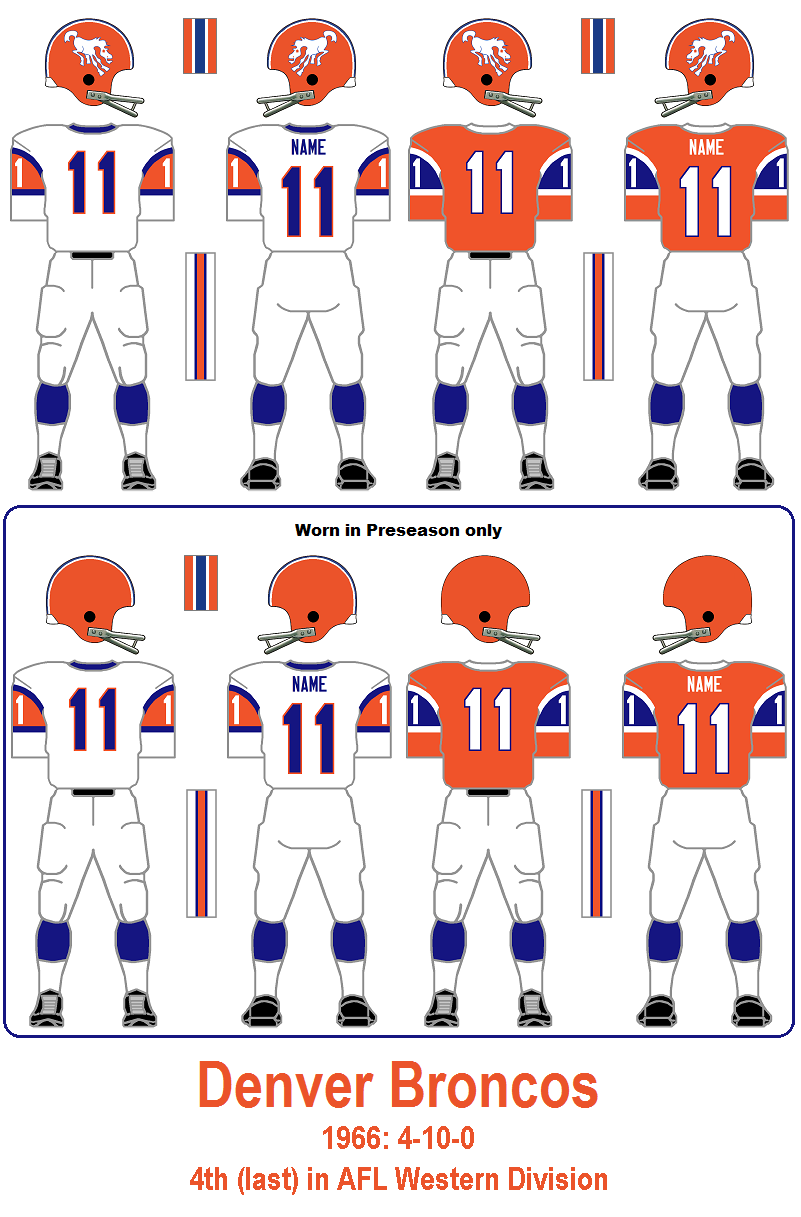
It looks like at some point they were trending towards a full 1966 throwback but cut it short.

Literally, the bottom of the sleeve striping got cut off. I wonder why they didn't opt for just this? You'd still get the Avalanche-style peak but the stripes would show more clearly.

And if you wanted to throw in a classic white/orange/white helmet stripe and a white facemask, well I wouldn't complain.-
 17
17
-
-
Just now, MCM0313 said:
That worries me. Of course, I’m sure the pants and socks are officially made to be mixed and matched, so we may occasionally get other combos than what was shown. But, yeah, the HURR DURR emphasis on monochrome and
 is definitely there.
I'm very opposed to any white socks, white pants, color jersey combination (Pat Patriot throwbacks included).
I've gotten used to the leotards in team colors so it doesn't bother me.
-
 3
3
-
-
The pants and socks color are the same in every example shown except the white jersey/orange pants combo.
-
Just now, oldschoolvikings said:
Why don’t they?
When it comes to grey facemasks, that was just the original color of the material from the manufacturer, kind of like how we don't count the silver from the chinstrap buckles.
That changed when the first colored masks became available and teams could opt to move away from factory grey.
The Cardinals in 2023 are the first instance I've seen of a team trying to retroactively add that facemask color to their overall scheme (admittedly they switched the facemask color to silver from grey to pull that off). -
-
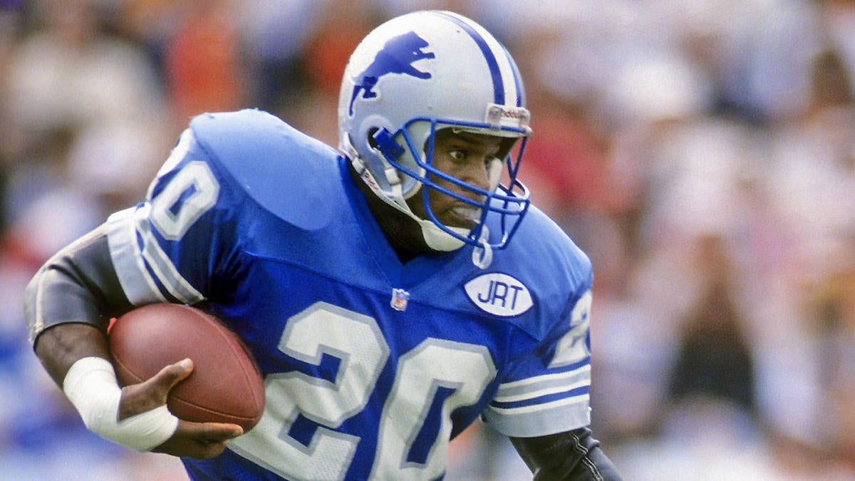
Having digested the Lions for a few hours, here are my thoughts:
The home uniform is nice. I feel strongly the Lions should wear silver numbers. I thought it was a major bonus in their previous set. It invokes the 1930's set which is the best look they've ever had. So going back to white feels like a step back even though so much about this home design really works.
The stripeless pants (white, blue, black) make me sad. They aren't aesthetically bad per se but I don't see the reason to worry about making sure the stripes all match. They don't match across every on the home uniform, so just put the appropriate stripes on every element.
The black should not have come back. I don't why it's back and if bringing it back is why the blue pants have no stripes it definitely shouldn't be back.The new facemask is fine. I will miss the silver ones though. The Northwestern stripes being gone kinda bugs me. The Detroit Lions have had Northwestern stripes in some form or another since 1961 and its a little sad to see them go even if the overall look is very nice.
Overall, I think this is pretty good but I'm going miss the previous set.-
 1
1
-
-
18 minutes ago, Chi-Tex_Kidd said:
I think that the last Lions set is the best one yet (sans white yoga pants) and this set removes almost everything that the last set improved on. First I loved how there was almost no white because it was unique and the silver and Honolulu really popped. Also the number font was great and really evoked some sweet old car imagery. Finally the beautiful striping has been torn down what once was great classic NorthWestern stripe has been turned into some weird half breed ugly looking stripe straight out of 1983. Finally the fact that the black blue and white pants have no stripes is absolutely appalling and the last set achieved stripes on its primary pants(again ignore those horrid white yoga pants) and that in all is why I believe this is a downgrade and also why I think the last set was the best or at least tied with the Barry Sanders unis. Enjoy.

I don’t disagree with much of this.
New set is nice but the old way fit my personal preferences better
-
My bold take, every successive Lions uniform since 2009 hasn’t been as good as the one before it.
-
 2
2
-
 1
1
-
-
-
Just make the numbers on the blue jersey silver so I can stop thinking about it.
-
 1
1
-
 2
2
-
-
The white jersey has blue numbers with blue dominant stripes while the blue jersey has white numbers with silver dominant stripes.
No don't like the look of that.
-
 1
1
-
 1
1
-
 2
2
-
 1
1
-


/cdn.vox-cdn.com/uploads/chorus_asset/file/22639733/1176673663.jpg)


/cdn.vox-cdn.com/uploads/chorus_image/image/71385239/1358680721.0.jpg)


/cdn.vox-cdn.com/uploads/chorus_image/image/72805603/1752994591.0.jpg)


2024 NFL Changes
in Sports Logo News
Posted
I might put it top 10.