


Carolingian Steamroller
-
Posts
2,474 -
Joined
-
Last visited
-
Days Won
9
Posts posted by Carolingian Steamroller
-
-

I don't have any issues with the Chargers. I think it's a great design and the flaws are pretty minor.
If there was one thing I'd be curious about, it would be using a darker shade of blue as the outline color on the bolt, just as they had in the 60's. (and maybe also ditch the outlining on the numbers)
-
 6
6
-
 2
2
-
 1
1
-
-
1 hour ago, aawagner011 said:
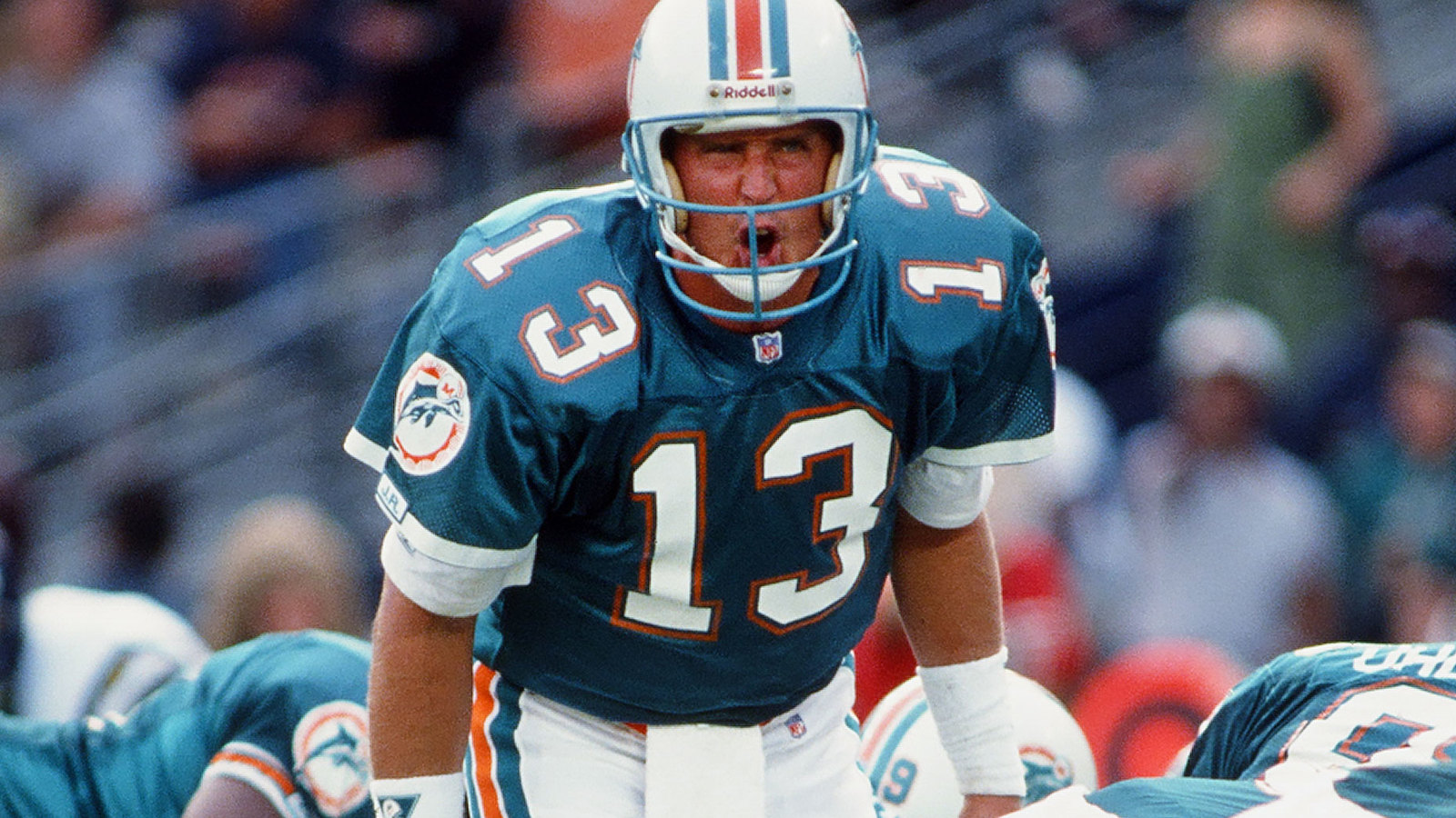
While a new logo would be nice, I still have gripes with the current uniforms. They look like generic Dolphins uniforms if a film crew couldn’t get the licensing.
There are some positives here. I love the updated colors. I also love how they dropped the dark blue several years ago. However, I think that while aqua should be the main color (besides white), the current uniforms have too much aqua.
Look back at any Dolphins uniform, up until the 2013 rebrand. They all featured a prominent orange stripe down the middle of the helmet. Not only that, but they all featured a stripe pattern with white breaking up the colors. It just doesn’t feel right to see such a thick aqua stripe with only a little bit of orange. Dropping the navy years ago definitely fixed that a bit, but it still feels like the off brand Dolphins.
Notice the width of the white stripes (spacers?) on the current throwback helmets verses the old version. The current throwback spacing is a lot more equal with more white in between the aqua and orange stripes.
I think that just looks better than the original. Maybe it helps keep the colors clean against the backdrop, but to my eyes it looks better.
-
1
-
-
20 hours ago, ruttep said:
Told you so.
Ebbets Field Flannels remains unbeaten.
-
6
-
-
2 hours ago, Anubis2051 said:
I can never tell what's Han and Leia's theme and what's Marion's theme...
You'll just have to watch Raiders of the Lost Ark and Empire strikes back to back until it clicks.-
1
-
-
I once read that Gritty so successfully embodied Philadelphia because it somehow seemed to nail the idea of Chaotic Good on the matrix.
Not sure where the Phanatic falls in.
He'll pull down your pants but he won't eat the rich, is that Neutral Good?
-
18 hours ago, ruttep said:
This was that uniform at its most tolerable (when they promoted it to home status because the primary design was so horrible):
You know I thought so at first too but now, especially given the Browns employ the knicker looks elsewhere, I think that added too much orange. Going with the brown socks conveys that this is a true curveball look for the team.
Anyways, I liked it, would be nice if it came back.-
3
-
 1
1
-
-
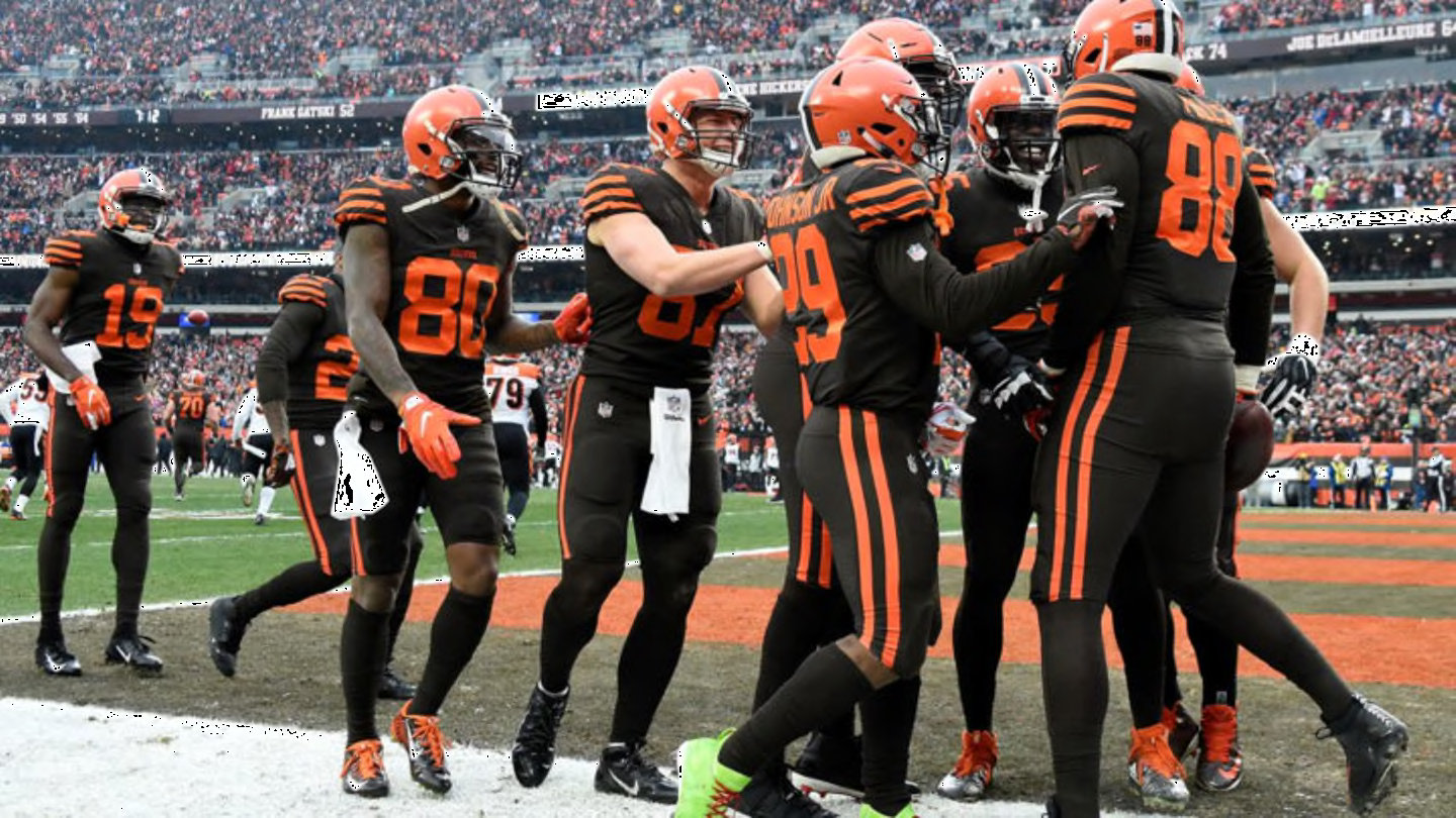
6 hours ago, MJWalker45 said:
Officially they still do, but they are fourth choice since they've added the white helmet.
Wore the mono brown look three times in 2022.
I miss the stripes. Always felt this had some merit.
-
9
-
-
4 hours ago, Brave-Bird 08 said:
A certain terrible human being ruined red ball caps for me.
Same. You don't deserve this Dick. You're such a better man.
-
 2
2
-
-
11 minutes ago, Silver_Star said:
Nothing more than a Ketchup Superbowl. Just look at it. We have 2x the Ketchup, Mustard, and Honey Mustard!
Is Dijon or honey mustard a good call on a burger or is yellow pretty much the only way to go?
*Assuming you are putting mustard and ketchup on a burger so don't @ me with quips like "Special Sauce!" or "No mustard!" or "Mayo!"*-
1
-
-
8 minutes ago, ruttep said:
I promise you that there will be an all-white jersey in their new set because it essentially became their primary road look in their best season since 1991. The outcome of this game won't change how the Lions and Lions fans view that look.
Eh, a little late given how long it takes for the design process to work its way through.
I think a white helmet is more likely.
-
1
-
-
8 minutes ago, PurpleHayes said:
I really hate when teams get superstitious about uniforms. Using that logic, if the Lions lose 42-7 they should BURN the white pants...but they won't. You don't lose or win because of your laundry!
My Chicago Bears haven't worn white over white for 15 years because the last time they did they got embarrassed by the Packers in Jay Cutler's first game (and Brian Urlacher was lost for the season).
-
1 hour ago, PurpleHayes said:
I really hate this 'icy white' nonsense. It's like the NFL is trying to appeal to people in 5th grade only. If the Lions had any sense of history (which they don't, since the current players probably don't even know the NFL existed before Twitter) they would at least wear the silver pants so there's some connection to their 1957 playoff win over the 49ers, where they overcame a 27-7 halftime deficit on their way to the NFL title with a backup QB:
Most of the Lions' history is TERRIBLE. Having a sense of history would only bring revulsion and self-loathing. Part of what Dan Campbell and his team have done is erase a lot of that history.
They've won a lot of big games in the all whites, starting with the one in Green Bay at the end of 2022 which really kicked their present run into high gear. If they win on Sunday, I promise the all-whites will become a classic that people will clamor for in 20 years. -
19 hours ago, PurpleHayes said:
I know, but I wish they could put limits on it, like only wearing discounted clearance pants from Dick's Sporting Goods for 2 games max per year.
Maybe Goodell could send one of his goons to have a "talk" with the Lions' equipment manager: "You know, it'd be a shaaaaame if something were to happen to that pile of white pants."

Roger Goodell doesn't have goons. Let it go.
-
1
-
-
21 hours ago, PurpleHayes said:
Apparently so...I guess Goodell likes the 'icy whites' which are 'straight fire' or whatever those darn kids are saying these days...

It's sad that the NFL will allow a team to wear pants that look like they were bought off the discount rack at Dick's Sporting Goods.
NFL can't dictate pant selection to teams.
The times when the NFL granted dispensation for a different uniform is when there was a jersey change. It's not a dictatorship.
Lions are 4-1 in the all whites. It's the same reason the Niners wore throwbacks in the 94 playoffs.-
5
-
-
9 hours ago, MJD7 said:
I do wonder how much of this change was facilitated by the new Nike template, because their (now) old design would’ve seemingly transferred over just fine.
It definitely looks to be an authentic because of the much thinner placket. It looks like authentics are keeping the more “chubby” thicker Nike swoosh, while the replicas now have a thinner stitched version (which, in my opinion, looks better).
I think the choice to go single color on the lettering drove the choice to remove the sleeve stripes. Having the stripes on the sleeves makes less sense with plain letters since the striping would then be the only white on the jersey. It also jibes with the pre-double look for the Yankees.
My guess is that either the Yankees just really liked the Field of Dreams look or the new lettering favors single layer scripts. The decision on the stripes then proceeded from there.-
3
-
-
Something interesting to me about the new Yankees road jersey is that they got rid of the sleeve stripes at the exact time the template switched back to elastic inserts at the cuff.
The Yanks had been using the elastic insert.
Then they switched a few years ago to braided ribbon stitched flat on the sleeve.
If you were ever a fan of the original style, now would be an ideal time to let it come back but they just let it drop.
Maybe they really did get great feedback on the Field of Dreams Game:
-
8
-
-
It's not really accurate anymore to say the Namath-era because the Jets wore those uniforms for longer in the 90's and 21st Century than they did in the 60's and 70's.
That design breaks down to a contrasting sleeve cap with an added, spaced stripe. I think it's still possible to make it look good. Or at least a version of it.
I don't like the idea of trying to combine eras. I think that's how you wind up with nobody feeling satisfied.
That being said, I wouldn't complain about a straight return to the Sack Exchange. Fit the current tailoring of the jersey well. Helmet color is great, especially in a division with the Dolphins and Bills wearing white helmets. Maybe add some simple green pants (I always liked the white over green in the 00's design). Definitely use a white collar on the green jersey. People would dig it.-
2
-
-
32 minutes ago, MJD7 said:
In the case of the Jets, the NYSE uniforms are probably better than their current set, almost by default due to not having black. But I don’t think many people would put them among the best in the league, like the Dolphins’ & Saints’ throwbacks are. If anything, this discussion has revealed that a lot of people think the Jets have another throwback that’s better in their own repertoire, i.e. the Namath era uniforms.
The Jets were wearing the Namath era uniforms just 5 years ago. As much as I like the green helmet Jets (both the NYSE era and the early Parcels years) this to me remains my favorite look of theirs.
-
8
-
2
-
-
8 hours ago, ruttep said:
God I love that black over purple look from the Ravens.
It's so slick.
-
17
-
-
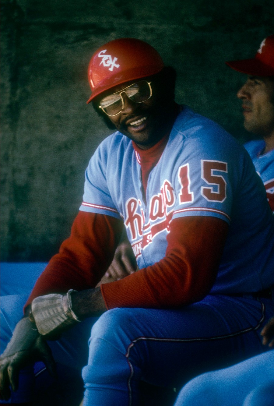
27 minutes ago, GoHawks said:
Ravens for some reason going with black pants instead of white this week
Ravens should have gone full crazy and brought back the mustard pants.
-
4
-
2
-
1
-
-
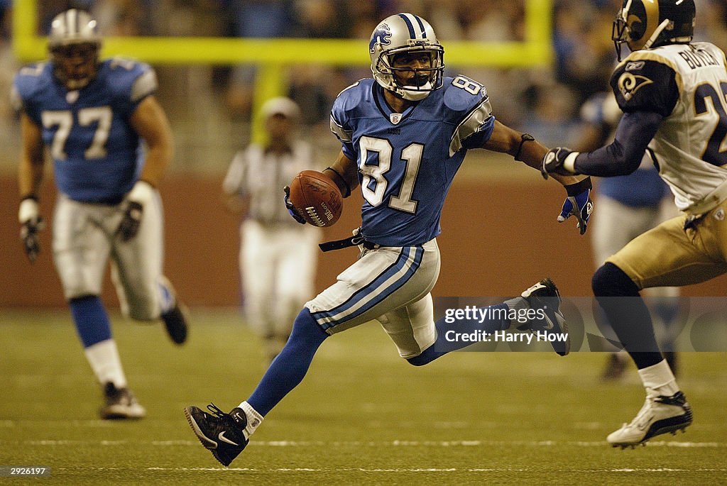
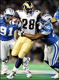
On 1/14/2024 at 8:04 PM, ruttep said:
Rams/Lions in DET:
2018
2009/2010/2012/2016
2003
2001
1999
I'd say "best" since 2016. Hated the white horn look in 2018, but at least in the 09/10/12/16 matchups, each team had properly contrasting uniform elements.
Of course, 1999 blows the other matchups here out of the water. 2001 and 2003 are a distant second and third.
My hot take is that Mono-Honolulu Blue wo black + Yellow Pants > Honolulu Blue over silver w black + Mono-White-
1
-
-
This is easily the best this Rams/Lions matchup has looked in a quarter century.
-
1
-
 1
1
-
-
1 hour ago, tBBP said:
Vosik thinks all corners of the fan bases will find what they’re looking for in at least one of the four new designs.
We haven't seen anything yet and making everything different can and has worked, also the thought is nice so I'll reserve my judgment but I'm reminded of one of Mark Brendanawicz's only funny gags in Parks and Rec.
"You ever heard the saying that a camel is a horse designed by a committee?"
-
I know the red helmet is popular but I LOVED this look.
-
10
-
2
-
 1
1
-
1
-


/cdn.vox-cdn.com/uploads/chorus_image/image/72502310/1435999049.0.jpg)
/cdn.vox-cdn.com/uploads/chorus_image/image/66013943/1176904243.jpg.0.jpg)

/cdn.vox-cdn.com/uploads/chorus_image/image/71790451/1452205306.0.jpg)


/cdn.vox-cdn.com/uploads/chorus_image/image/73019348/usa_today_22200771.0.jpg)


/cdn.vox-cdn.com/uploads/chorus_asset/file/20031121/72522616.jpg.jpg)

/cdn.vox-cdn.com/uploads/chorus_image/image/70322790/usa_today_17412506.0.jpg)

2024 NFL Changes
in Sports Logo News
Posted
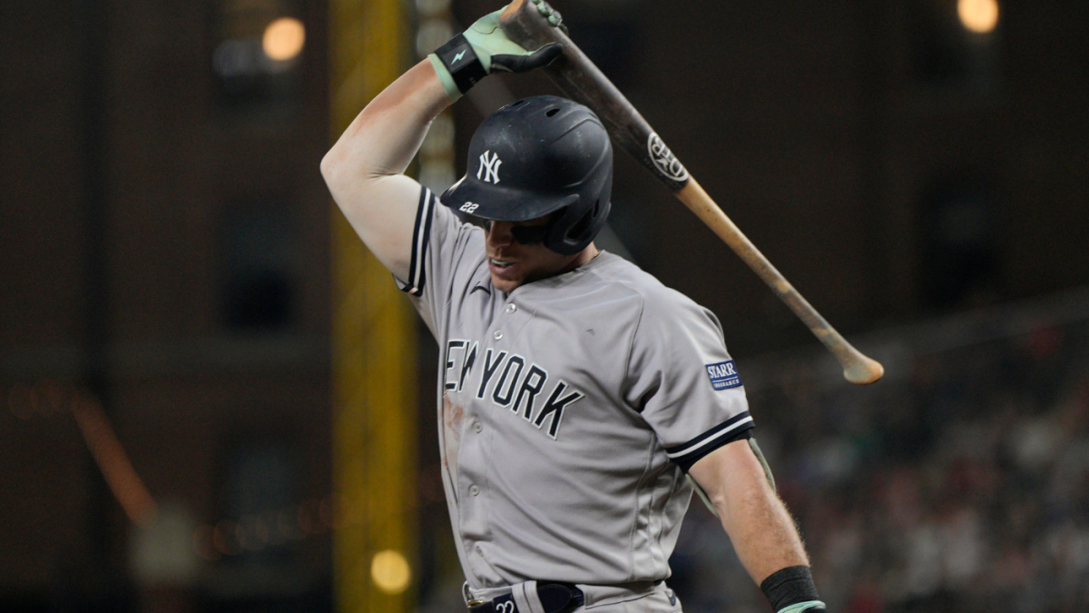
I loved those 90's Chargers uniforms.

My grandparents lived in San Diego so I always associated that set with visits for holidays. I don't know if it's the Chargers BEST look but It looks amazing.
To be clear, I really like what they have now. I like how straightforward the design is and how the right combination can really hit against the right opponent. The fact that we get the below every year now is an absolute gift.
I just have a couple thoughts rolling around in my head that I'd be curious to see even though they probably would fail.