


Carolingian Steamroller
-
Posts
2,474 -
Joined
-
Last visited
-
Days Won
9
Posts posted by Carolingian Steamroller
-
-
Just now, Jezus_Ghoti said:
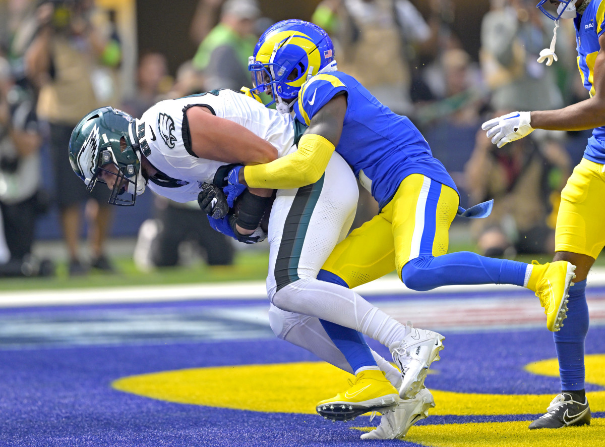
I have no input on the width of the Rams' stripe, but just want to say that it's nice seeing this particular simple two-color stripe design, which has always felt very 1980s to me, on both teams in this pic. It is nearly extinct.
The bi-color stripe is great but neither team uses the classic version. The Rams stripes are asymmetrical and the Eagles are also asymmetrical but with a grey stripe between the two colors.-
 2
2
-
-
Going with an Aegean blue color could work well for the Titans given their name and the general Greek vibe going on in Nashville (they have their own Parthenon). Add some bronze like the early 2000's Oilers and they might be onto something.
Actually the entire state has a weird Hellenistic thing going on given that everything in Memphis (actually that whole region extending into Southern Illinois) has an Egyptian vibe. -
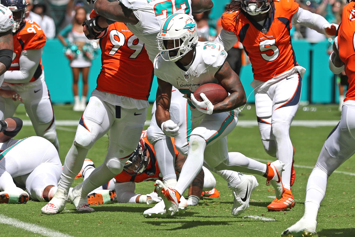
Am I nuts or did the white stripe on the Rams yellow pants look a little wider this year?
For comp:
2023

Previous Years:
-
2
-
-
34 minutes ago, TruColor said:
And I agree with all of this as well, although I think I would like the Red jersey to be a mirror-in-style of the White jerseys (posted before, but here it is again):
(Oh - Unpopular Opinion here: I actually LIKE the Black alts. A couple of games a year, sure.)
I'm also cool with the black alts a couple of times a year.
That said, I don't need stripes on the red jersey! I just want the bird head logo on the sleeve.
I like the concept of the red jersey/pants having no stripes but the white jersey/pants having the silvered striping. The Cardinals have never had striping on their red jerseys (apart from the most recent set). I think rather than the big wordmark, if you rolled with the logo, that would be a good way for it not to be completely plain. Same goes for the pants. Put the logo on the hip, wear them on the road with white socks and you've got another crack jack set.-
 1
1
-
-
-
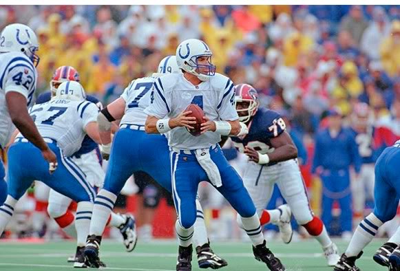
13 hours ago, Cujo said:
Bring em back already

Fascinating period in Colts history.
They only wore the blue pants for one season but it was also Marshall Faulk's second year in the league, they had an aged but somehow productive Harbaugh at QB, and they were wearing old school black cleats (NOBODY wore black cleats in the mid 90's) inside the RCA Dome with its green concrete surface. And they went to the AFC Title Game against the Steelers.
Then Harbaugh leaves, Faulk goes to the Rams, the Colts draft Manning and the team looks completely different.
*Addendum, they also added the blue facemasks that season which would persist for the next decade.-
6
-
-
11 hours ago, ruttep said:
And you cannot convince me otherwise.
Always makes me think about Stratego:
-
1
-
-
Hear me out....
Silvers match, blues match, numbers match compared to navy jersey.-
5
-
 1
1
-
-
11 minutes ago, MJD7 said:
Yeah, that makes sense. I wonder if the Bengals could've done that from the beginning, like Carolina did.
Non zero possibility there was a paperwork issue.
-
2
-
-
5 hours ago, Chawls said:
All white with black cleats would look bad.
-
3
-
-
Let's be honest.
The uniform and the delay in changing the name are both tied to one guy and it ain't George Floyd.-
10
-
1
-
-
2 hours ago, tBBP said:
Just so everyone understands my position on this: by sharing the story I found, I'm not advocating one way or the other as to what WFT, NAGA, NCAI or anyone else should do; none of that is my fight. What I shared of my own experiences was just that: my own experiences, just to add some additional perspective beyond the media narrative from my experiences on the ground. Draw from those whatever one wishes to add to their own perspectives, but that's about where it ends with me. So there...that's what it is.
I get that and it’s been known for a long time that the Indigenous community has a diversity of opinions which your experiences reflect. There are complicated feelings and I like hearing stories about that. I found your first hand accounts very intriguing.
Kerry Byrne, however, ain’t part of that conversation. He’s been on this same thing for close to a decade with the same quack talking points. So there is a conversation, but recognize when a guy is trying to pull a fast one.-
3
-
-
5 hours ago, tBBP said:
Wellp, the plot thickens...
I'm not sure whether this should go here or in the SiG forum, I definitely ain't finna start a new thread on this, and mods can feel free to MOD EDIT this completely out of the conversation, BUTTT...the Washington former Football Team formerly known as the R-words name and identity plot drama just took on yet another level of uh-oh.
Just a little bit of a snippet:
(Spoiler alert: George Soros' name pops up in this drama.)
Now, I will say this, having traveled all lower 48 states and 49 of 50 and having seen/known this myself with my own eyes/experience: there were and are plenty of tribes in the upper midwest, mainly in North Dakota, Oklahoma, and Montana, who embraced the former Chief White Calf-inspired logo, just based on that fact that a/ I saw some indigenous wearing the merch and b/me asking them about it. (Shoot, somewhere in I believe Oklahoma was a Native hihh school whose athletic nickname was, in fact, the R—well, that.) That said, support/dissent of the name/identity varied from tribe to tribe, and sometimes even within tribes/Native ingroups, as evidenced by the number of Lakota who nearly chewed my head off for me daring to wear my Florida State Chief Osceola hoodie my first few times traveling/working and eventually living up in South Dakota...which just about all of them thought was the Washington Re—well, them, until I explained it was for Florida State. Didn't make a difference to many, which is why I eventually quit wearing anything Chief Osceola-related up there out of respect to them, once I heard and understood their perspective on the Re—umm, that controversy.
That said, obviously as is reported in the link above, there's always been dissenting views of the controversy, and the story should also serve as further evidence that no one body speaks nor should try to speak/spin the narrative for an entirely of a particular population—and that "special interest politics" abound even amongst the Indigenous peoples of this nation (then again that's also been going on since even before the confederation became a "nation". Anyway, so there's another perspective out there is all, and coupled with Harris' reported abhorrence of the current Commanders identity, perhaps this may further fuel the flames of change in DC??
Dissenting fine but this is crack pottery and flim flamery.
Kerry Byrne, the author, made this same goofy appeal to Tamanend 9 YEARS AGO while a contributor to the Boston Herald.
https://www.bostonherald.com/2014/06/25/byrne-(Commanders)-a-tribute-to-popular-chief/
It was bizarre then and it's bizarre now especially because of what happened to Tamanend's Leni Lenape tribe shortly after his passing (spoiler: it was not pretty).
There's more to say on this, especially given original owner George Preston Marshall's opinion on other topics, but there's very little credence to be given to a guy who blames an obvious and long overdue move on George Soros.-
3
-
2
-
-
You see how this is the intended primary combination for the Rams.
It's a blue backdrop with all the details from the helmet crown to the toes fading from yellow to white and back to yellow.
-
4
-
 6
6
-
1
-
-
By tonight's end, 11 out of 32 team playing this weekend will have worn solid white socks with white pants:
\
That's not including any players who wore white socks with white pants on their own accord.-
1
-
5
-
 3
3
-
 1
1
-
-
38 minutes ago, the admiral said:
Always liked this Bears uniform but they're like the only team that's not doing all-white! Then again, the key to that set was the sock stripes and jersey stripes matching, which in the I'm a Gangster I'm Iced Out Like a Freezer era wouldn't happen
Ownership doesn't like it.
-
2
-
1
-
-
2 hours ago, dont care said:
Do the dolphins use a different stripe for their pants? That should be enough there to get your answer
I wasn't really looking for an answer to so much as asking the question as to whether people would prefer the Dolphins switch the colors on their stripes. -
1 minute ago, GriffinM6 said:
What team is in the photo I quoted? Also, look at my sig.
I figured but I used the vagueness to open up the discussion to the Dolphins.
-
17 hours ago, GriffinM6 said:
And as a fan of Miami, I can't stand it anymore. The helmet stripe looks so much better. A lot of times the pants striping can end up looking brown on TV.
Are you talking about the Miami Hurricanes or the Miami Dolphins? -
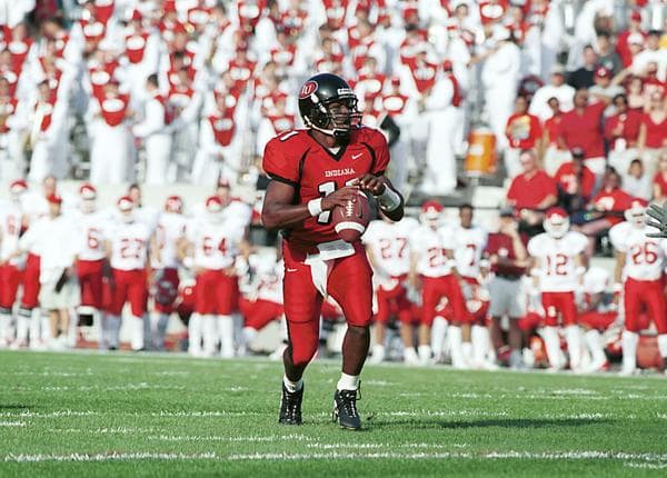
15 minutes ago, TenaciousG said:
The Antwaan Randle-El era! Honestly these were so absurd that they almost worked. At least they went for it. Too many crimson and white teams as it is.My favorite look from that era.
The red over red with the black helmet was great idea. IU hoops get most of the attention but this was a fun way to differentiate the football team.
I remember walking into a BIG 10 pride store when I was doing college visits (I think it was at Purdue but I'm not 100% sure) and they had a whole row of collectable helmets with all (then) 11 teams and the black IU helmet was one of them. -
27 minutes ago, fouhy12 said:
Oh my god, I only just realized the helmet stripe doesn't match the pants stripe. How do you mess up something so simple lmao
Well it does match the orange helmet and I would argue that helmet should have a color balance that leans toward the brown rather than orange. I think it matches the jersey terrifically. Now the pants have a wider brown center stripe but then you mess with the striping proportions on the helmet compared to the non-alternate helmet and I think it's simpler just to roll with the stripes they did.
Again, I don't think they messed up at all. I thought it looked really slick.
Addendum: This swapped helmet/pant stripe deal is also found in the U.
-
1
-
-
I loved the white helmet idea but was skeptical on the stripes but I liked it how it looked. I'd consider making it match the pant stripe but that's it. Gets a thumbs up from me.
-
10
-
-
41 minutes ago, Sec19Row53 said:
I don't believe it was custom - it was in the catalog of the company from which Halas bought his uniforms.
Halas owned the company he bought the uniforms from…My theory has been that it was based on the Cubs. With whom the Bears shared Wrigley Field and for whom Halas also supplied jerseys in the late 40’s.
-
2
-
-
8 hours ago, Old School Fool said:
It's been the Bears number font since 1950. It doesn't need to change.
It's slender, yet curvaceous. Graceful, yet assertive.


/cdn.vox-cdn.com/uploads/chorus_image/image/72274684/1245160690.0.jpg)


/cdn.vox-cdn.com/uploads/chorus_image/image/72686370/usa_today_21496487.0.jpg)


NFL 2023 Changes
in Sports Logo News
Posted
Oddly enough, the Football Team aesthetic solved a small problem with the original Gibbs look in that they removed the helmet stripes which that set inherited from the 70's which, though lovely, didn't match the bicolor striping.

#BringBacktheFootballTeam