


Carolingian Steamroller
-
Posts
2,498 -
Joined
-
Last visited
-
Days Won
11
Posts posted by Carolingian Steamroller
-
-
21 minutes ago, HOOVER said:
Their number font is dainty. It’s dated. You’d never put it on a new uniform design.
You're right there.
-
 7
7
-
 3
3
-
-
20 minutes ago, HOOVER said:
Haha, yeah that’s about what the response I imagine I’ll get from this suggestion.The problem is that Orange and White are too similar, tonally. There’s not enough contrast. They compete. It just creates problems with Navy.
Their number font is dainty. It’s dated. You’d never put it on a new uniform design.
So, the first thing I’d do is change the font to the 1-color block font they use on their most recent throwbacks. White on the Navy jerseys, Navy on the White jerseys.
I’d drop the outline on the C logo altogether and move to a Satin finish on the helmet. I’d add an Alt helmet: Matte White shell, Navy facemask, single 1” Navy stripe, Orange 1-color C logo. Maybe even make that the primary helmet. Maybe consider using the Bear logo on it.
I’d retain the sleeve stripes & color pattern from the current White jersey and copy it to the Navy jersey in Orange/White/Orange. I’d drop the GSH from the sleeves and just wear it as a left chest patch. I’d consider adding small stars to the striping pattern on the set to tie into Chicago’s flag.
Pants might have a single stripe to match new Alt Matte White helmet. Otherwise, might be plain White, Bear logo on front right hip opposite Swoosh. Navy pant would be optional and only worn with White jersey and would be plain, no striping.
Striped socks would mirror jersey sleeve stripes; a set of Navy with Orange/White/Orange stripes and a set of Whites with Navy/Orange/Navy stripes.
All off the top of my head here, I’m in the middle of the 7-hour drive from Atlanta back to Orlando.
You're describing turning the primary home jersey into the Packers.-
2
-
-
4 minutes ago, HOOVER said:
All around, the Bears have a traditional look that, due to the logo, colors, and font, just hasn’t aged like most of the other traditionally-dressed teams.
I actually think they’d benefit greatly from a modest update.
Explain this heresy.-
3
-
-
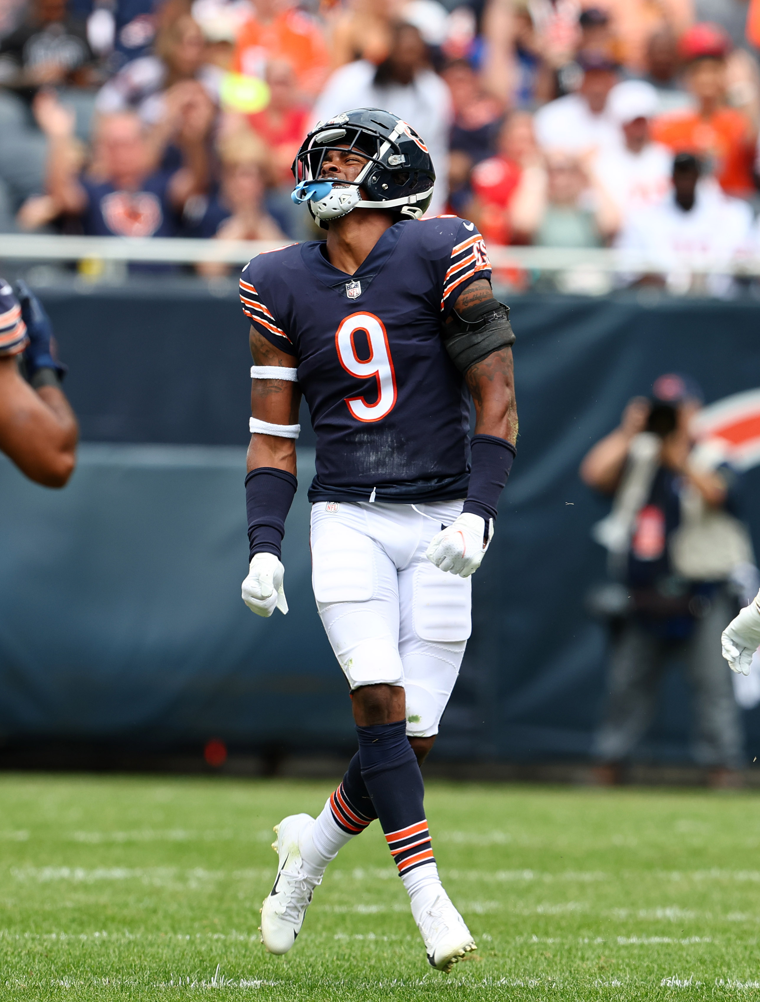
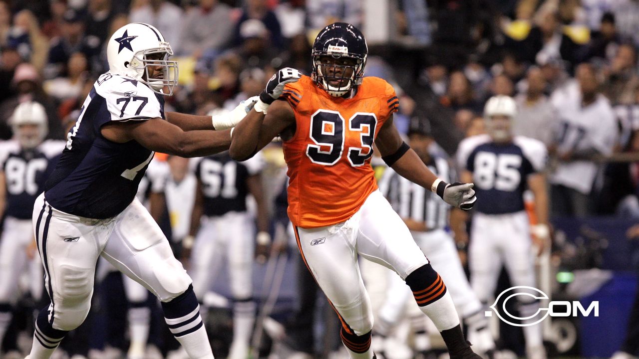
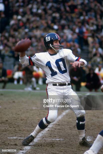
I post this all the time but the key flaw of the Bears' orange jersey is the white numbers. White numbers on an orange jersey is exactly what the Broncos, Bengals, Bucs, and even the Browns for a while (wow the team names all start with B).
When the Bears originally wore orange jerseys in the 1930's and then again in a throwback game in 2004, the numbers were navy blue outlined in white. That is how they should look:
And if you're curious what they would look like with the iconic rounded numerals, something like this:
-
11
-
 1
1
-
-
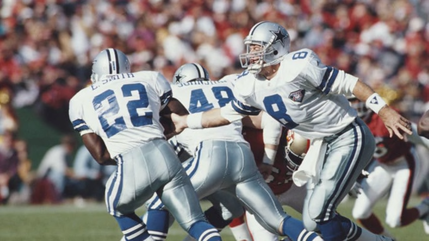
I feel like the Cowboys had the silver shades (helmet included) more or less matched in the early 90's. I like the idea of having a subtle blue tint to both. Even the royal blue in these photos looks a touch closer to the helmets.
-
9
-
 1
1
-
-
36 minutes ago, simtek34 said:
Oh?
Maybe but this weekend in NY the pants looked pretty blue:
-
5
-
1
-
-
3 hours ago, mattb6 said:
While the black and red jerseys already vaguely give off Georgia vibes, I think a red collar on the white jerseys really would’ve looked like a UGA ripoff. Black was the right choice.
Sound argument. Though I think the use of black/white helmets would cancel out the Georgia comps.
-
1
-
-
Wish Cincinnati would've opted for red collars on the white jerseys. This way the collar and sleeve treatments across all three jerseys match the underline on the "C" logo with the numbers matching the lettering.
-
4
-
-
32 minutes ago, gothedistance said:
The Bears are the only team left who hasn't revealed their jersey games, among the teams who release uniform/jersey info. Who usually gives out their uniform schedule.
Before they do I'll take a guess on their third and fourth jersey games. I'm guessing that Chicago wears orange jerseys against the Panthers for their Amazon Prime game. Maybe at Tampa, like what they did at Miami in 2018. As for their white throwback uniform, the Broncos, Panthers, and Falcons game can be ruled out for that. The possibilities for the white throwback games are one of the NFC North opponents, the Raiders, and the Cardinals.
My prediction:
Week 1: Packers - Classic Navy over WhiteWeek 2: @Bucs - Classic Navy over White (Bucs in white)Week 3: @Chiefs - Classic White over NavyWeek 4: Broncos - Retro White over NavyWeek 5: @Commanders - Classic White over NavyWeek 6: Vikings - Classic Navy over WhiteWeek 7: Raiders - Orange over White with Orange lidsWeek 8: @Chargers - Classic White over NavyWeek 9: @Saints - Orange over White with Orange lidsWeek 10: Panthers - Classic Navy over WhiteWeek 11: @Lions - Classic White over NavyWeek 12: @VIkings - Classic White over NavyWeek 13: BYEWeek 14: Lions - Classic Navy over WhiteWeek 15: @Browns - Classic White over NavyWeek 16: Cardinals - Classic Navy over WhiteWeek 17: Falcons - Classic Navy over WhiteWeek 18: @Packers - Classic White over NavyThese are based as much as the timing in the season as anything. The Bears have tended to favor October for orange and something around the first quarter season mark for a throwback game (they previously wore them in Weeks 3 (2022), 6 (2021), 15 (2021), 14 (2020), 4 (2019), 14 (2019). They have worn them late in the season but usually in years when they're worn twice. Cardinals game would be a good candidate, though. Entirely possible they swap out an orange game to wear throwbacks against Arizona. -
All I would want from the Cardinals are as follows:
Add TV numbers to the white jersey.
Add the Cardinal head logo to the sleeves of the red jersey while dropping or reducing the ARIZONA mark.Add the Cardinal head logo to the hip of the red pants.
Mix and match the white and red pants with frequency, pairing contrasting socks therewith.
Honestly that's it. I like the red-silver-red Northwestern stripes. I like the idea of the red jersey and pants being stripeless. I like the silver outline on the red jersey and the black outline on the white jersey.-
2
-
-
32 minutes ago, oldschoolvikings said:
I thought the dirty dishwater uniform had gone away.
I thought last year was the last time too but apparently not and we haven't seen mono bone since 2021.
For my part I think it's overly maligned. Especially when worn as intended as monochrome with blue accessories.-
1
-
 1
1
-
 1
1
-
-
1 hour ago, CaliforniaGlowin said:
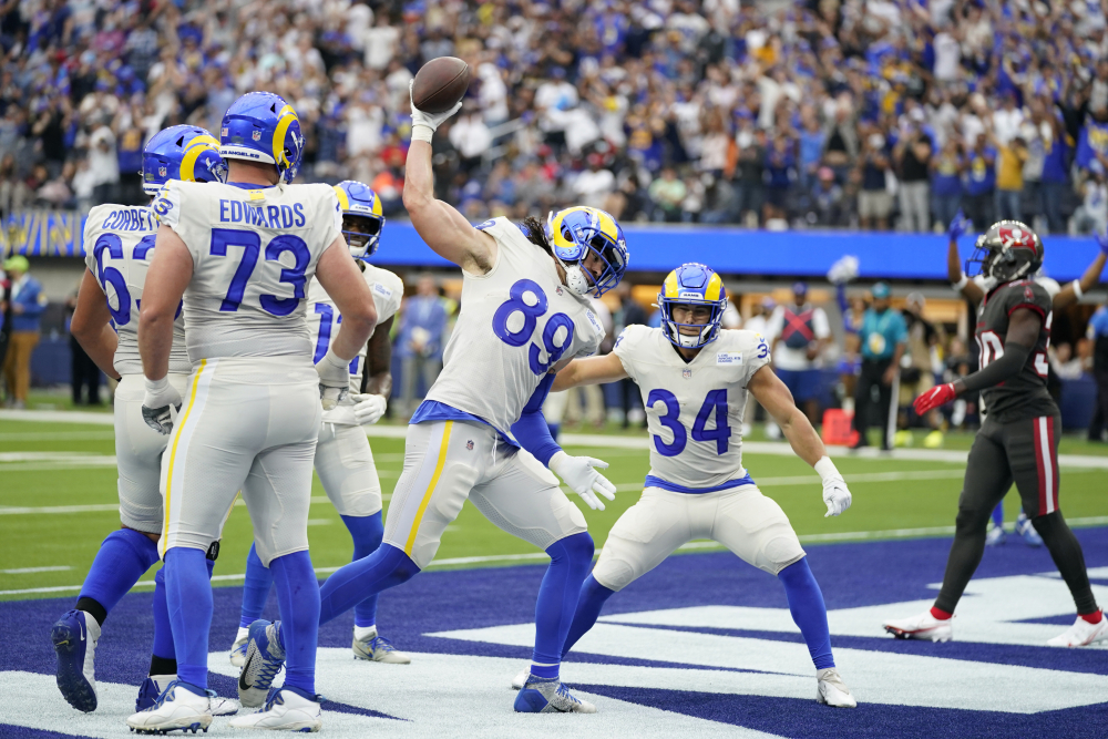
Looks like the Rams are not getting another alternate this season.
Interesting choices for the bone jersey.
They wore bone over bone the first two years of the current set in Arizona and added blue pants last year.
I'm hoping to see the mono bone with blue socks against red over white for Arizona.
But I suspect we'll get something like this.-
 1
1
-
1
-
 2
2
-
-
15 minutes ago, jerrylawless3 said:
Then there's Notre Dame wearing Packers-styled jerseys for their game in Chicago against Wisconsinbecause becuase it was originally slated to be in Lambeau.
I still think the ones they wore the next year were designed for the Chicago game. Which is a bit of a shame since wearing that prairie design would have looked really nice in some bright lakefront sunshine.
-
2
-
-
It's weird how there's a mental hierarchy about which positions should get to wear which numbers.
The funny thing is when the NFL first instituted the change, it was based on how close you were to the ball laterally if you were on offense (QB in the single digits or teens, backfield in the 20's or 30's, Center in the 50's, Guards in the 60's, Tackles in the 70's, ends/WR in the 80's) while the defense had something similar but with higher numbers closer to the ball/scrimmage line (down linemen 70-99, Linebacker 50-69, Defensive Backs 20-49).
Now certain numbers convey certain status with single digits being higher followed by teens and so forth. -
4 hours ago, PlayGloria said:
One the white set, I would even be okay if they went all white if the white socks had horizontal stripes at the top. I think that would look killer.
That's essentially this:
-
2
-
1
-
 1
1
-
-
31 minutes ago, MrAstrodome said:
I disagree. White-striped socks and white pants look terrible.
Even this?-
1
-
1
-
1
-
 1
1
-
-
43 minutes ago, Sec19Row53 said:
Can't you still read it without having an account? I didn't realize it was locked out if that is the case.
It's possible to read an X but not a thread or replies and you cannot view a profile on its own chronologically.
-
2
-
-
4 hours ago, jerrylawless3 said:
Put together an investigatory thread on the new Vandy uniforms. Lots of interesting questions surrounding this new set.
Not seeing the thread.
-
1
-
-
1 hour ago, PlayGloria said:
I've mentioned this set a few times on this site and I 100% agree. This should have been the basis for their new Commanders set. It reminds you how historic the franchise is, even if they had a new name. This is one of my favorite football uniforms ever worn.
I think they took some influence in making the Commanders uniforms. The gold numbers outlined in white seemed a reference to me.
-
3 minutes ago, tBBP said:
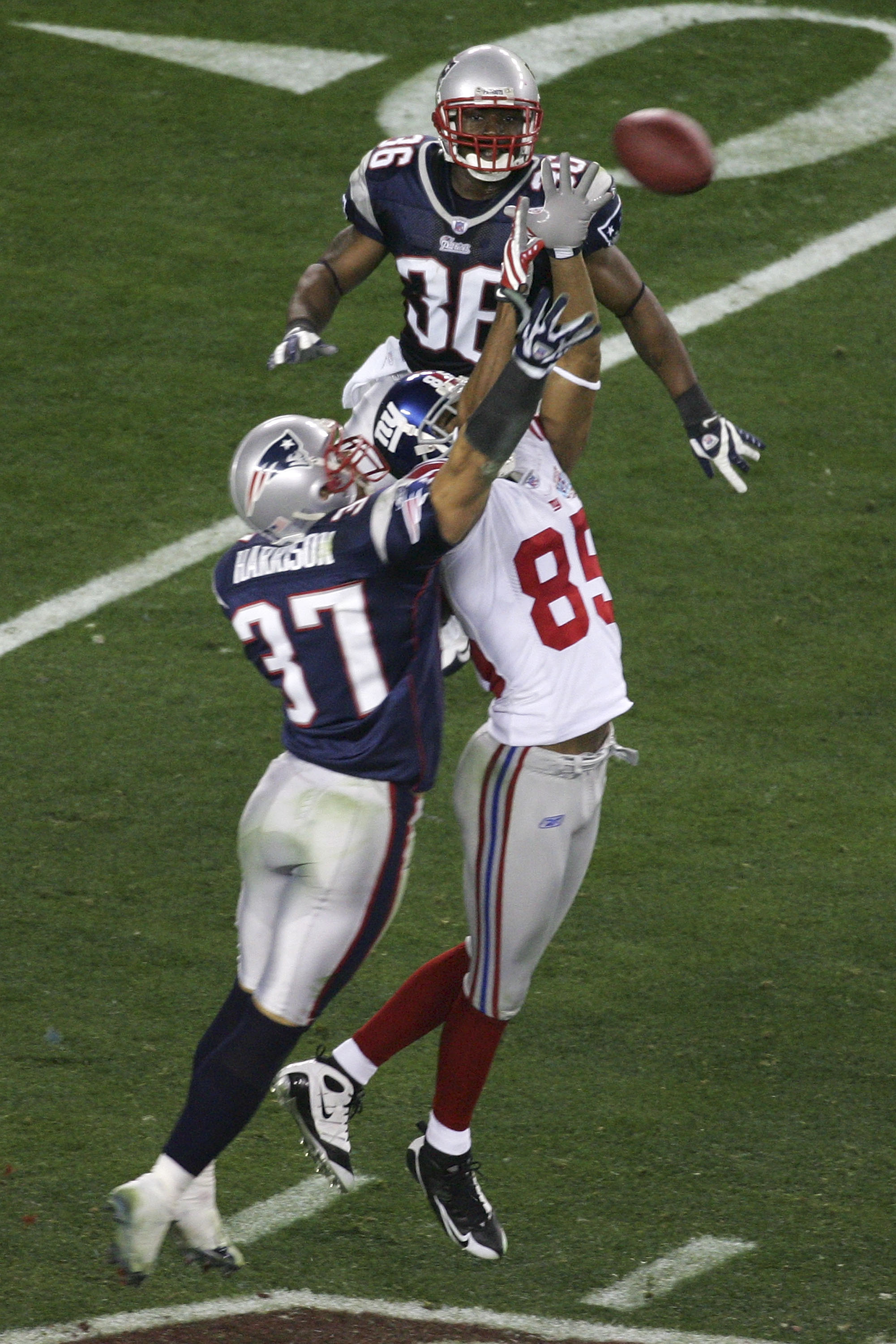
Not for nothing, but since these examples never get shown nor talked about, probably worth showing the late '60s into '70s Giants road sets:
(Homer Jones and Fran Tarkenton, respectively.)
Why these never seem to get as much if any love is beyond me...
If the Giants were to switch to blue dominant road uniform, this is the route I'd like them to take.
If they can't go with the early 60's style they wore in the 2000's and 2010's, this is the next best thing.
-
One more. (Side note: with the one shell rule officially dead why can't these come back? Sans Sleeve patch.)
-
8
-
2
-
-
4 minutes ago, the admiral said:
Yeah, I know, it's a real shame. It's not "Cavaliers win their first title in Under Armour t-shirts" bad, but it's still, all things considered, kinda bad. Those jerseys need blue.
Not anymore.
-
1
-
1
-
-
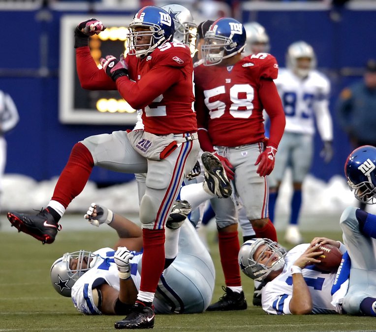
4 hours ago, the admiral said:
Team is associated with a color, jersey and socks are not that color. Sounds like a branding failure to me. I'm sure Mister Mara liked them, though.
The defining moment of the last three decades of the franchise. Red accented jersey, red socks.
So associated with the brand that it was worn at home as throwback when they'd already replaced the pants two years ago.-
4
-
-
I know the 80's look has it fans but the 50's/60's retro design has always had a soft spot in my heart.
I remember watching old early color film of the 1963 NFL championship game when I was a kid and thinking, "Wow, the Giants used to have really cool uniforms!"
So as an adult when they came back, it was really exciting.-
8
-
 1
1
-
/cdn.vox-cdn.com/uploads/chorus_image/image/72635366/usa_today_21391489.0.jpg)


/cdn.vox-cdn.com/uploads/chorus_image/image/72633516/1673007325.0.jpg)
/cdn.vox-cdn.com/uploads/chorus_image/image/67439408/usa_today_14955868.0.jpg)


/cdn.vox-cdn.com/uploads/chorus_image/image/70010540/1347165959.0.jpg)


2023 NFL Season week by week uniform match-up combos: From HOF Game to Super Bowl LVIII
in Sports Logo News
Posted
For Bears fans already suffering thanks to that team it would be very, very bad.
You maybe get away with it by making the numbers orange like their 40's throwbacks.
Thing is, what you're describing is very common in football design today: minimalist sleeve design + custom block font. It describes the Jaguars and even the Jets.
I think if the uniform is missing anything, it's the sheen on the white and blue pants in the era of dazzle really was a cherry on top that's missed today.