


Carolingian Steamroller
-
Posts
2,474 -
Joined
-
Last visited
-
Days Won
9
Posts posted by Carolingian Steamroller
-
-
1 hour ago, Ted Cunningham said:
The Cotton Bowl is a color v. color game. I think it's a pretty good contrast (despite there being very few pictures of it online that I could find).

Mizzou in mono black is a good fit for them too.
-
8 hours ago, Old School Fool said:
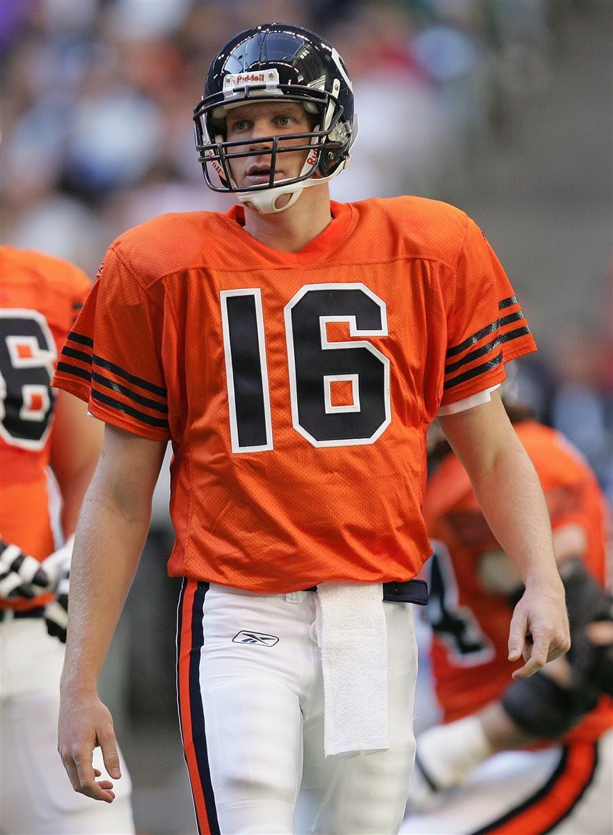
I didn't like it when they wore that jersey on Thanksgiving in 2004. The genius of the Bears orange jersey is that it's a color swap, which I think is a lost art among alternate jerseys nowadays in sports. Don't get me wrong I love myself some wacky looks from time to time but sometimes the best alternates are the ones that don't go all out.
See, I loved that look and still think it's superior. The huge block numbers hold it back in my opinion which is why I favor swapping them out for the current rounded numbers.
I don't think the color swap has worked so well for the Bears. The sleeve stripes are quite fine. It works on the navy jersey because the orange and white blend together to create a glowing affect.
However, that same blending of orange and white when you do the color swap works against the orange jersey because the white outlining blends into the jersey color making the stripes look very, VERY thin indeed. (Ditto for the "C" on the helmet.)
That's why I like a thematic connection. The Bears have a jersey with three identical outlined stripes (navy) and one with three alternating solid stripes (white) so have one with three identical solid stripes is the logical missing piece. It's a bonus that it also happens to be a historical design.-
 2
2
-
-
17 minutes ago, Silver_Star said:
Anyone who disliked my comment can see the similarities to these two uniforms. The white pants do not make this uniform unique at all. Here, take a look
Only difference is that they throwbacks do not use the same orange, but design wise it is TOO SIMILAR TO EACH OTHER! A no go for me if Denver decides to do the Syracuse style.
That every orange jersey in the NFL currently uses white numbers and some other white element like pants or helmets really hammers home my belief that the Bears should try to replicate their 1930's orange jerseys by wearing blue numbers.
-
14
-
-
12 minutes ago, Michael Bolton said:
Maybe I didn't express my point clearly enough. My issue is the tweet showing little diagrams pointing to socks, pants, etc. with a little sidebar saying WHITE or BLUE. It just screams desperation for attention and is, for lack of a better word, cringey/lame/cheesey/nauseating. I obsess over uniforms just as much as the next guy, but a full uniform detail "announcement" is completely unnecessary. Let us find out what you're wearing on Sunday morning during warmups; it's completely unnecessary to make a social media post about your freaking blue socks.
This is a thing I'm a little tired of.
I see just as many complaints on here about the social media or marketing of the uniform as the uniform itself.
At a low setting, its just "old man yells at cloud." Tedious but tolerable.
When its really cranked up I feel there's a sense of gatekeeping. Those posts aren't meant to hype up the people who look at practice photos to figure out whether a team is wearing throwbacks or who check beat reporter twitter for pregame warm ups to figure out the color undershirt a team is wearing that day. They're trying to get engagement from people who aren't keyed in and that's fine.
At this point I'm more annoyed at the people on the board complaining about "icy whites" than the club social media teams much less the all white uniforms themselves.-
11
-
 2
2
-
 1
1
-
-
5 minutes ago, Michael Bolton said:
Call me a grandpa, but this tweet perfectly encapsulates just how stupid, cringey and pointless these UnIfOrM rEvEaLs are. Nevermind the g*dd*mn lame-ass frozen face dude emoji, but c'mon, do you really need a little graphic showing SOCKS down there???? Good lord I hate this league, and the vast majority of its fanbase, so damn much.
STOP THE PRESSES, OUR FOOTBALL TEAM IS WEARING BLUE SOCKS WITH OUR STANDARD ROAD UNIFORMS. PLEASE RETWEET THIS AS FAR AS THE EYE CAN SEE. Give me a break. Get off my lawn. Take me back to 1982.
This is a thread for obsessing over those exact details:
-
12
-
 3
3
-
-
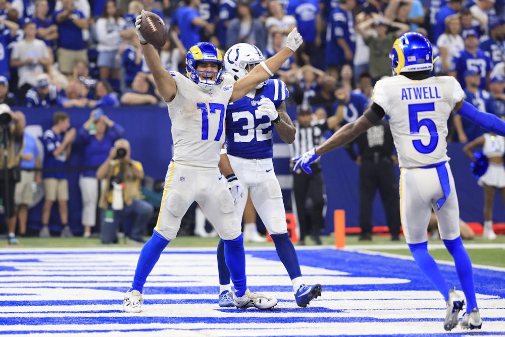
On 12/4/2023 at 10:16 AM, Carolingian Steamroller said:
With three home games remaining for the Bears, they're likely to wear their 1936 throwback for one of them and I would say there's a strong possibility of that game being this weekend against the Lions.
We'll know for sure if the stripes change on the helmets for practice this week.Against the Cardinals. Good choice. Should make for nice contrast even with Arizona in mono-red.
-
4
-
-
12 hours ago, MJD7 said:
My general rule of thumb is that if the jersey matches the pants, the helmet should match the socks, whether that results in a completely monotone combo or not. That's part of why certain monochrome combos like the Seahawks work for me, while a number of the Color Rush sets, which often were a different color from the helmet but were one color from the neck down, didn't.
It's also why I think that Bills set actually works, as @fouhy12 said, the socks help balance out the helmet. It'd be better with stripes on the socks, though.
That Jets combo isn't bad, as there's plenty of white on the jersey for the socks to balance out with, and a white facemask would be even better. Green socks would probably work just as well with this set though.
As for the Bears, if they go all-navy, I prefer their worn-once Color Rush combo:
The team confirmed as much, as you can see in @Pigskin12's post on the previous page:
Bears went mono navy this January and while most players wore the white socks, a few seemed to miss the memo and went with navy socks, and I have to admit, I prefer it that way because the Bears socks have the same stripes as the sleeves:
-
5
-
-
20 minutes ago, ruttep said:
Out of the three looks that you listed, the only one that looks remotely good is the white on yellow that they wore in the Super Bowl.
The other two are two of the worst looks in the new set (all bone with bone socks is the worst by a mile). The only way I can find this set tolerable is if the Rams stick to only ever wearing blue over yellow and white over yellow, with the occasional white over blue if contrast is needed. Burn all bone uniform elements.
That's just my opinion. I happen to think the blue over blue (where you can see the elements shift from yellow to white and back to yellow) and the bone over bone with blue socks (where we get a continuous yellow/white pattern from knee to the shoulder) look good.
Again. This is my personal opinion.The combinations I don't like is the bone over yellow and the bone over blue which don't mesh well because they were never intended to be worn together.
-
Well to be honest, I'm not desperate for a Rams redo myself. I can see what this was supposed to look like and I think it's turned out better than it seemed in spring 2020. For example, the two original primary looks, when worn as intended, are quite good.
And this has worked out quite well indeed.
-
3
-
 9
9
-
-
12 minutes ago, MJD7 said:
So much better. I’d still like the horn to curl back upwards, but otherwise that’s a pretty perfect Rams set in my eyes.
Another small detail on the helmet is how the horns are pushed outward from the centerline and curl back more pronounced from roots. Compare that to the old horns which would interfere with the flex panel on the front of the helmet.
Naturally this isn't an issue if you go old school and just paint the horns on.-
 2
2
-
-
On 12/4/2023 at 10:16 AM, Carolingian Steamroller said:
With three home games remaining for the Bears, they're likely to wear their 1936 throwback for one of them and I would say there's a strong possibility of that game being this weekend against the Lions.
We'll know for sure if the stripes change on the helmets for practice this week.
Standard helmets for the Bears in practice today. Would expect traditional navy over white Sunday.
https://www.instagram.com/p/C0h8LWmsu2b/?igshid=MzRlODBiNWFlZA==
Compare with 2022 when they wore the throwback helmet stripes in practice.
https://www.instagram.com/p/Ci0QwWzMlir/?igshid=MzRlODBiNWFlZA==
-
11 hours ago, the admiral said:
I would not have applauded. That's a terrible, brand-diluting idea. It astounds me that people think sports teams' color schemes should be elastic. It would be like saying that the flag of France should be blue, white, and red in France but navy blue, white, and navy blue whenever it appears in another country. What are we doing here?
France has actually used two shades of blue for the tricolor for decades. Hasn't stopped people singing La Marseillasie.
-
1 hour ago, Ted Cunningham said:
Meaning they wear royal/athletic gold at home and navy/white on the road? I was just thinking about that reading through this stuff and looking at those pictures of those late 2010s uniforms. Like, if the uniforms themselves were the same design (be they either the throwback or the modern) and the only differences were that at home they were royal/gold and on the road they were navy/white, I think I could get behind that. Something like a late-90s/2000s Washington State: two different helmets depending on where they're playing. In the modern uniform context:
Home:
Away:
I don't think that I'd advocate for this, specifically. (I think I fall somewhere between the hard-line throwback and the modern look, but consistent use of royal and athletic gold, including the helmet.) But I also wouldn't hate it, either.
No I meant an all white/navy very of the 70's-90's uniform with the team continuing to wear the throwbacks at home.
Imagine the mustard color rush uniform but with gold swapped out for white on the jersey/pants and helmet (plus white facemask). -
I also think that in 2020, had the Rams trotted out a road jersey that was a copy of the royal throwback but with white and navy only and changed nothing else about what they wore in 2019, this board would've exploded with applause.
-
4
-
-
17 hours ago, timjameskohler said:
The problem with the STL Rams uniforms wasn’t the colors, it was the bubbly number font, the inconsistent striping, shoehorning the secondary logo on the sleeves, and their insistence on incorporating unnecessary white pants. Not to mention the side panels (early on) and the devastating hybrid of 2017-2019 (later). Blue and white helmet and pants with random gold on the jersey. Who approves these things?
Inconsistent striping isn't a deal breaker in itself. The gold stripe was always more or less fixed as was the blue sleeve. What shifted was the present or lack of a white stripe on the sleeve after the gold.
15 hours ago, MNtwins3 said:The 2017-19 Rams is the worst look in the NFL this century. And it makes zero sense considering the looks they had previously and immediately after that horrendous set
I think by 2019, the set up the rams had settled into of white/navy on the road and 70's-90's at home had turned out pretty well. A couple of tweaks like removing gold could've kept that dynamic intact. I genuinely miss the white horns paired with a white facemask.
-
With three home games remaining for the Bears, they're likely to wear their 1936 throwback for one of them and I would say there's a strong possibility of that game being this weekend against the Lions.
We'll know for sure if the stripes change on the helmets for practice this week.-
3
-
-
14 hours ago, Cujo said:
How silver and blue should be done in Dallas.
Cowboys should be metallic blue, not true silver. Like the old gumball helmets.
I don't think they're far off now. I think they had it down more or less in the 90's.
-
1
-
-
7 hours ago, Silver_Star said:
The crazy story behind the navy blue jerseys was to make their road uniforms differ from Detroit Lions and the Seattle Seahawks at the time. How crazy is that?
Do you have an article to share about that? Or at least more details?
Sounds like a really interesting story.-
1
-
-
Seeing these Seahawks uniforms is like running into your first crush after a long time and seeing he/she/they still have it.
-
3
-
-
8 hours ago, ruttep said:
I'll be honest, I have no idea what the connection you're trying to make is. Those jerseys were not navy, and they have white pants. The current uniform is clearly an attempt at a "
 " color rush uniform.
I'm talking about the blue bolt outlined in yellow compared to the yellow bolt outlined in blue. It's unique to the Los Angeles era of the Chargers. The powder blue was really a San Diego thing.
I think if you paired that helmet and jersey with white pants, that could really mark the break with the San Diego era. -
There's an argument to be made that this look for the Chargers is the true LA Chargers.
-
1
-
 1
1
-
2
-
 1
1
-
-
6 hours ago, Cujo said:
Such a cringe look. 2020s helmet paired with 1960s jersey.
A different stripe (or even no stripe) and we're all singing a different tune on here.
-
10
-
-
2 hours ago, DCarp1231 said:
Ah shoot. That’s right. I forgot about their throwbacks. I’m hoping Washington wears burgundy pants at least. Best case scenario is they bust out the mythical gold pants.
Yep, this is most probable.
Interestingly, in the early 60's, when the Cowboys were wearing those white helmets and contrasting sleeves, the Washington football team wore some gold pants on the road.
-
1
-
-
Since the evening game was added in 2006, we've had at least one team go mono/Color Rush 9 out of 17 times.
The home team has gone Color Rush now for three seasons straight in the evening game.


:format(webp)/cdn.vox-cdn.com/uploads/chorus_image/image/1593109/134857460.0.jpg)


/cdn.vox-cdn.com/uploads/chorus_image/image/67170410/1197216973.jpg.0.jpg)

:format(jpeg)/cdn.vox-cdn.com/uploads/chorus_image/image/18344253/123283647.0.jpg)

/cdn.vox-cdn.com/uploads/chorus_image/image/65144985/usa_today_11777154.0.jpg)


:quality(70)/cloudfront-us-east-1.images.arcpublishing.com/tronc/4Z5YEKSFT2OKGFWLOMTD34WGZE.jpg)


NFL 2023 Changes
in Sports Logo News
Posted
Awkward sex where one party has a nagging back injury and the other threw out their knee earlier that day.