


Carolingian Steamroller
-
Posts
2,499 -
Joined
-
Last visited
-
Days Won
11
Posts posted by Carolingian Steamroller
-
-
1 hour ago, Gobbi said:
Have there been many other examples of this in the NFL? I can only think of a few off the top of my head:

(plus other Packers throwbacks)
Depending on the angle there was also this one.
Really it comes down to there not being that many three color teams to start with.
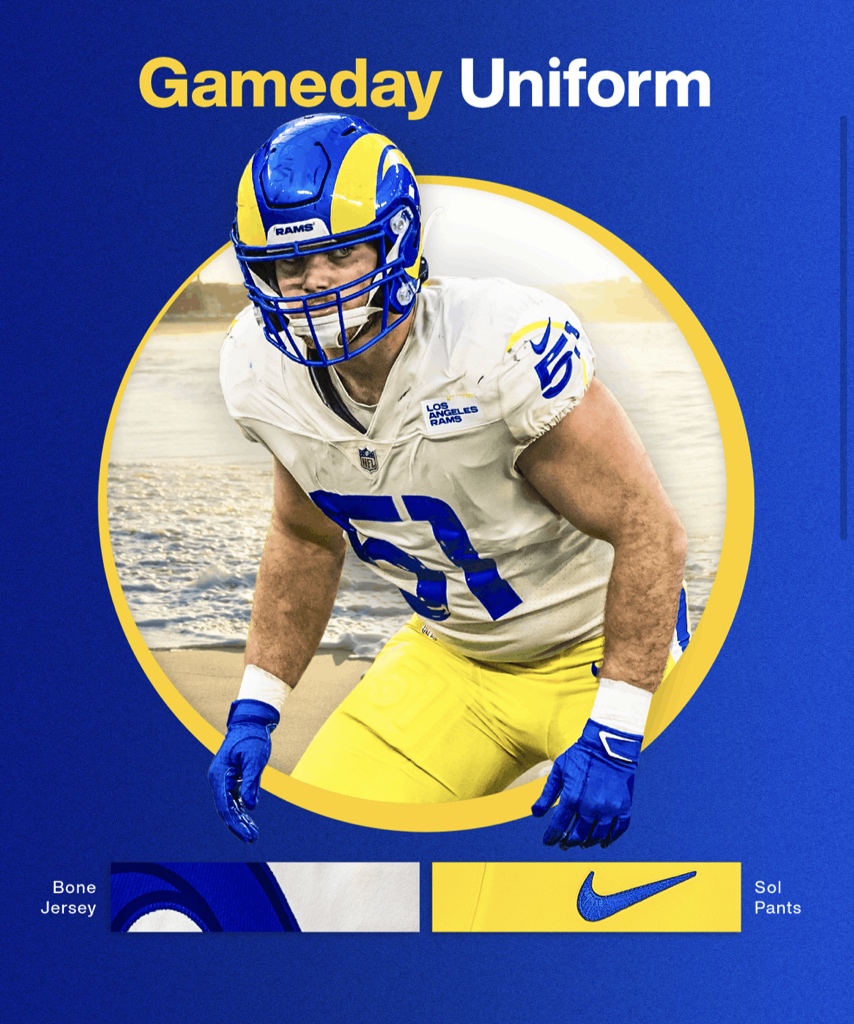
Often the third color is relegated to an accent or neutral backdrop. Also I will take this combo over the 80's retro uniforms any day.-
 4
4
-
 2
2
-
-
1 hour ago, SFGiants58 said:
It's why "Who Pooped the Bed?" is among my favorite episodes of It's Always Sunny in Philadelphia.
It's also the best episode of Sex in the City, if you look at it a certain way.But back to the Browns - their 50-yd/primary logo really should be a stylized representation of the helmet, two-bar mask and everything.
1. That poop and fart jokes are thousands of years old will always make me smile. It's truly an art that should not be approached lazily.
2. Single bar, since the Browns invented it.
-
2
-
-
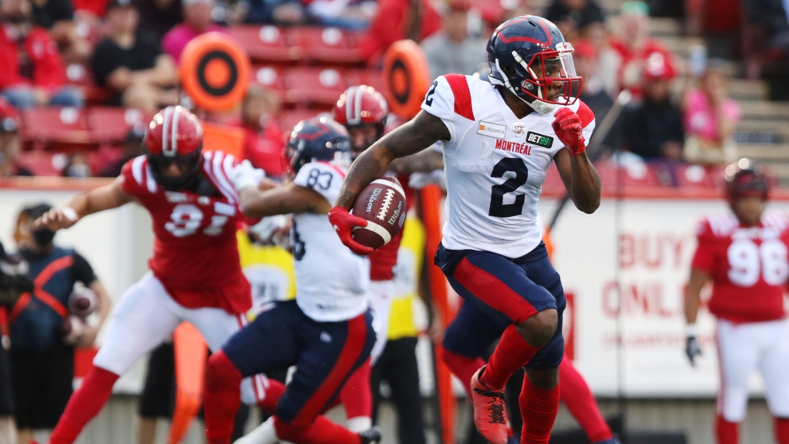
8 minutes ago, MCM0313 said:
Striping reminds me of their 1993 set.
Exactly. And a bit of the Montreal Alouettes too (I miss that helmet).
-
4
-
-
29 minutes ago, solvetica said:
Wouldn't have minded that for the Arizona Cardinals.
-
2
-
-
29 minutes ago, Brave-Bird 08 said:
"Nah these go hard
 !"
!"
I kinda like that Patriots one. A couple of tweaks and it could be something.
-
1
-
-
2 hours ago, DCarp1231 said:
Since a lot of people associate uniforms with players that wore them, would this be considered the “Kerrigan Era Set”?
What's weird looking at the years, the Spartans had introduced their jagged numbers already.
That's a very long lived look for CFB.
-
Sometimes it seems people more upset about social media and press releases than the actual stuff on the field.
This year seems no exception.-
2
-
-
26 minutes ago, Michael Bolton said:
If the Jets indeed wear white I see the Bucs going with the seldom-seen red jersey/white pants combo on Saturday.
That look is a true treat.
-
1
-
2
-
-
For the handwringing about monochrome, by my count just 7 of 32 teams effectively wear monochrome as their primary home look: Dolphins, Titans, Seahawks, Patriots, Saints, Bills, and now the Cardinals.
-
I can almost guarantee the Cardinals will wear red over white at some point this season.
The Falcons, Rams, Jaguars, and Commanders all released uniforms with monochrome primary home combinations and every single one of those teams eventually made a contrast version their primary home uniform.
The Seahawks, whose uniform is made to be monochrome at home more than anyone else, have managed to wear contrasting pants.
The Patriots even released grey pants last year (even if it was for only one game).
Red over white is going to happen. It's just a question of when.
*Before the replies about white socks with white pants, the only team of those four to do that is the Jaguars. The Eagles being the only other team to try to pull over the 80's Patriots style. You will get your red socks.-
5
-
-
10 hours ago, henburg said:
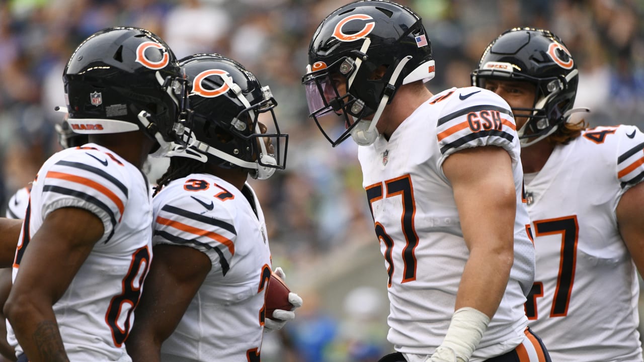
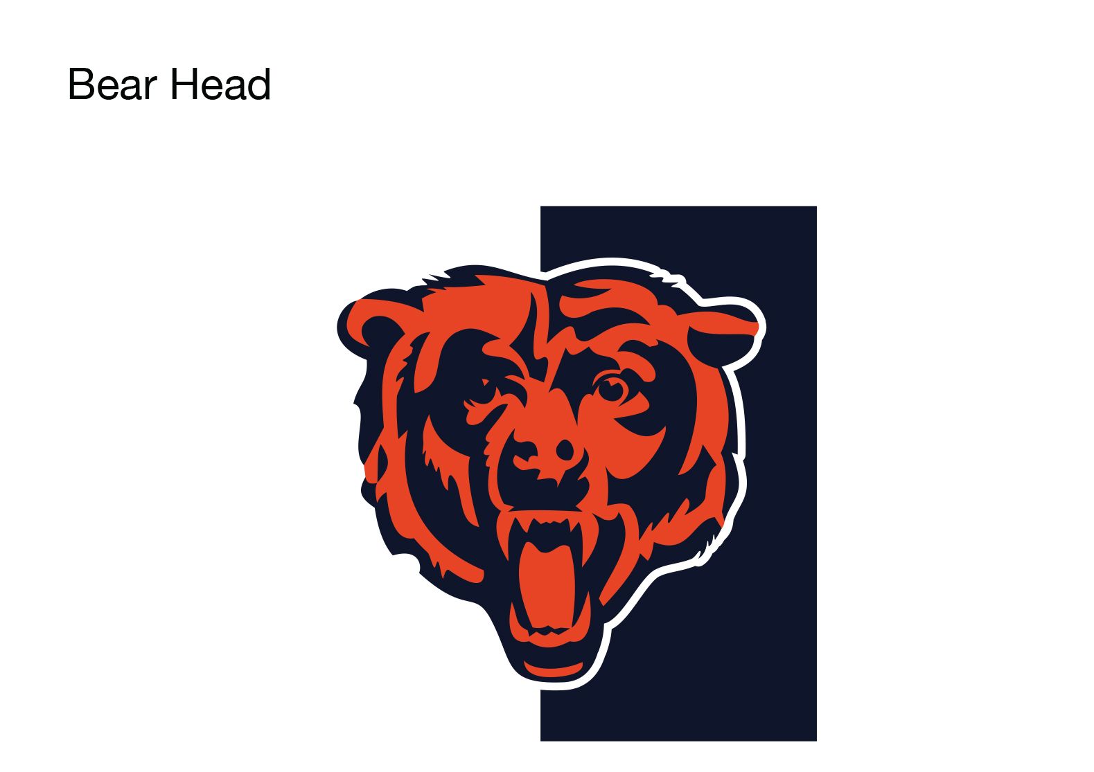
I don't necessarily think that the Bears should completely phase out the wishbone C, but I do think this looks pretty awesome in a vacuum. At the very least, it could work pretty well on a new alternate helmet.
One thing that's nice is how the bear emblem has the white outline which echoes the white outline on the current "C."
I wouldn't want the change because I happen to think the "C" has a false-eye effect because of the specific elongated wishbone shape and the way the hollow center of the "C" acts like pupil.
-
1 hour ago, the admiral said:
Because the Bears are trying to move out of Chicago and their fans hate Chicago.
Those suburban season ticket holders might wind up awful disappointed if the Mayoral candidate they wouldn't shut up about but couldn't vote against has actually convinced the new Bears leadership to stay...
-
2
-
-
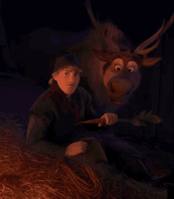
6 minutes ago, ManillaToad said:
Wtf is an arctic cowboy?
 Reindeers are better than people...
-
 2
2
-
-
20 minutes ago, Sec19Row53 said:
If you were older, or saw older still baseball cards, you could have said it came from the Cleveland Indians or the Chicago Cubs, each of who used that logo in the past.
My favorite nugget is that during the late 1940's, early 1950's George Halas (Bears founder) owned a sporting goods company headquartered down the street from Wrigley Field that produced the jerseys for the Bears AND the Cubs.
I will never not believe the iconic Bears rounded numbers (the only non-block numbers worn in the NFL for 40 years) were not based in some part on the rounded numbers the Cubs introduced in the 1930's, that Halas' company stitched onto jerseys in the 40's and 50's and an evolved version of which the Cubs continue to wear to this day.-
5
-
-
10 hours ago, HOOVER said:
I love the bear logo. Born in ‘83, they were my first favorite team 100% because of that bear. I had sweatpants with that bear head on it.Then I watched Joe Montana lead “The Drive” in January it ‘89 and that was it. I was a Niners fan for the next 4 years until he was traded to KC, where my fandom has been ever since.
But damn it if it doesn’t make me feel good seeing this bad boy back:
The Bear Head logo is old but it went through a lot of changes.
I had toque as a kid that was similar to that much rougher. Very similar to this:
Lot's of merchandise with this logo:
Then in either the late 80's or early 90's, they made a much more modernized, monocolor version:
Which then appeared on the 75th Anniversay logo:
I don't know when exactly it happened but by 2001, the team was using a cleaned up version of the original bear head logo and that's what was designated as the "Primary."-
2
-
 1
1
-
-
1 hour ago, gothedistance said:
They also wore the teal jersey of that uniform design against the Chargers in 2013. With white pants.
Right but that was with the original Nike flywire template. Compare the collars
-
29 minutes ago, MCM0313 said:
Eh, “legendary and historic” may be overstating it a bit. The Cincinnati Reds have been using (essentially) the same C for a lot longer, and a team called Bears should have some bear iconography IMO. I wouldn’t want the C taken away altogether, nor would I want the bear logo on the helmet. I think this is a nice in-between.
It's not coming off the helmet. It's been there all through camp.
-
1
-
-
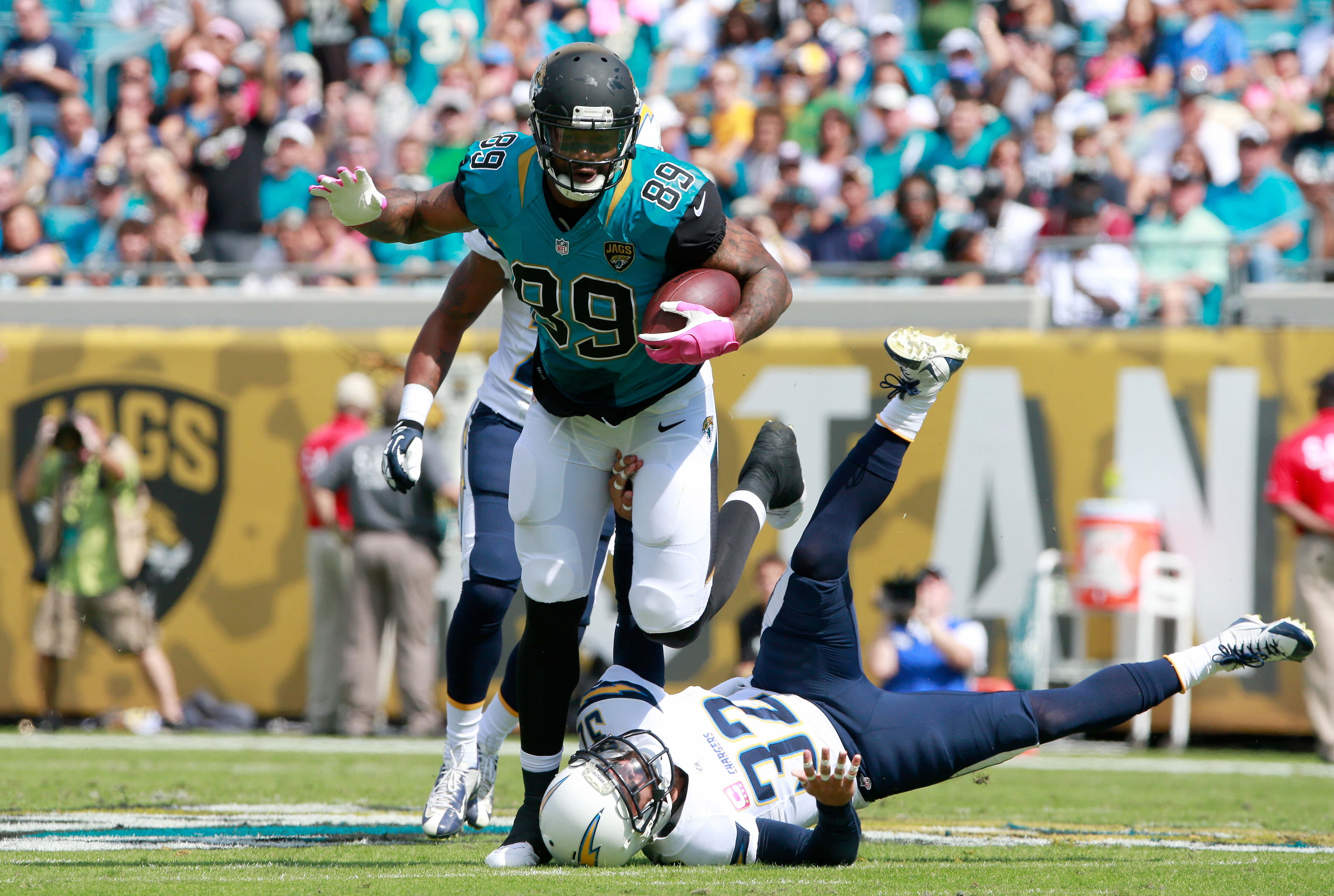
10 minutes ago, Pigskin12 said:
Would've been cool to see an updated version of these color combos, for that Monday night game, but instead it will probably be White Tiger against Black Jaguar with no orange or teal to found.
Interesting that this specific game is from the one season the Jags wore that uniform with that template.
Interestingly enough, the Jaguars have followed a pattern since Nike took over. One season wearing the old jerseys in a new template, then changing over to a new uniform to go with the new template.
2012 - Flywire Template applied to 2009 redesign2013 - BiColor helmet uniform released.
2017 - New Template applied to 2013 redesign.2018 - Current Uniforms released.
2023 - New Template applied to 2018 redesign.2024 - ???
-
3
-
-
11 hours ago, Pigskin12 said:
This was a rule until 2019. No idea what genius came up with the idea to nullify it.
100% untrue.
The old NFL rule was that socks must have have white bottom and contrasting top, unless the top was also white in which case the socks must have stripes. E.g:
What changed in 2019 was the allowance of solid color socks (in non-Color Rush games). This is where you get solid white socks being worn, at first with dark pants but now frequently with white pants.
There was never a pants/socks must clash rule. The "leotard look" is quite old. Rarely the norm but very old.-
7
-
-
22 minutes ago, HOOVER said:
The major issue with the current uniform is the number font. Pants are good. Change the charcoal in the numbers to Silver and the White in the pants to Silver and it would be a nice Bridge, but holds it back the most is the number font.
I don't know what the attitude in Philly is to the font. For all I know it might be positive.I tend to assume it's baked in at this point.
-
@Kiltman Replacing the charcoal on the numbers with true silver and using the Cunningham era pants (with the current shade of green) would be a pretty simple but awesome tweak. People would love it and it would make the minimum numbers of changes to the overall brand.
-
6
-
-
49 minutes ago, Pigskin12 said:
Yup, this is another case of a uniform not being as bad as people want to believe it is, but because they wear stupid combos all the time, people develop a negative opinion of the team's aesthetic in general and want a change.
Ditto for these two, especially the latter, which we only have gotten once in the regular season.
Attention to sock details always pays off.-
17
-
-
1 hour ago, Pigskin12 said:
I miss when the Jets looked like this in 2020 for most of their white jersey road games.
That remains a legit great combination.
This too.-
5
-
1
-
 1
1
-
1
-
-
One odd thing about the Eagles set from 2003 onward is the use of both silver and charcoal. The silver has been used exclusively on the wings and sleeve patch while the charcoal is used on the pants and the numbers.
The proportions on the pant stripes have always struck me as odd as well. The outer stripes are different sizes with the thin stripe inserted in the center.
The green has gotten quite a bit lighter over the years to the point where I think the green itself isn't an issue. I'd much rather see the charcoal replaced with silver and the pant stripes going to a different style.-
6
-
/cdn.vox-cdn.com/uploads/chorus_asset/file/11710749/91242145.jpg.jpg)
:format(jpeg)/cdn.vox-cdn.com/uploads/chorus_image/image/19756177/129357520.0.jpg)


/cdn.vox-cdn.com/uploads/chorus_image/image/67722824/usa_today_15142531.0.jpg)


/cdn.vox-cdn.com/uploads/chorus_image/image/70863278/1339865698.0.jpg)

NFL 2023 Changes
in Sports Logo News
Posted
I know the 80's look has it fans but the 50's/60's retro design has always had a soft spot in my heart.
I remember watching old early color film of the 1963 NFL championship game when I was a kid and thinking, "Wow, the Giants used to have really cool uniforms!"
So as an adult when they came back, it was really exciting.