


Carolingian Steamroller
-
Posts
2,474 -
Joined
-
Last visited
-
Days Won
9
Posts posted by Carolingian Steamroller
-
-
On 11/16/2023 at 12:33 PM, simtek34 said:
LOVE it! Thank god it's not Color Rush. (We have one more alt jersey use left, it better not be the CR.)
Two things could make this uniform matchup a perfect '60's throwback...

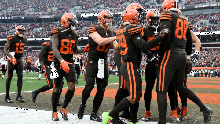
We kinda got this matchup in 2008:
-
 4
4
-
 1
1
-
-
Wasn't my favorite but I did think there was a place for this:
-
7
-
2
-
 1
1
-
 1
1
-
 1
1
-
-
8 hours ago, MJD7 said:
I think the Texans are a prime candidate for the triple-mismatch (i.e. different color helmet, jersey, & pants). They could do the red helmet, navy jersey, & white pants at home, and do the white jersey with navy pants on the road. They could even continue the triple-mismatch with the alternate by switching to the navy helmet with the red jersey & white pants.
The Texans taking over the 80-90's Bills niche of being the red helmet, blue jersey, white pants team.
-
5
-
 8
8
-
-
1 hour ago, simtek34 said:
LOVE it! Thank god it's not Color Rush. (We have one more alt jersey use left, it better not be the CR.)
Two things could make this uniform matchup a perfect '60's throwback...
Bears would need to break out these helmets:
-
4
-
-
15 hours ago, Webfooter said:
Oregon going chrome/eggshell/nightmare in the desert against Arizona State.
I like it?
I think I like it.-
4
-
-
The way the board reacts to the promotional use of "icy..."
-
1
-
5
-
-
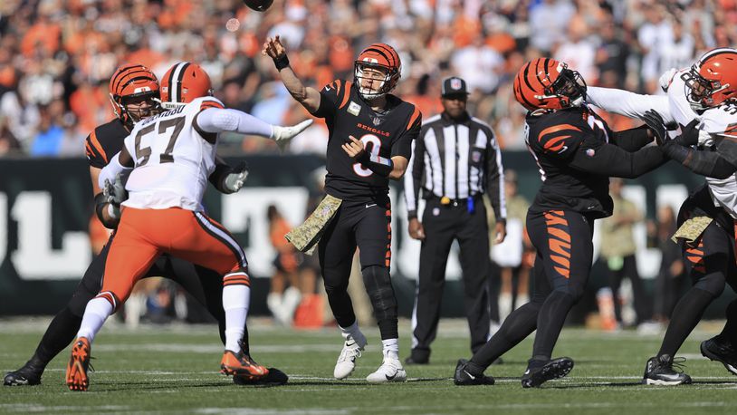
21 hours ago, DCarp1231 said:
The Bengals (very minor) problems would be solved if they just used one pair of white pants with both orange and black striping
Minor quibble, I like the setup as it exists now.
I like the white jersey having only black stripes and the white/black only pants match that very well. I could see tweaking the orange/black striped pants in a way to more appropriately tie into the black jersey but it's something I'm cool living with.
My only quibble is the tendency to over mix. The black/white only pants should only go with the white jersey (though there's an argument for the orange jersey as well). Use the orange forward pants with the black jersey.
I like the black pants on the road with the white socks, not orange. For the home set, I like the idea of black being the "normal" color socks with the orange ones coming out for "big games."I like both of these. Just pick one and stick with it. Don't care which.
-
1
-
-
Truth is the Bears have worn white over white over white before but stopped after a particularly gutting loss at Lambeau.
-
3
-
-
13 hours ago, fouhy12 said:
Wear these with white socks that use the shoulder hoop design as a stripe, and you've got a good uniform.
Remember once upon a time they did this:
-
7
-
-
1 hour ago, SFGiants58 said:
It also has the unfortunate context of being adopted the season after Tom Brady left. They’ll always be the “regression to the mean” set, tainted by their association with the team falling apart.
This is the same issue as the Cavs’ early 2010s uniform set, after Lebron left for the first time. It looked good, but it was tainted by that association with the “austerity” years in between Lebron’s two tenures.
In fairness, the Cavs won their title in those very uniforms after Lebron returned.-
1
-
-
25 minutes ago, Jezus_Ghoti said:
-
1
-
4
-
-
Sinking feeling the Bears are wearing orange this week.
No evidence. Just a hunch.
-
5 minutes ago, Cujo said:
We've been played again.-
1
-
-
-
The aughts Seahawks uniforms really benefited from dazzle fabric. Pity that due to weather and being in a division with (at the time) 2 dome teams the lighting was rarely bright enough.
-
8
-
-
On 10/28/2023 at 11:22 AM, the admiral said:
No better evidence of Chicago's weakness as a college football town than the Bears having to schlep all the way out to Missouri: The Director's Cut to find a marginally acceptable interim venue.
Trying to do a few games at Wrigley Field would have been fun, but that was when the Tribune owned the Cubs and wasn't keen on using Wrigley for anything but baseball, which actually may have been the right move, in retrospect. Another right move might have been building a combined Bears/Northwestern stadium in Evanston. Oh well.
Champaign is more Western Indiana than Missouri. Going from the Blue and Orange of Champaign to the Cream and Crimson of Bloomington isn't that much of a shift.
The real move in 2002 would've been to play in South Bend, which Chicago has always treated like their team. But the Bears and Fighting Illini have a connection because of Halas and Grange, plus I bet it would've opened up a political can of worms to play out of state. -
1 hour ago, Ted Cunningham said:
Not to kickstart an "intellectual dishonesty"/Browns & Ravens debate, but a hypothetical: If the impossible came to pass and the city of Houston/Texans ownership got a hold of the Oilers IP, would anyone miss the Texans or their identity if the NFL/Texans did an NBA-Bobcats/Hornets switch, in which the Oilers history ends in 1996, and restarts in 2002 (or even go farther and just say the Texas were a separate team that ceased to exist)? I'm not arguing the practicality of the situation (as I don't think it's practical or that it would ever happen). But if it did, would anyone miss the Houston Texans beyond "Their logo was pretty clever"? Forgettable color scheme, forgettable uniforms, only four double-digit-win seasons, never made it past the divisional round of the playoffs. I guess it's been so long now that there's a generation of football fans who grew up only knowing the Texans, so maybe? I guess it would depend on how long this hypothetical would take to play out. But while the Texans identity is OK, it's just that: OK. The Oilers brand was/is much stronger and more recognizable.
Anyway, this post made me think. Mods, if this is appropriate elsewhere, please move it.
I don't think the Texans uniforms are forgettable. The custom font is one of the better ones that came out of the early 2000's, the jersey stripes are simple and modern and the combinations work really well, including the "Battle Red" stuff.
Houston should remember the example of the team that left, sometimes you do get it right the first time. It's been pointed out every time the rumored uniform change is brought up but just wait until these uniforms are gone.
Were the Oilers IP be transferred, I think there'd be at least a fauxback. The Charlotte Bobcats never quite created a visual identity that lasted or stuck which isn't true for the Texans. I do think there's some appreciation for the Texans IP.-
4
-
-
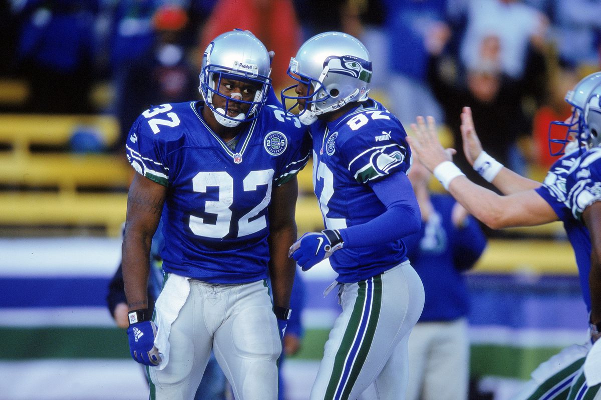
Here is what, in my opinion, made the OG Seahawks uniform special:
The helmet.
The other 3 NFL teams that use silver helmets all have a stripe bifurcating them. The Seahawks never did and instead had the rare wrap around logo.
Additionally, the shade of silver was never a speckled or sparkly version as would later be used by the Lions and Raiders. Instead, I always felt it gave off a stainless steel look.
With no stripe down the helmet you got a shining silver crown, even under the artificial light of the Kingdome.
Today that was on full display and it was glorious.
The post 2002 helmets maintain the wrap around logo but with darker blues, there's less contrast and the logo has to rely a lot on white outlining to stand out.With the silver lids, the logo demands attention.
-
15
-
 1
1
-
-
1 hour ago, nuordr said:
I'm hoping for powder over white against white over navy.
Bears are out of conference. No need to break out the gold. Plus the white britches will look good against the navy blue with white socks.-
2
-
1
-
2
-
-
The whole Oilers thing is weird because the team moved and but then later rebranded.
Usually you get a rebrand WITH the move like the current Winnipeg Jets, the Minnesota Twins, or the Baltimore Ravens (the last one being complicated).
More common is the no rebrand with the move like the Los Angeles Rams, Indianapolis Colts, the Los Angeles Raiders, the Arizona Cardinals, the Oakland Raiders, the St. Louis Rams, the Los Angeles Chargers, the Los Angeles Rams, or the Las Vegas Raiders.
There isn't a big fan argument when the Colts come to Baltimore wearing blue and white (of course a pair of titles by the purple and black go a long way).
So the Oilers are in this position of straddling two fanbases because they didn't rebrand for a couple of years.-
5
-
-
12 hours ago, MJD7 said:
I thought the Bucs’ creamsicles looked absolutely gorgeous in action. Paired up against the Lions finally wearing silver pants, it’s gotta be my matchup of the year, by virtue of its uniqueness.
I think keeping it reserved to one game a year is perfect, it keeps it special (having the designated “creamsicle game” every year) while still keeping it relevant to the brand. I don’t think the creamsicle would work full-time because the away jersey simply isn’t as endearing as the home.
I disagree with this because the creamsicles and the modern set are trying to do completely different things, so taking the ‘97 logo out of its proper context within the rest of the brand doesn’t really work.
The creamsicle set is bright, fun, and kind of kitschy, which is why it was derided in its time but also why it’s beloved with the lens of nostalgia. On the other hand, the post-1997 brand is meant to be dark, menacing, and intimidating, a seemingly deliberate course correction from the creamsicle look.
This is why any attempts to combine the two, whether by bringing the newer logos in or adding black/pewter to the creamsicles, don’t work in my opinion, because the two brands are so diametrically opposed. I think a throwback game still works though, precisely because of the contrast. The creamsicle is a refreshing change of pace from the Bucs’ usual dark and moody set.
I also disagree with this, because I think the bright colors of the creamsicle are precisely what make it work. Darkening both colors would make the set completely lose its appeal to me.
Agree with pretty much all of this.
The change in fabric has really helped but also the league more generally. There's been a shift towards black and darker blues (Chargers and Rams excepted) since the 1997 rebrand so going with the brighter scheme is a breath of fresh air.
Now if we could get this to make an appearance in 2023 that would be good.
-
5
-
-
One thing to keep in mind with the Bucs is that prior to 1997, the creamsicles were associated with FAILURE.
Massive and perpetual failure.The year before the rebrand, the Bucs had register double digit loses in 13 of 14 seasons.
After the switch they were .500 or better for 6 straight seasons and won a Super Bowl.
The throwbacks only started happening in 2009, well after the team had ceased to be a joke on the field.
-
5
-
-
16 minutes ago, DCarp1231 said:
Wasn’t the intention of including pewter for the helmet to mimic a cannonball? If that’s the case, they missed the mark.
Ohio State on the other hand, hit the mark a few years ago with their alternate black helmet-
I think its just the general use of pewter wares (grog cups, plates, buckles, knives, etc.) in the Age of Piracy.
Besides cannonballs were never made of pewter but iron.-
6
-
-
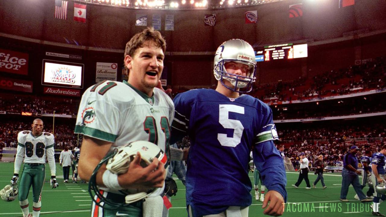
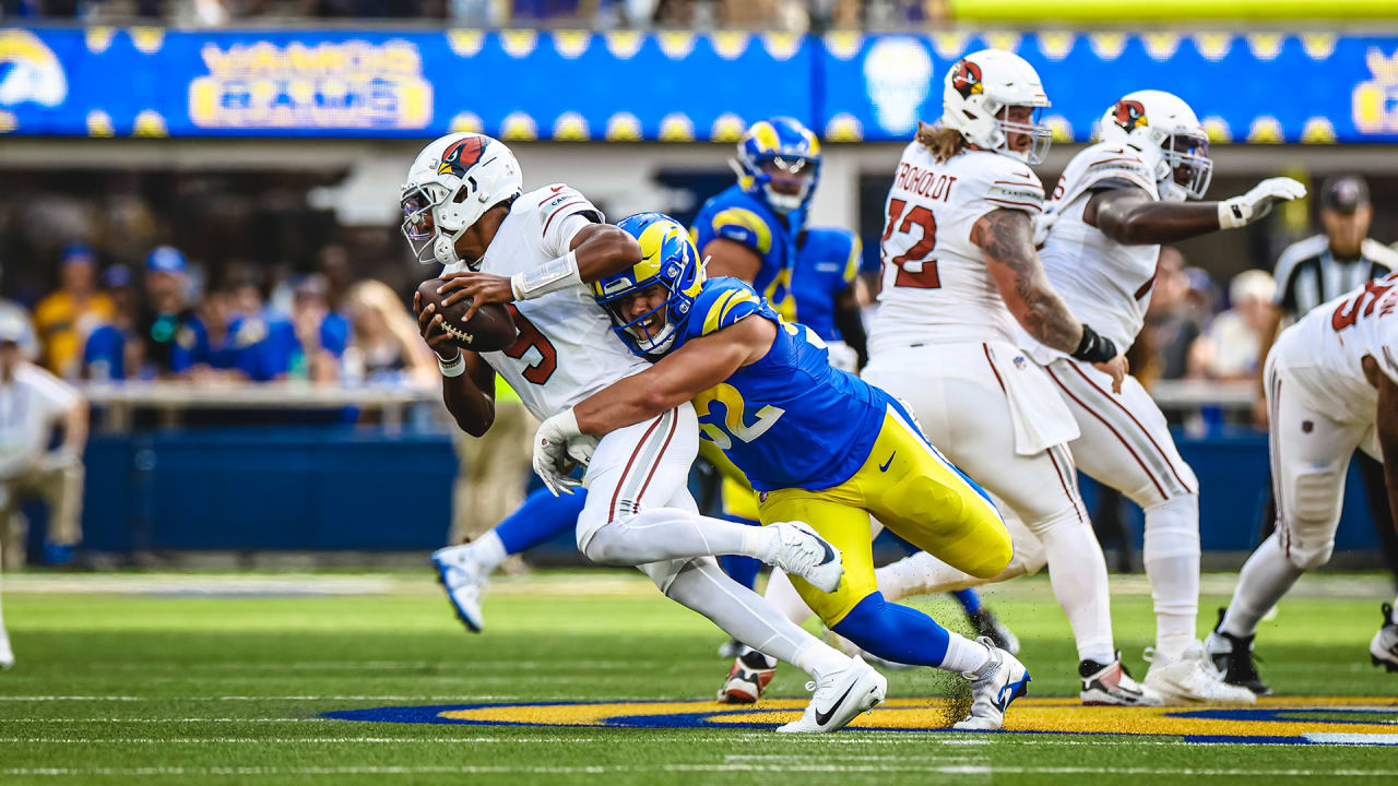
The new Cardinals away set is filling a very specific niche in the uniform world: the mono white / red centric uniform.
While there are multiple other mono white uniforms (white helmet, jersey, pants) in the League, all of those other teams are blue or teal (Colts, Bills, Dolphins, Chargers and alts for Browns and Cowboys)
Something about this is scratching an itch for me:
Now the Cardinals previous set was also white over white with a white lid but with the red shoulders, it felt different from this set.
I like the new set much better.-
9
-


/cdn.vox-cdn.com/uploads/chorus_image/image/72807450/1763789756.0.jpg)


/cdn.vox-cdn.com/uploads/chorus_image/image/70402038/usa_today_17523160.5.jpg)
2023 NFL Season week by week uniform match-up combos: From HOF Game to Super Bowl LVIII
in Sports Logo News
Posted
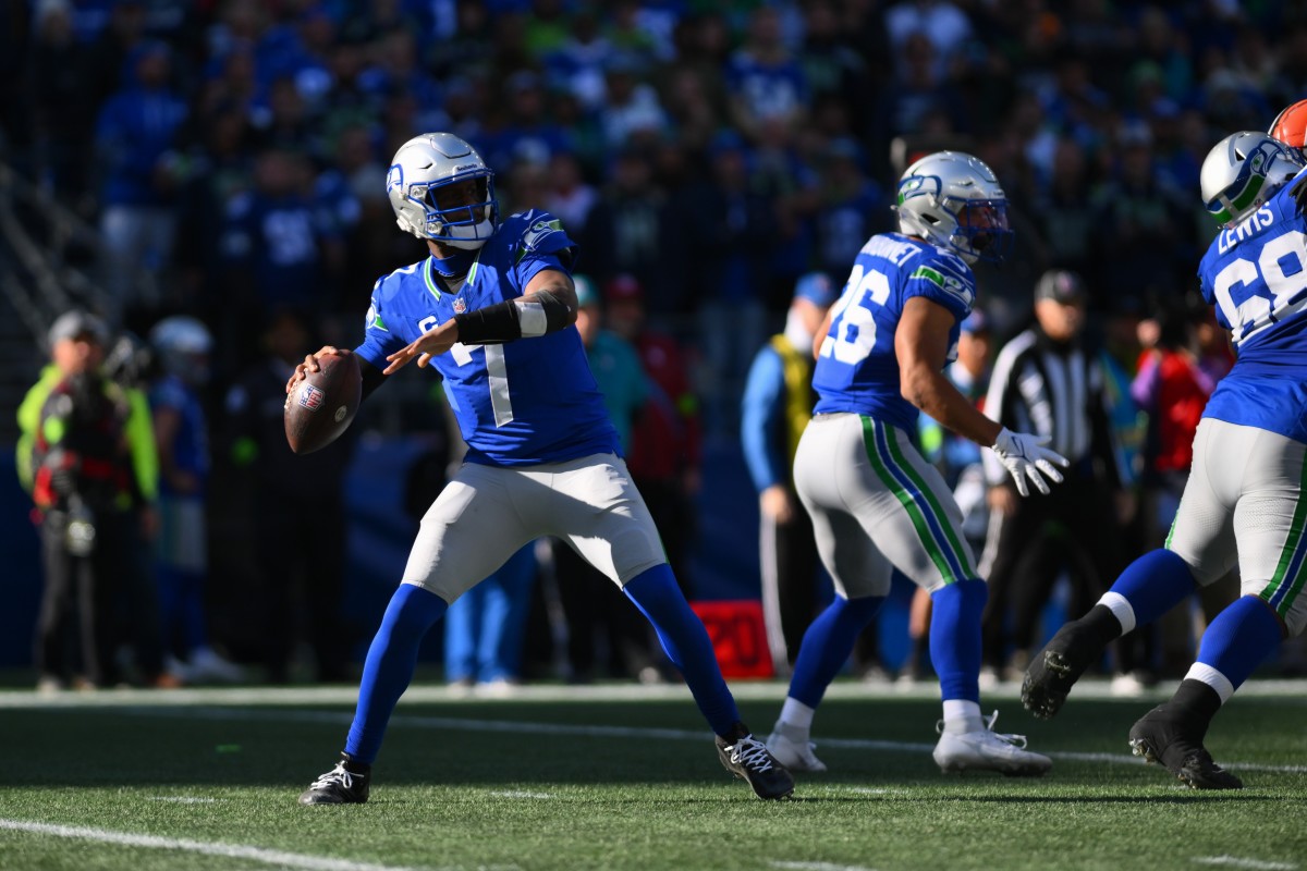
At this point, the Seahawks in action green kinda is their traditional vibe.
It's their thing. Until this year, we hadn't seen the royal and silver look for two decades.