


Carolingian Steamroller
-
Posts
2,499 -
Joined
-
Last visited
-
Days Won
11
Posts posted by Carolingian Steamroller
-
-
13 minutes ago, McCall said:
We don't need to relive the past, people.
Tell that to whoever decided to introduce half a dozen throwback uniforms in a single offseason.
-
 2
2
-
-
1 hour ago, HOOVER said:
“I don’t want to get overly political…”[Pulls the Race Card]
Hard to tell the whole story about the issues between Memphis and Nashville without bringing that up.
There's a lot more to the Oilers saga and when it comes to football its hardly the main event, but can't leave it out.-
 7
7
-
 1
1
-
 1
1
-
 2
2
-
-
10 hours ago, tBBP said:
Memphis specifically, but also the whole of West Tennessee, is the red-headed stepchild of the Volunteer State in that the heads who run the state keep forgetting that they exist...and it's evident in the overall lack of infrastructure development out there. Seriously, once you get past oh, say, Hurricane Mills, and at any rate west of the Tennessee River, whatever niceness you may perceive of the state seems to drop right off a cliff...along with the topography turning flatter and not-as-scenic (trying to be nice here). It's really an [unfortunate] tale of two Tennessees...and Memphis has long borne the brunt of that neglect among other things, still does to this day. (Oh and the vitriol in Memphis toward Nashville is still all the way real.)
I don't want to get overly political but if anyone is interested and wants to look into this outside of this board, there is a racial element to this: Nashville is 53% white, Memphis is 61% black.-
4
-
 1
1
-
 1
1
-
 1
1
-
 1
1
-
2
-
3
-
-
10 minutes ago, FiddySicks said:
I remember this well. My dad’s family is from Memphis and I remember my cousin bringing home a Tennessee Oilers shirt. I also remember him throwing it away when he found out they were going to be based in Nashville (I also remember everyone being really pissed they weren’t getting a home game vs Dallas) Memphis wasn’t having any of that, being a two year stop on their way to Nashville, and I’m pretty sure they ended up in Vanderbilt’s stadium for the second year as the Oilers.
It was an arrangement that seemed to make nobody happy. Here's an article from the Memphis perspective.
https://www.commercialappeal.com/story/sports/columnists/geoff-calkins/2017/08/29/twenty-years-ago-memphis-told-nfl-and-oilers-now-titans-stick/610647001/
I also have family in Memphis (transplants) and I've been there several times, I can understand the hard feelings.-
1
-
-
2 hours ago, colinturner95 said:
Modell got hit by a lawsuit which resulted in the "Cleveland Deal" where the Browns ended up as a continuation of the original franchise, that had a period of inactivity, that retained the branding, uniforms and history and Baltimore (while being made up of the moving Browns team) would be considered an expansion team beginning play in 1996
Bud Adams moved the Oilers because he felt less and less confident in getting a new stadium in Houston.
That's something to keep in mind was the Cleveland fought really hard to keep the Browns in Cleveland. I remember a big push in the press trying to keep the Browns.
The Oilers sort of left with a whimper. They'd been at or near the bottom in home attendance the three seasons prior to the move.
Then there was the weird limbo where they were based and practiced in Nashville but played the games in Memphis, which despite being in the same state are two very different towns. -
1 hour ago, gosioux76 said:
This is a strange hill on which to plant your flag.
It's not as if the royal/green of the 80s and 90s is such a vast departure from navy/neon green that you can't see the evolution from one to the other. This isn't like, say, the Broncos wearing their original brown and yellow uniforms, or the Eagles wearing powder blue/yellow throwbacks like they did once upon a time.
Cut it down to its roots and you essentially have a team that's always been blue/green. Seeing them play in different shades of those colors won't lead anybody to believe that they aren't still the Seahawks. (The giant wraparound hawk on the helmets might also give people a hint.)
It's OK to prefer the current look to the old one, but this point just doesn't make sense. Also, a team's brand shouldn't exist in a single place in time. These are organizations that carry their histories with them, and suggesting the throwback look doesn't fit the current brand is just false.
Personally, I just feel like the league has become too drab and these throwbacks highlight that point. I'd love to see the Seahawks return to a more vibrant blue. It's also why I will always love the Bucs' Creamsicles and the Oilers uniforms.
Looking back, you can pretty much map out a 25-year timeline of teams ditching bright colors for darker ones, starting with the Chargers in late '80s gradually shifting to darker and darker shades of blue before letting Navy take over. The Broncos, Patriots and Buccaneers soon followed, joined with three expansion franchises (The Panthers, despite incorporating a touch of brightness, still leaned into the black and silver.) and later with the Seahawks shifting to darker blues with both of their uniform redesigns.
The transition of the L.A. franchises back to brighter colors seems like an indication that the trend may be shifting. I hope this new batch of throwbacks convinces some current franchises to follow suit.
I think this is a good general breakdown. To put a finer point on it, we have multiple teams right now that use throwbacks from the 1930's that no person alive has memory of. The Patriots use a red jersey, white helmet throwback with a logo that hasn't been the primary look for 30 years.
To get back to my 1994 analogy, part of the throwback gimmick has always been seeing uniforms from well before your time. At least five teams that year had uniforms that were at least 50 years old.
I don't think the Seahawks are concerned about fans not connecting the throwbacks with the brand. It's part of the deal when you put out a throwback.-
3
-
-
1 hour ago, FSUViking said:
Oh, Christ. Which of these teams will you not know who's playing if you tune in? Will you not recognize Seattle? Or the Jets? The Vikings?
Stop. It's nowhere near as bad as the NBA or college.
It's not the NBA...
IT'S 1994 BABY!!
-
9
-
 1
1
-
4
-
-
39 minutes ago, DCarp1231 said:
With the resurgence of throwbacks and more traditional style uniforms, the current iteration of Seahawks uniforms is quickly becoming outdated. Wouldn’t surprise me if it reached “Reebok unnecessary piping” status.
I could maybe see the front striping disappear but the sleeve cap has turned out very well.
-
1
-
-
Would also add that this has aged far better than I ever expected:
-
14
-
3
-
 1
1
-
2
-
1
-
-
Something always felt off to me about the Disney-era Angels pinstripes.
Maybe the weight on the pins looked a little thicker or the spacing was closer. I've looked up some game worn jerseys and they don't use zig-zag pins and they don't seem super close together but something always felt funky to me.
-
1
-
-
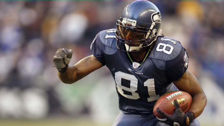
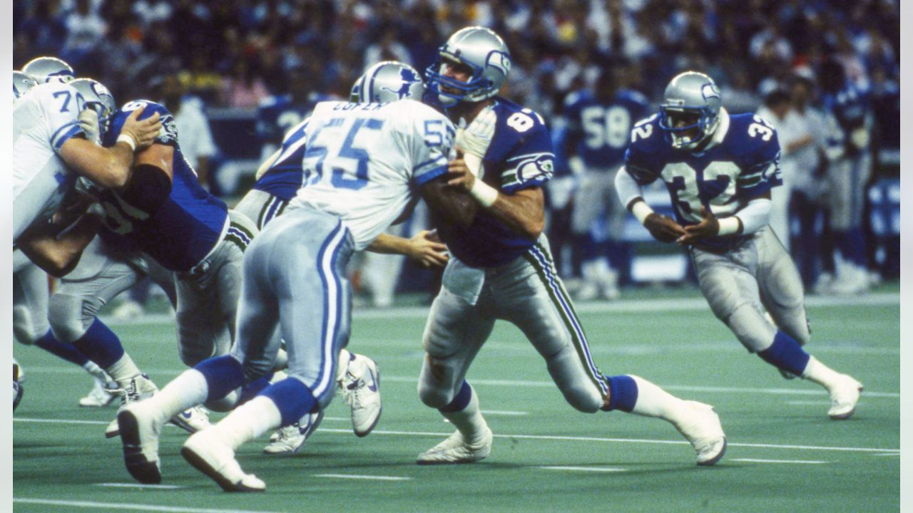
Fun fact: The Seahawks are the only NFL team that has never worn white at home.
-
4
-
1
-
-
4 hours ago, 4_tattoos said:
I only had three problems with the Seahawks' uniforms of that era.
- The sleeve caps being a different color from the rest of jersey. Seemed unnecessary.
- The inclusion of the helmet logo on the sleeves. If an alternate logo was created for this set in it's place it would have looked better off to me.
- The alternate versions they ended up unveiling. Mainly the navy blue pants. The jerseys might have been better off had the numbers been slate blue instead white.
1. This is actually a positive for me though not necessarily the contrast itself as the method in which it was done. The Seahawks did something rather remarkable and replicated the old rounded should yoke that you would see on old durene or wool jerseys. But they filled in the sleeve portion not the shoulder section creating a sleeve seem that had a rounded cutout. It was simultaneously retro and modern.
2. It was definitely a little small and something better could have gone there but it doesn't drag down the set for me because so hard to notice.
3. When they used the navy pants in 2009, something felt off to me. I think it was that the stripe pattern had to change for the first time which threw it off. (Not showing the lime green tops because I don't think that's a fair representation).
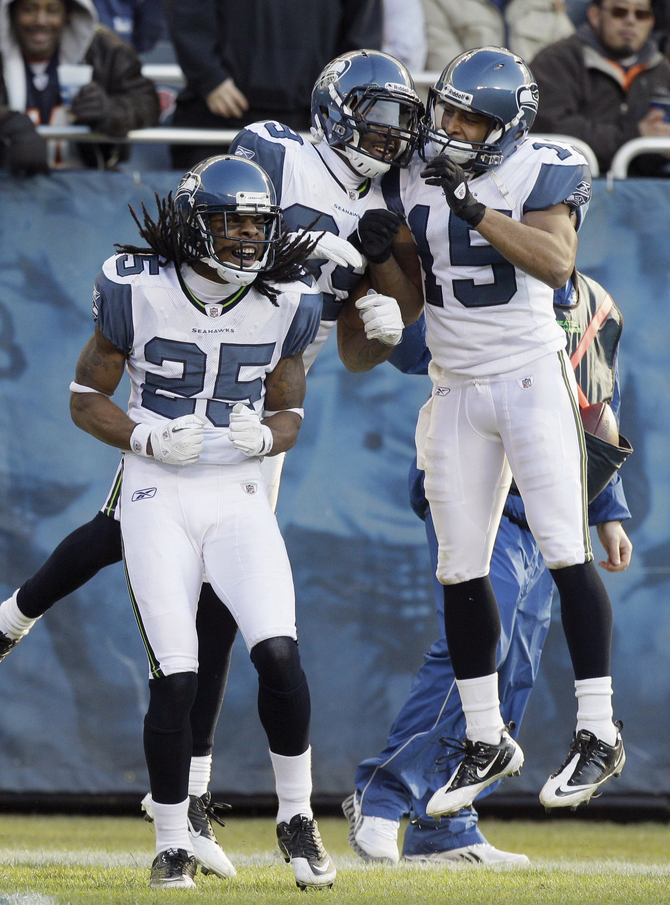
My only real complaint is that because the Seahawks wore solid white on the road (which works thematically) we rarely go the chance to see the slate blue dazzle fabric in the sunlight (Seattle being Seattle and all) and by God did those things glisten when they got their chance.-
10
-
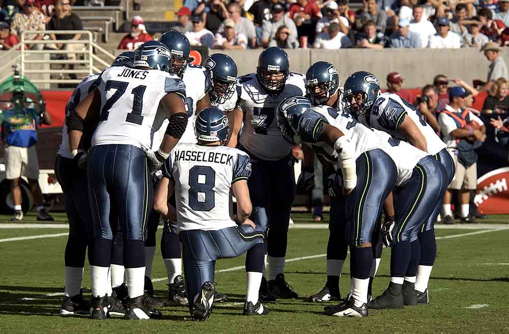
9 minutes ago, DCarp1231 said:
-
1
-
-
Just want to add for the record that I've loved EVERY Seahawks uniform since I was a little kid.
My dad even poked fun at me for wanted a Seahawks helmet when I was little despite being in a rabidly pro-Bears household (it was the Ditka era so fairly typical).
I've long felt that this was a criminally under appreciated idea even though I couldn't tell you whether I thought it was an improvement over the royal and silver.
My main complaint being they didn't utilize this look nearly often enough
They've had a great logo since word go and deploying that in a wrap around design that uses the whole geometry of the helmet made it an instant classic.
They've looked good in every era and for wildly different reasons. Good for them.-
16
-
-
13 hours ago, the admiral said:
No, that's just it! On top of it all, they look bad! They look like the Lions from a distance, but cheaper and sadder. It was a bad uniform for a bad team. Okay, the logo looked slightly more like a totem pole than it does now. Still bad.
Maybe they look like the Lions from a distance but then so do the Cowboys. This is why we have home and away jerseys to provide the contrast. Just looking at old pictures, there was a big difference in the tones of blue (Honolulu is always lighter) and the Seahawks silver was much more of a stainless steel than the silver bullet Lions.
-
3
-
-
7 minutes ago, shstpt1 said:
Unique as in generic, then sure. WFT was terrible, plain and simple.
Hard disagree. -
I am once again asking for the Red Tails.-
3
-
 2
2
-
4
-
2
-
1
-
-
2 minutes ago, ManillaToad said:
Wtf happened to the Colts' aesthetic in the last few years? They used to be a guaranteed good look every week. Now it's all-blue, all-white, all-blue with an incongruous black helmet...??
The only that's changed is they've opted to wear white socks with the away jersey. Once a year they wear all blue but that's been the case for the past six season. -
1 hour ago, BadSeed84 said:
The players have to feel goofy doing the posing for the video, with some crap rap like music in the background.
Trying so hard to be cool.
A. It's just beats, not hip hop.
B. You do know that the music is dubbed over in post-production? This stuff is shot in slow motion so to get the footage for a two minute video they players only have to move around a few seconds. Then the production team cuts the clips together and adds whatever music they want. A team can hire John Williams if they want.
-
5
-
-
Seeing the AOL login design and feeling instant nostalgia for Instant Messenger makes me feel old, then warm and fuzzy, then sad that I'm such an old, easy mark for that.
-
8
-
-
19 minutes ago, oldschoolvikings said:
It has to do with feeling like the throwback uniform is blatantly more visually appealing.
To clarify, there is a diversity of opinions present. Not every feels that a given throwbacks is blatantly more appealing and while the "They should wear these full time" may seem like a solid group, some people feel differently depending on which team we are discussing.
It's just the board format can make it seem like its a wall of comments, especially when not everyone is tracking all the different handles.-
1
-
-
39 minutes ago, Silver_Star said:
Do they mean the 1983-2001 uniforms? Honestly, the 90’s Seahawks were horrible. So horrible that in 1998, Holmgren end up being their coach and the rest is history.
Oh, Mike Holmgren.
-
1
-
3
-
-
50 minutes ago, lahaye7 said:
DROP SHADOWS 4 LYFE!!!!!!!!!!!
Needs to be pointed out that the Browns were unique in deploying 3D Block that shaded down and to the left, compared to the 49ers, Eagles, and Ravens who are shaded down and to the right and the Falcons who are shaded straight right.-
3
-
-
7 minutes ago, Pigskin12 said:
This is interesting and potentially could mean that they will pair them with the navy Color Rush set for one game. I’ve always wondered why the team doesn’t wear red more than one game. I have a feeling it might be the Watt Pittsburgh game in addition to the Thanksgiving weekend Jags game, or maybe the Christmas Eve game against Cleveland.
Red helmet, navy jersey, red pants, navy sock.
Do it.-
1
-
3
-


2023 - 2024 NBA changes
in Sports Logo News
Posted
Do the shorts have a spike on the sides coming down from the waistband?