


Carolingian Steamroller
-
Posts
2,474 -
Joined
-
Last visited
-
Days Won
9
Posts posted by Carolingian Steamroller
-
-
I'm on record for a full rebrand for Texas but while we're talking about the current set, they're a good example that just as important as the design that comes from the supplier is how the team chooses to wear them on the field:
This is the look at the unveiling:

Now look at how different the uniforms look when you change the red cap for blue or vice versa:
-
 5
5
-
-
21 hours ago, PlayGloria said:
I figured this out: On TV from the aerial view of the field, they look amazing.
Exactly. I think the overall aesthetic is really important.
-
1
-
-
I think we should talk about the Bengals 2021 redesign as a smashing success.
The base design is great but we also need to give props to the equipment staff in Cincinnati that have consistently made good pairings for each week.
Wearing white socks with the black pants on the road is terrific for starters but also keeping the black socks with the white over white (paired with the black striped pants) and going with orange/black/orange last week have been so satisfying to watch. I even liked it when they went black over black with black socks because it still felt like the right choice with that particular combination.
-
14
-
-
One thing that was interesting about the original Royals uniforms was that the road uniform had a script Kansas City that was vertically arched not angled.
If you went with the KC monogram, do you go with official logo or with something that more closely resembles the cap monogram?
It is a relatively thin logo and it looks like the team wanted to roll with plain blue numbers.
-
On 11/21/2021 at 10:45 PM, seasaltvanilla said:
Re: legibility of long scripts
I saw someone suggest this on here once (with the Dodgers) and it's stuck with me since:
Why not stack the different words? (Old template because it was easily available)
Pretty sure that was me. https://boards.sportslogos.net/topic/118970-mlb-2020-by-carolingian-steamroller-outtakes-and-outtlaws-3131/?do=findComment&comment=2988171
I did it with the Dodgers because the stacked "Los Angeles" had been done by the Lakers. Also because of the way the letters slant it was relatively easy to fit the "Los" into the negative space to the top left while still leaving space for the number in the bottom right.
-
4
-
-
On 11/6/2021 at 12:38 AM, joekono said:
I've said since the Padres and Brewers corrected their boring drab uniforms(and added some nostalgia while they were at it) and the Diamondbacks tapered down those terrible uniforms before these, the league has looked the best it has in a loooong time as a whole. Yes, Miami might be a mess but I don't think we are going to see the 1993 uniforms anymore. I think we hopefully won't see any major changes. It's refreshing unlike other leagues(lookin at you NBA) to be able tell what teams are playing. I just would be happy with home, road grays(or powder blues) and a single alternate jersey. Being a Mets fan, there's no need for two blue alternates. So, I've heard the Rockies might do something with their alternate but they got it right the first time, no need to change. The MLB looks really good now. Root for the laundry!
One thing that's interesting to me about the Padres and Brewers were the parts of the uniforms that were not nostalgic but radical.
One of the great things about the Padres set in particular was that it was able to blend pinstripes and collar/sleeve striping. We haven't seen that widely since the 80's (the Padres had never done anything like that themselves) and the particular path the Padres chose took full advantage of the more current fabric. They also took the path of having two different sets of road pants while maintaining only three regular uniforms.
For the Brewers, they made a sharp departure from their uniform history by including a cream uniform. The Brewers came into existence well after fabrics had progressed to the point where even flannels were more white than cream. They furthered that by mixing the cream uniform with double knit style sleeve stripes. Also new was the creation of a vertically arched "Milwaukee" mark, something the team had only ever done in the 90's (their road greys keep looking better to me every time I see them).So while both teams pitched some nostalgia, they also took those uniform in new, hitherto unseen directions.
-
7
-
-
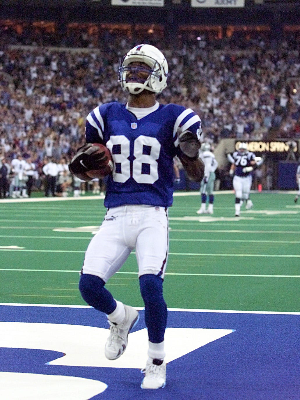
On 10/31/2021 at 5:03 PM, Chawls said:
This was a perfectly color-balanced uniform. Blue and white. Simple. Effective.
If I recall correctly, the shift happened as part of a broader, let's call it Unitas-isation of the Colts identity in 2004.
At that point they not only shifted to grey facemasks, but also black cleats and striped socks. The base color blue also became less vibrant, shifting from Pantone 280C to Pantone 654C. The sock stripes were ditched in 2006, but the color change remained until 2020 and the grey facemask is still there.
-
5
-
-
21 hours ago, MNtwins3 said:
Respectfully, do not change the TC ever.
We don't wear the "Twins" navy alternate anywhere but home. All jerseys with gold are worn exclusively at home with the matching hats and pants with gold trim. On the other side of the coin, we only wear the navy "Minnesota" alternate on the road.
I could've sworn I saw them wear the gold trimmed navy jersey on the road a couple of times but I'll take your word for it.
Still would be good if they made a decision on all of their uniforms having gold or none of them.
-
1
-
-
I thought the 2009-2011 Jaguars had a really interesting dynamic.
Teal forward at home and black forward on the road. The teal flecks on the helmet did a good job of balancing the two looks.
-
5
-
-
It'd be nice if the Twins committed one way or another on the gold. As it stands:
Home Whites: Gold trim on uniform and capRed Alternate: Gold trim on uniform and cap
Navy Twins Alternate: Gold trim on jersey and cap, not on pants when worn on the road
Navy Minnesota Alternate: No gold trim
Road Greys: No gold trim
Powder Blue Fauxback: No gold trim
-
2
-
-
19 hours ago, CreamSoda said:
Hopefully the Avs just used cheap materials for the rookie camp games and we see numbers that better match for the regular uniform. This looks so much better:
What's really missing here is the silver outlining on the numbers. For most of Avs history, the blue and maroon elements have not touched (yes the blue shoulder stripes on the Reebok era jerseys had no border but that's the lone exception). I think the maroon and the blue, while a great pair, really benefit from having a neutral color separating them. Put those numbers in blue, outlined in silver, and see a big shift.
-
1
-
-
There's also the intellectual property aspect.
Trademarks have to be filed and that process can take a while.For example, the Rams "LA" mark is still pending with the USPTO.
-
2
-
-
1 hour ago, MDGP said:
Boston College aren't the Golden Eagles. Only the marching band's dance team and sports media outlets with bad editors use that moniker for them.
Huh, I never knew that.
I know that was a misconception common among Marquette students and alums at the time.
That really adds another wrinkle.
Thank you for that.
-
1
-
-
I think one issue with the WFT and the "Warriors" is that, frankly, there are better options that don't take the team out of the Lightning Sand and into the teeth of the ROUS's.
To keep using Marquette as @SFGiants58 has done, when the name Golden Eagles was chosen in the 90's, one problem was that it felt a little generic because there happens to be another D1 Jesuit University called the Golden Eagles: BOSTON COLLEGE. So the school wasn't just dropping their own nickname but seemingly picking up someone else's.I think one thing that happened in 2005 was that the school then went from fine but maybe not unique to awful. Especially since it looked like they were copying other schools again with the Syracuse Orange and the Stanford Cardinal having so recently changed their names.
I wonder if any of the controversy would have happened if the school had selected Hilltoppers (or Golden Avalanche) in the 90's which were both unique names with connections to the school.
Right now the WFT has a bunch of unique interesting options like Red Tails and Hogs (even Red Wolves is nice) that are better. They have plenty of good choices on the table so there's no reason to risk turning the nickname into an ongoing problem.-
1
-
-
I was on campus in 2005 for the Marquette Gold fiasco.
I voted Hilltoppers in the poll but I think it worked out ok.
Golden Eagles was never a bad name and this was a really cool logo.
https://www.sportslogos.net/logos/view/4701/Marquette_Golden_Eagles/1994/Primary_Logo
I think the longest lasted negative effect of the attempted 2005 rebrand was the eagle logo went away and never came back.
The point is Washington could do a lot worse than “Washington Football Team” with a W mark.
-
1
-
-
Love the Cardinals/Sox design!
The connection to U of C is really interesting given that the Cardinals are the Cardinals because they wore faded U of C Maroons jerseys.It's also nice to have an all South Side set with U of C being located in the lovely Hyde Park neighborhood on South Lakeshore Drive.
Looking at it now, I'd be tempted to use a wishbone "C" on the cap, even though its not accurate to that era just to cement the connection since the Cardinals used to use one and the Maroons continue to feature it.
-
1
-
-
2 hours ago, MJD7 said:
I tried that originally, but didn't like it as much as without the outline. Here is a look, however:
I like this better given the blue brim is used. If the cap was all red and had a plain white P, I'd like the white outline better.
-
4
-
-
How about blue outlining on the home pins too?
-
2
-
-
I love those numbers for the A's!
-
2
-
-
Gorgeous! Wonderful shade of blue!
-
3
-
-
I really like the way that road alternate turned out!
Using the single red soutache compliments the red outlining on the lettering without clashing harshly with the "A" on the cap. It's very subtle but undoubtedly effective.
I love little features like that. Some small detail that really ties a uniform together like a nice rug.
-
3
-
-
Delightful!
Crisp, clean, bold.
-
2
-
-
These are terrific!
Extremely minor edit:
On the Bucks green jersey the piping separating the side panel from the rest of the jersey matches the collar piping while on the white jersey its different. I think either style would look good so long as its consistent.
-
1
-
-
This is a good look.
-
3
-

/cdn.vox-cdn.com/uploads/chorus_asset/file/22482276/usa_today_15987884.jpg)


/cdn.vox-cdn.com/uploads/chorus_image/image/69998367/1345860439.0.jpg)
/cdn.vox-cdn.com/uploads/chorus_image/image/70008126/1347117554.0.jpg)
/cloudfront-us-east-1.images.arcpublishing.com/gray/22HQGKH3FBF4LJ37NODHEUIFZY.jpg)


MLB 2022 Uniform/Logo Changes
in Sports Logo News
Posted
Just now realizing that in two seasons, the Brewers have never worn their navy blue "Milwaukee" alternate jersey at home, even though they probably could pull it off with either set of home pants.