


1insaneguy
-
Posts
1,168 -
Joined
-
Last visited
Posts posted by 1insaneguy
-
-
I'm guessing the bell shape has to do with the bells in the Spanish missions, which is where the original padres did their work. It's pretty clever.I hate bell-shaped front panel baseball caps.. The Padres, and anyone else who wants a colored front panel need to go full panel, not the ridiculous bell curve nonsense.
Clever, maybe.. Ugly, definitely.. I like colored panels, but crudely chopping up a normal panel for a poorly conceived semi-bell-ish shape, just to be "clever" is a swing and a miss in my book
I'll admit, it looks a lot better when it's not on someone's head.
I don't know. I prefer the bell shape. The full panel seems overly big for the Padres.
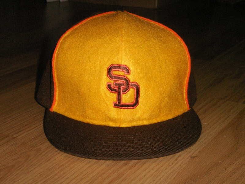
Is it me or does that logo look a bit small?
-
I'm guessing the bell shape has to do with the bells in the Spanish missions, which is where the original padres did their work. It's pretty clever.I hate bell-shaped front panel baseball caps.. The Padres, and anyone else who wants a colored front panel need to go full panel, not the ridiculous bell curve nonsense.
Clever, maybe.. Ugly, definitely.. I like colored panels, but crudely chopping up a normal panel for a poorly conceived semi-bell-ish shape, just to be "clever" is a swing and a miss in my book
I'll admit, it looks a lot better when it's not on someone's head.
-
I hate bell-shaped front panel baseball caps.. The Padres, and anyone else who wants a colored front panel need to go full panel, not the ridiculous bell curve nonsense.
I'm guessing the bell shape has to do with the bells in the Spanish missions, which is where the original padres did their work. It's pretty clever.
-
Tbh the new gold unis aren't that bad. If they didn't wear monochrome I might be a fan of them.
They'd be really cool if they were worn with the black pants.
Exactly. So far, 4/4 Color Rush jerseys have been decent, and so far 4/4 of those decent, respectable alternate jerseys have been ruined by the insistance on monochrome.
I'll take it a bit further concerning the Jags, but if there's any silv--well, gold--lining to the monochrome gold atrocities, it's that the Jaguars finally have gold pants and thus can justify wearing a 100% gold helmet.* Maybe someday, they'll combine gold helmets and pants with a teal jersey.
*BTW, can the colored pants/socks going to be options after tonight?
That'd look pretty bad@$$ imo.
-
Tbh the new gold unis aren't that bad. If they didn't wear monochrome I might be a fan of them.
They'd be really cool if they were worn with the black pants.
-
^I don't see "Cuba". That's my unpopular opinion.
-
You just HAD to post a pic of a knockoff, didn't you....THIS looks better than 84:

Further, by using a knock off as the example, cubsfan2015 undermined his argument for why this jersey is superior (at least in my mind). The color the Dolphins use now for their aqua is one of the best colors used in the NFL currently, far outstripping any other shade of the color they've worn since 1966.
I could not disagree more. The current aqua is too light for me. I prefer the aqua used from 1997-2012. It looked much better with the orange.
-
Nationals- Location. I'm from the DC area.
Capitals- Originally, they were my favorite NHL team because they were from DC, and I follow all the other DC teams. I started to follow them more in the past few years.
Wizards- Again, location. It only makes sense for me to be a fan of DC's NBA team.
-
In the Seahawks first year, 1976, they met the 'heavily-striped' New York Giants for the only time. No pics, but they would meet again in 1980, by which time the Giants would take on their most iconic look of the 1980s and 1990s (with the stripes toned down).
I was only able to find pics for this one.
-
You really are looking forward to getting a fantasy team, aren't you?
-
I liked when the Royals did this.

-
I don't know if there's really a general opinion on these here but I heart these! I think they were way ahead of their time


I'd actually not seen those before your post, but I agree with you. Those are pretty awesome.
-
I feel that the "Jazz" nickname is, in many ways, more synonymous with Utah than New Orleans. Stockton and Malone, the '97 and '98 Finals against Jordan's Bulls, and Jerry Sloan's long tenure in Utah have all made it such an appropriate fit.
I don't see how that makes it an appropriate fit. Just because they have more history in Utah doesn't mean that the name makes more sense than it does for New Orleans. Jazz music is one of the things New Orleans is best known for. Utah is about as well known for jazz as Winnipeg is for beaches and bikinis.
I'm guessing he means that he's now come to associate the Jazz nickname as being something he associates with more with Utah than New Orleans. While Jazz itself is not something Utah is famous for, Satomiblood now sees the nickname as being a better fit for Utah than any other team. (Of course this is just my guess.)
-
I see what you mean now. That doesn't really bother me, though.
-
Do you have a specific example?
-
I can't stand when a team wears a modern uniform from the neck down, yet stays with a traditional helmet stripe on the helmet. Am I the only one who doesn't like this?
What do you mean by traditional helmet stripe?
-
In no particular order, the top 5 best looking college football teams are Cal, Colorado, Maryland, Minnesota and Utah.
I know that I'm biased being from Maryland, but I really like their uniforms.
On kind of a related topic, I think West Virginia's current uniforms are fine.
-
I like the Eagles black uniforms. Still want to see the green jersey paired with black pants.
Yeah, the Panthers are plenty modern. They're only "traditional" in the sense that they haven't significantly tweaked their look since it debuted. Which is fine. It's nice seeing newer teams get it right on the first go and stick with it.
I don't like their shoulders stripes (which vary based on the cut of the jersey) or the inconsistent striping thoughout the uniform in general.
But I LOVE their color scheme.
I agree. It's not as bad as some people make it seem.
-
RIP Kelly Green

For some reason when I first read this, I thought "Kelly Green" was the name of one of the players in the picture. It took me about a minute to realize you were talking about the Jets kelly green uniforms.
(I agree with you though, those Jets uniforms were nice.)
-
 1
1
-
-
I like this Vikings wordmark.

-
2
-
-
-
"Miami Marlins" is much better: it's alliterative
This would be true if they were the Manchester Marlins. In Miami, the vowels are much more dominant than the M, so the alliteration loses its effect.
Florida Marlins just sounds better, any way you pronounce it. Flor-da Marlins, Flor-ih-da Marlins, Flar-da Marlins, Flar-ih-da Marlins.
Exactly. Sometimes alliterations aren't the way to go.
-
I really loved how old baseball caps had the kelly green underbrim
Is that unpopular? I hope not.
-
I like this logo:


Unpopular Opinions
in Sports Logo General Discussion
Posted
The boxcar numbers are (in my opinion) the coolest part of that jersey.