-
Posts
1,168 -
Joined
-
Last visited
Posts posted by 1insaneguy
-
-
I don't know how unpopular this is, but there are a number of CFL identities that I really like.


You don't know how unpopular this is? Seriously?
Seriously.
-
I don't know how unpopular this is, but there are a number of CFL identities that I really like.


-
I hate the New Orleans Pelicans identity so much that I would support a CFL-like New Orleans Hornets in the west, Charlotte Hornets in the east situation in the NBA. There, I said it...
What exactly do you mean by CFL-like?
CFL-like meaning it would be similar to how the CFL had two Roughriders franchises for many years. (In Saskatchewan and Ottawa)
-
To me this is one of those "So bad it's good" uniforms. I know there's too much red, but I still like it.
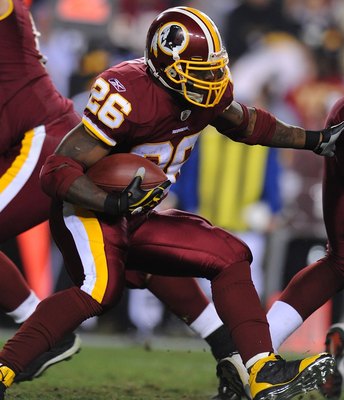
EDIT: Looking back, I realized I have a ton of unpopular opinions.
I feel like they've gotten obliterated on national television every time they've worn these. They just remind me of the darkest parts of the Jim Zorn era (as opposed to the oh-so-magical times we're experiencing now). Hopefully this combo never sees the light of day again.
Yeah, the Steelers obliterated them.
When they wore them against Dallas in 2009, the Cowboys beat the Skins 7-6 on a last-minute TD pass...Skins were shutting Dallas out 6-0 for the whole game and lost at the end. Was a crazy game actually.
Story behind the uniforms:
I'm actually glad I missed that game. My neighbor gave me a recap of the whole thing right after it ended.
-
To me this is one of those "So bad it's good" uniforms. I know there's too much red, but I still like it.

EDIT: Looking back, I realized I have a ton of unpopular opinions.
I feel like they've gotten obliterated on national television every time they've worn these. They just remind me of the darkest parts of the Jim Zorn era (as opposed to the oh-so-magical times we're experiencing now). Hopefully this combo never sees the light of day again.
Monochrome red or not, they'll still get obliterated on national TV.
-
To me this is one of those "So bad it's good" uniforms. I know there's too much red, but I still like it.

EDIT: Looking back, I realized I have a ton of unpopular opinions.
-
This is the best Lightning jersey imho:
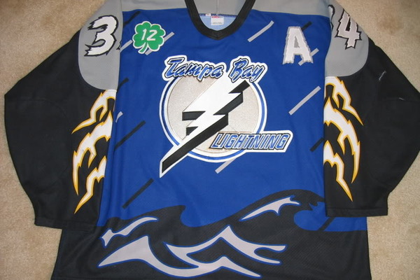
Please tell me that's fake.
No that uniform is very real. It's so bad it's almost good.
Oh yes, it is real. (And yes, I know this jersey is bad from a design point of view.) But for some reason, it's my favorite of the Lightning's jerseys. It just says "Lightning" to me.
-
This is the best Lightning jersey imho:

-
That explains the too-big shoulder stripes. Still though, I've gotta tell you that you fooled me for a minute there.
-
 1
1
-
-
The Senators are OK. Personally, I think you should make the top and bottom stripe both gold.
Canucks: I actually like that you made the "Johnny-the-Canuck-head" the primary. I'm not a fan of bringing back the "flying V", though.
-
I love this Canadiens throwback.

-
so then why do we have rating members by stars if we got rid of the dislike button. just pointing that out
Was there ever a dislike button?
-
I like it when the Penguins wear light blue.
-
*Can't quote in IE for some reason*
Either way: What OnWis97 said. It's unpopular because that's my favorite look for the Chargers. I'd take that over ANY other look they've had. Not just the current one.
-
Another one about the NFL:
I like the old Chargers jerseys better than the new ones. Something about how that lightning bolt looks on a darker background. I just think it's cool.

-
 2
2
-
-
*gag*

Now this I like to see haha! no more injuries to my Packers!
Even he looks pissed about playing for the Dolphins.
-
Honestly, I agree that I like them. Not better than what they have now, but I like them.
That monstrosity might be worse than the jags or bucs
You are 1insaneguyFor some reason I like the Bills old uniforms. Don't get me wrong, I actually like their current uniforms. I just really like these for some strange reason:

(I know that nobody agrees with me.)
I do though, like that red helmet a lot better than the current whites.
I actually like what they have now. But I have to agree with you. The Red Helmet is much better than the White helmet.
-
For some reason I like the Bills old uniforms. Don't get me wrong, I actually like their current uniforms. I just really like these for some strange reason:

(I know that nobody agrees with me.)
-
 2
2
-
-
-
- Hamilton Tigers*
Why does everyone always make their Hamilton teams involve Tigers, Cats, or a combination of words involving "-Cats" at the end? Surely there's something else that's got to do with Hamilton.
Hamilton Hammers.
That's actually not too bad.
-
-
Carolina Hurricanes concept. I miss the wrap around flag motif, and I'm adding a color. Thoughts?
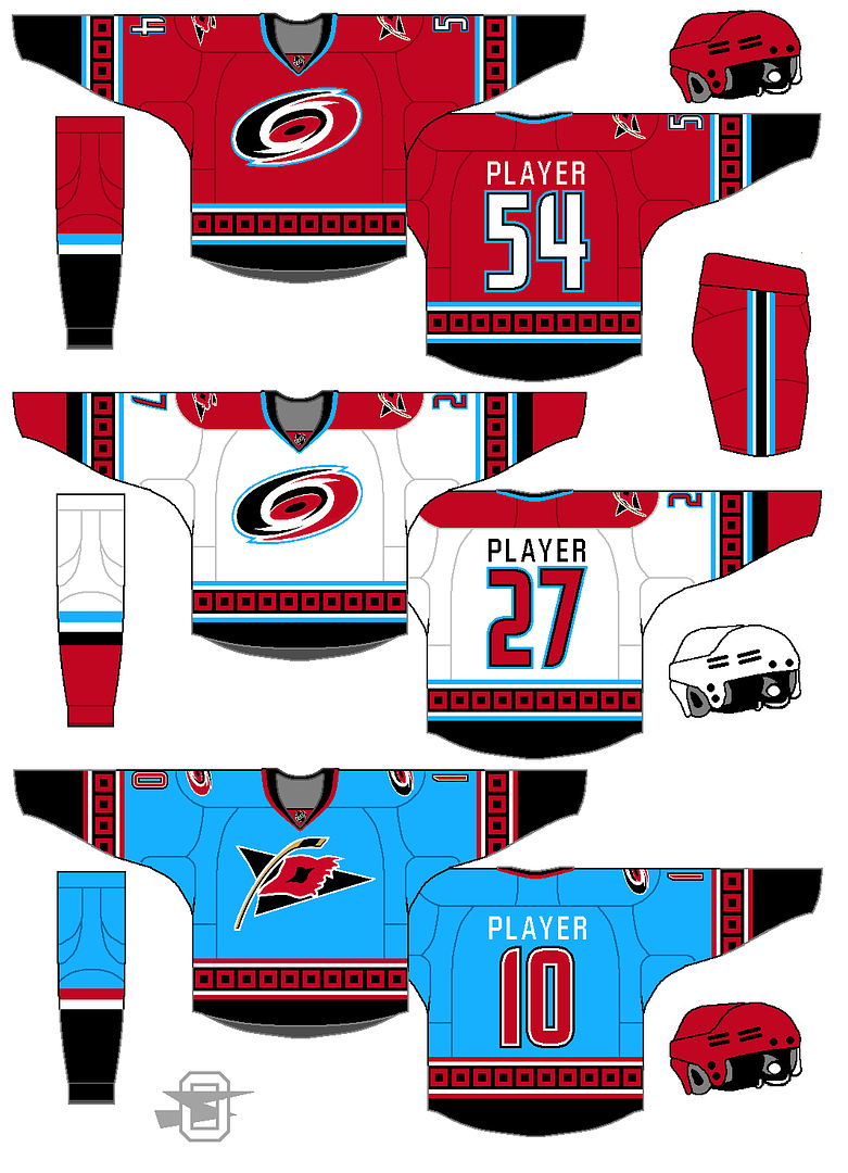
If there's any color that would work for Carolina, it's probably "Carolina Blue".. I really think this could grow on me.. Perhaps a slightly less vibrant shade could work better, but the blue is a nice touch.. Symbolizing sky, air, water (hurricane-ish elements), and Carolina as well - well thought out and executed
I like the alt. I think you should darken the blue just a little bit, but other than that I like the changes you made.
-

(Don't ban me, Chris
 )
)David Price, Blue Jays. He'll always be a Tampa Bay Ray in my mind.
(the picture doesn't work for some reason.)
Price only really played parts of 6 seasons with the Rays. Considering he's not even 30 yet and on his third MLB team, I have a feeling he'll feel much less like a Ray when his career is over. I'm assuming he'll get a big pay day when the season is over and spend the next 6-7 years on his next team.

(Don't ban me, Chris
 )
)David Price, Blue Jays. He'll always be a Tampa Bay Ray in my mind.
(the picture doesn't work for some reason.)
Price only really played parts of 6 seasons with the Rays. Considering he's not even 30 yet and on his third MLB team, I have a feeling he'll feel much less like a Ray when his career is over. I'm assuming he'll get a big pay day when the season is over and spend the next 6-7 years on his next team.
The Rays are the team he's spent the most time with, though. That's why I picture him as a Ray.
-
-
- Hamilton Tigers*
Why does everyone always make their Hamilton teams involve Tigers, Cats, or a combination of words involving "-Cats" at the end? Surely there's something else that's got to do with Hamilton.
-
-
Is it HTML or is it just the coding the board software uses? Does it use greater than/less than symbols (<, >) or brackets ([, ])? If it uses brackets, there's nothing wrong and there's a button at the very top left of the reply box that you can click to change it back to visual mode.
It was brackets. Thanks for telling me Geoff.
-

(Don't ban me, Chris
 )
)David Price, Blue Jays. He'll always be a Tampa Bay Ray in my mind.
(the picture doesn't work for some reason.)


Unpopular Opinions
in Sports Logo General Discussion
Posted
See, that's why I said "I don't know how unpopular this is..." I was thinking there were a fair amount of people who like Hamilton and Toronto's uniforms.