


1insaneguy
-
Posts
1,168 -
Joined
-
Last visited
Posts posted by 1insaneguy
-
-
Me too!whats the point of ranking users by stars. i have one star, and not alot of people i feel vote, leaving everyone to beilieve im one of the trouble makers on this site
i gotta ask, ECUFan, whatever happened to that whole cartoon head thing you were doing?
-
OK even though this sounds dumb, I don't feel like going thru 56 pages looking for an answer, but seriously what does that little green box with a number in it mean?
Is it the number of likes a person gets? Is it how many ironic things you post? And why does it have a (usually) positive adjective under it?
Ding ding ding.... we have a winner.
Ah. This makes a lot more sense now.
-
OK even though this sounds dumb, I don't feel like going thru 56 pages looking for an answer, but seriously what does that little green box with a number in it mean?
Is it the number of likes a person gets? Is it how many ironic things you post? And why does it have a (usually) positive adjective under it?
-
End of the 21st century? There's about 12 European &/or Asian cities that might be on that list one day.
Also Havana, Cuba
-
I had a just for fun idea: An NFL/ CFL crossover.
EX. the BC lions colors and uniforms combined with the Lions logos.
the team I have:
The CincinnHamilton BengalCats
The BritishDetrUmbia Lions
The Denskatchewan BroncoRiders
The Indiannapolgary Stampeding Colts
The BaltiPeg Blue Bombers (because there was almost a team in Baltimore called the Bombers iirc)
The GreenMonton Packskimos
I picked the teams based on color similarities or name theme (ex. Horse themed).
It's mostly the fill bucket for logos but the uniforms are harder.
I got stuck on who to mix the Argonauts, Alouettes and RedBlacks with. Suggestions?
Tenneronto Titanauts
Cleveawa RedBrownBlacks
Montredelphia Eaglouettes (I was least happy with this one)
Hey those are pretty cool. I still have no idea how I'm going to make this happen because in the end I think TRoy has a point, most people won't want to see project with just the fill bucket.
I think this would be an excellent place to start. I agree, people won't really want to see the Detroit Lions logo recolored and then call it a concept, but I think combining elements of each logo and uniform would be an interesting and enjoyable series
The combination of Eras is a cool idea. I think the easiest might be the Eskimos/Packers because they share colors and several elements to their uniforms.
-
I had a just for fun idea: An NFL/ CFL crossover.
EX. the BC lions colors and uniforms combined with the Lions logos.
the team I have:
The CincinnHamilton BengalCats
The BritishDetrUmbia Lions
The Denskatchewan BroncoRiders
The Indiannapolgary Stampeding Colts
The BaltiPeg Blue Bombers (because there was almost a team in Baltimore called the Bombers iirc)
The GreenMonton Packskimos
I picked the teams based on color similarities or name theme (ex. Horse themed).
It's mostly the fill bucket for logos but the uniforms are harder.
I got stuck on who to mix the Argonauts, Alouettes and RedBlacks with. Suggestions?
Tenneronto Titanauts
Cleveawa RedBrownBlacks
Montredelphia Eaglouettes (I was least happy with this one)
Hey those are pretty cool. I still have no idea how I'm going to make this happen because in the end I think TRoy has a point, most people won't want to see project with just the fill bucket.
-
I had a just for fun idea: An NFL/ CFL crossover.
EX. the BC lions colors and uniforms combined with the Lions logos.
the team I have:
The CincinnHamilton BengalCats
The BritishDetrUmbia Lions
The Denskatchewan BroncoRiders
The Indiannapolgary Stampeding Colts
The BaltiPeg Blue Bombers (because there was almost a team in Baltimore called the Bombers iirc)
The Edmonton Bay Packskimos
I picked the teams based on color similarities or name theme (ex. Horse themed).
It's mostly the fill bucket for logos but the uniforms are harder.
I got stuck on who to mix the Argonauts, Alouettes and RedBlacks with. Suggestions?
Personally I don't see the point of a paint bucket project
Yes, TRoy. That's why it's here and not in the concepts section. I'm rethinking my idea.
-
My C&C so far:
Kings: Good Job!
Coyotes: I feel like there needs to be some green somewhere, although maybe that's me.
Flames: Stick to one shade of red and use either the horse head or the C
Lightning: I think some black would work here.
-
I had a just for fun idea: An NFL/ CFL crossover.
EX. the BC lions colors and uniforms combined with the Lions logos.
the team I have:
The CincinnHamilton BengalCats
The BritishDetrUmbia Lions
The Denskatchewan BroncoRiders
The Indiannapolgary Stampeding Colts
The BaltiPeg Blue Bombers (because there was almost a team in Baltimore called the Bombers iirc)
The GreenMonton Packskimos
I picked the teams based on color similarities or name theme (ex. Horse themed).
It's mostly the fill bucket for logos but the uniforms are harder.
I got stuck on who to mix the Argonauts, Alouettes and RedBlacks with. Suggestions?
-
EDIT: Stupid question. Nevermind
-
The double-shaded bolt isn't bad. It could work better in different colors, but this is a good first concept.
^This is pretty much what I was about to say.
-
Here's the problem with full-bodied logos: the head almost always looks tacked on.
Yeah, the 1939 helmets were really cool.
Agreed, throwback leather helmets always look cool, no surprise I always really digged the Texas A&M throwback this yearI also like these throwback alts. Even with their current helmets. (I'll catch a lot of heat for this I'm sure.)
Another thing I like that most people don't are these full body animal logos:

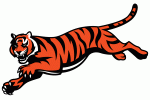


That's why I just glance at it and don't think too hard about it
And here I am spending countless hours looking at a logo, when I could just glance at it for a second. Damn, learn something new everyday.
That Seahawks one does look like it has a broken neck if you look at it long enough and that Broncos one looks like it just got shot in the side. I still like them anyway. That Panthers one is great though.
-
I also like these throwback alts. Even with their current helmets. (I'll catch a lot of heat for this I'm sure.)
Agreed, throwback leather helmets always look cool, no surprise I always really digged the Texas A&M throwback this year
Yeah, the 1939 helmets were really cool.
Another thing I like that most people don't are these full body animal logos:
-
I also like these throwback alts. Even with their current helmets. (I'll catch a lot of heat for this I'm sure.)
-
+1
I like the Reds drop shadow and honestly I think the uniforms without a bit of black were too plain.
-
The Bobcats' original orange was a bright reddish orange. They dropped it after one season in favour of a more standard orange.
They recolored or tweaked their uniforms and logos almost every other season they existed.
-
How the **** can it be done properly? Don't give me the crap that a little patch wouldn't be too bad, it's still horrendously out of place and a disgusting symbol of greed.Oh three more things
-Throwback for throwback's sake is worse than BFBS
-The new Bucks rebrand top to bottom sucks
-Sleeved NBA jerseys don't bug me that much and if done properly I wouldn't mind ads on NBA jerseys.
Agreed^ it would never look good
I'm pretty sure "if done properly" means "if never done at all, ever".
-
Last year of those Sixers unis vs Only year of those Bobcats unis:

What year was that? That seems wrong to me?
2007-08
Yeah 07-08. The striping on the 76ers uniforms were different than in previous seasons as well.
What's different about those Bobcat jerseys? Aren't those the same ones worn since 2004-05 when they started?
According to the NBA logo page, it was a different shade of Orange they used for that season only.
-
This may be the most lopsided unpopular opinion,but:
I like the Thunder logo.
I still have trouble comprehending how the logo lasted this long.
They started winning right away. That, combined with the new car smell, blinded a lot of people in the home market to the logo's terribleness.
IIRC the Sabres had the best record in the NHL their first season with the Buffaslug.
-
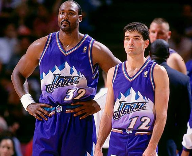
The second image isn't showing up for me so I can't see what it is. But, I agree with you about those Warriors uniforms. That matchup against those Jazz uniforms is one of my favorites.
-
This may be the most lopsided unpopular opinion,but:
I like the Thunder logo.
I like the OKC part of it. Not the rest and I hate the font "THUNDER" is in.
-
NO!
YES!
This was perfect for them in my opinion
Yeah, it really is terrible. Should have gone back to purple instead of adding navy blue.The Jazz have the worst color scheme in sports
Purple, Light Blue & White with Copper accents
-
I like the Blue Jackets identity, all of it.
May be an unpopular opinion here, but all of Columbus (including myself) loves their identity.
Let me be more specific. I was about to post this logo with it, but for some reason it didn't work.

All of it means I like pretty much all their logos including this.
-
I like the Blue Jackets identity, all of it.
Ask A Moderator
in Forum Policies and Announcements
Posted