-
Posts
3,005 -
Joined
-
Last visited
-
Days Won
13
Posts posted by FinsUp1214
-
-
To be honest, the more I’ve sat on it, the more I don’t mind “Commanders”. I’m not necessarily thrilled about it, but I certainly don’t hate it either. George Washington was both the Commander of the Continental Army and later, of course, Commander in Chief as President, so it’s a name that hits on both of the roles we know Washington for without heavily diving into one or the other (ex: “Generals” or “Presidents”). I have no idea of course if that’d be the reason they went for it, but it’s something that came to mind.
If the stencil “W” is real, that’d explain why I thought I was seeing a separate object within the “W” in the teaser. Ah well, it’s still fun to dissect and try to make sense of things like that.
The one thing I’m really not liking so far is that seal. There’s a bit too much going on there and looks too much like a high school seal to me. They could really do without that.
-
 9
9
-
-
The Jets are a weird case for me. Like many other teams, they wear some bad combos (mono black, white over black), but I really don’t think the base design of the uniform as a whole is bad at all. That being said, I also don’t think there’s anything particularly special about it, either. To me it’s very average, middle of the pack uniform and doesn’t do much to stand out in bad or good ways. All in all, I just feel nothing but indifference towards that whole set, which I suppose can be just as bad as dislike.
Take that with all the losing it’s associated with, and I feel like they probably just need to go either back to the Namath set (but with the updated green and fixed shoulder stripes), or something that more closely resembles the 80’s or early 90’s sets than this current one does. That team is in desperate need of an identity boost, and tapping into some nostalgia and heritage in a more deliberate, clear fashion could do them some wonders.
-
 9
9
-
-
^ Oh I understand that, I’m just saying that I think a ‘98 throwback has been there for the easy making and probably should’ve been thier work-around of the one helmet rule to begin with. It makes little sense to me to continue trotting out a Frankenstein version of the ‘66 set when they’ve already got most of the pieces there to directly wear the ‘98 set. Swap out the pants and wear the solid black socks and boom, you’ve pretty much got the real thing.
-
 4
4
-
-
30 minutes ago, nuordr said:
That is why they should've release gray pants with a red stripe and it would have went perfect with any jersey.
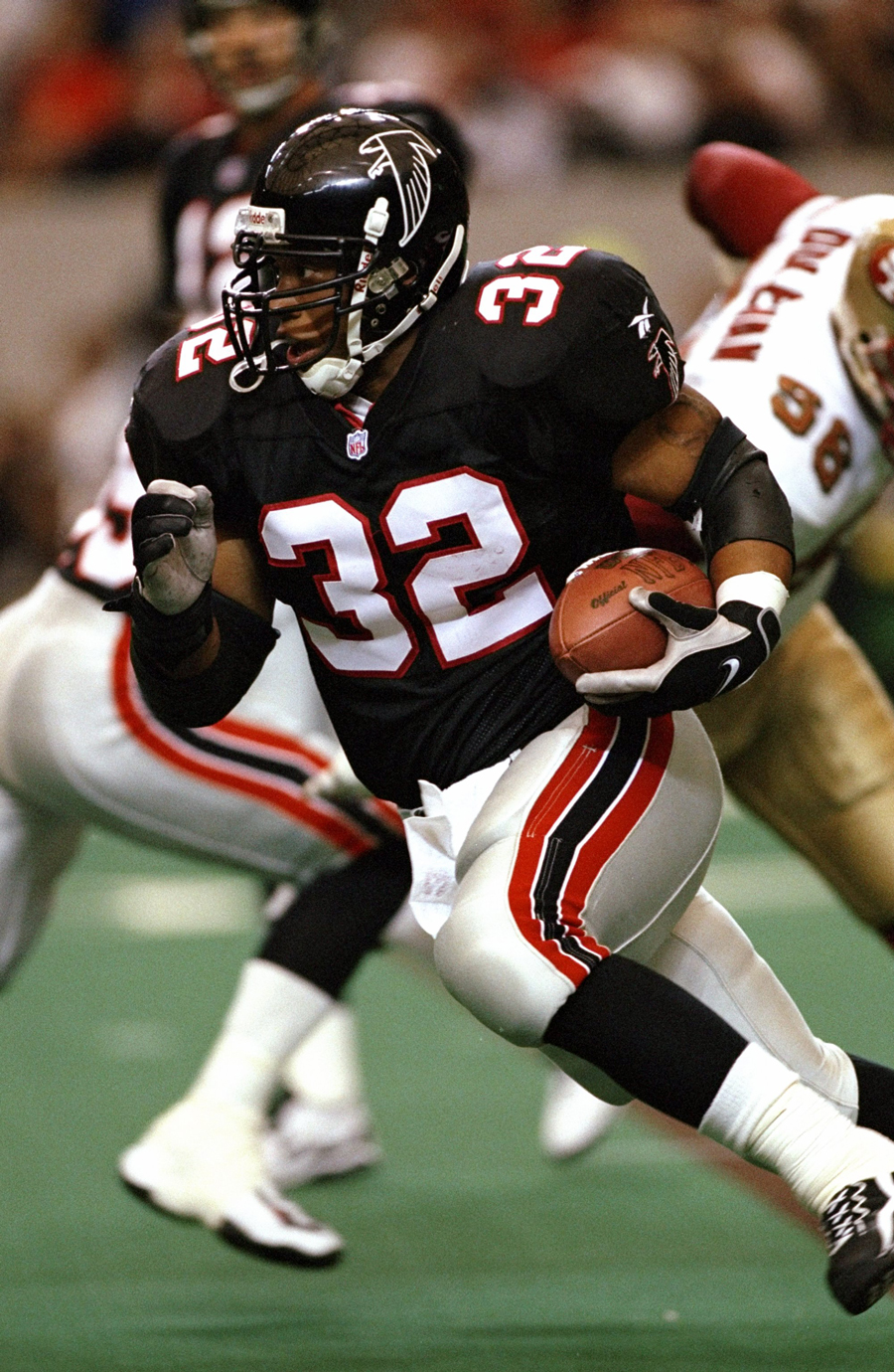
Definitely. It also would’ve been a nice little nod to the ‘98 team.
Side note: Atlanta could easily bust out a new pair of these pants and make thier fauxback alternate a straight up ‘98 throwback. Why in the world haven’t they done that yet? It’d be so easy to do, and the ‘98 team’s status as one of - if not THE best team in Falcons history - certainly warrants the use.
-
 13
13
-
-
The Falcons’ change of heart on monochrome black has, admittedly, helped that set grow on me the slightest bit. I still think the uniform has a lot of parts that just flat out aren’t good and will keep it from ever being a good uniform in my eyes, but the black over white combo is the best one they have and wearing it more often has managed help the set out a little.
-
 9
9
-
-
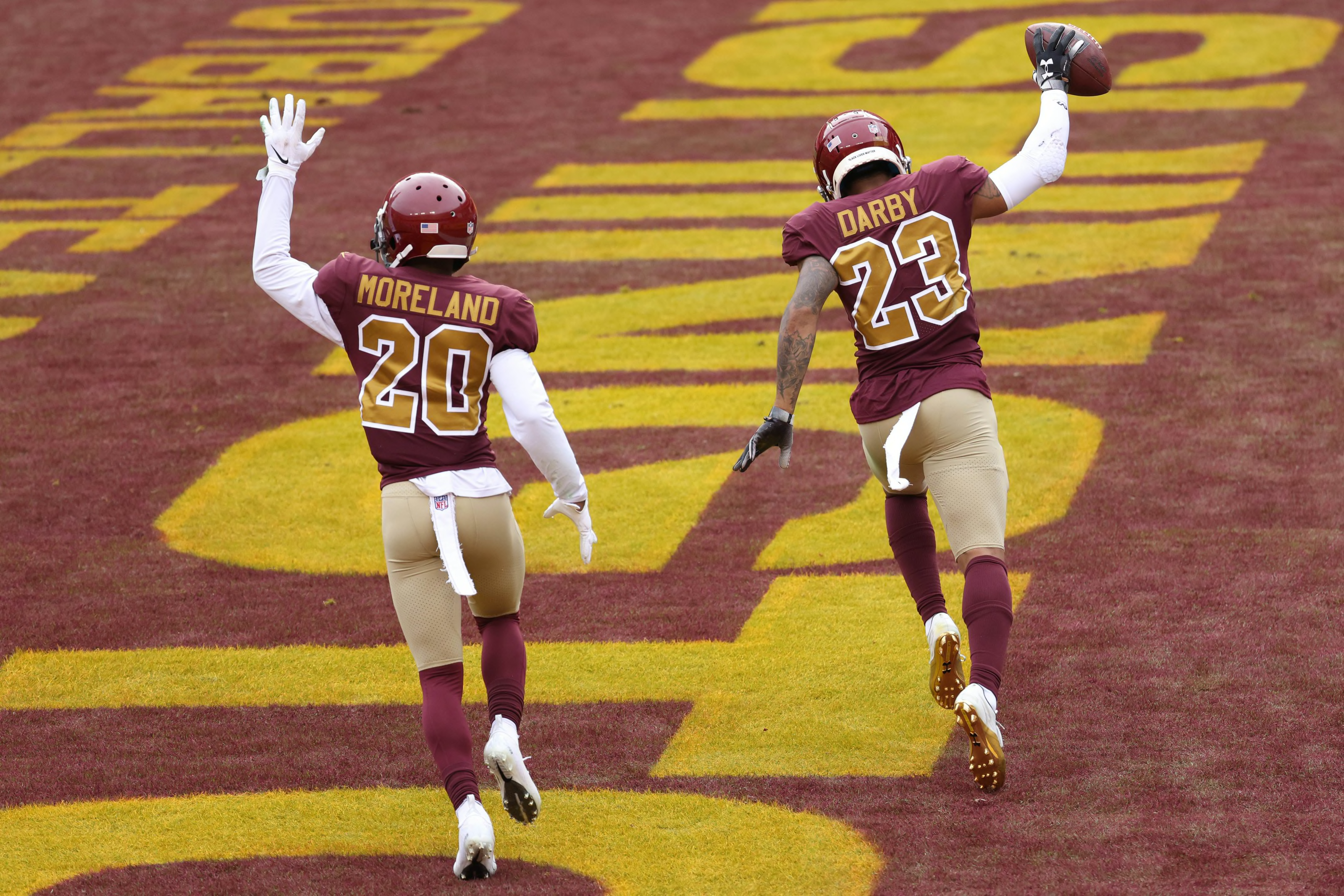
I have to admit, there’s a part of me that was hoping Washington would take this opportunity to switch the shades of burgundy and gold to the 2002 fauxback shades and redesign the new uniform accordingly. Name aside, this is still one of my favorite football uniforms of all time:

Remove the name + spear and put a “W” of some sort on the helmet, and they’d have been in some good business. Oh well. I still think the new set has a lot of potential from the bits we’ve seen, so we’ll have to see how the whole thing comes together when all is said and done.
-
 20
20
-
-
10 minutes ago, Survival79 said:
“So I look at the list of final names and what do I find out man what do I find OUT?! There iiiis no Washington Admirals, the name does not exist okay so I’m deciding AWWWW *censored* buddy I gotta dig a little deeper there’s no Washington Admirals? Are you KIDDING ME I’ve got BOXES full of Washington Admirals! Alright so I start maaarchin’ my way down to Carol in HR…”-
 9
9
-
-
4 minutes ago, tron1013 said:
I assumed that was the back of the jersey and the space where a player's last name would go.
Right, I had the same thought. It could still say “WASHINGTON” on the back for a jersey that’s being used for the reveal.-
 2
2
-
-
2 minutes ago, DC in Da House w/o a Doubt said:
Circling back on this, just spit-balling here...
Look at the letter on the name plate. It definitely isn't an S or N. I think it could be an a M. And I think the nameplate may have the team name, FOOTBALL TEAM (or just TEAM, whatever. Admittedly a little ridiculous to see either on a jersey, but work with me here.)
;
There's precedent for using the team name on the back of the jersey in an unveiling: The Rams did it. The Browns did it. The Falcons did it.
Hardly conclusive evidence, but something to think about. WFT's whole bit this year has been "Making the Brand", I think that could just end up being new uniforms and logos to go with the existing name.
Are we sure that’s not an upside down “W”? I promise I’m not trying to stir the pot here or be contrarian, but I honestly can’t quite tell for certain if the jersey in the picture you’re referring to is rightside up or upside down. If it is upside down, that could be saying “WASHINGTON”.-
 5
5
-
-
5 minutes ago, DCarp1231 said:
These being a lasting part of the regular set are why I’m not fretting too much about the supposed second helmet option (yet). I think a re-worked fauxback could be a way to further integrate the team’s history into the new brand, and I really wouldn’t be surprised to see them do just that. I know the sound of a second helmet (and clear visual evidence of it in the teaser) can be a bit off-putting, but we still have very little context of what that helmet is and no confirmation of what uniform it’s being paired with yet.
Sure, it could end up being awful, but I’m not jumping to conclusions on it quite yet without seeing the whole thing. I’m holding out hope it’s a fauxback.
-
 2
2
-
-
I’m afraid of possibly reaching here too, but it seems like that shot of the helmet bumper has the logo edited out of the bumper. It’s extremely faint and easy to miss, but looks like a “W” had been there and you can still see a sort of shadowy outline of it.
-
 2
2
-
-
8 minutes ago, Pizzaman7294 said:
Definitely a bold “W” and looks similar to the WFT one. Looks like there’s something in the center of the W, but can’t make out what it is. The Capitol building, maybe? Could be the bow of a battleship? The latter would fit right in with “Armada”.-
 4
4
-
-
I’m a little suspicious about it being Admirals because of the reasoning they gave for not using “Red Wolves”; if a name like “Red Wolves” gave them that much legal trouble, I’d have to imagine “Admirals” would too (Milwaukee, Norfolk, etc). I could be totally wrong and they actually did make that work, but who knows.
If it IS Admirals, then I think it’s okay. Not spectacular, but it’s good and safe.
As for the comment about the helmets, I’ll reserve judgement until we see what that possible extra helmet actually is, and the uniform it supposedly goes with. It could always be a re-worked fauxback of sorts - I wouldn’t be all that surprised if they tried something like that.
-
 3
3
-
-
10 hours ago, WSU151 said:
I think this would’ve been better if the gold banner were on the bottom beneath the 50, and were pulled in to be the same width as the 50. As it is, I think it stretches the width of the overall logo a little too awkwardly.I dig the return of the cowboy hat ball, though. I’ve always thought a cleaned up version would be a fun thing for the Rangers to have again.
-
 2
2
-
-
I’m torn on the Royals changes. I feel like there are a couple of really good tweaks, but they are offset by some poor ones and the whole thing feels lateral.
I like the thickened piping overall, and the move to clean white word marks and numbers on the powder blue set is a nicer nod to the 70’s-80’s than the last powder blue alt was. But I also feel that this new powder blue set needs the same triple stripe cuff as the 70’s-80’s sets to provide a better balance between powder, white, and royal. Right now, I don’t think that balance is there. They may have been better off just doing a straight up Bo Jackson throwback as-is, really, and I’m not sure why they don’t just do that instead of continually wearing inferior nods to it.
Furthermore, I get that the block arch wordmark has historical precedence and isn’t random by any means, but it really lacks the character the previous script had. I feel like the road uniform just had a fair bit of life sucked out of it. It may need a little bit of white as well. The home uniform does look really good with the thickened piping, though.
I dunno, this is one of those moves where I see how lateral the full overall result was, and despite the good parts, I just wonder why it was even done at all. It all comes across as change for change’s sake rather than deliberate, worthwhile improvements.
-
 4
4
-
-
20 hours ago, pelicanfan said:
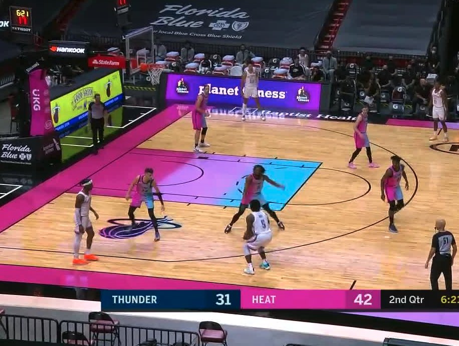
Yeah, I really love what Atlanta did with thier court. It might be my favorite new court this year. If they wanted to wear one of the Mutumbo jerseys as a classic edition next year so they could use this court another year, I sure wouldn’t mind.Of course that’s assuming/hoping they’d planned for that well in advance, but still.
-
 4
4
-
-
I like Chicago’s overall concept, but that gap between the word mark and number looks so awful and awkward that it nearly ruins the whole thing for me. I’m assuming that’s a purposeful quirk that’s in homage of something, but that’s still no good reason to do it.
-
 3
3
-
-
I honest-to-goodness believe Memphis may have just released the very uniform they should be wearing full-time. That’s the perfect blend of eras for them, and something that could absolutely stand on its own and last. I even love the teal accents with the navy and gold. Excellent stuff.
Detroit is a really pleasant surprise: I did not expect red-blue-teal to work as well as it does. The bolts down the side don’t even seem that gaudy, either. Kudos to them for taking elements that could have been a disaster together and making something really good out of it.
It’s really easy to blast the Cleveland and Miami sets, but I honestly think Orlando is just as bad, for the sole reason that the orange is inexcusable. Everything that’s orange on that uniform ought to be blue, no exceptions. I have no idea what in the world they were thinking, other than trying to stretch the city court one more year (which is a poor excuse for hanging onto the bad decision of orange altogether).
Last thought; seeing how successful some of these sets were makes me mourn for the loss of what Utah could’ve done had they elected to try. Sure, it could’ve been bad, but I think they have all the elements in thier history to have made something great, too. Oh well.
-
 2
2
-
-
21 minutes ago, monkeypower said:
I guess I worded my part incorrectly. It's not that they were all worn at different times, it's more that not all of them were permanent colours. I don't even think the Jazz wearing three colour schemes a season is completely out of the ordinary in this modern NBA with the City jerseys and vague throwbacks. It's not great, but it's not a massive difference from what other teams are doing.
I don't think it's fair to include the throwbacks in this specific discussion because those, for the vast majority of teams, are going to be different than the main uniform set and are an intentional departure from the main uniform set. I don't think it's fair to say a team immediately has an identity problem just because they wore throwbacks a couple times over the course of a season.
If the new owner wants to change the look, that's his prerogative. I just don't think the narrative that he implied with his one tweet about the Jazz having too many colours is a good justification for this change because it's not as if all those colours are being used permanently at the same time. Especially since it looks like it'll be a completely new colour scheme and I would have to assume some of the previous colour schemes would return in some fashion. It's not the case where they are in between schemes (like the Arizona Coyotes of recent years) or wearing one colour set at home, a different on the road and then like the arena signage is a third. Everything is (or was) based in the Navy/Gold/Forest Green being the primary.
I get where you’re coming from here, but I think you might be missing the bigger picture. Yes, the Jazz haven’t officially made all of those colors co-existing primary colors, and yes, everyone has city uniforms and most have had classic editions. But in the Jazz’s case, all of those identities have unofficially co-existed anyways because of how much these different identities have either segmented the fan base or led some fans to assume it’s all official. The story Smith told about D-Wade’s mom not knowing what the actual colors are isn’t all that uncommon, really, even within the Jazz fan base.
Fans outside of our CCSLC community generally don’t know the fine details like we do, and sometimes we have to step away from our lens to see the bigger picture and wider effect of these brand choices: if the team wears it, it’s going to appear official to most fans no matter what the designation is. Take it from someone who goes to multiple games every year, ALL of those colors are routinely worn to games as if they are all official in some capacity. And to be totally honest? Redrock and purple is worn more than the primary navy/gold/green, at least by my eye test. You still see it of course, but not so much that you’d assume it to be the primary scheme. This isn’t like the occasional Chicago flag color stuff in a sea of red and black at Bulls games.
In short, I’ve yet to attend a single game in which fans showed up to the arena in one dominant, “primary” color scheme (not including shirt giveaway games). You see them all, and some more do than what the team seems as primary. Maybe the team hasn’t made all of those colors co-existing primary colors officially, but the fan base sort of unofficially has.
BTW: I do agree with you that black/white/yellow isn’t the right solution either. I’d much rather them pick either of the purple schemes, stick with it, and reinforce the brand that way.
-
 4
4
-
-
On 10/18/2021 at 10:07 PM, monkeypower said:
RE: Jazz talk, I don't know where I stand on it. I do agree that the Jazz have a colour palette issue (though I do think that's a bit overstated because not all the colours have been used over the same season)
They nearly did over the course of two seasons in which they wore classic editions, as they coincided with two seasons of the redrock set. While you’re correct in that they’ve never busted out EVERY color they’ve ever worn in one season, they just about did it over two with the exception of powder blue.
In both seasons, they wore three color schemes per season:
- Navy/Gold/Forest Green
- Redrock gradient (includes black)
- Purple/Gold/Kelly Green or Purple/Teal/Sky Blue/Copper
Sure, that isn’t all of the color schemes they’ve ever worn, but it’s still too way much over the course of one or even two seasons. And…..it also says a lot that it still wasn’t all the colors they’ve ever worn, either.
-
 2
2
-
-
46 minutes ago, the admiral said:
No no no. It was always a terrible fit for them. Phantom side panels, the most WordArt scripts we've ever seen, purple being a team color but also not. It was a disaster of a rebrand, especially because the Grizzlies rolled out almost the same colors like a week later.
Yeah, all of this. Add into that the only rationale for double blue seemingly being “uh, well, it snows here.” Compared to the very Utah-centric color scheme that preceded it (as well as a similarly Utah-centric color scheme for the Salt Lake Olympics just two years earlier), the double blue came off as generic-cold-weather-team as it gets. Adding copper or orange to it would’ve made it better, but I still don’t think it’d have escaped the inevitable comparisons to Denver and Memphis either. -
The yellow the Jazz have been using to go along with the black and white roll-out has been a bit brighter, with a little bit of a highlighter yellow look to it:

I kind of get Columbus Crew vibes from it, though it would remain to be seen of course if they’d use the yellow as much as they do.
-
 3
3
-
-
1 hour ago, HighCheese said:

Oh boy. As I’ve said before, I really do think this general idea is coming from a good place, and I do appreciate that ownership understands there’s a been a bad branding problem for some time. That said, I just don’t think this was the right solution at all.
Instead of doubling down on and re-emphasizing one of the previous color schemes and cementing the brand that way (a la the Padres), they’ve just added one more color scheme on top of many. Perhaps this color scheme could look good in a vacuum (and of course I hope the final product does look good) but in the grand scheme of things, I think this is going to add more to the problem than solve it overall. Now the spilled skittles bag that is the collection of Jazz gear worn to the arena won’t match anything.
In another tangent of thought, I’m curious how much bees/beehive as a state symbol has influenced the supposed color scheme? The baseball Bees also wear black/gold/white, so there’d be some cohesion there as well. Just something that came to mind.
-
 10
10
-
-
Wasn’t the Knicks’ anniversary uniform going to be the city uniform? Or am I misremembering that? Seems like city and classic are one in the same for this year, at least that’s been my assumption (could absolutely be wrong though - it’s hard to keep track of the NBA’s system these days).


Washington Commanders to debut new NFL identity
in Sports Logo News
Posted
Dang it, now the thought of paintings of Ron Rivera styled like the Chairman Dwight portrait hanging around the stadium is stuck in my head.