


FinsUp1214
-
Posts
3,005 -
Joined
-
Last visited
-
Days Won
13
Posts posted by FinsUp1214
-
-
Here’s what I’ll say about the Heat: brand equity matters. I know the NBA in general has taken a fat dump on brand equity over the last few years, but it still matters and ought to be preserved as much as possible, especially in the NBA.
The Heat have been a red/black team for 34 years, won three championships in it, and multiple hall of famers have worn it over the course of illustrious careers. “Classic”, “tradition”, “championships”, etc are not buzzwords, they are vital byproducts and elements of strong brand equity. The Heat have certainly built a great deal of it in red/black by now.
To be honest? I actually thought Vice looked great. I had no problem with the design or colors in a vacuum. What I have a problem with is the idea that it should supplant 30+ years of brand equity for no good reason other than just to do it. There’s nothing so flawed or problematic about the current identity that warrants it being dropped for something so vastly different and course-changing as Vice.
The perfect balance between the two identities had already been struck with Vice being a City Edition, and that’s the most it ever should be, in my opinion. Anything more is another loss for brand equity in the NBA, which needs to happen much less than it has been.
-
 11
11
-
 1
1
-
 2
2
-
-
For me, I understand that the Ducks have established a lot of recent equity with orange/black/gold, and understand they won a cup in it too, but it’s eggplant and jade all the way in my book. And furthermore, it’s duck mask or nothing at all.
A large reason for that, admittedly is nostalgia - the Mighty Ducks were my favorite team as a kid, being of the generation they successfully targeted with Disney - but another big reason for it is that I just don’t think they’ve ever looked good in orange/black/gold. The very first rebrand set especially was an atrocity. The weird fat numbers and extreme-y logos/fonts always made them look like skating energy drinks (in the worst way), and it just never looked any good for them. Bringing the duck mask back again was awesome, and I’ll gladly take it in any color scheme, but if I had my choice, orange/black/gold would be gone yesterday.
Honestly, I get that the original Mighty Ducks stuff was cartoony and overtly 90’s. Totally get it. But it was also kind of the whole point; it’s exactly those parts of the identity (and the connection to the movies and cartoon) that got me hooked on them as a kid. Nobody looked cooler than them to me back then! I was part of that target audience and I was one of the ones that was sold quick. The Mighty Ducks get dunked on here sometimes over thier Disney-fied identity, but it worked on me. It still works on me after all these years, and I think that ought to count for something.
-
4
-
3
-
-
No more black note outside the arena, huh? A possible mea culpa?

-
5
-
-
I’d have much rather had that mashup for one season than redrock dark mode for another. I actually think the mashup is really good for what it is, and looks more “Jazz” to me than redrock ever has.
-
6
-
-
I’m absolutely floored Willis fell that far, but I also think Tennessee is a really good situation for him to be in. Maybe even ideal. He has a good quarterback ahead of him to learn from, a great coach, obviously a great running back, and a team that’s been establishing a culture of success as of late. This may end up being an exceptional pick for the Titans and the perfect place to develop for Willis. I honestly think he has the talent to be another Lamar or Vick.
Ridder is in a good spot too, I think. Bad roster, yes, but he has some similar traits to Mariota and can really learn from him too. I actually think he could be a good starter in the league after needed polishing.
Corral’s an interesting pick for Carolina. There’s definitely durability issues there (Kiper but the risk best when he said “he wants to play like Josh Allen, but doesn’t have the body for it”), but then again, there’s durability issues with Baker should they have traded for him too. I’m wondering if they did try to trade up for Willis but couldn’t get it done, so they struck a deal they could make for next best QB. Corral is very risk/reward.
-
Weird, I had such low expectations for the Jazz in the playoffs that another underachieving bow-out isn’t really fazing me this time. I truly felt “whatever” about it. It goes to show much this underachieving has sapped my trust in this team’s core, system, philosophy, all the above.
I’ve been as much a defender of Gobert-Mitchell-Snyder than anyone, but I’m at a point now where anything and everything is on the table. This isn’t working. They’re not learning from blatant, obvious mistakes. They’re not adjusting anything to match up right with other contenders. Something’s just incredibly off with this team, and I can’t imagine it’s magically going to click anytime soon. Last year’s team feels like the ceiling.
I don’t know what the solution is, but Ryan Smith and Dwayne Wade need to decide soon how hard of a reset is necessary; standing pat or tweaking some pieces isn’t a viable option anymore.
-
2
-
-
8 hours ago, GDAWG said:
So do Seattle, Carolina, Atlanta and maybe Detroit and New Orleans go for Malik Willis and Matt Corral tomorrow? Or do they call Cleveland and ask for Baker Mayfield?
Yeah, seems like Seattle, Detroit, and New Orleans must have had the intel to know they could stand pat and wait it out (if Willis was a target). I honestly thought Detroit (with the traded-up pick) or New Orleans would pull the trigger, but when they didn’t I had a sense Willis wasn’t getting drafted last night.To be honest, I’m intrigued a little bit by Houston too. They’ve got Mills, but if Willis falls down to them at 37 (before Seattle, Indy, or Atlanta), would they get tempted into grabbing him? Not saying I’m betting on it by any means, but it wouldn’t surprise me. Otherwise, I can’t see him falling past picks 40-43 (Seattle x2, Indy, Atlanta). At that point I’m guessing Corral and Ridder are right up next, possibly even Howell if a team feels the need to reach up a little.
That leaves Baker Mayfield to Carolina, I think. Possibly Detroit. Seems the rumblings lately have been more Seattle for him, but I’d imagine Willis falling to them would be too tempting to pass up. At that point, I imagine Carolina or Detroit would be making a call to Cleveland.
-
2
-
-
50 minutes ago, the_grateful_ted said:
Well your first mistake was being a Jazz fan…
-
 2
2
-
-
12 hours ago, LA Fakers+ LA Snippers said:
This is a really rough edit (done on an iphone at work, and is not reflective of my photoshop skills) but i think it conveys what it would look like if they moved the stripe down, removed the logo, and stretched the numbers
I’m definitely on board with something like this, great idea. I’d much rather Carolina try to preserve what they can from thier set and make it work somehow than try to get cute with a rebrand. There’s been very few, if any, Panthers concepts I’ve seen that I feel are genuine improvements and there’s also just too much potential for a rebranding disaster for them. No need to trot out in claw-scratched spacesuits when a change like what you’ve done will perfectly suffice.-
9
-
-
8 minutes ago, Nordiks_19 said:
Ducks might finally get a much needed rebranding
I still hate the color scheme and the number font, but this is definitely a step in the right direction. It’s not a bad halfway point if they won’t go full eggplant and jade again.-
2
-
-
I’ve voiced my opinion on the Jazz de-brand often here, but just to re-emphasize in a boiled down fashion:
My team makes me sad.
-
10
-
-
It’s dawning on me that these are the last days of the Jazz navy/gold/green and (presumably) redrock. I’m honestly torn between “good riddance” and “but oh crap, black and highlighter”. Sigh.
Oh, and count me in as a fan of the Minnesota mashups. I love everything about them. I’ll admit I’ve actually come around to the primary set a fair bit, but the mashup set is really what they should be wearing full-time.
-
2
-
-
6 hours ago, Mingjai said:
As much as this BYU grad would love to see NHL in Provo, there are at least two problems with this:1. They don’t sell beer at LaVell Edwards Stadium. Or pretty much anywhere else in Provo (and yet BYU football players somehow are able to find it and consume it in front of either a cop or the media).
2. More importantly, there aren’t very many hockey fans in Provo. I know, as I was one of the few. In fact, for being a winter sports haven and a former Winter Olympics city, Salt Lake City is a surprisingly mediocre hockey market. That’s not to say there aren’t hockey fans there doing the Lord’s work spreading the gospel of Howe, Orr, and Gretzky, it’s just that there aren’t enough of them to even make a smaller venue like Rice Eccles Stadium work.
You’re absolutely right on both counts. A Winter Classic in Provo is an idea that sounds awesome in theory but would have a lot of roadblocks. That said, if by some miracle it worked? I’d pay whatever dollar it took to go. I live just minutes from the stadium and would be thrilled.EDIT: I will say this, I have seen more and more Knights fans pop up along the Wasatch Front in the last few years….not overwhelmingly, but it’s evidence that hockey is starting to interest at least a few more people here.
-
It’s every Jazz fan’s favorite time of year!
Abbreviated predictions:West Finals
Phoenix 4, Golden State 1
East Finals
Philadelphia 4, Milwaukee 3
NBA Finals
Phoenix 4, Philadelphia 2
-
2
-
2
-
-
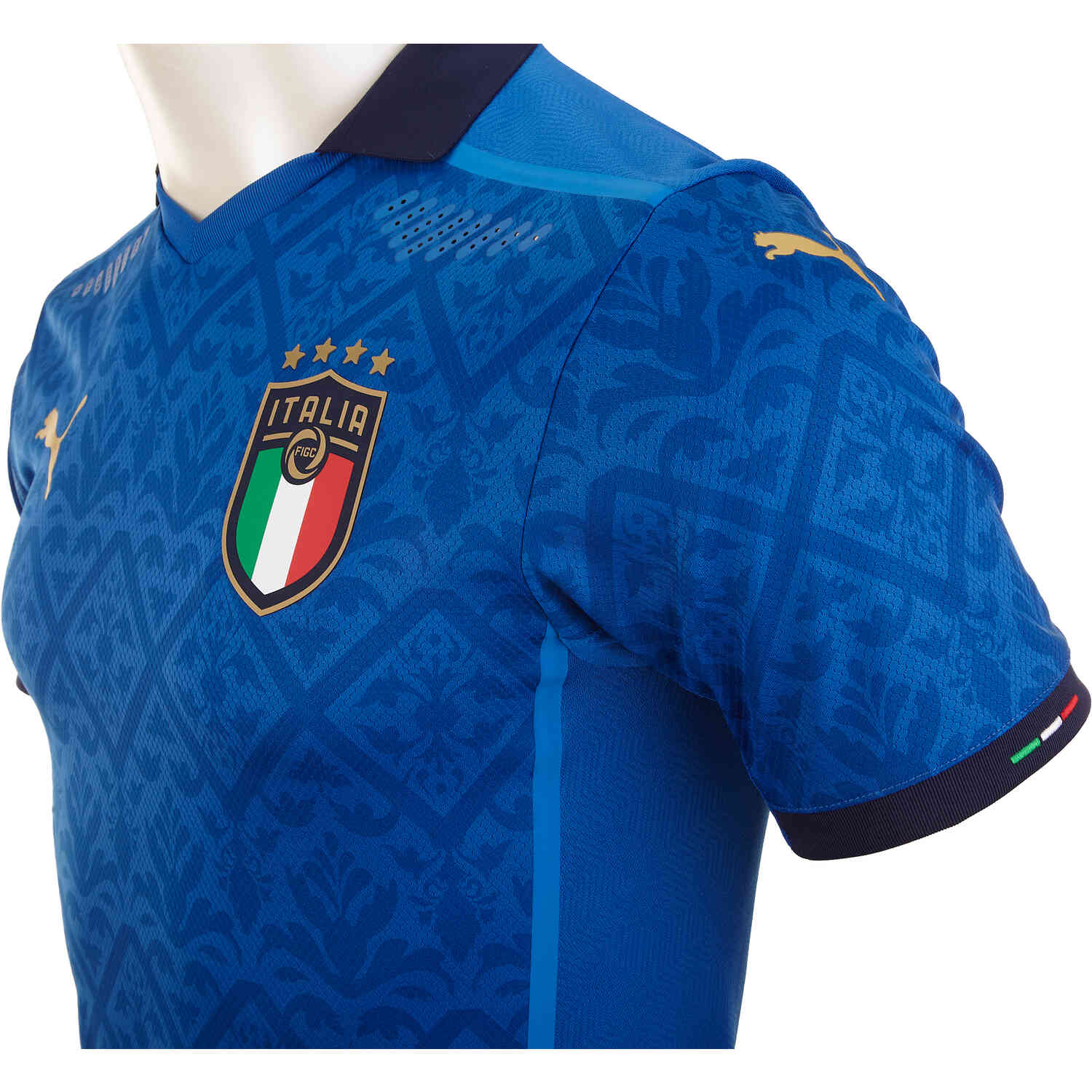
The swoosh on the sleeves for USMNT is going to look weird, especially with the World Cup patch and captain’s armband taking up sleeve space. If they’re going to get experimental with swoosh placement, I’d rather it be on the shoulders (but closer to the very top of the arm than the neck). I feel like it’d get the same idea across but with more breathing room.
EDIT: Kind of like how Puma does it, but I think they could get away with the swoosh being a bit larger, especially if it isn’t on the chest anywhere:
-
The Jazz make me sad. I truly think thier rebranding is coming from a good place, and something needed to be done, but playing Columbus Crew dress-up is far from the answer. Not even close to it, really.
This team’s brand has fallen so far from the one I grew up with and loved. There used to be no doubt what they were: they were a solidly purple team who had a “New Orleans era” and a “Utah era”. It really was as simple as that. Fast forward 20 years and consider all of the in-between along the way, and they look like a team devoid of a brand or a personality altogether.
Rooting for a team who reeks of false promise and underachievement every single year is frustrating enough; add a crumbling brand that’s difficult to be proud of or connect with on top of that, and it’s almost a joke altogether. I’ll always be a Jazz fan, but right now I’m a frustrated one. I don’t know what this team wants to be or what it’s trying to achieve in so many aspects.
-
5
-
2
-
-
1 hour ago, FSUViking said:
I know people love to complain about literally everything in this sub......but what's wrong with that logo? Its fine. Who cares?
The fact that the contents within the shield (aside from the NFL and Prime Video logo) are italicized while the shield itself isn’t is driving me crazy. It’s causing a lot of visual confusion for me, and that’s a huge knock I have towards it. A design ought to allow for your eyes to be comfortably guided through a composition, and I don’t know whether this shield is “in motion” or not. That’s a legitimate problem.-
1
-
-
My positive take about the Arizona flag and the Cardinals is that, given thier relatively nomadic history, using the flag is a solid way to visually establish permanence in the Arizona region. Also, it’s (in my opinion) one of the best flags in the nation, if not the best, so it looks very good when used right.
I think the concept posted earlier in the thread is one of my favorite Cardinals concepts I’ve ever seen because of how well it utilizes the flag while still maintaining a more traditional uniform base. I’d go with the current Cardinal head over the concept logo too, but the way the flag is integrated as a striping pattern on the uniforms is genius to me. It achieves what the 90’s road uniforms tried to do in a really creative way.
-
4
-
1
-
-
I think Bruins vs. Rangers or Islanders would be fun; a Boston vs. New York matchup just seems right for a game at Fenway.
-
On 2/2/2022 at 6:58 PM, Ridleylash said:
A black RR design for Dallas, eh? Hm. Could be a redux on the star, or maybe....juuuuuuust maybe.....it's a Mooterus in modern colors?

Hmm…Heavily doubt it’s North Stars inspired considering the Wild have claimed that already, and they already had a black uniform in the 90’s and the edge era, so…I’m thinking it’s gotta be a black version of the star sweaters.
Perhaps an inverted version with green sleeves, sweater bottom, and pants? That could possibly look pretty cool.-
4
-
-
Take this uniform, swap the spear and former name for a “W” and “COMMANDERS”, and they’d have one of the very best uniforms in football.
It’s amazing how badly you can blow it when you overthink everything and miss the obvious answers staring at you in your very own archive. It’s legitimately frustrating to watch.
-
38
-
-
5 minutes ago, Old School Fool said:
These uniforms would not have happened if the team name didn't change. If they were still [REDACTED] then they probably would have brought out the Lombardi Era throwback again.
Most importantly, this stuff is only happening because Dan Snyder is a piece of trash. I'm glad they changed their name but any other team would've done this sensibly.
Eh…maybe. But there’s also a part of me that’s not so sure about that. They made a point to talk about legacy during the behind the scenes a month ago, and the first 1:15 of the reveal is all about legacy and everyone from Sammy Baugh to Joe Gibbs…and they still gave it all the middle finger.Good riddance 1000x over to the name, but there were still visual elements of the teams’ history worth keeping. Even whole uniforms from the team’s past could’ve been repurposed, stripped of old name and logo, with “W” and “COMMANDERS” slapped on. At that point I’d have bought the “legacy” talk. But the team still chose this route instead.
It could just be reactionary pessimism on my part, but I feel like something in this disjointed vein was coming whether the name stayed or not. Dan Snyder is Dan Snyder, after all.
-
13
-
-
Honestly, if a 90-year old franchise is going this far off the rails with the removal of the one-helmet rule, there’s a part of me that’s worried for any future rebrand from any team at all. I don’t think I can trust teams to not look at this and get wild ideas they shouldn’t be running with.
Give it five years and we’ll have a game with Arizona in a copper helmet vs Minnesota in a black helmet. That of course isn’t anything I’m rooting for, but I think that could be where we’re headed. The NFL unlocked the door, and Washington just kicked it down.
-
11
-
-
Burgundy jersey: Not bad
White jersey: The hell?
Black jersey: The Hell? Episode II
What’s bothering me most about this is that all three look like three different concepts of the same team; it’s as if there’s three topics in the CCSLC concept forum for “Washington Commanders” by three different posters, yet they’re all real and co-existing on the same team. It’s absolutely bizzare and I don’t know how a team so adamant about getting it right effed this up so bad.
I expressed much more optimism earlier on than I should have. This is very bad.
-
22
-


2022-23 NBA Logo & Jersey Changes
in Sports Logo News
Posted
I’m 99.9% certain the Jazz would theoretically still be going forward with thier rebrand despite the backlash, but I’m still a little curious to see what we get on the hat. It’d be hilarious if the navy/gold/green were on the cap instead, and even more so if something purple got snuck in. Both seem highly unlikely though, and I’m fully expecting the black/highlighter.
I vaguely recall some Cavs rumors too. I don’t remember what they were, just that they were potentially changing things up.