


FinsUp1214
-
Posts
3,001 -
Joined
-
Last visited
-
Days Won
13
Posts posted by FinsUp1214
-
-
Yeah, Mikan was not only the Lakers’ first superstar, but he was probably the first dominating force the league ever had. He was basketball’s very best player for most of his career.
Players of that caliber and stature should have thier number retired quickly, not 60+ years after thier retirement and some 15 or so years after thier death. I’m honestly shocked the Lakers hadn’t done so until this recently.
-
 6
6
-
-
16 hours ago, Digby said:
I'm so bummed we won't get a Messi vs Ronaldo final, though. Would've been some gooood narrative.
It would’ve been fun for sure, but we could also still get Messi vs. Mbappe, which would carry an exciting “passing of the torch” kind of narrative too. To me, the thought of that feels very similar to if Jordan and young LeBron were somehow able to have met in the Finals.-
3
-
-
10 hours ago, WSU151 said:
I love Hakeem as a player and he had great defensive stats...but defense is not what I remember him for, as I would for Wallace or Mutombo.
That’s where I’m thrown off on this too. Hakeem is obviously one of the greatest players ever, and he was indeed a great defender, but defense is never the first thing that comes to mind when I think of him. I almost feel like naming DPOY after him inadvertently puts him in the wrong box.If you’re going to name a specialty award after a player, then that player ought to be known and remembered clearly for that specialty. Not that they were one-dimensional players by any means, but that they were one of the all-time greatest at thier specialty and role. When it comes to defense? Gary Payton, Ben Wallace, Dikembe Mutumbo, Dennis Rodman…each of those would have made perfect sense to me (Gobert’s in that group too, but he’s still active and awards should be named after retired/retiring players). Hakeem, as great as a defender as he was, doesn’t make the same amount of sense to me.
-
2
-
 1
1
-
-
RIP, Mike Leach.
Paul Finebaum said this morning that he was “truly one of the most irreplaceable figures in college football.” I know this kind of statement gets tossed around a lot, but I think it truly applies in this case: we’ll likely never see another Mike Leach again, considering he was equal parts innovator, mad scientist, competitor, and comedian. College Football just got a lot dimmer today. He will be missed.
I think the perfect video to honor him would have to be his Pac-12 “mascot battle” commentary. It perfectly summed up his persona - quirky, hilarious, yet brilliant.
-
2
-
 4
4
-
-
First off, you’re a freakin’ pro. 30 minutes or not, you always churn out quality work. Death, taxes, and raysox!
The only feedback I have is the logo might be a little too wide, and looks a little stretched out on the uniform. I think the width could be brought in a little bit and would help the logo look a little more substantial on the uniform. Other than that, I love the idea and love the color distribution. It’s absolutely better than the Doctor Who logo and a vast improvement. Well done, man!
-
Croatia is absolutely resilient. Between the 2018 run and this year, they just seem so hard to beat (especially if the game goes to extra time). It’s going to be hard for me to count them out against Netherlands or Argentina.
-
1
-
-
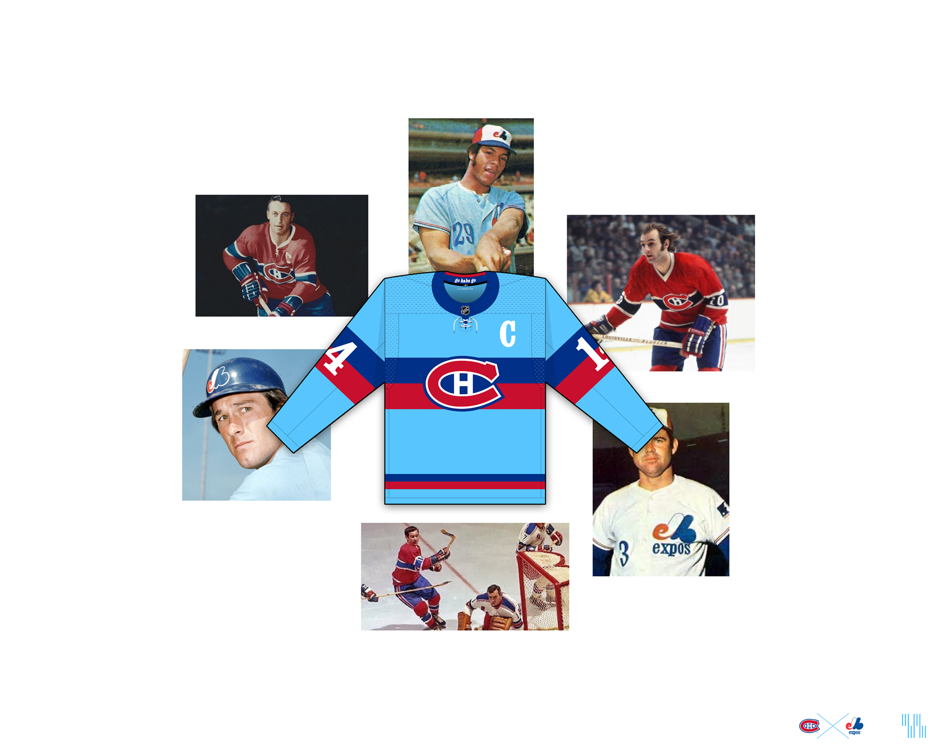
Haha, thank you @johne9109! I appreciate both the kind words and the reference

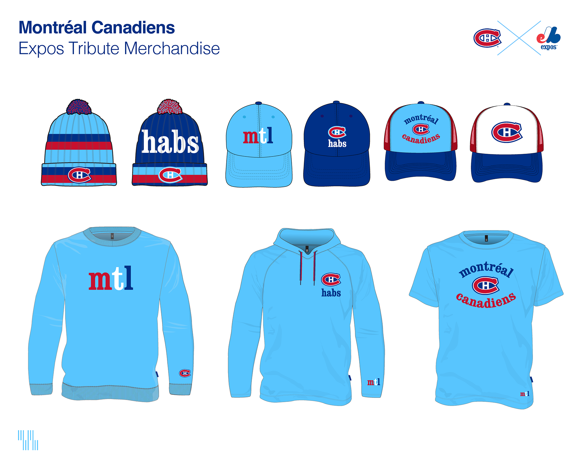
I had some ideas over the last couple of days for some capsule collection merchandise that could be made for this as well. Lots of powder blue stuff of course, but tried to include some other items to mix things up a bit, including a couple of royal blue items and a white-paneled, directly Expos-inspired trucker cap. I'd love to hear all of your thoughts and feedback on the sweater and the new merchandise concepts as well! Thanks all!

-
1
-
-
17 minutes ago, IceCap said:
It's a fun "what if?" look about the Devils keeping their Scouts/Rockies colours.
But the Devils were red, green, and white for ten years. And have been red, black, and white for thirty years and three Cups.
So it might be too late to decide they're a red, white, blue, and gold team now

Oh I’m not at all suggesting they switch now, I totally agree with you there. Switching shouldn’t be on the table at all.I’m just saying the “What if” is far better than I ever imagined it would be, and if the Devils wanted to, I don’t know, keep it around as a third? I wouldn’t be the least bit upset about that.
-
1
-
-
It feels very wrong to me that I like this just as much (if not, a tiny bit more… *gasp*) as the traditional Devils set:
It’s messing with me. I shouldn’t love it, but I do. I blame the Scouts and Rockies for being really bad teams with really good uniforms to draw inspiration from.
-
2
-
3
-
-
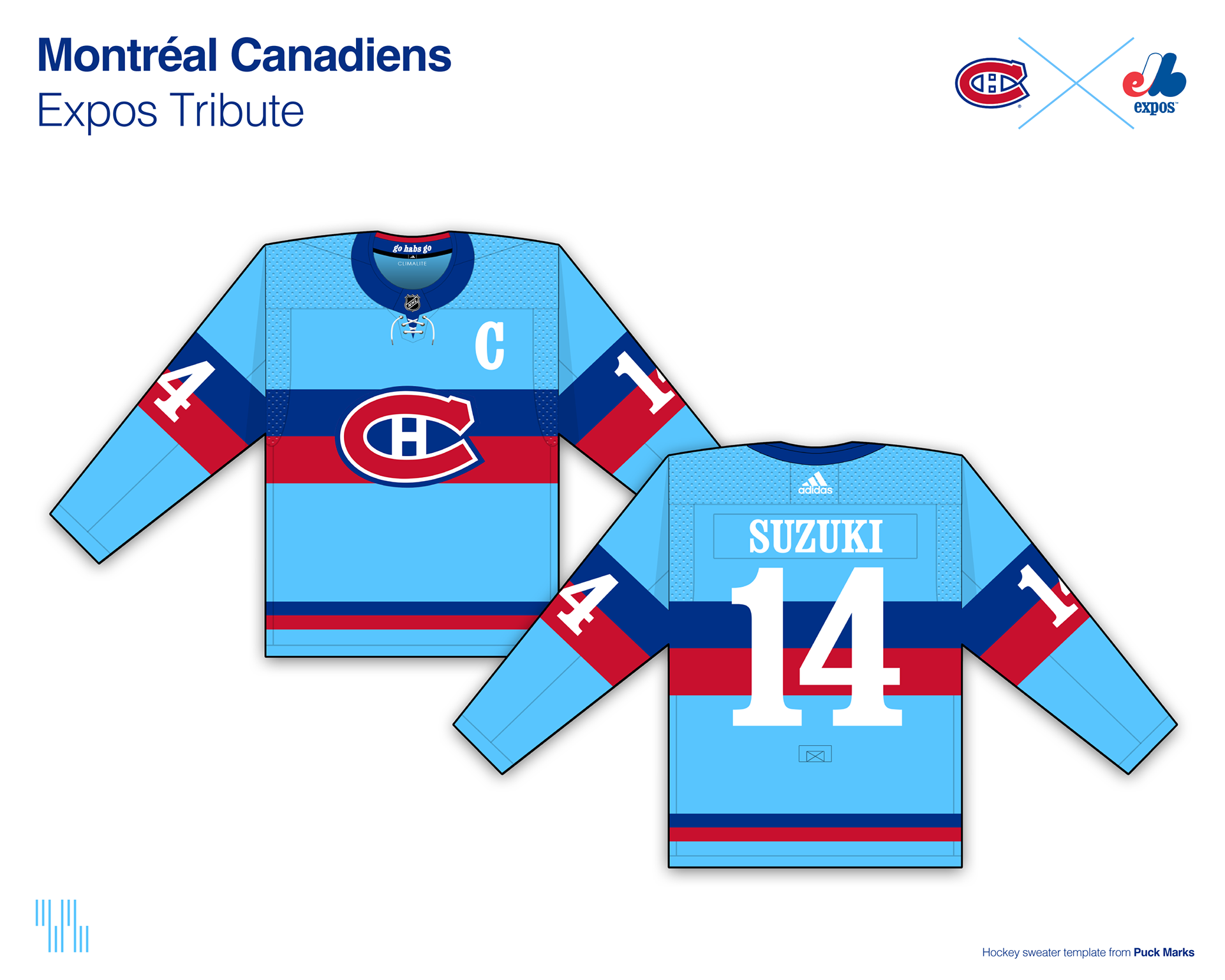
Hello, all!
It's been a very long time since I've posted concepts here. Working full-time has a way of taking a lot of, well, time! Who'd have thought?
 Although I design for a living and am creating something every day, it's been a long time since I've taken the chance to sit down and actually make something for the fun of it. It's good to be back posting in this section again; it may be intermittent, but I'd love to do more of it. I always appreciate your thoughtful feedback and comments.
Anyways, let's get to the heart of what I'm here for: a new concept!
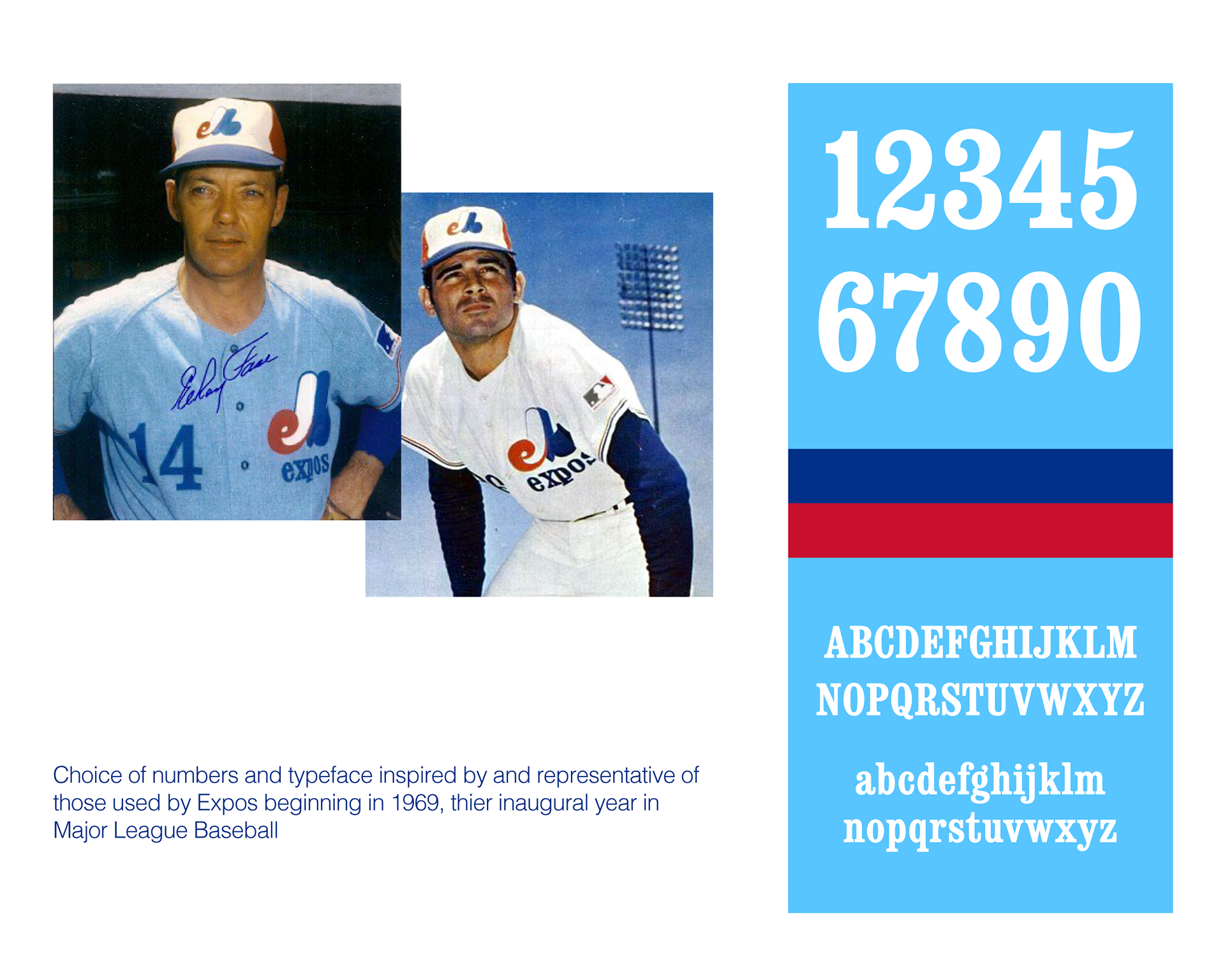
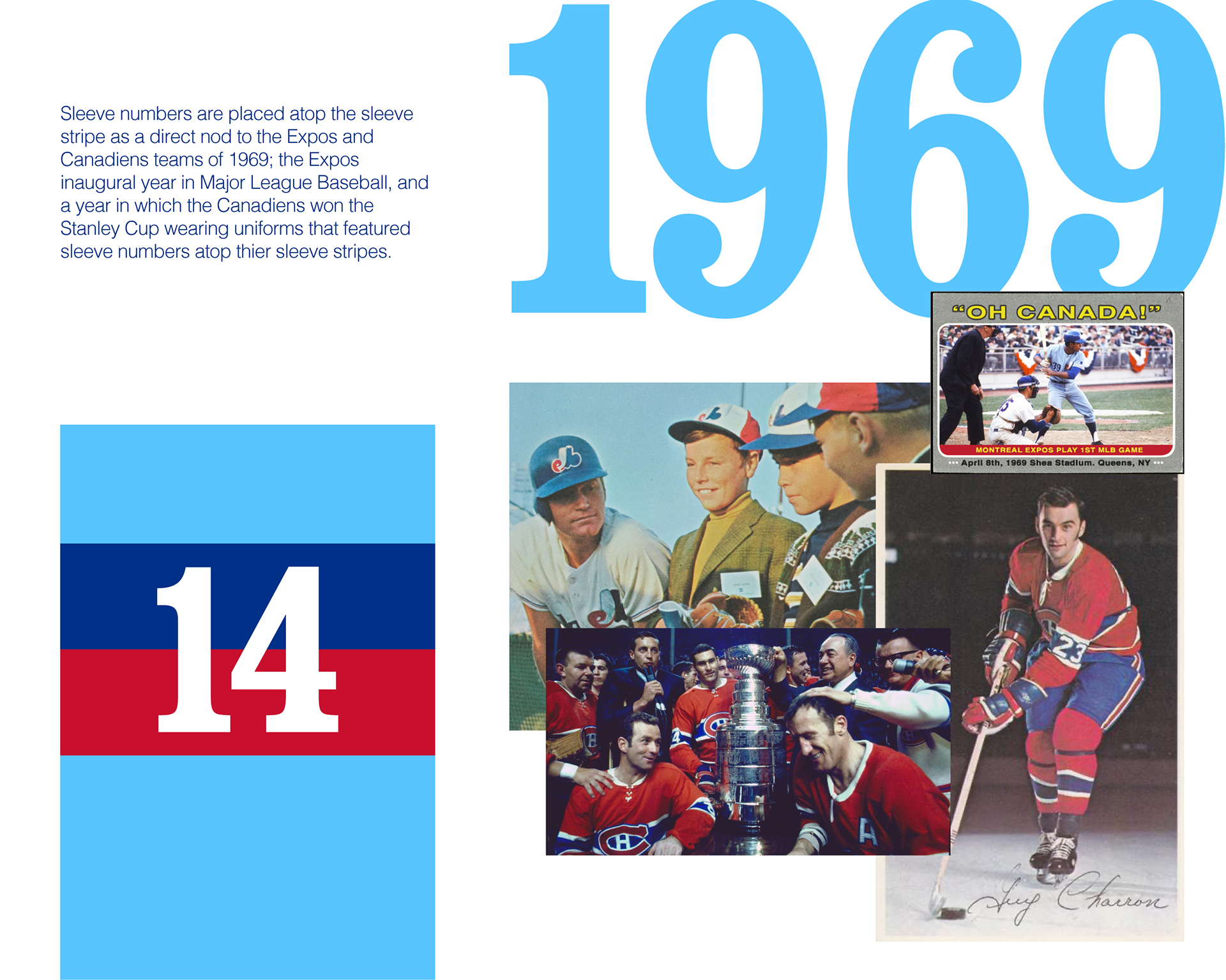
When rumors began circulating that the Canadiens would go powder blue for their reverse retros and possibly pay homage to the Expos, I developed an idea in my head of what an ideal Expos tribute would look like. The Canadiens of course simply recolored their traditional sweaters powder blue and called it a day, but I decided this weekend to get the idea I've had for an Expos tribute sweater out of my head and onto the computer.
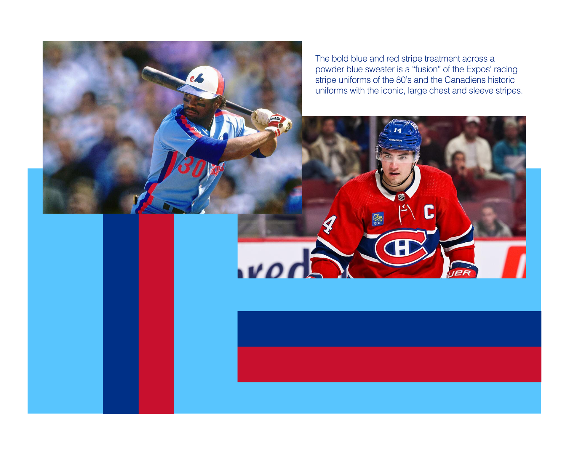
It's a design that might ruffle some feathers, as it deviates a little from the traditional Canadiens look. But I had every intention in the design of honoring Canadiens tradition by carrying over familiar elements and translating them into Expos nods. Namely, the sweater maintains the familiar stripes running along the sleeves and chest, but with an Expos twist.
More insight into the design and the inspiration behind it will be included in the following graphics. I would love to hear your thoughts, feedback, and comments! Thank you all for viewing!
-
7
-
-
38 minutes ago, Conrad. said:

This Jazz fan approves. Take my money!Honestly, if the surveys lead to positive change and something even close to this came out of it, I’d be thrilled.
-
5
-
-
Stick a fork in ‘em, Jerry. They’re done.
Honestly, I’m not saying the US should’ve necessarily panicked at any point - and I do think this was a case of the Dutch simply being the more talented and sharper team - but the US seemed….too patient, at times? That word seems a little wrong, but I don’t know what else to call it than that.
They didn’t seem complacent necessarily, but they also didn’t seem as consistently aggressive as they should have been. They penetrated enough to create a lot of chances, but always seemed to take thier foot off the gas as soon as those chances opened up. Shots on goal looked weak, passing wasn’t as crisp, and they seemed hesitant to get creative and find a way through the Dutch’s tough defense.Good lessons there for them to learn going into 2026. Biggest of all: aggressively capitalize on the chances you’re given. Hopefully a more experienced and seasoned US team will remember that in four years and execute better.
-
1
-
-
It blows my mind looking at the stats that the US has had more possession, shots, and shots on target. That doesn’t look like the game I’ve been watching. It goes without saying of course, but it really goes to show that you can’t afford to have more opportunities but execute them less than your opponent, especially if your opponent is as talented as the Dutch.
As I type this, Wright scores! A new glimmer of hope notwithstanding, the US have generally been really poor at making something out of thier chances, and the Dutch have made them look borderline helpless until the Wright goal. Not the showing that was hoped for.
EDIT: And just like that, it’s 3-1 Netherlands. Oof.
-
I had an…educated worry that ads on baseball uniforms were coming very soon. I don’t know how much I can say at the moment, but to be safe: the company I work in the creative department for was approached by a major league team to be a sleeve patch sponsor. I have no idea how those discussions are going or if it’s even going to happen, as the senior leadership of our marketing department handles that (also, hence my vagueness as I don’t want to break confidence, lead on, or speak out of turn), but I do know for certain we were at least approached by one team.
-
18 hours ago, RyanMcD29 said:
I have absolutely no idea why, but watching that Avalanche game with the reverse retros the other night gave a Thrashers feel to it. Maybe it was because of seeing blue/red/yellow together combined with the Avs number font sort of looking like the Thrashers' number font
That actually makes a lot of sense, and I can totally see it now that you mention it. There’s differences of course, but the vibe is very much the same. I agree that it must be the way the color scheme is distributed, and the “pointy” number fonts.-
1
-
-
Boston’s Winter Classic set is an absolute triumph. There isn’t a single thing I’d change about it. The inspiration and the execution are both so, so good. I have no sliver of Bruins fandom whatsoever, but even I’m tempted to get a beanie or hat from the set.
The Penguins…well, the set looks good in a vacuum, and the inspiration behind it totally makes sense. I just wish they had gone double-blue something because I think a black/gold vs. double-blue color matchup would have been absolutely stunning. Sure, “we had black and gold first” is an understandable team pride statement to make, but it robbed us of what could have been - barring poor execution by Pittsburgh - a potentially all-time great WC matchup, at least in colors.
-
2
-
-
2 hours ago, Digby said:
Ha, I kinda thought the opposite. I don't particularly like the German font, but I'm glad they got out of Adidas's usual tradition of everyone getting the same font, because this year's gaff tape numbers would be an even worse match for the kit in question.
Oh I totally agree that the gaff tape numbers would’ve looked bad on the German kit, but I just think they could’ve done a lot better than Myriad Pro’s cousin. That font just looks default and cheap.Meanwhile, Belgium’s kit is pretty bad. The sleeves and socks are almost comical. They look like they were supplied by Flavortown.
-
1
-
 3
3
-
-
I really dig Canada! That flannel plaid trim on the sleeves is great, and the wintry blue away kit is fantastic. Well done there.
-
1
-
-
Seeing Germany’s white kit in action, I feel like it’s “almost there.” Honestly, I think the number font holds it back significantly more than a number font should.
It isn’t deafault Myriad Pro, but it has enough similar characteristics to it (not so much the “3”, but especially the “1” and others) that it looks like it may as well be. I just have the funny thought that the designers didn’t outline thier fonts before sending the production file, and the font got defaulted without being caught.
-
This Twins rebrand has my head spinning a bit. I don’t recall a rebrand in which I really liked all of the elements individually, but really disliked how they were executed together. It’s as if all the good and bad of the whole set cancel each other out to me, and leave me feeling kind of blank about it all.
I really like the new wordmarks and number fonts in terms of their construction and craft, but really dislike them being single color without outlines and dislike them being two different colors together. Sure, them being single color are technically “cleaner” than being outlined, but they also look unfinished, rushed, and lack the weight previous wordmarks + numbers had in comparison. The ties to team history are evident in how the wordmarks + numbers are constructed, but the ties end there. The execution is completely different in general and, to me, looks very (almost deliberately) separate from team history. That’s very important in my eyes, as it gives the largest and most visible parts of the uniform a very different look and personality than what Twins uniforms have had before. That may sound dramatic considering we’re talking about mere outlines and color distribution, but hey, that’s what we’re here for.
As I previously stated, I really like the new “TC” and feel like that’s the standout of the rebrand. No qualms at all there. I actually do like the new “M” logo and to be honest, would probably buy a hat with it. But here’s where it gets weird: while I really like the mark individually on its own, something about it looks wrong when paired with the uniforms. I really can’t place what it is, but it looks very out of place to me when in use with the whole package. As much as I like the logo, I think I would have much rather the hat not exist, and that they used the “TC” all across the board.
The red-white-blue striping looks good on the white uniform, but looks very, very out of place on the road uniform. Excluding the cap, the stripes are the only place where white is on the jersey and pants, and sticks out terribly. The striping looks very tacked on last-second on the road uniform, and probably shouldn’t have been included there at all.
Finally, I’m a sucker for classic, cream uniforms and like that they gave one a swing, but the execution doesn’t work for me at all. It sorely needs a pinch of red somewhere. I don’t know if this was the intention or not, but if the straight navy and cream was supposed to be some kind of a Senators nod, there’s nothing else on the uniform that drives that point home enough to warrant it. Thus, it ends up looking like nothing the Twins have ever worn before (in a bad way), and looks like nothing they should be wearing at all. The very nice “TC” and “Twin Cities” wordmark notwithstanding, the cream uniform falls very flat to me.
All in all, the rebrand has a bunch of individual elements I like, and probably a bunch of singular merchandise I would consider purchasing. But as a compiled, whole brand, and as executed on the uniforms especially? I don’t think it works nearly as well as it should have, and for that reason, this rebrand is one of the most confusing to me that I can remember. What’s sad to me is, it was probably just a few small pivots of execution away from being perfect. They just whiffed on the fat pitches down the middle when it counted most, in my opinion.
-
6
-
-
So, I went to the Suns/Jazz game in Salt Lake City tonight, and the Suns were wearing thier new city uniform. I really like the idea and theme behind it, but the jersey numbers were really hard to read from where I was sitting (very top of the lower bowl). A couple of my friends I went to the game with said the same thing. The multicolor inline stroke causes a little bit of a jarring effect from that distance, and led to the numbers reading less like numbers and more like a separate graphic of some kind.
I’m guessing it looks better and more legible for refs on the court, but it really wasn’t from at least the mid-level stands.
-
1
-
-
1 hour ago, PlayGloria said:
Bias alert: I am a Blues fan, so I'm sure that plays into this post. But the Blues look rad in the RRs last night.
I’m generally not the biggest fan of gold/yellow hockey sweaters, but I think this Blues one is excellent. I think it helps that’s there’s a significant amount of blue in the uniform to balance it out, but in any case, they look great to me. It was a really good idea to reference the ‘67 prototype instead of re-hash one of the other throwbacks.-
2
-
-
6 hours ago, pepis21 said:
There is one tiny good thing about City editions and @WestCoastBias already mentioned it that sometimes you can learn something new about team, city, area or state. I by myself probalby wouldn't knew about Memphis sanitation strike if not the 17/18 Grizzlies City uniform but thanks to that I know now. I wish more Citys have some real valuable story behind them because it would give more sense to the whole project which is now very doubtful.
The program had this going for it for the first couple of years, but now I don’t think there’s much to learn from city edition sets anymore because ideas are being run out of, for the most part. You have some exceptions like Phoenix (educating about native tribes of Arizona) and Detroit for example (I learned about St. Cecilia’s Gym from them), but most of the league is throwing empty ideas around at this point. There’s nothing new to learn from Miami’s Mismash, New Orleans is driving Mardi Gras into the ground again, the Lakers have pretty much given up trying with theirs, and Dallas’ is pretty much just saying “the 70’s and early 80’s were cool…so yeah.” And that’s just a few of the uninspired issues the program is suffering from this season.Don’t get me wrong, I totally see where you’re coming from and I do think that intent worked for the first couple of seasons across the board in the league, but that purpose is rapidly losing steam to the point where half the league looks like they’re just filling the uniform slot to say they filled it with something. The program has run its course and it’s time for the league and Nike to either pivot to a program with a different vision, or trim fourth uniforms out altogether and reset.
-
2
-
-
I like what I’m seeing so far for the most part, but I do think the “Twins” wordmark needs a navy outline. It may just be that I’m used to every Twins wordmark having an outline of some kind, but single-color doesn’t look quite right, it’s not substantial enough in weight. I do like the actual construction of the wordmark a lot, though.
Count me in as a big fan of the new “TC” logo, also. The contour of the top of the “T” and the “C” works so much better without the sharp serifs, and the whole thing looks much more balanced as a result. I never realized the “TC” needed those changes until I saw them.
-
4
-


Qatar 2022 World Cup Discussion
in Sports In General
Posted
I watched the game on Telemundo instead of Fox this time. Cantor’s call on the winning penalty almost had my eyes welling up. I have no Argentine ties that I know of (I’m Hispanic, but not Argentine), but even I felt something with that call. Is it possible to vicariously feel a whole nation’s raw emotion? Because that’s what Cantor’s call just about did to me.
And then the game itself, wow! That is without a doubt the greatest soccer game I’ve ever watched. Messi and Mbappe delivered everything you could’ve wanted in an all-time great matchup. And to watch a legend like Messi finally win the cup was something special. I’m never forgetting this one, that’s for sure.