


SilverBullet1929
-
Posts
2,284 -
Joined
-
Last visited
-
Days Won
6
Posts posted by SilverBullet1929
-
-
I'm not convinced these are an upgrade over the previous set and that bugs me because it should have been an upgrade by it's existence alone. In time I'll probably love these more (I think we overlook how our first reactions are just first reactions and our opinions can change over time and those who put these uniforms together have looked at them over time and settled on their decisions with the benefit of time behind them).
Anyways, my collection of thoughts on these...
-I don't like the road pinstripes being so subtle. They weren't subtle in the Metrodome set and that's why people loved them. To me those road pinstripes were the most iconic part of that set because they were unique. So either do the pinstripes or don't, commit to them.
-TC upgrade is good and cleans it up but honestly most fans won't even notice this so it's not like anything is lost here.
-The M hat sucks. It's a Loria-era Marlins hat all the way. The star is a good idea but it's tiny and doesn't stand out at a distance, not enough contrast. Should have just refreshed the Metrodome M, not sure why they seem to be running away from it.
-I like the serifs on the font except that this comes when they remove the serifs from the TC??? How does that happen? Either keep the serifs on the cap and the font together, or remove them both. How do we eliminate something and then put it right back elsewhere?
-Speaking of eliminating something, I can't believe Minnie and Paul are completely gone from the uniforms. They should have been kept somewhere on at least one uniform, namely the home one. Big mistake there. Even if they wanted to change everything, that's the one thing that should be kept to imply consistency with their history, like the A's elephant and even that Devil Ray on the Rays sleeve.
-Surprised there isn't more complaints about them darkening the navy. It's almost black, not a fan of that at all because then it's suddenly like they're a black and red team instead of navy and red. Leave the dark navy to the Yankees and Tigers. Twins were already the normal navy, why change that?
-Twin Cities alt works as a City Connect because those are supposed to be outliers but this isn't that and they are getting a City Connect soon so why is this uniform so different than the rest? If this fit with the rest it would be fine. Can't stand that it's got no red and that the cap is different. And this leads to my biggest issue with the whole set...
-Why does this set about consistency have so much inconsistency??? The biggest thing that they wanna promote with this rebrand is having consistency throughout the whole set yet I see that as the biggest lie. Serifs gone from the cap but added to the fonts. 2 different wordmark styles in 3 different colors. The home jersey looks like a different team than the road and navy alternates. The M hat is supposed to look like it goes with the TC but it doesn't as there's no interlocking on the M hat so to me it's 2 completely different team hats. I like the contrasting numbers with the wordmarks but it's a different pairing on every jersey. The Twin Cities alt has a completely different color scheme than the rest including having a 2nd TC logo when they just needed one. That also makes 3 different caps.
Yes plenty of teams have elements that don't match but apparently that's what these guys were trying to get away from yet it's still all over the place.
Also, the modern update that worked for Toronto and San Diego is because those refreshed those teams most beloved uniforms but the Twins ran completely away from their most beloved uniforms. The one element of those uniforms that they kept is just done "subliminally" because they're apparently afraid to go with those uniforms. The Padres and Jays embraced their history, not these guys.
-
 2
2
-
-
Yea the Red Sox CC is the one that's least associated with the team wearing it. It's like "City" without the "Connect" part, which connects the team to the city. Probably shouldn't have started with that one.
-
4
-
-
Wow these Angels ones kinda don't feel like City Connect jerseys, they're not wacky enough for that. They just seem like a nice retro style uniform from simpler uniform times. Not sure if that's great or not.
-
On 6/1/2022 at 2:42 PM, DCarp1231 said:
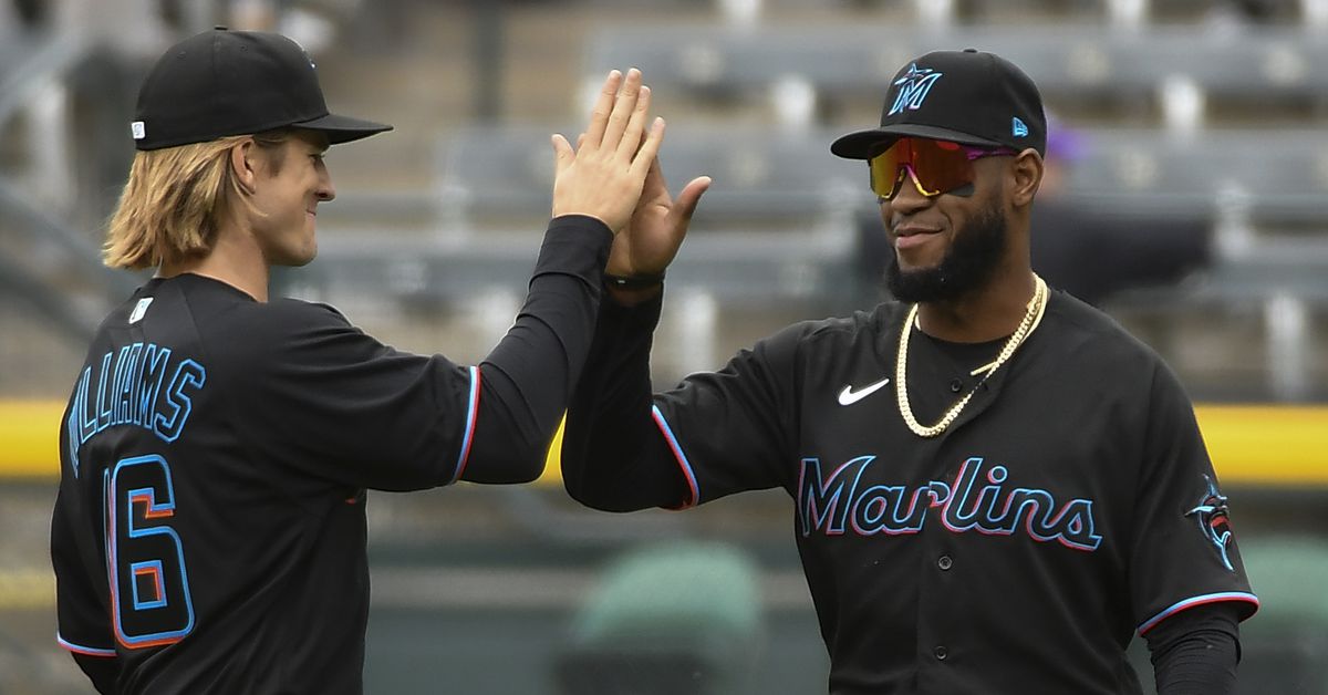
Never realized how much the Marlins black jersey sucked until I saw this image

I truly feel like they only saw these jerseys indoors/under certain lighting conditions and never once tested them on the field or in photographs because as faulty as they are, once in a blue moon I see them in specific photos and you can see what they say they were going for. Obviously it's a failure because it doesn't work on the field and on TV and at any distance but just to show some examples of images where it does look the way they intended it, I feel like they saw examples like this and in person and thought oh yeah we nailed it...
-
3
-
-
People saying green and purple reminds them of the Hulk and the Wimbledon logo but nobody thinks of The Joker?
Also people ranking their CC uniforms got me thinking, people actually like the Giants ones? To me those are by far the worst. It's like that Moneyball movie line where Pitt says there's the bottom, then 10 lbs of crap, then the A's... that's how I see those Giants CC unis.
-
3
-
 2
2
-
 1
1
-
-
On 4/26/2022 at 4:43 PM, bowld said:
Mlb the show added these in today. Batting helmet has light blue bill, not sure if accurate or not..
I can't see the pic, what did they add in?
-
37 minutes ago, adsarebad said:
Where do the navy come from?
Most of the prior teams in the history of KC before the Royals wore navy like the Monarchs and Athletics.
-
1
-
-
On 4/16/2022 at 8:14 PM, schultefamily4 said:
Shouldn't we start seeing the holiday caps by now? Mother's Day is 3 weeks away
Maybe they forgot, please don't remind them.
-
 1
1
-
-
I like them except for the WSH, which is kind of a big part of it.
But I'm curious is there any "reason" said for choosing the gray and the off-white color?
-
2
-
-
13 minutes ago, MNtwins3 said:
I can stomach some of these bad designs because it's spring training
True but it'll also be the batting practice cap for the rest of the season, though those are admittedly seen in public less.
-
Now that I look at more of them, the ST/BP caps look like when the All Star Game and/or Home Run Derby caps take the aesthetics of the host city's team and these all use the Marlins/Angels/Brewers style of the inside of the logo matching the color of the crown.
-
The concept of the ST caps is pretty close to the Marlins' usual aesthetic so their cap is probably one of the best for this style as it's not something out of the box for them. This concept is gonna work great for some teams but not as well for others but thankfully it's not as dumb as so many recent ST/BP designs.
-
1
-
-
57 minutes ago, EddieJ1984 said:
Why wouldn't they change the color's of the A so its mostly black.
I guess it's because it's "never" black. They keep the logo the same no matter what the background is. I think this is the same concept for why logos like the Angels, Marlins, and Brewers are "always" the same color and they don't change based on the backgrounds even if they end up being the same color as the background? Just a thought.
-
1
-
-
For the fan who really, and I mean really, "loves" their team...
-
7
-
-
2 minutes ago, lgbaseball8 said:
I’m glad they chose to stop focusing on gold. Gold accents didn’t look bad, it was just hard to fit it in with their already full color scheme. I think they would look fine if they went with a royal, gold, and, white scheme, but I’m glad they stuck with royal, powder, and white.
This is a good point. I've always wanted to like the Royals using some gold but hadn't really thought about how it battles against the powder over who is the true accent color for them. Picking one or the other and embracing it is probably for the better.
-
1
-
-
Are the Royals keeping the pants piping thin while making the jersey piping thick???
-
45 minutes ago, Marlins93 said:
I can never keep up with the Royals' changes. I thought they already had a powder blue alternate?
They did but the wordmark had a royal blue outline and the front numbers were royal blue, now everything is solid white.
The changes are a lateral move at worst, possibly an upgrade overall. I like that this lines them up a little more with their 70s and 80s looks. It's ultimately minor changes, cleaning up their look, most people may not notice the changes even considering the changes in the road wordmark. And with the road jerseys its really just whether you prefer the block letters or script, I think both look good and fit with the Royals history.
-
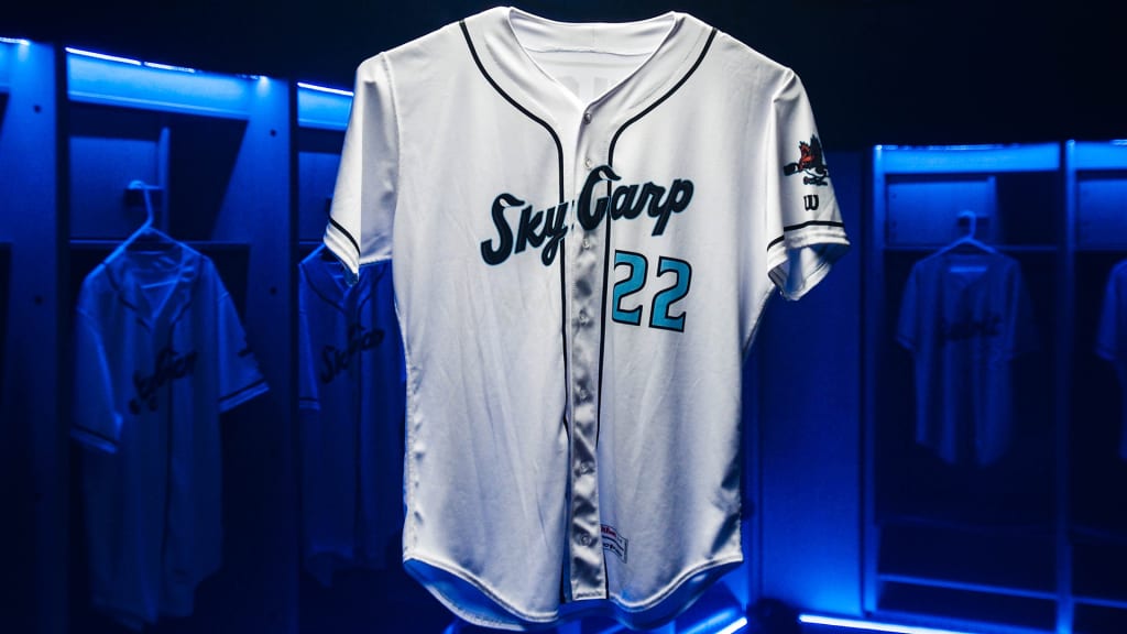
I'd tweak some minor details but when you look at the Sky Carp's full uniform details like the numbers which aren't on the mockups, you see they cleared addressed most of the issues that the Marlins uniforms have. Notice the red numbers on the blue jersey, the white numbers on the black jersey, the blue numbers on the home jersey, the use of a blue cap as a road cap, all of those great improvements to inject more color and improve the visibility of the Marlins uniforms.
-
3
-
-
25 minutes ago, CreamSoda said:
Wasn't Colorado supposed to get new uniforms next year? Is that still a thing?
For now it sounds like they're just getting one new alternate. Most are assuming they'll update the black vest but it's unlikely much more than that especially if we haven't heard of something bigger by now.
-
1
-
-
On 9/17/2020 at 11:59 PM, Davidellias said:
Charlie Hough who was born in the 1940s, played for the Florida Marlins for two years.As a Miami kid who didn't start watching baseball consistently until the Marlins became a team, this is not a specifically "wrong uniform." I think there are ways to have a uniform still be positively associated with someone who may have a different "right" uniform. Obviously Hough had greater success before the Marlins but the only clips I keep seeing of Charlie Hough over the last thirty years have been him pitching in the Marlins' inaugural game. When I see Charlie Hough, I think Marlins 1993, not Dodgers. Of course I'm not saying his Dodgers uniform is wrong I'm just saying there can be right uniform and wrong uniform but there can also be a middle ground.
-
2
-
-
Brewers new pinstripe home alternates should be the primary home uniform. There's no right or wrong on this one though, probably more personal preference than anything else.
-
1
-
-
19 minutes ago, CaliforniaGlowin said:
At least XFL 1.0 uniforms didn't look like copies of each other with color and slight font differences,
This.
-
I'm no expert on football uniform aesthetics but after seeing all of them my first thought is, while they're all fine, they all look like they were designed by the exact same person who just had one template that they just made loose changes to. For all their differences all the uniforms look and feel exactly the same to me. The number fonts are all different but seemingly all started from the same basic design. Their isn't any true uniqueness to make any of these stand out. I'm used to uniforms that vary from team to team because they were designed by different people at different points in time using different inspirations and different concepts and themes. It's like when you look at a pack of crayons and all the labels are the same design but only the colors changed. There's not enough variety here. Maybe revealing them all on the same day doesn't help but it sure looks like all of these came out of one single person's mind only.
-
3
-
-
15 hours ago, Ferdinand Cesarano said:
However, a bit of humour in which the worst NFL team is depicted as being a member of a lower league is not necessarily an expression of this toxic phenomenon.
Yea this is true too... the Dolphins thing was literally just a timely joke.
-
1
-


Minnesota Twins New Identity
in Sports Logo News
Posted
That makes sense but did they darken the caps too? I just don't want to look at the Twins now and see the caps nearly black as the Tigers and Yankees often do appear.