


flyersfan
-
Posts
1,362 -
Joined
-
Last visited
-
Days Won
1
Posts posted by flyersfan
-
-
If the top left came to a point a la Titans numbers, it would look much better. Coming to the rectangle end is what makes it yeesh
-
 2
2
-
-
The Chiefs' seamstress/uniform staff is about to have a fit...
Edwards-Helaire, Smith-Schuster, and now highly rumored Valdez-Scantling. That's just skill positions.
-
1
-
 5
5
-
-
The Ferrari on it's own looks great. Compared to the field, the bright red being missing is quite a let down. The grid is extremely dark and ways away from the colorful 2019/2020 grids.
-
I'm a fan of the TCU frog collar. It's uniquely them, and I think it works as a modern look. Awesome jersey element. Simply make the jersey numbers contrast more, make them white. Too often its too much dark on dark, especially in shadows. Keep helmets satin, and keep stripes off the helmets, or keep them simple and straight. The white uniform is great, the others just need some visibility help. I won't complain if they simplify, but they have to stay different from Northwestern's chosen identity. I just believe the current set is more of a "modern classic" with tweaks needed than a disaster, a la the Denver Broncos

-
4
-
-
The league as a whole could really use a purple. Kings in the Black/Silver is a great look, but a purple would really help the overall color balance.
-
1
-
-
The fonts are referencing two separate instances. The STANLEY CUP is representative of the original engraving font, and PLAYOFFS is referencing the hotel font that the NHL was created in. While I like style>history, they're nice nods and not overly gimmicky.
Counterargument: the NHL has been templated for a long time, and the over-metallic try of the last iteration started to age.I'm happy with this. I see it as an upgrade, it should translate well in application, but not a "this is amazing" reaction
-
1
-
-
Theres a few good ones and a whole lotta bad...
Again, redundant alternates or uniforms that literally are nowhere close to the team ideas. I'm tired of this all...
-
1
-
-
The fact they are in team colors and feature logos very much in the realm of team branding, I'm happy. There's plenty of caps that have existed where one of those things isn't true, and/or there's a gigantic gimmick.
-
1
-
-
Bad experiences with fanatics...
-
NASCAR on FOX did well. I could to with a little less italics, but custom car numbers, no gigantic gimmicks in the scoring pylon, I like it.
still wish they would disallow ads that light up significant parts of the score bug yellow though, makes me think there’s a caution every time.
the graphics in race to highlight specific drivers are cool, colorful, and branded like the car with a huge car #. Only downside is they’re still using the cartoons instead of actual driver pictures.
-
Apparently uniform cohesion is no longer a thing. They're walking a slippery slope towards NBA and UEFA type change uniforms...
-
4
-
-
According to the mother site they have 4 pant options:
gold, burgundy, black, and white
the black helmet will be worn with both the white and black jerseys.
-
12
-
-
No consistency, BFBS, disgraceful elements on the uniforms.
I can’t say I didn’t expect this from Nike but I hoped the traditional Washington look kept things from going like this, alas
-
10
-
-
ESPN's NFL package is rough right now. They like to use helmets in the imagery, almost all having the wrong colored facemask. The flags with metallic on them are cool until they disintegrate in the wind, then it's not great, which they definitely do during the draft. I also don't understand the obsession with altering the logos, why do they have to add the bubbling effect? And why do the NBA ones have to be 3D? It just doesn't add anything but make the logos look goofy. There's ways to apply them to add more than just the base logo, but it doesn't have to go all ridiculous.
FOX needs to stop with the cartoons. It was fun the first time, but ever since then they just look bad. Why can't they just use a picture of the person? Newer viewers don't know what these people look like, especially in NASCAR and Football where they wear helmets.
As for NASCAR, yikes is coming. I don't understand the need for it to be all patriotic in stars and stripes. Simple is nice, and NASCAR has actually done a real good job in their branding, why can't they adopt similar design elements to the broadcast?
-
3
-
-
Anything played on grass will feel much better than anything on turf. Which rules out many of the recent games. I can only speak for the games I've seen in my lifetime (I've at least rewatched all SBs back to the 2001 Rams-Titans (Which I think has a very underrated balanced uniform matchup).
Some highlights though, we're 6 years into a tradition of the field design. NFL shield / main logo for the season at midfield (Gold for SB50, 100 logo for NFL100), with the 25 yardline having the SB logo (although they have unfortunately been pretty template-y), the endzones each being the team's logo on the left, and nickname-only wordmark to the right, with a primary team color background.
All of that considered, the 2 recent ones (KC-TB and KC-SF) have been beautiful, IND-NO was a great one, and I'm a sucker for SF-BAL personally.
SoFi's turf looks very nice, and there should still be some sun (although on it's way down) for the SB kickoff this season. Really just the Titans, Rams, (and Bengals to a degree) are the ones to avoid in getting a crappy uniform matchup (although they could be muuuuch worse unless the Rams wear anything with Bone). Packers/49ers/Bucs and Bills/Chiefs are all some of the best dressed in the league. Throw in some personality in this year's logo? We're in good shape...
This Page (GUD) has all the uniforms and field designs for all the Super Bowls
-
2
-
-
Yes, the pants were subjective and guessed, all we saw were Burgundy pants with a gold swoosh.
Helmets could be adjusted with logos, stripes, facemask, but there's definitely a black one in the video, featuring a gold emblem with burgundy outline (although it's not enough to tell what it is)
Rams making two separate and non-cohesive uniforms gives us a precedent to see something without a consistent brand. The white *could* be an alt, but why would they show us the home and the radical alt?
I adjusted the original post of mine on pg 3 to account for the changed W.
-
I hope it's incorporated in the pants, because the video's clips of the jersey show zero gold...
-
2
-
-
4 hours ago, Conrad. said:
I keep on coming back to this topic, hoping someone with more motivation (and free time) than me will make an updated mockup of what we've seen so far...
Forgive my limitations on Paint and a base template, but this should be a very close ballpark...
And yes, I'm well aware that the template's complexion doesn't match that of the player name & number I used, I just took that of the font we saw so I could get it right.
-
3
-
-
35 minutes ago, the_grateful_ted said:
32’s is such a clunky sounding name, + there is already a “number” team in the league. It’s actually baffling how we ended up in a situation with SO MANY bad options, how does the capital of the US not inspire at least two or three somewhat generally well-liked nicknames?
Well, it did, "Wolves" of some sort seemed to be the consensus lead with the most positive reception, but "legal troubles" for the most popular and biggest league in America, of course.
I know there is long history behind them, but we have multiple Giants, Cardinals, Jets, in the big 4, and there's countless Eagles, Lions, Falcons, Bears, Raiders etc. when you factor in College Football too.
Are the Minnesota Timberwolves and Arkansas State RedWolves really giving them THAT much trouble that they have to -potentially- disappoint the fans?
I guess I don't understand the copyrights and trademarks, if they design a whole brand that is independent in design from those others, there can't be that much of an issue, no? Minnesota can't own everything to do with a wolf in sports, right?
-
4
-
-
4 minutes ago, DC in Da House w/o a Doubt said:
To clear it all up, yes, this is different from the home uniform, thats part of the point.
The white is a seam, implying that is the base layer (jersey). The twill used there is the default material for numbers across many American sports uniforms. They are not perforations, you can tell in the largest white diamond on the lower number, it has the same surface texture of the burgundy part on the same number. On the top number's largest diamond, if there were perforations there would be some sort of shadow, which there is not.
Could this be on a sleeve? Yes, (doubtful because they are using twill) but we also saw a white jersey with no yoke or striping coming down the back of the shoulder, with a square pattern on a sleeve cap.
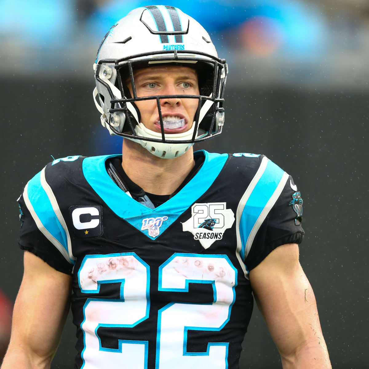
These look like numbers (the black outline and stitching suggests it), and the diamonds are some sort of pattern on them, it looks like some sort of gradient towards the top and the bottom. This picture of CMC is to evidence the sleeve stripes being a jersey fabric and not a twill...
-
2
-
-
The Diamond pattern is different in the center than the top/bottom. It's showing some sort of a gradient-like pattern, and not a faux mesh since the diamond sizes are different. It's also printed directly on the fabric/twill, it isn't holes like the burgundy, which are uniform in size over the whole number.
From the video, you can see the square pattern with the glimpse of a nameplate, which confirms that its on the shoulder. It could be angled from what I drew below, but this is a ballpark of what we can see:
-
1
-
-
The NFL has done a good job for the most part in brand cohesion. When you turn a game on, it should be clear the two teams you're watching without any need for extra stuff in terms of logos and field paintings and the announcers telling you. Teal and Orange? Dolphins. Black and Gold? Steelers. The very casual viewer should be able to know what team they're looking at instantly.
IDC how many alternates a team wears or how often, but they should look like one cohesive set.
If WFT has what I drew out above, I'll be disgusted. One week they'll look like the WFT, one week they'll look like an Arizona State "Icy Dust Storm".
"Cool" and gimmicks are passing brand cohesion. Yuck.
-
9
-
-
1 minute ago, Pizzaman7294 said:
Unfortunately you can't see it in this shot, but there's a gold decal on the black helmet, its at the very top right of the screen
-
Their hints of the phrases in the teasers:
-hail to the greats that laid the foundation for our legacy
-hail to the fans we consider family
-we are and always have been Washington
-we'll fight for our community
-and together we will define our future
-we will launch
The Launch part feels significant, but idk what name that could refer to.
-
4
-


/cdn.vox-cdn.com/uploads/chorus_asset/file/22503117/1229636823.jpg)


NFL 2022 Changes
in Sports Logo News
Posted
The black base stinks, they should be team colors. Overall, it’s a template. They’re always going to look good for some and terrible for others.
as a Jags fan I view those individually, they’ve had a lot of wooooof designs, this one is okay in comparison