-
Posts
1,362 -
Joined
-
Last visited
-
Days Won
1
Posts posted by flyersfan
-
-
Them missing the gray will look odd. Blue and White to me is the Colts, RWB is the Bills. The gray was an excellent differentiator.
Now that they are seemingly dropping the gray, they need a touch-up on the uniforms. I like the White facemask, NY or Giants on the helmets I'm indifferent, but the set should be based around that color rush uniform, it is truly an elite look.
-
 6
6
-
-
I actually kinda like the Pistons new home court. The wordmark on the baseline should have a red outline, and the paint should be red. Otherwise, I like it. The oversized logo in the background I like, it brings both a color balance and its just, good. I imagine some other teams could create a design like that as well.
-
 5
5
-
-
Ravens have military-like patches that must mean something internally, and use different templates for their same uniforms. They're also one of the few teams that don't wear specific mesh or lightweight practice jerseys w/ screen print either.
-
 1
1
-
-
If the nike speak was determined pre-logo, yes, I like to hear that. if it was thrown on to describe a part of the logo when the real reason was "it looked better"? Gross.
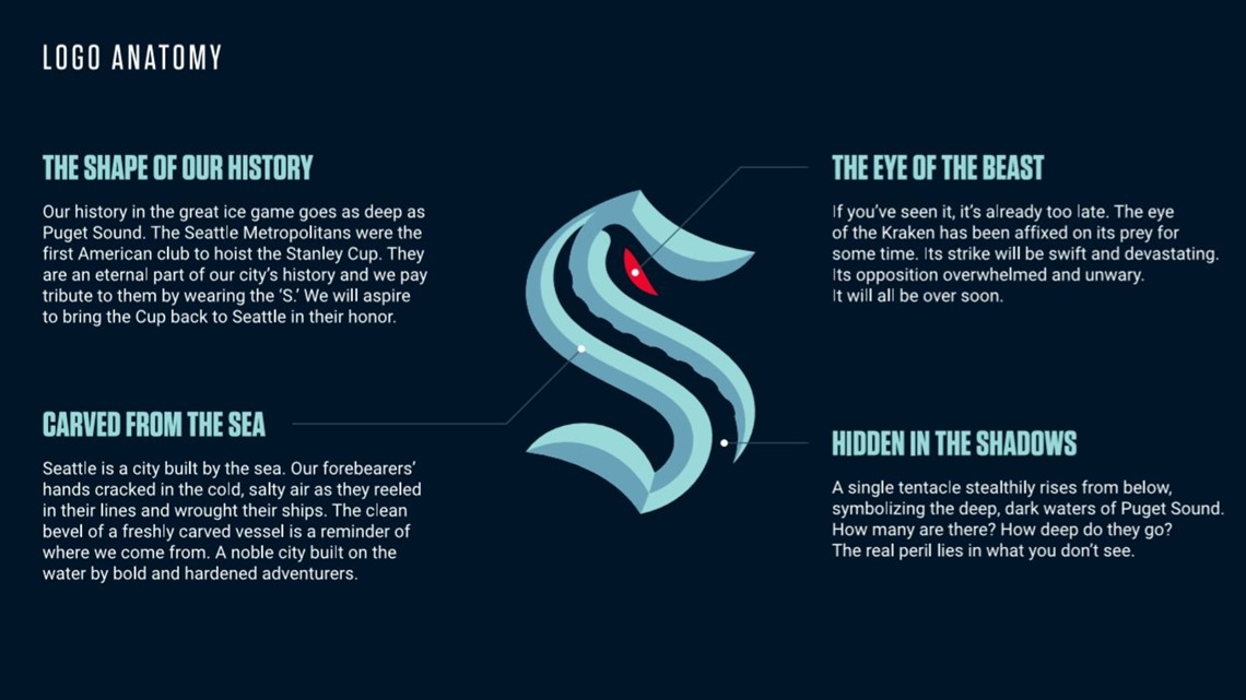
Not NBA, but the Kraken's speak on the logo is fantastic. Each part sounds like something they came up with, then built the logo afterwards.

-
 9
9
-
-
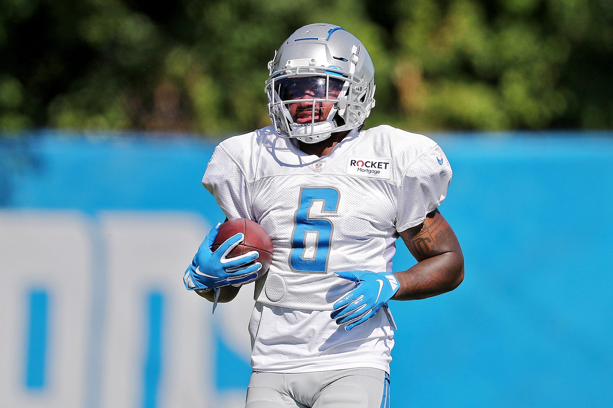
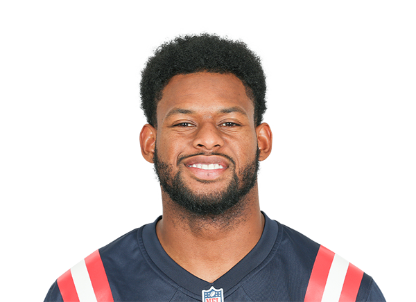
I've always laughed at the team headshots using incorrect uniforms, or players wearing preseason numbers (since they take these early summer)
James Robinson #38 (wore 30 all season)

D'Andre Swift #6 (32 in games)

Steelers still use an ancient reebok jersey for headshots:


-
 1
1
-
-
25 minutes ago, packerfan21396 said:
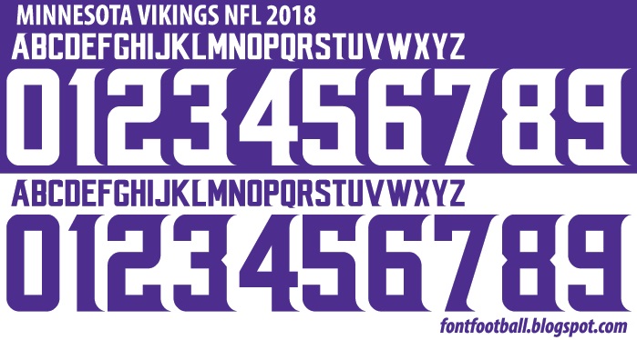
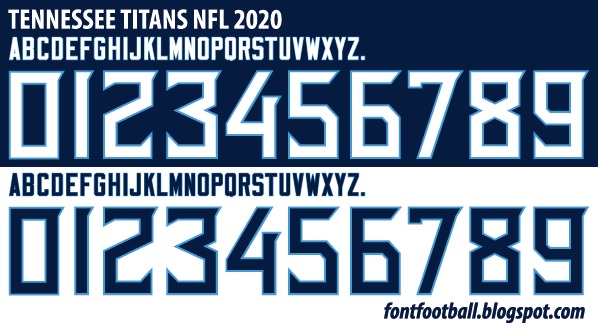
My go to for NFL numbers is going to the youth section of NFLShop and take them from jersey screenshots. However, for the Vikings, the actual logoslick with all the numbers is here, and I used this picture with some outline consistency adjustments (the outline is thin on the top for some reason) for the Titans. As for the Chargers, I worked a little backwards and found some jerseys and made the rest of the numbers by italicizing the Vikings' numbers, chopping off a serif on the 5, and adding an outline, because that's what they are. You have decent reference pictures, so it's not too much effort to make the numbers.
I just assumed the youth jerseys were taken at the same angle as the adult ones, so good idea! I guess I'm trying to say I'm looking for pics like the ones I attached but for all 32 teams, I've tried to draw some myself and its just taken a very long time, as i'm no drawing expert. Appreciate the help!
-
Does anyone know where I can find images like the ones below of the fonts in the NFL today? Trying to make graphics of my fantasy football league but lack a lot of the numbers (and can't draw them all out myself). The site linked to these only has a few.


-
I bought a Trevor Lawrence jersey as a Jags fan. Bought it in medium. very normal build, I'm 5'10" 175, and its pretty form fitting around chest and stomach. the sleeves go down to my elbows. I don't understand why they're like this, but can't we get some sort of happy medium? I mean, it's not like shortening them removes actual elements of the uniform...
And the Rams did this uniform right. They really did. If they came out with this, the blue uniform (with no number gradient), and strictly blue and yellow pants, I would've loved it.
-
 2
2
-
-
In a vacuum, these jerseys are nice. I really like them.
However, every time they wear these, it's one less time they wear the current look, which is among the very best in the NFL, if not already #1. Sucks, but I'm sure this jersey will sell enough!
-
 2
2
-
-
The nets have 3 separate black uniforms, and the iconic Celtics have 2 greens and 2 whites. Now at least those are in team colors but that’s the problem, forcing teams to have 4-5 uniforms either gives us redundant alternates or uniforms nowhere close to the teams identity.
-
 12
12
-
-
On 6/14/2021 at 8:08 AM, Dnice said:
I 'm guessing Sixers wear the earned or white jerseys tonight vs the Hawks MLK uniforms.
Schedule for the series is:
(PHI) White @ (ATL) MLK
(ATL) Red @ (PHI) Blue (Game 2)
(PHI) White @ (ATL) Red (Game 3)
(PHI) Red @ (ATL) Black (Game 1)
Source: NBA Lockervision
-
Sixers-Hawks is an excellent example of how simple, yet unique uniforms can look gorgeous, as well as giving us 3 distinctly different uniform games with no loss of "Who am I watching?"
2 of the best dressed teams in the league.


-
 14
14
-
-
2 hours ago, Friedrich Stuart Macbeth said:
Now I looked at it for a while, it's tolerable but I wouldn't use it for another season.
Its moreso the size of the spacing that interrupts the numbers. And this means no outlines either, which makes it hard to read on kits with any back pattern.

-
 3
3
-
-
I'm kind of a fan of that league-wide font mentality if there's like a reward for being able to wear it, like Gothamite said, a badge of honor. Conversely to the awesome Premier league font, the EFL one is awful.

-
 2
2
-
-
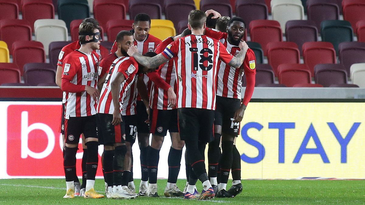
They actually haven't been all too bad recently, at least not in the numbers department. Sure a little funky but easily readable:


They have had their share of stinkers though too:


Some favorite fonts of mine:


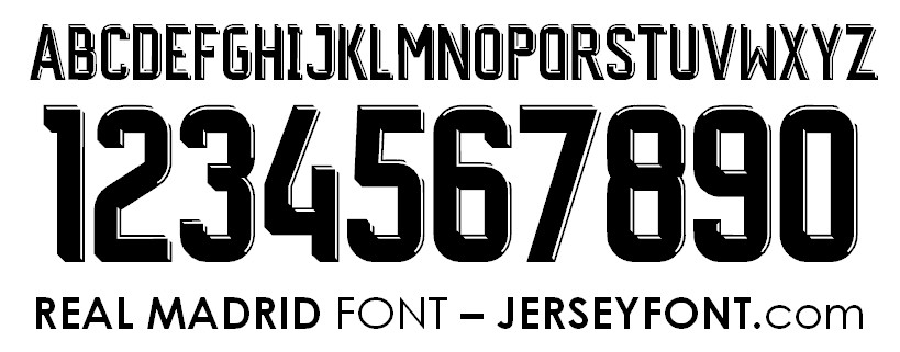
I like the tasteful flair. Gimmicky is fine if the numbers are consistent, readable (a balance between thick and thin), and don't look sloppy. Some fonts I just can't get behind with an odd 1 or a 7. There's no perfect science to it, but there are definite misses, Madrid's of 2021-22 is a miss (and last year's was a massive hit)
-
 1
1
-
-
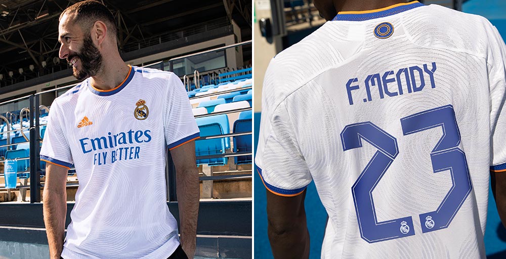
I consider myself a massive fan of custom fonts. However, there's a point where they get to be a bit ridiculous, and this new Madrid font ruins a classy and wonderful shirt otherwise.

-
 4
4
-
-
Madrid nailed that kit. "Fly better" is a bit weird but I'm not going to argue about what specifically the sponsor puts, it's at least in team colors.
As for my Spurs, This is my favorite kit of theirs in a long time. Simple is effective. The texture to it makes it look sweet up close, but clean from afar. Wish the AIA was the same blue, that's my only gripe, but they did a great job with it. A blue stripe on the collar or sleeves would be a nice addition if anything, but I'd always rather the plain versus anything over complex.
Upset at the comments about Kane leaving, let me try to continue to enjoy the career-to-date Spurs player. The transfer paycheck would be nice but this team needs him if they want to not be mid-table!
-
 2
2
-
-
To further the NY branding argument, Think New York Knicks. I couldn't tell you what a Knickerbocker is, but they're a legendary team because of history and New York.
The Jets current uniforms are okay, I think the black alts are unneeded with the dark green, but I can live with them. I like the stripe being unique, not a gimmick, and fits the modern look.
I wish there was some sort of jet (or branding hint) in the logo, since their logo hasn't reached identifiable icon status (which allows skipping the actual team name) like the Bears and Cowboys. We have to read the word Jets to know its them, unless you're plugged in to the uniform design community like us all.
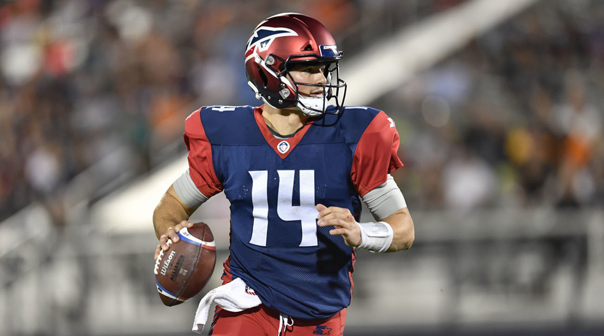
A bit gaudy with the gradient, but I liked the Memphis Express helmet logo (worn by Jets legend Christian Hackenberg)


-
 10
10
-
-
Let me do some quick math, if teams have 7 uniforms for next season, 82 games, that means each look is worn... 11-12 times? YUCK YUCK YUCK
-
 2
2
-
-
1 hour ago, officeglenn said:
Saving folks a click because these need to be seen to be believed ...
*cut images to save page space*
Yuck, Yuck, Yuck. They get worse as I scroll.
Maybe a new kit every year is a bad idea when there's this force1 that says they must be wildly different
Footnote
1 Force refers to money, which is the same force that tried to build a super league.
-
 3
3
-
-
the wall of chrome helmets, yuck to all
-
 5
5
-
-
im just very meh on it. the logo itself isnt bad but inter's branding WAS good already, this is just a downgrade, and dropping the gold sucks...
-
 4
4
-
-
I mean thats exactly what Denver should do. Minimal changes, just un-90s it. The logo is great (clean and modern), the orange and navy is nice, the number font is non-gimmicky and fits the Broncos, they just need to drop the curves and points and go with stripes. That concept is gorgeous. I likely place them in blue pants on the road, but that's just a personal preference. Want to stay away from looking like Auburn, but the blue helmet should help that.
-
Amazon has a huge presence in Seattle, their campus in downtown is nuts, google it. I wouldn't be shocked, but I also wouldn't limit Bezos to Seattle either, frankly it can be almost anyone.





/cdn.vox-cdn.com/uploads/chorus_image/image/69412774/usa_today_15993443.0.jpg)

/cdn.vox-cdn.com/uploads/chorus_asset/file/22641048/usa_today_16216549.jpg)




/cdn.vox-cdn.com/uploads/chorus_image/image/63212978/9124b35f75023d15472f34105cada8eab7f6dbb9_express_team_edited.0.jpg)
2021-22 NBA Changes
in Sports Logo News
Posted
To be fair, they are the LA Lakers, and their team has LeBron James (who is also switching to a new number this year).
Lots of jersey sales coming, and each one comes with a forever advertisement patch. I'm not surprised to see a number this high, I think Man U's Chevy deal was $130 mil a year, but I could be wrong as this number is just off the top of my head