

KittSmith_95
-
Posts
1,830 -
Joined
-
Last visited
Posts posted by KittSmith_95
-
-
Maybe I have an unpopular opinion because a bunch of people seem to love the Redskins' yellow pants. I have grown really tired of them.They look stale and just completely symbolic of a failed era in Washington. I particularly dislike the home jerseys with them. And it's not just the pants, it's the socks that match nothing, the shrunken sleeve stripes and the toothpick sleeve numbers Nike reduced them to. The whole Redskins uniform just looks awful and cheap now, at least to me.


So much better than:
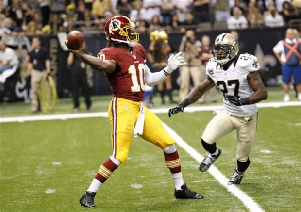

(and I realize they dropped the toilet collars on the roads. I couldn't find a better picture).
This one strikes me. I love the yellow pants, but the burgandy ones look way too good with that white jersey.
-
Did they gte your permission?
Cuz damn dude.... that looks great.
-
Okay.
What's the rule about bumping up a topic in the case of it being a template that wasn't added to the pinned topics?
It would be nice for people to see some templates that have been released but aren't used, right?
-
Speaking of that post up above, can I say that I love that Memphis Grizzlies jersey set?
Also, agreed on the pinstripes.. but not my fave Pacers set of all time. I feel they're close with what they have now, but once again, NBA and Adidas/Reebok/CCM/ WTF call themselves now going piping crazy on us.
-
My other opinion is NBA related, and I know this is gonna get me flak. But I don't understand the hate for this Magic set:

The pinstripes set has too clunky of a font, as did the sublimated stars. And the set they have now has piping issues ala Calgary Flames.
I don't think there was any hate for this set, mostly just indifference. A 90's team in Orlando, Florida with a singular team name that's as silly as Magic should not be using block fonts and a subdued look. And this set was the latecomer to the block-fonts-with-double-double-outline-and side-panels bandwagon the NBA had from the late 90's to the early 00's. It looked like a NOLA hornets ripoff


the spurs could probably be included here too
Sad to say this, but that font is stil the best font they've used.
-
 1
1
-
-
Not sure how unpopular this is, but when it comes to Canucks, my fave set is the Pre-Edge set.


This set is just beautiful..... I love the colour scheme, the logos (The Orca looked better in it's natural colours IMO)...
My other opinion is NBA related, and I know this is gonna get me flak. But I don't understand the hate for this Magic set:
The pinstripes set has too clunky of a font, as did the sublimated stars. And the set they have now has piping issues ala Calgary Flames.
-
Okay. Looking for a easy to use basketball template, including a sleeved one.
If possible, with multiple collars as well.

NHL Anti-Thread: Bad Business Decision Aggregator
in Sports In General
Posted
You know what?
Leave Kane be until trial. Give him that fair shake at least, media. Who knows what'll happen?